Tableau Desktop Specialist Certification Overview
Tableau is a premium data visualization tool used for BI that has an impact on a wide variety of stakeholders. This chapter focuses on the Tableau Desktop Specialist certification’s purpose, relevant careers, and the tool with a basic look at default charting. Understanding these fundamentals will provide you with the necessary background before your certification journey begins.
In this chapter, we will cover the following topics:
- How will a Tableau Desktop certification help me?
- Top careers and their relationship to learning Tableau
- Tableau Desktop basics
- Tableau basic Show Me charts
Let’s begin by covering what a Tableau Desktop Specialist certification is and what it can mean to you.
How will a Tableau Desktop Specialist certification help me?
Many people learn Tableau and never receive a certification. Although they have the skills to pass the certification, many people are passed over by recruiters and employers, who will look for people who passed the certification first. In this section, you will learn how the certification will help you and the relevant careers you can explore through the certification. Many careers include data visualization as a primary or secondary focus. Tableau is considered one of the most popular and widely used data visualization tools. Many employers require verifiable evidence that their prospective employees can use the tool and contribute. Unlike other official Tableau certifications, the Tableau Desktop Specialist certification is permanent and is easily verifiable by sharing a link to the online verification. It can also be verified from LinkedIn and other social sites. It’s important to have a verifiable certification from the software company that’s easy to confirm so that potential technical recruiters and employers seeking talent can immediately confirm your qualifications and reach out to you without leaving the site.
It breaks down your capabilities not only with the tool but also your general abilities to analyze data and data presentation, which is also helpful to support your general functionality as a person who is data-capable.
Last year, I took the test as it just changed from a hands-on to a knowledge-based format. This book will focus on the new format, which has new and more complex challenges compared to the prior version.
Here is the certification I earned last year:
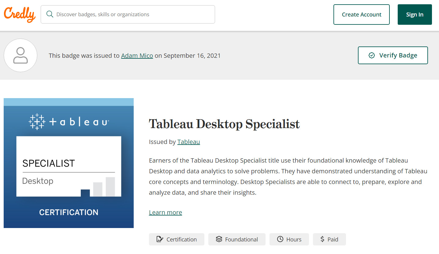
Figure 1.1 – Adam Mico’s Tableau Desktop Specialist verification page
There are many jobs where this certification has significant usefulness, several of which are included in glassdoor.com’s 50 Best Jobs in America and 25 Best Jobs in the UK for 2022. The following is a breakdown of the rankings:
Rank| Job Title | Median Base Salary (US $ | UK £) | Job Satisfaction | Job Openings | Job Requirement Likelihood (Low-Possible-Primary-Principal).
To help streamline and provide a consistent understanding between the US and UK glassdoor.com job rankings, this defined breakdown will be used for both the US and UK sections that follow.
United States
United States glassdoor.com job rankings that can require or provide a benefit with a Tableau Desktop Specialist certification are as follows:
- #3 | Data Scientist | $120,000 | 4.1/5 | 10,071 | Possible Requirement (and growing)
The data scientist job is constantly evolving. That evolution is to help create discovered insights that are more approachable for business stakeholders. Those stakeholders need clearer insights in a language they understand. One significant approach is data visualization. This comes into more focus with companies that do not have a dedicated data visualization team.
- #7 | Data Engineer | $113,960 | 4.0/5 | 11,821 | Possible Requirement (and growing)
The primary role of many data engineers is not to create data visualizations (especially in larger organizations), but it is often a necessity to create and learn to develop data visualizations to vet the data, provide a proof of concept, or possibly develop visualizations if the company does not have a dedicated data visualization team.
- #8 | Software Engineer | $116,638 | 3.9/5 | 64,155 | Principal Requirement (Tableau)
A Tableau Software Engineer or Software Developer’s primary role is to develop data visualizations, though there are other tasks, such as working with business teams, technical teams, and stakeholders. As a current Principal Software Engineer, I can share that having at least a Tableau Desktop Specialist certification was essential for even the basic consideration of my role.
- #20 | Consultant | $90,748 | 3.9/5 | 17,728 | Principal Requirement (Data Consultant)
Similar to a Tableau Software Engineer, many consultancies have data consultants. Their responsibilities cover the data gamut from data engineering/modeling/preparation to a deliverable top-class data visualization. I recently worked as a Tableau Evangelist for a data-focused consultancy. Certifications are essential to that role as special Tableau certifications are needed to help partners retain services with Tableau. Having a certification pre-hire helps establish that you can attain those certifications.
- #35 | Data Analyst | $74,224 | 4.0/5 | 13,657 | Primary Requirement
From 2017 to 2021, I worked as a data analyst and business automation specialist and as a senior analyst for the final 2 years of my employment. That role was new and only became possible for me because of the internal development I did with Tableau. For the entirety, at least 20% of my job was related to Tableau. In the current data analyst skill stack, data visualization is a necessity.
- #36 | Business Analyst | $81,556 | 3.9/5 | 15,238 | Primary-Principal Requirement
In many cases, companies may employ data analysts and business analysts interchangeably, depending on their structure. Although there is some specialization with larger companies, which may restrict some of the data visualization needs of a data analyst, with business analysts, that’s even less likely. Where a data analyst may need to work more on the backend, much of a business analyst’s work is more frontend- and stakeholder-focused.
United Kingdom
The United Kingdom’s glassdoor.com job rankings that can require or provide a benefit with a Tableau Desktop Specialist certification are as follows:
- #5 | Data Scientist | £49,449| 4.2/5 | 1,011 | Possible (and growing)
For the description, please see #3 for the US.
- #9 | Front End Engineer | £43,803 | 4.2/5 | 1,529 | Principal Requirement (Tableau)
In this specialty, the employee’s experience is related to that of a business analyst but is someone who works more closely in Agile (likely) project teams, which would likely include backend developers/engineers and subject matter experts.
- #11 | Software Engineer | £50,060 | 3.9/5 | 3,599 | Principal Requirement (Tableau)
For the description, please see #8 for the US.
- #24 | Consultant | £46,215 | 3.9/5 |1,498 | Principal Requirement (Data Consultant)
For the description, please see #20 for the US.
Entry to very lucrative, growing, and impactful careers are possible with a Tableau Desktop Specialist certification. Furthermore, there are many more roles that are transitioning to a generalist approach as businesses are looking for potential ways to better understand their data and be proactive rather than reactive. In recent years, in my professional experience, people are leaving the once-a-week/month/quarter email delivery of static infographics to interact with data visualizations displaying live or more recent data for more effective questions, analysis, and iterations. You may be checking this book out as you have a new job requirement to learn Tableau and validate those learnings with a certification.
Now that you understand the importance and impact a certification can have, we need to explore the fundamentals of the tool itself.
Learning Tableau Desktop basics
You must learn the basics of Tableau before exploring the application. To complete the Tableau Desktop Specialist certification, fundamental knowledge of the correct terminology will provide a strong basis for further development. In future chapters, we will deep dive into each relevant component of the application in more detail.
Application basics (as of April 2022)
Here are the elementary items that will help you understand Tableau’s accessibility, pricing, release cadence, and what data it can support:
- A desktop application with a separate application for Windows and Mac.
- The desktop application includes a 2-week free trial but is $70 per month thereafter.
Pro tip
Download the Tableau Public application at https://public.tableau.com/app/discover. It will have all the features you will need to understand the concepts for the Tableau Desktop certification and is free.
- The user interface and supporting documentation are available in the following languages: English, French, German, Italian, Spanish, Brazilian Portuguese, Japanese, Korean, Traditional Chinese, and Simplified Chinese.
- The release cadence is quarterly but is backward compatible.
- Supports many data sources.
- Capable of handling millions of rows of data.
- Can support code and scripts, but is mostly utilized with drag-and-drop functionality with the ability to create maps, field hierarchies, dimensional groups and sets, calculations (from simple to very complex), and parameters. It can also utilize extensions that are not part of the out-of-the-box functionality.
To begin developing data visualizations, you need data. The next section will cover the basics of connecting to data.
Connecting to data
To use Tableau, a user needs to connect to data. The number of data sources you can connect to is ever-growing, with a multitude of connectors developed by companies in association with Tableau to ensure scalable connectivity. Here is a screenshot of the data connection page:
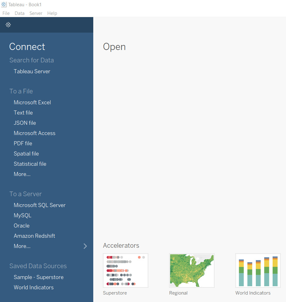
Figure 1.2 – Connect to Data from Tableau 2021.4
With Tableau, you can connect from the following services:
- Tableau Server (or Tableau Online): Tableau Server data sources are data sources published in the Tableau environment. They can be sourced from any supported file and server but hosted and formatted for usage in Tableau Server.
- A file: Tableau supports a significant section of files that may potentially be used, from CSV (referred to as a part of a text file) to PDFs to statistical and spatial files.
- A non-Tableau Server: So long as a user has credentials, many servers have dedicated connectors. Even if your server is not inherently supported through dedicated connectors, there are ad hoc JDBC and ODBC database connectivity options.
Unlike many other data visualization tools, Tableau supports an extensive and ever-growing list of data sources. In every release, it’s very likely to see even more supported and named connection options.
Worksheets
Worksheets are the next order of the application. Once connected to a data source, Tableau highlights Sheet 1 (default name) so that you can explore the data further. The following screenshot shows an example of this:
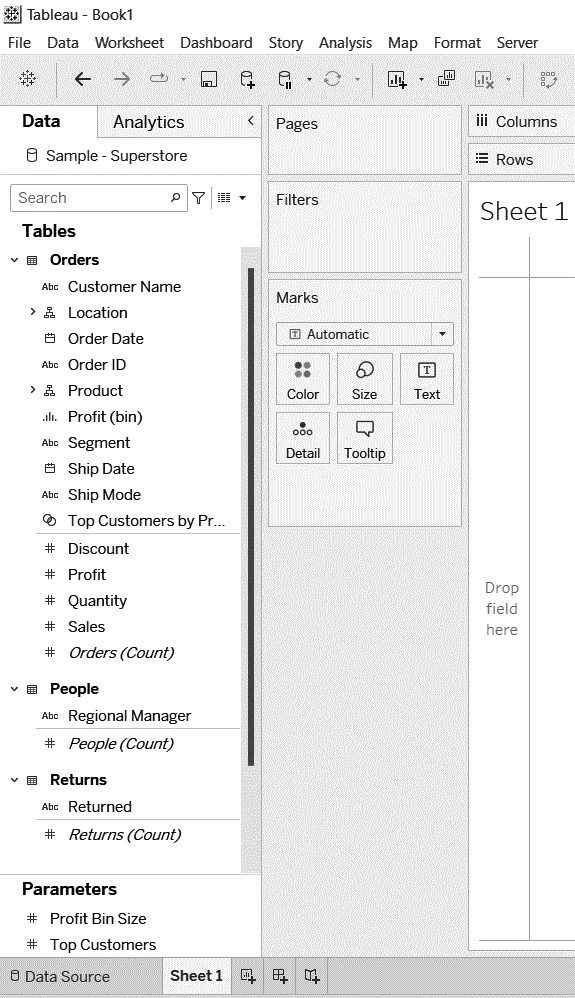
Figure 1.3 – Worksheet using Tableau’s default Sample – Superstore data
After connecting to a data source, the application will direct you to a sheet, as shown in the preceding screenshot. On the left, there will be a Data pane. This hosts your dimensional fields and measurement fields. To work with those fields, you can drag and drop them onto one of the following areas shown on the right-hand side of Figure 1.3:
- Columns: Stacks data dimensions from left to right in a visualization
- Rows: Displays data dimensions vertically in a visualization
- Marks: A section that adds context, dimensions, and context to the visualization
You have learned how to connect to data and the basics of its structure. I will begin sharing more about the visualization application in the next section.
Worksheets, dashboards, and stories
At the bottom of the application, some icons identify access to additional worksheets, dashboards, and stories. The following screenshot shows those icons:

Figure 1.4 – Worksheet, dashboard, and story icons (respectively)
Let’s learn more about the preceding screenshot. Tableau has a hierarchical structure for dashboard building, as follows:
- Worksheets are at the lowest level and the one item people will spend the most time using to create visualization elements (charts, tables, and so on)
- Dashboards can contain one or typically multiple worksheets so that you can create an interactive visualization
- Stories hold at least one dashboard
Selecting any of these icons will launch that function. Most end users will see a dashboard when they use the tool as stories are not utilized frequently unless they’re used for demonstration purposes (as there are more modern options, which will be covered later). Worksheets can be displayed on their own, but dashboards have more functionality and design applications.
Worksheet Data pane basics
The Data pane is the developer’s working section. Here, they can see the tables and fields associated with the data source and get a preview of what is available to work with. Figure 1.5 provides an example of how that looks:
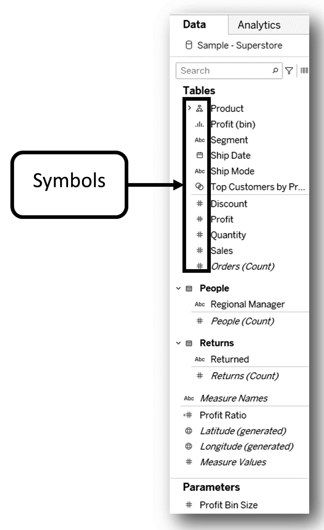
Figure 1.5 – Worksheet data pane
A lot is going on in Figure 1.5. The following list details some of the basics associated with it:
- Tableau displays a faint line between dimensions (or qualitative data) and measures (or quantitative data). This faint line is a visual indicator to help users determine what can be used as a dimension and what can be used as a measure as each has a very different purpose for data visualization. This can be seen in the People table between the Regional Manager and People (Count) fields.
- Tableau provides various symbols left of the field by table name to show whether it’s a string (abc, as seen in Segment), a number (#, as seen in Discount), geography (a globe, as seen in Latitude (generated)), a date (calendar, as seen in Ship Date), a hierarchy (hierarchy icon, as seen in Product), a bin (bar graph or bin symbol, as seen in Profit (bin)), or sets (overlapping circles, as seen in Top Customers…). These symbols are there to help users quickly scan data to see what they have to work with and how it can be utilized.
- Any field with an equals sign to the left of it (as seen in Profit Ratio) means it’s a calculation that’s been made in Tableau.
- Beneath the table fields, the available parameters are displayed. Although parameters can only be created in the same way as a calculated field can, they do not have equals signs in front of them like calculated fields.
Columns and rows
Beyond the Data pane, you can explore Columns and Rows. Adding measures to rows or columns creates a quantitative axis where a dimension to a row or column generates a header:
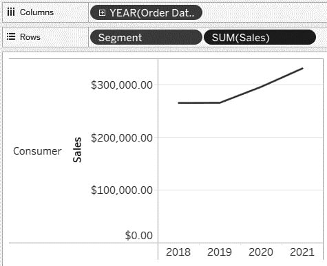
Figure 1.6 – Columns and Rows (Sample – Superstore)
With just a few drags and drops, you can create a useful chart. For example, as shown in the preceding screenshot, we can drag and drop Order Date to Columns (which displays as a discrete date – that is, Year), and then Segment (dimensional string) and Sales (a measure that defaults to Sum, resulting in a sum of sales) to Rows.
Marks
The Marks card is used to make updates to the default visualization. It is responsible for showing additional dimensionality and adding color and labels. It can be utilized to update charts, add colors, mark labels, add reference paths, shapes, use window calculations, enhance tooltips, and for sizing (all of which will be covered later), and additional options. The following is a visual representation of the Marks card:
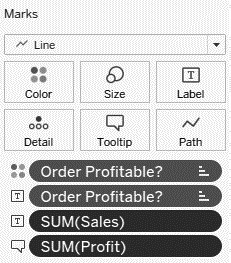
Figure 1.7 – Marks card
In Figure 1.8, I have the same structure in Columns and Rows as in Figure 1.6 but modified the chart using the adjustments I made in Figure 1.7 in the Marks section:
Figure 1.8 – Updated visual
In the chart in Figure 1.8, I wanted to see what sales came from profitable versus unprofitable orders. I colored by whether an item was profitable (top mark with the four dots). This coloring created a separate dimension for whether the order was profitable. In Figure 1.8, I can see that most of my sales came from Profitable orders in the Consumer segment. In the text of the line charts (Figure 1.8), I wanted to show which line represented what was profitable and the most recent sales (or what the sales for each were in 2021).
Note
Calculations will be demonstrated in future chapters, beginning with Chapter 5.
Filters
The following screenshot shows how a basic filter can impact what is displayed to a user:
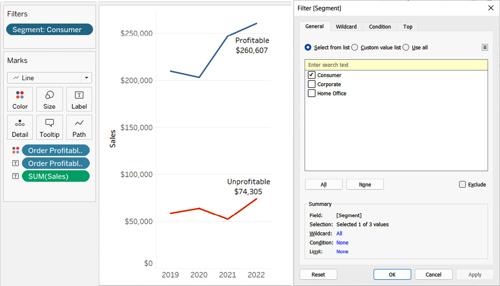
Figure 1.9 – Filter on Segment
Filters provide a developer or end user more flexibility to see what they need to see and ignore the rest. The preceding visualization only includes the Consumer segment. However, it is simple to show and/or hide a filter to determine whether you want end users to access the filters on a dashboard.
Quick measure adjustments
Tableau provides quick updates to measures. It’s vital to be able to display your data in the way that's intended. Figure 1.10 shows an example of this with additional information:
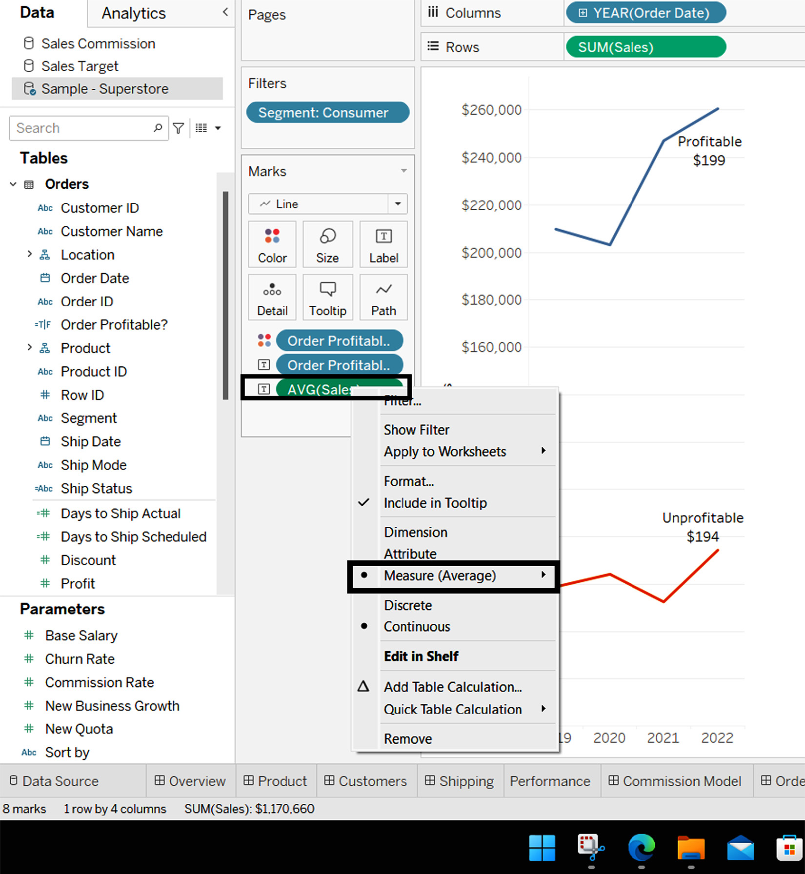
Figure 1.10 – Quick measure adjustment (Sales)
With a couple of clicks, a user can quickly adjust the chart’s measurements and the text of those measurements by adjusting the measure. In this instance, the end user did not want to see the total sales of what was profitable, but rather the average sales of orders profitable versus not profitable to determine any trends or whether they should consider a cut-off point. What they saw immediately is that there was very little difference when looking at average sales by year when considering profitable orders; in fact, the average sales of profitable orders declined rapidly over the past couple of years.
There are many more features and items to uncover with Tableau, but this gives you a brief introduction to some of the power of its very basic core functions.
With that, we have previewed a couple of the quick charts and adjustments we can make using columns, rows, marks, and filters.
Show Me charts
Tableau provides a list of charts that can be accessed from the top right-hand corner of the application. This feature intends to help users determine what visualizations can be made based on the data utilized. The following screenshot shows the available charts, which will be explained further shortly:
Note
Most users tend to only use these aids for the first 2 or 3 months, but it’s very helpful to understand the data to chart structure as this will likely be captured in some fashion in several of the Tableau Desktop Specialist exam questions.
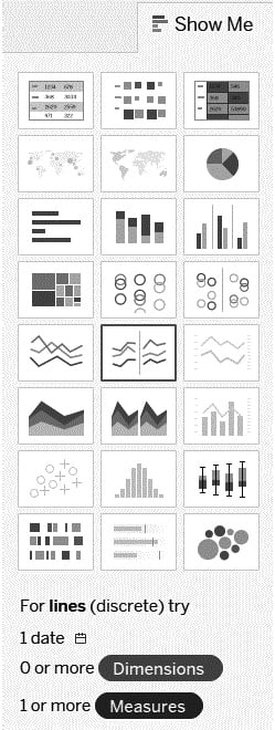
Figure 1.11 – Tableau’s Show Me charts
Tableau provides a list of 24 charts that are of great help to those new to using Tableau. The data on the worksheet highlights the usable charts and grays out or lightly shades out the ones where you do not have enough data needed for these charts. Even if you do not have the data you need to apply to the sheet, you can hover over the chart type to reveal the number of dimensions or fields of qualitative data and measures of quantitative data. Even more, it points out special fields such as date fields (as referenced in the lower portion of Figure 1.11).
You don’t need to know all of these charts by heart and you may not necessarily use some of these charts frequently, but it helps to learn the basics of these to better understand how to utilize the tool.
Here, we will cover the charts shown in Figure 1.11 from left to right while moving down, repeating this for each of the eight rows of charts. For example, chart 1 represents the chart shown at the top left, while chart 24 represents the chart shown at the bottom right. The format will be as follows:
Chart Name | Brief Explanation | Basic Data Needed
Let’s take a look:
- Text Table | A data breakdown similar to a spreadsheet | 1+ dimension and 1+ measure
- Heat Map | Similar to a text table, but uses shapes and colors to identify data | 1+ dimension, and 1 or 2 measures
- Highlight Table | A data breakdown similar to a spreadsheet, but with conditional formatting | 1+ dimension and 1+ measure
- Symbol Map | A map that commonly uses sized/colored filled circles to provide contextual insight | 1 Geographic data dimension, 0+ other dimensions, and 0 to 2 measures
- Filled Map | A map that uses filled geography rather than sized marks to provide contextual insight | 1 Geographic data dimension, 0+ other dimensions, and 0 to 1 measures
- Pie Chart | A sliced circle based on the size relative to the whole circle (or pie) | 1 or more dimensions and 1 or 2 measures
- Horizontal Bar Chart | A dimensional horizontal-stacked set of bars sized by value | 0+ dimensions and 1+ measures
- Stacked Bar Chart | A dimensionally stacked set of bars sized by value, broken down by multiple dimensions in a bar | 1+ dimensions and 1+ measures
- Side-By-Side Bar Chart | A dimensionally unstacked set of bars (rather side by side) sized by value, broken down by multiple dimensions in a bar | 1+ dimensions and 1+ measures (3+ fields required in total)
- Tree Map | Similar to a pie chart, but each “slice” is stacked in descending order of volume (usually) and sized from top left to bottom right to demonstrate a hierarchy in nested triangles of a different size | 1+ dimensions and 1 to 2 measures
- Circle View Chart | Uses a circle to provide comparative analysis for many dimensions | 1+ dimensions and 1+ measures
- Side-By-Side Circle View Chart | Like a circle view chart, but provides additional analysis of additional dimensions side by side | 3+ fields required, 1+ dimensions, and 1+ measures
- Continuous Line Chart | Used to track a measure over time with clean lines from the start to end date | A date field (continuous), 0+ dimensions, and 1+ measures
- Discrete Line Chart | Similar to a continuous line chart, but the dates are discrete, which breaks up lines by dimensions | A date field (discrete), 0+ dimensions, and 1+ measures
- Dual Line Chart | Combines multiple axes of multiple measures to create two single line charts | A date field (discrete), 0+ dimensions, and 2 measures
- Continuous Area Chart | Used to track a measure over time with clean lines from the start to the end date (effectively a filled continuous line chart) | A date field (continuous), 0+ dimensions, and 1+ measures
- Discrete Area Chart | Similar to a continuous area chart, but the dates are discrete, which breaks up lines by dimensions (effectively a filled discrete line chart) | 1 date field (discrete), 0+ dimensions, and 1+ measures
- Dual Combination Chart | Similar to a dual line chart, but one of the lines is substituted for a bar chart to get a bar versus line chart effect | A date field (discrete), 0+ dimensions, and 2 measures
- Scatter Plot Chart | Utilizes measures to create a comparison of numerical data over the X and Y axes | 0+ dimensions and 2 to 4 measures
- Histogram Chart | Creates a bin of a measure to look at the data distribution | 1 measure (creates a bin in the Data pane, but not available for all measures)
- Box and Whisker Plot Chart | Shows data in its quartile distribution with individual data points | Requires at least one dimension or disaggregate, 0+ dimensions, and 1+ measures
- Gantt Chart | Used most frequently to display project timelines | 1 date field, 1+ dimensions, and 2 measures
- Bullet Graph Chart | Used as a bar chart, but with additional context – think comparing an actual with a target | 0+ dimensions and 2 measures
- Packed Bubbles Chart | Used similarly to a tree map, but packs filled circles together by size (and often color) to fit randomly into a user-defined container | 1+ dimensions and 1 to 2 measures
Summary
In this chapter, we covered what purpose the Tableau Desktop Specialist certification has for your career and looked at some highly sought-after careers that the certification can apply to. Then, we covered the basics of Tableau, which included looking at the application, providing an introduction to data ingestion, providing an introduction to tool basics, and looking at in-tool charting resources.
In the next chapter, we will dive deeper into data ingestion as it applies to using Tableau.
Knowledge check
To check your knowledge of this chapter, here are three questions that this chapter’s material will help you answer. The questions that have been selected aren’t intended to trick you, but provide you with a learning benchmark to give you a foundational understanding to help prepare you for the exam. The answers are marked in italics:
- What is the cost of the Tableau Public application?
- $70 per month, billed annually
- $150 per year
- Part of the Tableau Desktop license, so no cost on its own, but the same cost as Tableau Desktop
- Free
- In Figure 1.6, in what years are consumer sales less than $300,000?
- 2018 and 2019
- 2019 and 2020
- 2020 and 2021
- 2018 only
- What type of data is contained in dimensions?
- Quantitative data
- Qualitative data
- No data
- None of the above