

Just to get a taste of how easy it can be to do some really cool things with R and to start to build the foundation of the Shiny application that we are going to build through the course of this book, let's build a few graphics using some Google Analytics data and present them in an interactive document. We are going to use two contributed packages, dplyr and ggvis. The dplyr package provides very powerful functions for selecting, filtering, combining, and summarizing datasets. As you will see throughout this book, dplyr allows you to very rapidly process data to your exact specifications. The ggvis package provides very simple functions to make your visualizations interactive.
We're going to run through some of the code very quickly indeed, so you can get a feeling for some of the tasks and structures involved, but we'll return to this application later in the book where everything will be explained in detail. Just relax and enjoy the ride for now. If you want to browse or run all the code, it is available at chrisbeeley.net/website/index.html.
The Google Analytics code is not included because it requires a login for the Google Analytics API; instead, you can download the actual data from the previously mentioned link. Getting your own account for Google Analytics and downloading data from the API is covered in Chapter 5, Advanced Applications I – Dashboards. I am indebted to examples at goo.gl/rPFpF9 and at goo.gl/eL4Lrl for helpful examples of showing data on maps within R.
In order to prepare the data for plotting, we will make use of dplyr. As with all packages that are included on the CRAN repository of packages (cran.r-project.org/web/packages/), it can be installed using the package management functions in RStudio or other GUIs, or by typing install.packages("dplyr") at the console. It's worth noting that there are even more packages available elsewhere (for example, on GitHub), which can be compiled from the source.
The first job is to prepare the data that will demonstrate some of the power of the dplyr package using the following code:
groupByDate =
filter(gadf, networkDomain %in% topThree$networkDomain) %>%
group_by(YearMonth, networkDomain) %>%
summarise(meanSession = mean(sessionDuration, na.rm = TRUE),
  users = sum(users),
  newUsers = sum(newUsers),
  sessions = sum(sessions))
This single block of code, all executed in one line, produces a dataframe suitable for plotting and uses chaining to enhance the simplicity of the code. Three separate data operations, filter(), group_by(), and summarise(), are all used, with the results from each being sent to the next instruction using the %>% operator. The three instructions carry out the following tasks:
filter(): This is similar tosubset(). This operation keeps only rows that meet certain requirements, in this case, data for whichnetworkDomain(the originating ISP of the page view) is in the top three most common ISPs. This has already been calculated and stored withintopThree$networkDomain(this step is omitted here for brevity).group_by(): This allows operations to be carried out on subsets of data points, in this case, data points subsetted by the year and month and by the originating ISP.summarise(): This carries out summary functions such assumormeanon several data points.
So, to summarize, the preceding code filters the data to select only the ISPs with the most users overall, groups it by the year or month and the ISP, and finds the sum or mean of several of the metrics within it (sessionDuration, users, and so on).
We already saw how easy it is to draw line plots in ggplot2. Let's add some Shiny magic to a line plot now. This can be achieved very easily indeed in RStudio by just navigating to File | New | R Markdown | New Shiny document and installing the dependencies when prompted. This will create a new R Markdown document with interactive Shiny elements. R Markdown is an extension of Markdown (daringfireball.net/projects/markdown/), which is itself a markup language, such as HTML or LaTeX, which is designed to be easy to use and read. R Markdown allows R code chunks to be run within a Markdown document, which renders the contents dynamic. There is more information about Markdown and R Markdown in Chapter 2, Building Your First Application. This section gives a very rapid introduction to the type of results possible using Shiny-enabled R Markdown documents.
For more details on how to run interactive documents outside RStudio, refer to goo.gl/NGubdo. Once the document is set up, the code is as follows:
# add interactive UI element
inputPanel(
  checkboxInput("smooth", label = "Add smoother?", value = FALSE)
)

# draw the plot
renderPlot({
  thePlot = ggplot(groupByDate, aes(x = Date, y = meanSession,
  group = networkDomain, colour = networkDomain)) +
  geom_line() + ylim(0, max(groupByDate$meanSession))
  if(input$smooth){
    thePlot = thePlot + geom_smooth()
  }
  print(thePlot)
})
That's it! You'll have an interactive graphic once you run the document (click on Run document in RStudio or use the run() command from the rmarkdown package), as shown in the following screenshot:
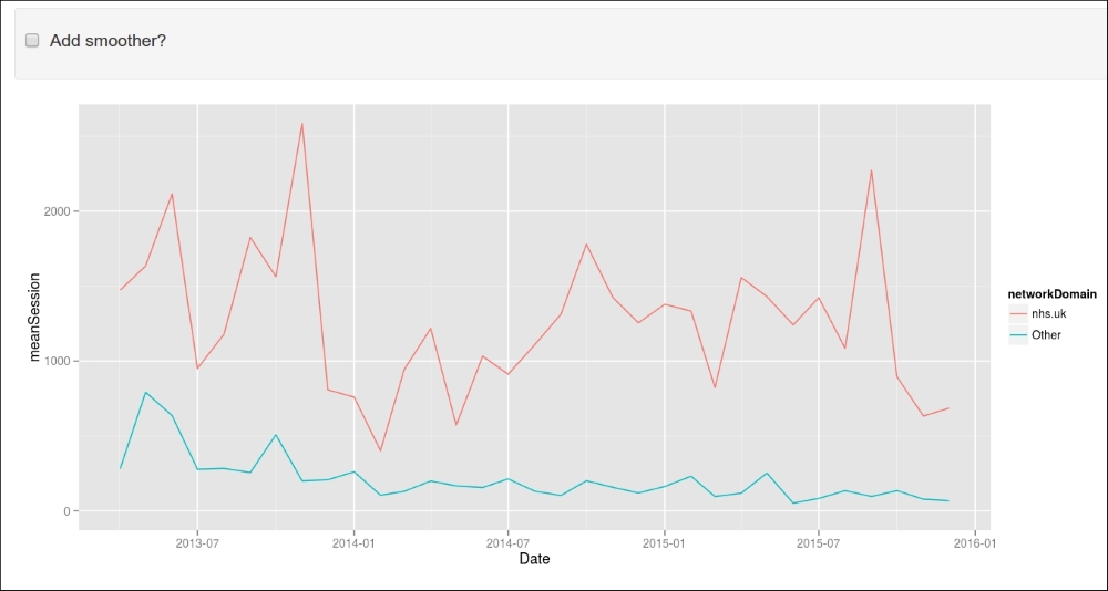
As you can see, Shiny allows us to turn on or off a smoothing line courtesy of geom_smooth() from the ggplot2 package.
Producing an interactive map (click to examine the value associated with each country) using the ggvis package is as simple as the following:
getUsers = function(x){
  if(is.null(x)) return(NULL)
    theCountry = head(filter(map.df, id == x$id), 1)$CNTRY_NAME
  return(filter(groupByCountry, country == theCountry)$users)
}

map.df %>%
group_by(group, id) %>%
ggvis(~long, ~lat) %>%
layer_paths(fill = ~ users) %>%
scale_numeric("fill", trans = "log", label = "log(users)") %>%
add_tooltip(getUsers, "click")  %>%
hide_axis("x") %>% hide_axis("y")
The final result looks like the following screenshot:
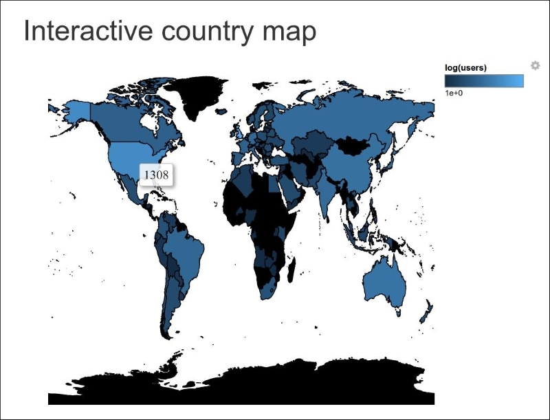
As you can see, the number of users is shown for the USA. This has been achieved simply by clicking on this country. Don't worry if you can't follow all of this code; this section is just designed to show you how quick and easy it is to produce effective and interactive visualizations.