
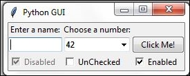
In this recipe, we will add three Checkbutton widgets, each with a different initial state.
We are creating three Checkbutton widgets that differ in their states. The first is disabled and has a checkmark in it. The user cannot remove this checkmark as the widget is disabled.
The second Checkbutton is enabled and, by default, has no checkmark in it, but the user can click it to add a checkmark.
The third Checkbutton is both enabled and checked by default. The users can uncheck and recheck the widget as often as they like.
# Creating three checkbuttons    # 1
chVarDis = tk.IntVar()           # 2
check1 = tk.Checkbutton(win, text="Disabled", variable=chVarDis, state='disabled')                     # 3
check1.select()                  # 4
check1.grid(column=0, row=4, sticky=tk.W) # 5

chVarUn = tk.IntVar()            # 6
check2 = tk.Checkbutton(win, text="UnChecked", variable=chVarUn)
check2.deselect()                # 8
check2.grid(column=1, row=4, sticky=tk.W) # 9

chVarEn = tk.IntVar()            # 10
check3 = tk.Checkbutton(win, text="Enabled", variable=chVarEn)
check3.select()                  # 12
check3.grid(column=2, row=4, sticky=tk.W) # 13
Running the new code results in the following GUI:
In lines 2, 6, and 10, we create three variables of type IntVar. In the following line, for each of these variables we create a Checkbutton, passing in these variables. They will hold the state of the Checkbutton (unchecked or checked). By default, that is either 0 (unchecked) or 1 (checked) so the type of the variable is a tkinter integer.
We place these Checkbutton widgets in our main window so the first argument passed into the constructor is the parent of the widget; in our case win. We give each Checkbutton a different label via its text property.
Setting the sticky property of the grid to tk.W means that the widget will be aligned to the west of the grid. This is very similar to Java syntax and it means that it will be aligned to the left. When we resize our GUI, the widget will remain on the left side and not be moved towards the center of the GUI.
Lines 4 and 12 place a checkmark into the Checkbutton widget by calling the select() method on these two Checkbutton class instances.
We continue to arrange our widgets using the grid layout manager, which will be explained in more detail in Chapter 2, Layout Management.