

Since beginning this chapter, you have already asked a lot of questions, and have hopefully received all your answers so that you can begin working on your map or maps. You have considered who the audience of the map is, what you need to show, that data already exists, and if you will need to recreate this map later.
You will finish off the rest of this chapter going through a scenario where you need to create a map for a report that your marketing manager is putting together. The marketing manager needs a simple map showing the population density of all the states of the contiguous United States (lower 48) and Alaska, using a single color ramp to fit on a US letter-size paper in landscape. The marketing manager said that it just needs to be a basic map, as the focus will be on the report and not the map. This is a quick and easy task in ArcGIS Pro.
First, let's open ArcGIS Pro and sign in:
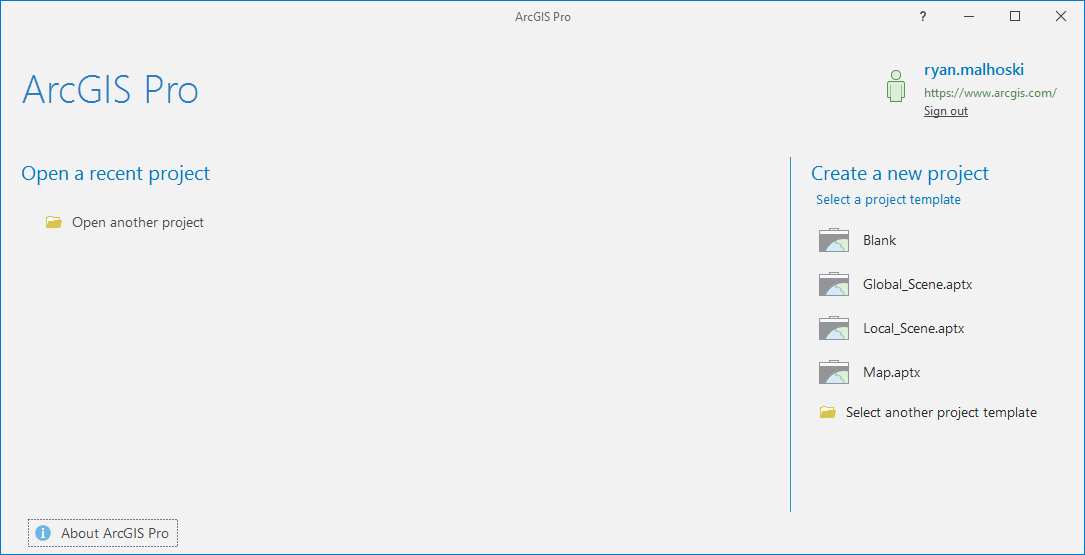
Figure 1.2: ArcGIS Pro initial screen
After signing in, we need to follow the following steps:
- Once signed in, you are asked to create a new project. You'll want to choose the
Map.aptxtemplate. - Let's make sure to give a descriptive name for this map. You want to be able to tell what it is for just by looking at the filename. Let's call this
PopulationDensityForMarketingReportand store it in a folder for our ArcGIS projects.
- Leave the checkbox checked to create a new folder for this
Mapproject.
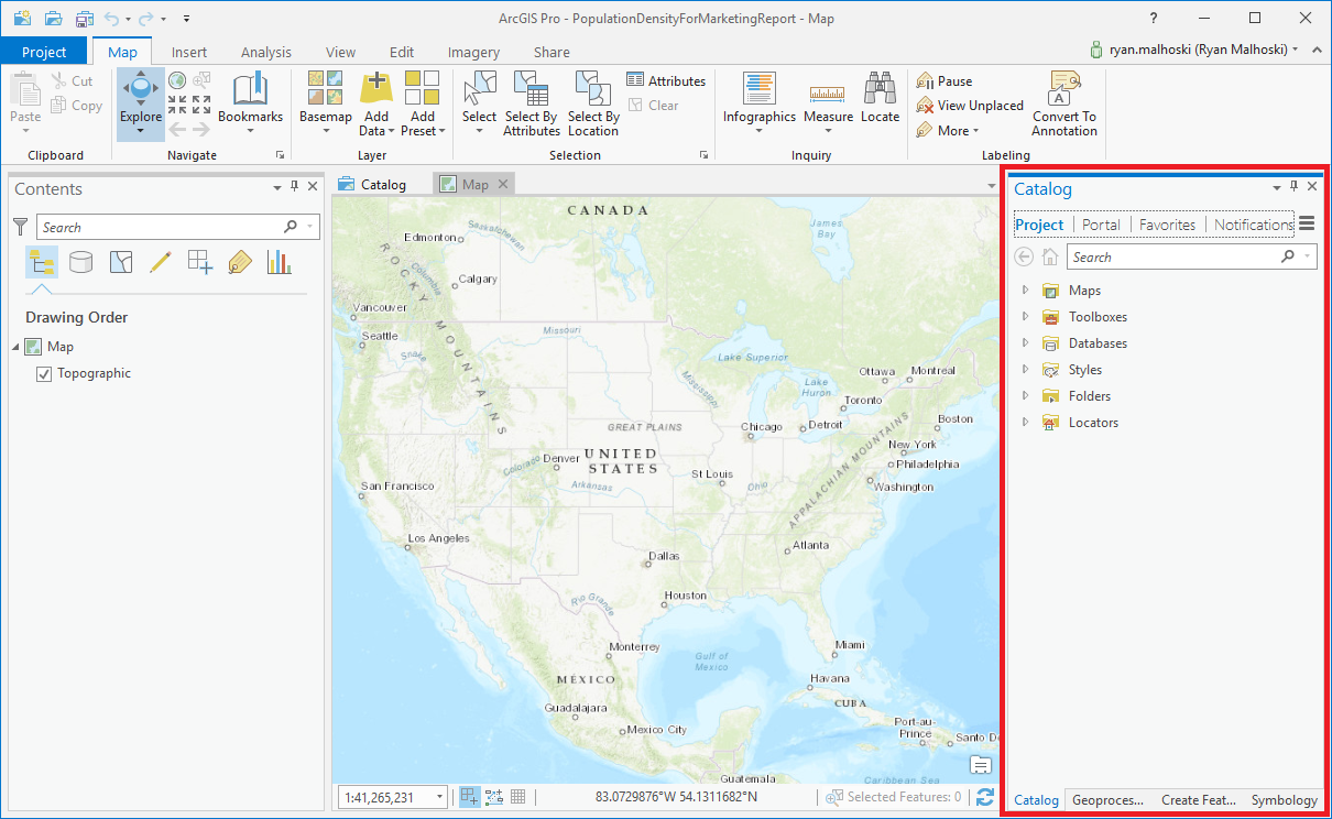
Figure 1.3: Initial map in the Map.aprx template with the Catalog pane highlighted in red
You now have a simple map showing the United States. Now you need to find your state data, with population density. Luckily, ArcGIS Online's Living Atlas that you learned about earlier has the data you need:
- To find it, go to the
Catalogpane on the right and clickPortal. - Click on the icon with the green book on top of a cloud (shown in Figure 1.1).
- Once the
Living Atlasdata is populated, you will see an item calledUSA States (Generalized); right-click it and selectAdd to Current Map.
- This will bring the data into the map's table of contents. You will need to expand the
USA States (Generalized)layer and right-click theUSA_States_Generalizeditem and selectAttribute Tableto open up the attribute table. You will see the table pop up from the bottom, and you can inspect the fields available:
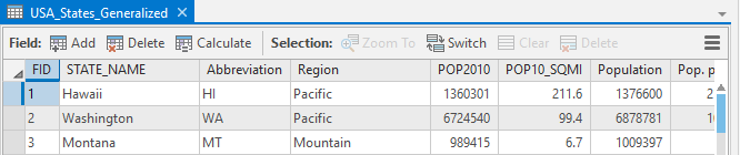
Figure 1.4: Attribute table
After looking at the fields, we can see a field called POP10_SQMI, which gives you the population per square mile from 2010. This was the data your market manager was looking for. Now you just need to symbolize the states using a single color ramp:
- To do this, you right-click
USA_States_Generalized,and then clickSymbology. - The pane on the right side of
ArcGIS Prowill show you the symbology properties of theUSA_States_Generalizedlayer, as seen in the following screenshot:
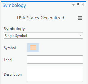
Figure 1.5: Symbology properties
- Click in the drop-down where it says
Single Symboland change it toGraduated Colors. You will see the map change and see that you now have new settings in theSymbology Propertiespane. - Since you want to show the population density, you should change the drop-down next to
FieldtoPOP10_SQMI. Choose a single color ramp of your choice, and you are almost ready to send out this map.
You have put data into a map, but right now, the map isn't put into a layout. A layout is where you would insert your map and other items, like a legend, scale bar, north arrow, and title:
- To create a layout, click
Insertfrom the top of theArcGIS Proribbon, clickNew Layout, then chooseLetterunderANSI Landscape. A new window will appear with the titleLayout. Right now it is blank, because we have yet to insert your map into it. - To insert your map, you will click the icon above
Map Frame. You now see the map with your data, and luckily, it shows the data to an extent where you can see the contiguous United States and Alaska. Now you just need to insert a north arrow, scale bar, and title. - To insert a north arrow, click the
North Arrowicon; this will place a basic north arrow into your layout. Let's move it to the bottom-left corner of the map; to do this, click and hold on the north arrow, then drag it to the lower-left corner. - You will need to add a scale bar by clicking the
Scale Baricon, next to where theNorth Arrowicon was. This will add a scale bar to the middle of the map; you will move it to the bottom-left corner of the map, just like you did with the north arrow. - You will need to add a legend so the reader knows what the colors mean. To insert a legend, click the
Legendicon. Unlike the north arrow and scale bar, you will click and drag within the layout to insert your legend. You will place the legend in the top-right corner of the map, where you have a bit of room. Click the top-right corner of the map and drag down to the left to create the legend. You can resize it if it's too small or too large. - You need to change the layer label and field label to look a little nicer in the legend and be more descriptive. To do this, expand the
Map Frameitem in the contents pane. Perform a slow double-click onUSA_States_Generalizedand change it toStates. Then perform a slow double-click onPOP10_SQMIand change it toPopulation per square mile.
- Finally, you need a title. To create one, click the
Texticon in theInsertribbon, which is a white square with the symbolAa. In the drop-down menu, selectTitle Large(Sans Serif). Then clickTextnext to the white square and click right above the map in the white space and start typing2010 Population Density by State, then click the white space of the map. Click and drag the text so that it is centered over the map. - Now you need to export the map to PDF. To do this, click
Sharein the ribbon, then clickLayout, which has a green arrow icon. Navigate to your project directory and name the filePopulationDensityMapLandscapeAnsiLetter.pdf.
By following these steps, you have created the map that the marketing manager was looking for. While this map may not win any cartographic contests, it clearly shows the data requested, and we have a descriptive title. Not every map needs to be a perfect cartographic product. The best map is one that clearly shows the author's message:
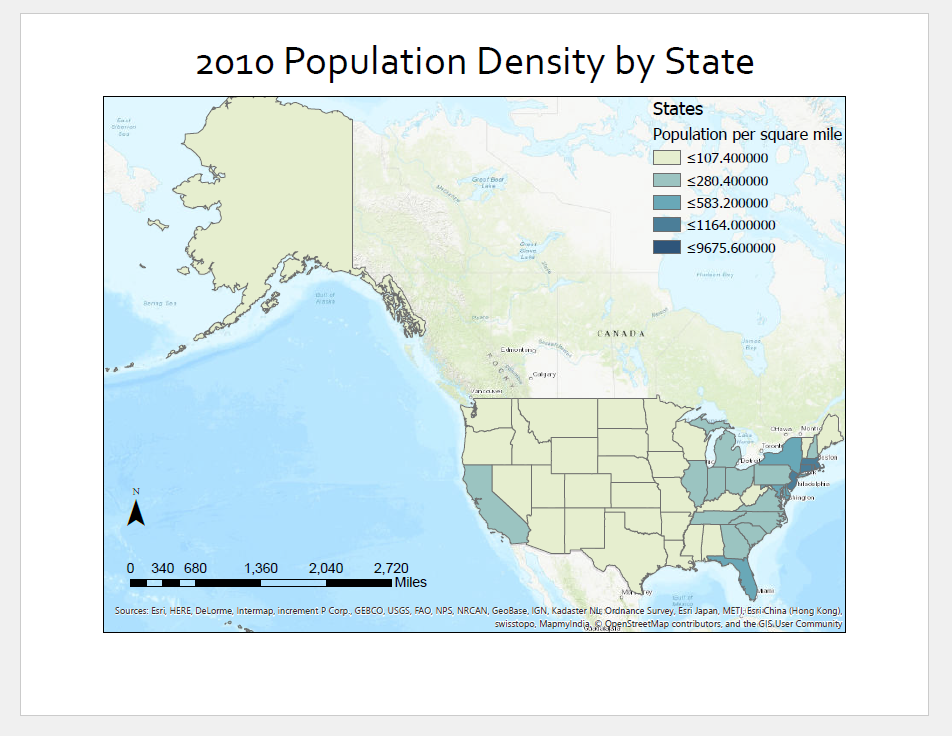
Figure 1.6: Our final map