

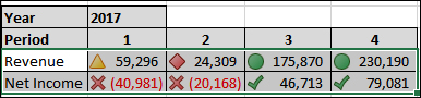
For our dashboard we're going to add a bar chart showing revenue over time to enhance our revenue table. Then we'll layer over a line to show net income as a complement to revenue. With this technique, we can show income, even when it's technically a loss, against revenue.
Let's start building our bar chart. To build a revenue chart:
Open the GP 2013
Dashboard.xlsxfile that we've been working with.Select the Dashboard worksheet.
Highlight cells D7 through H8. This should be the revenue and net income information from the table.
Select Recommended Charts from the ribbon.
Select the first option, Clustered Column, and click OK.

Drag the chart to anchor the upper-left corner in cell D10.
