Book Image

Building Dashboards with Microsoft Dynamics GP 2013 and Excel 2013

By : Mark Polino
Book Image

Building Dashboards with Microsoft Dynamics GP 2013 and Excel 2013

By: Mark Polino

Overview of this book

Accounting systems like Microsoft Dynamics GP 2013 hold a wealth of information. Excel 2013 provides a great tool for linking to, extracting, analysing, and presenting that rich data to help companies make better, faster, and smarter decisions.Building Dashboards with Microsoft Dynamics GP 2013 and Excel 2013 covers how to get the rich, detailed information contained in Microsoft Dynamics GP 2013 and present it in an attractive, easy-to-understand way using Excel 2013. The book shows in detail how to build great-looking dashboards that enhance a company's decision-making process.This book shows you how to get at the rich, detailed information contained in Microsoft Dynamics GP 2013 and present it in an attractive, easy-to-understand way using Excel 2013. This guide will take you from the basics of setup and deployment to creating secure, refreshable Excel reports. Using a whole host of tools available within Excel, this tutorial will show you how to visualize your data using simple conditional formatting techniques, easy-to-read charts, and allow you to make your data interactive with Slicers. Building Dashboards with Microsoft Dynamics GP 2013 and Excel 2013 provides a way for you to easily build that interactive dashboard that your CFO keeps asking for.
Table of Contents (17 chapters)
Building Dashboards with Microsoft Dynamics GP 2013 and Excel 2013
Credits
About the Author
About the Reviewers
www.PacktPub.com
Preface
Index

Quick Analysis


There is another tool that is new inside of Microsoft Excel 2013. It's known as Quick Analysis. Quick Analysis is a great tool for giving users different looks at data without having to commit to something like creating a chart.

Let's use the data we created for negative data bars to look at Quick Analysis. To do that, follow these steps:

  1. Select cell C5.

  2. Right-click and select Quick Analysis.

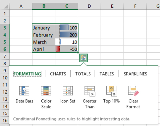
  3. A set of options pop up. Pick Charts and hover over Clustered Column to preview a column chart. Clicking Clustered Column will actually create a chart.

  4. Select Totals and hover over Sum, then Average, then the other options to see the different values.

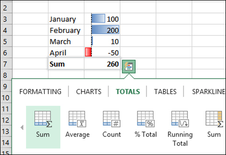
Clicking on any of the options activates that option in the sheet.