

Tableau connects to data stored in a wide variety of files and databases. This includes flat files such as Excel and text files, relational databases such as SQL Server and Oracle, cloud-based data sources such as Google Analytics and Amazon Redshift, and OLAP data sources such as Microsoft SQL Server Analysis Services. With very few exceptions, the process of building visualizations and performing analysis will be the same no matter what data source you use. We'll cover the details of connecting to different data sources in later chapters.
For now, we will connect to an Access data source included in the resources supplied with this book. This chapter's workbook includes a connection to the data source, but we will walk through the steps of connecting using a new workbook first:
Open Tableau. The home screen should appear. If you are not on the home screen, then from the menu, navigate to Data | New Data Source.
Under Connect in the To a file section, click on Microsoft Access.
Click on Browse… and navigate to the
Learning Tableau\Datadirectory and openCoffee Chain.mdb.The database does not contain any security, so you do not need to adjust either the Database Password or Workgroup Security options. Click on OK to connect.
Tableau's data connection screen allows you to visually create connections to data sources. We'll look at the details of this screen in the next chapter. For now, drag the CoffeeChain Query table, located on the left-hand side under Table, into the center of the screen. This query contains all the fields we'll need in order to build our initial visualizations and the dashboard. The query functions look like a single table in the Tableau connection.

Once you have configured a data connection, you can create visualizations and dashboards by clicking on a tab at the bottom. Click on the Sheet 1 tab in the lower-left corner.
If the Show Me panel is displayed in the upper-right corner, collapse it by clicking at the top of the panel where the Show Me text appears.
You should now be in the main work area of Tableau, which looks like this:
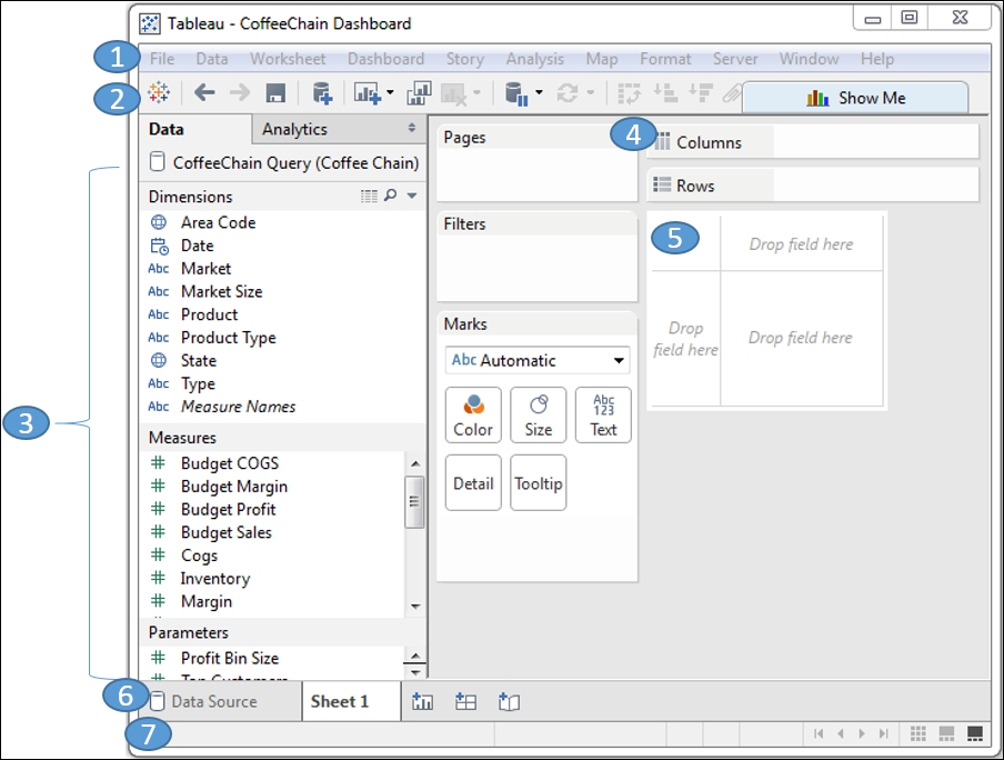
Locate the numbered features of the main workspace. We'll refer to these features throughout the book, so familiarize yourself with the terminology:
1: The menu allows you to perform a wide variety of functions.
2: The toolbar makes common functions, such as undo, redo, save, connect to data, and so on, easily available.
3: The sidebar appears on the left-hand side and contains different features and controls based on your current task (for example, data visualization, applying analytics, formatting, or designing dashboards). The default sidebar in the main workspace consists of two tabs allowing you easy access to data and analytics. The Data window consists of data source connection(s), and the fields contained in the data sources are divided into Dimensions and Measures.
4: You can drag and drop data fields from the Data window onto various shelves, such as Pages, Filters, Columns, Rows, Color, Size, and Text.
5: The canvas (sometimes called the view or visualization) is where Tableau will draw visualizations based on where you drag and drop fields. You may also drag and drop fields directly onto the canvas.
6: The tabs give you easy access to the data connection screen and also to each sheet, dashboard, and story you create in the current workbook. At the bottom is a single tab named Sheet 1. As you build your workbook, you will most likely add new sheets (often also called views), which are individual visualizations. You may also add dashboards (these combine and relate multiple sheets and other components together on a single screen) and even stories (these combine multiple dashboards and views into a unified data story). A set of buttons next to the existing tabs allows the quick creation of new sheets, dashboards, or stories.
7: The status bar will give you information about the current view and includes some options on the right-hand side to navigate sheets in the workbook.
Having created your connection to the data, you are ready to begin to visualize and analyze the data. Over the course of the following examples, you'll take on the role of an analyst for the coffee chain. We'll build multiple visualizations that answer various questions and finally put everything together in an interactive dashboard. As we begin, let's consider a few of the foundational principles.