Book Image

Learning Probabilistic Graphical Models in R

Book Image

Learning Probabilistic Graphical Models in R

Overview of this book

Probabilistic graphical models (PGM, also known as graphical models) are a marriage between probability theory and graph theory. Generally, PGMs use a graph-based representation. Two branches of graphical representations of distributions are commonly used, namely Bayesian networks and Markov networks. R has many packages to implement graphical models. We’ll start by showing you how to transform a classical statistical model into a modern PGM and then look at how to do exact inference in graphical models. Proceeding, we’ll introduce you to many modern R packages that will help you to perform inference on the models. We will then run a Bayesian linear regression and you’ll see the advantage of going probabilistic when you want to do prediction. Next, you’ll master using R packages and implementing its techniques. Finally, you’ll be presented with machine learning applications that have a direct impact in many fields. Here, we’ll cover clustering and the discovery of hidden information in big data, as well as two important methods, PCA and ICA, to reduce the size of big problems.
Table of Contents (15 chapters)

Mixture of experts


The idea behind mixture of experts is to use a set of linear regressions for each sub space of the original data space and combine them with weighting functions that will successively give weight to each linear regression.

Consider the following example dataset, which we generate with the following toy code:

x1=runif(40,0,10)
x2=runif(40,10,20)

e1 = rnorm(20,0,2)
e2 = rnorm(20,0,3)
 
y1 = 1+2.5*x1 + e1
y2 = 35+-1.5*x2 + e2
 
xx=c(x1,x2)
yy=c(y1,y2)

Plotting the result, and doing a simple linear regression on it, gives the following:

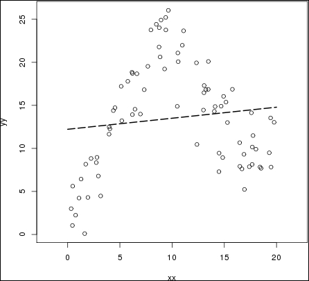
Obviously, the linear regression does not capture the behavior of the data at all. It barely captures a general trend in the data that more or less averages the data set.

The idea of mixture of experts is to have several sub models within a bigger model—for example, having several regression lines, as the following graph:

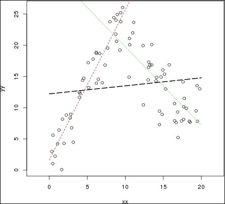
In this graph, the red and green lines seems to better represent the data set. However, the model needs to choose when to choose...