Book Image

Redash v5 Quick Start Guide

By : Alexander Leibzon, Yael Leibzon
Book Image

Redash v5 Quick Start Guide

By: Alexander Leibzon, Yael Leibzon

Overview of this book

Data exploration and visualization is vital to Business Intelligence, the backbone of almost every enterprise or organization. Redash is a querying and visualization tool developed to simplify how marketing and business development departments are exposed to data. If you want to learn to create interactive dashboards with Redash, explore different visualizations, and share the insights with your peers, then this is the ideal book for you. The book starts with essential Business Intelligence concepts that are at the heart of data visualizations. You will learn how to find your way round Redash and its rich array of data visualization options for building interactive dashboards. You will learn how to create data storytelling and share these with peers. You will see how to connect to different data sources to process complex data, and then visualize this data to reveal valuable insights. By the end of this book, you will be confident with the Redash dashboarding tool to provide insight and communicate data storytelling.
Table of Contents (10 chapters)

Data challenges experienced by companies on a daily basis

Let's have a look at an abstract example of a social gaming company and it's use of data:

  • CEO/SVPs use generic knowledge of company revenues, pre-defined KPIs (new daily users/daily active users/churn rate)
  • The marketing/business development departments use conversion funnels/campaign traction/pre-defined KPIs/growth rate/revenues (usually also sliced by department/game type/geolocation).
  • The finance department uses various revenue breakdowns (by department/by external clients, and so on)
  • The sales department uses revenues by campaigns breakdown (for better campaign evaluation)
  • The product department uses statistics/growth rate/feature popularity/new daily users (to find out whether a specific feature attracts more users/revenue (with at least the same slicing as marketing)
  • Customer support/QA/developers deal with bug rates/user reviews/usage statistics
  • Data analytics/data scientists require data on usage statistics
  • IT/DBAs/operations/infrastructure need information regarding load statistics/uptime/response SLAs/disk usage/CPU/memory (and other various system stats)
  • External (contractors/clients/partners) require daily/weekly/monthly reports of various business metrics

As you can see, all the different departments rely on data and have their own specific data needs.

We can also note that if we treat each need as a building block, we can reuse them across departments.

But data is not only about numbers. People like to get a real feel, and that's where visualization can come in handy, especially when there is a need to discover trends or spot anomalies. Most of the time, it's much easier to track everything through charts and graphs, even if they represent an abstract trend.

Needless to say, each visualization forms a building block too.

All the preceding points can be joined by a dashboard (or, in most cases, dashboards), where every department has at least one of their own.

Moreover, good visualizations, which are tied together to make an understandable and meaningful user journey through the data (like dashboards), are almost mandatory for data-driven decision making (instead of decision making based on a gut feeling).

This data usage pattern is not unique to social gaming companies. In fact, you can easily define a starter pack of KPIs/metrics that are crucial to track the growth of any company.

An example dashboard

(image source: redash.io)

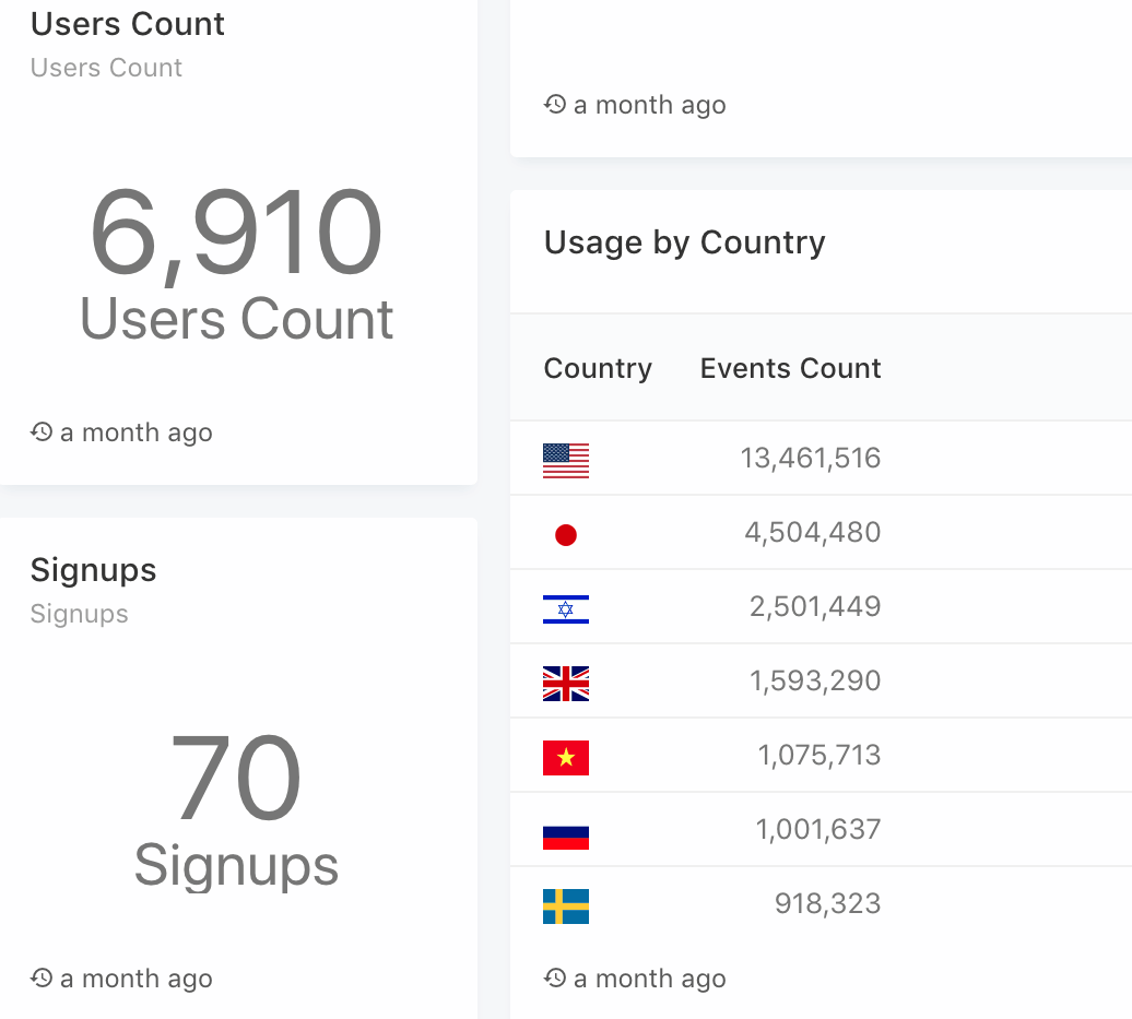
Suppose we want to provide our product department with a Redash usage dashboard (based on real Redash usage data), that consists of several metrics:

The preceding diagram is a Usage chart. Usage can be any form of interaction with Redash. This chart shows us the total amount of interactions with Redash per day over a 30-day period:

In the preceding chart, we can see that the different events have been broken down into types, which allows us to gain a better understanding of the main use cases of Redash:

Along with a further breakout of events by Country (gives us a distribution of events in different countries), using IP2Location transformation. In addition to this, there are the new signups and the total user count metrics.

Every single one of these metrics can tell us something valuable, but when combined with a single dashboard (as you can see in the following diagram), a metric can tell us a whole different kind of story (which we will cover in upcoming chapters):

Redash dashboard, themed queries, and visualizations combined