

Often, you'll need more than a single visualization to communicate the full story of the data. In these cases, Tableau makes it very easy for you to use multiple visualizations together on a dashboard. In Tableau, a dashboard is a collection of views, filters, parameters, images, and other objects that work together to communicate a data story. Dashboards are often interactive and allow end users to explore different facets of the data.
Dashboards serve a wide variety of purposes and can be tailored for a wide variety of audiences. Consider the following possible dashboards:
A summary level view of profit and sales to allow executives to have a quick glimpse into the current status of the company
An interactive dashboard allowing sales managers to drill into sales territories to identify threats or opportunities
A dashboard allowing doctors to track patient readmissions, diagnoses, and procedures in order to make better decisions about patient care
A dashboard allowing the management of a real estate company to identify trends and make decisions for various apartment complexes
An interactive dashboard for loan officers to make lending decisions based on portfolios broken down by credit ratings and geographic location
Considerations for different audiences and advanced techniques will be covered in great detail in Chapter 7, Telling a Data Story with Dashboards. For now, let's consider an example that introduces foundational examples.
Continue with the CoffeeChainAnalysis dashboard you have been building, and click on the new dashboard button to the right of the Profit by Location tab. You now have a blank dashboard, and the sidebar on the left-hand side shows options to build a dashboard instead of the Data window that was visible in a worksheet. The sidebar should look like this:
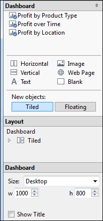
The dashboard window consists of several key components. Techniques to use these objects will be detailed later. For now, focus on gaining some familiarity with the options that are available.
First is a list of all visible worksheets in the dashboard. You can add these to a dashboard by dragging and dropping them. A light gray shading will indicate the location of the sheet once it is dropped. You can also double-click on any sheet, and it will be added automatically.
The next section lists multiple additional objects that can be added to the dashboard. Horizontal and Vertical layout containers will give you finer control over the layout; Text allows you to add text labels and titles. Images and even embedded web content can be added. Finally, a Blank object allows you to preserve blank space in a dashboard or may serve as a placeholder.
Next, you can select whether new objects will be added as Tiled or Floating. Tiled objects will snap into a tiled layout next to other tiled objects or within layout containers. Floating objects will float on top of the dashboard in successive layers.
The Layout section gives you the ability to navigate through a hierarchical structure of objects that have been added to the dashboard. This can be useful for finding objects in complex dashboards.
The final section gives you control over the size of the dashboard as well as pixel-perfect sizing and positioning of floating objects.
Continue following these steps to build the dashboard:
Successively double-click on each sheet listed in the Dashboard section on the left-hand side: Profit by Product Type, Profit Over Time, and Profit by Location. Notice that double-clicking on an object adds it to the layout of the dashboard.
Tip
When a worksheet is first added to a dashboard, any legends, filters, or parameters that were visible in the worksheet view will be added to the dashboard. If you want to add these types of objects, select the sheet in the dashboard and click on the little drop-down caret in the upper-right corner of the sheet and locate the object you want to add. Nearly every object has the drop-down caret providing many options to fine-tune appearance and control its behavior:

Add a title of
Profit Analysisto the dashboard by dragging the Text object from the sidebar to the top of the dashboard, enter the text, and change the size to 24 pt. You may need to resize the text object using the selection outline. Alternately, you can show the default title for the dashboard by checking the Title option at the bottom of the left sidebar.Select the Profit by Product Type sheet in the dashboard and click on the drop-down caret in the upper-right section. Navigate to Fit | Entire View. The Fit options describe how the visualization should fill any available space.
Select the Sales size legend by clicking on it. Click on X in the upper-right section to remove the legend from the dashboard:

Double-click on the title of the Profit by Location sheet in the dashboard to edit the text. Add text to indicate that size indicates sales. Having removed the legend, this is the only way the end user will know what size means.
Select the Profit color legend and use the grab bar at the top of the selection outline to drag and drop the Profit color legend immediately below the map.
Select the Profit by Product Type sheet and click on the drop-down caret in the upper-right section again. Click on Use as Filter.
Edit the title Profit by Product Type and add the
click a bar to see detailstext. It is a good practice to give the end user of a dashboard some indication of what interactivity is possible.Click on the bar for Tea. The rest of the dashboard should update. Both Profit by Location and Profit over Time are now filtered by the Tea product type:

You have created a dashboard that allows interactive analysis. As an analyst for the coffee company, your visualizations allowed you to explore and analyze data. The dashboard you created can be shared with the management as a tool to help them see and understand the data in order to make better decisions. When a manager selects the Tea product type, it immediately becomes obvious that there is one location where sales are quite high but the profit is actually a loss. This may lead to decisions such as a change in marketing or removing tea from the inventory at that location. Most likely, it will require additional analysis to determine the best course of action. In this case, Tableau will empower you to continue the iterative process of discovery, analysis, and storytelling.