
Data visualization is concerned with the presentation of data in a pictorial or graphical form. It is one of the most important tasks in data analysis, since it enables us to see analytical results, detect outliers, and make decisions for model building. There are many Python libraries for visualization, of which matplotlib, seaborn, bokeh, and ggplot are among the most popular. However, in this chapter, we mainly focus on the matplotlib library that is used by many people in many different contexts.
Matplotlib produces publication-quality figures in a variety of formats, and interactive environments across Python platforms. Another advantage is that Pandas comes equipped with useful wrappers around several matplotlib plotting routines, allowing for quick and handy plotting of Series and DataFrame objects.
The IPython package started as an alternative to the standard interactive Python shell, but has since evolved into an indispensable tool for data exploration, visualization, and rapid prototyping. It is possible to use the graphical capabilities offered by matplotlib from IPython through various options, of which the simplest to get started with is the pylab flag:
$ ipython --pylab
This flag will preload matplotlib and numpy for interactive use with the default matplotlib backend. IPython can run in various environments: in a terminal, as a Qt application, or inside a browser. These options are worth exploring, since IPython has enjoyed adoption for many use cases, such as prototyping, interactive slides for more engaging conference talks or lectures, and as a tool for sharing research.
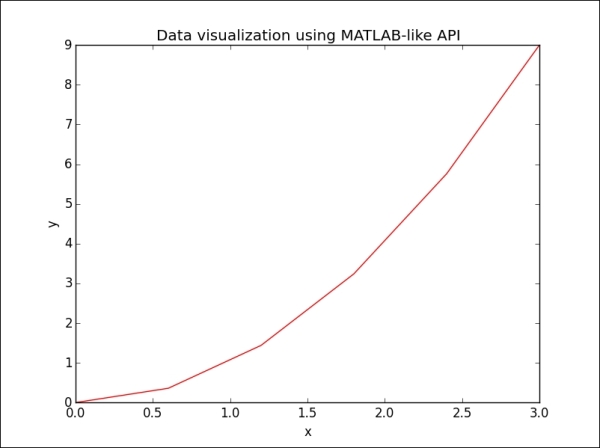
The easiest way to get started with plotting using matplotlib is often by using the MATLAB API that is supported by the package:
>>> import matplotlib.pyplot as plt
>>> from numpy import *
>>> x = linspace(0, 3, 6)
>>> x
array([0., 0.6, 1.2, 1.8, 2.4, 3.])
>>> y = power(x,2)
>>> y
array([0., 0.36, 1.44, 3.24, 5.76, 9.])
>>> figure()
>>> plot(x, y, 'r')
>>> xlabel('x')
>>> ylabel('y')
>>> title('Data visualization in MATLAB-like API')
>>> plt.show()
The output for the preceding command is as follows:
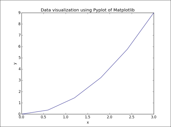
However, star imports should not be used unless there is a good reason for doing so. In the case of matplotlib, we can use the canonical import:
>>> import matplotlib.pyplot as plt
The preceding example could then be written as follows:
>>> plt.plot(x, y)
>>> plt.xlabel('x')
>>> plt.ylabel('y')
>>> plt.title('Data visualization using Pyplot of Matplotlib')
>>> plt.show()
The output for the preceding command is as follows:
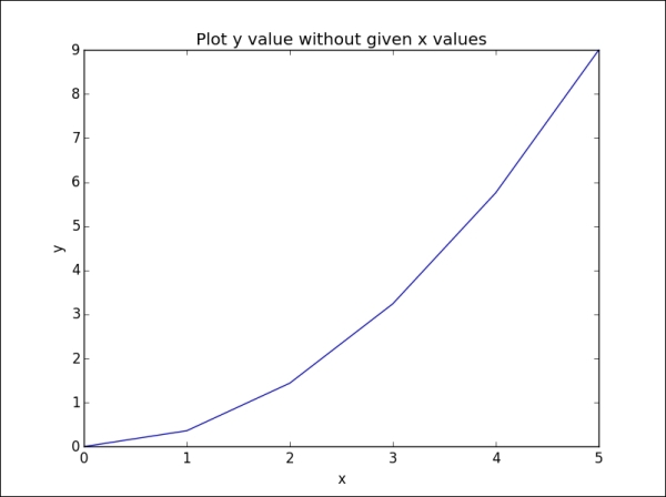
If we only provide a single argument to the plot function, it will automatically use it as the y values and generate the x values from 0 to N-1, where N is equal to the number of values:
>>> plt.plot(y)
>>> plt.xlabel('x')
>>> plt.ylabel('y')
>>> plt.title('Plot y value without given x values')
>>> plt.show()
The output for the preceding command is as follows:
By default, the range of the axes is constrained by the range of the input x and y data. If we want to specify the viewport of the axes, we can use the axis() method to set custom ranges. For example, in the previous visualization, we could increase the range of the x axis from [0, 5] to [0, 6], and that of the y axis from [0, 9] to [0, 10], by writing the following command:
>>> plt.axis([0, 6, 0, 12])
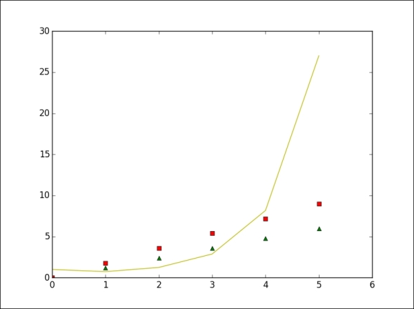
The default line format when we plot data in matplotlib is a solid blue line, which is abbreviated as b-. To change this setting, we only need to add the symbol code, which includes letters as color string and symbols as line style string, to the plot function. Let us consider a plot of several lines with different format styles:
>>> plt.plot(x*2, 'g^', x*3, 'rs', x**x, 'y-')
>>> plt.axis([0, 6, 0, 30])
>>> plt.show()
The output for the preceding command is as follows:
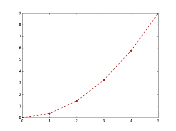
There are many line styles and attributes, such as color, line width, and dash style, that we can choose from to control the appearance of our plots. The following example illustrates several ways to set line properties:
>>> line = plt.plot(y, color='red', linewidth=2.0)
>>> line.set_linestyle('--')
>>> plt.setp(line, marker='o')
>>> plt.show()
The output for the preceding command is as follows:
The following table lists some common properties of the line2d plotting:
|
Property |
Value type |
Description |
|---|---|---|
|
|
Any matplotlib color |
This sets the color of the line in the figure |
|
|
On/off |
This sets the sequence of ink in the points |
|
|
|
This sets the data used for visualization |
|
|
[ |
This sets the line style in the figure |
|
|
Float value in points |
This sets the width of line in the figure |
|
|
Any symbol |
This sets the style at data points in the figure |
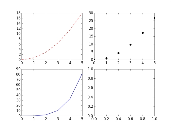
By default, all plotting commands apply to the current figure and axes. In some situations, we want to visualize data in multiple figures and axes to compare different plots or to use the space on a page more efficiently. There are two steps required before we can plot the data. Firstly, we have to define which figure we want to plot. Secondly, we need to figure out the position of our subplot in the figure:
>>> plt.figure('a')    # define a figure, named 'a'
>>> plt.subplot(221)    # the first position of 4 subplots in 2x2 figure
>>> plt.plot(y+y, 'r--')
>>> plt.subplot(222)    # the second position of 4 subplots
>>> plt.plot(y*3, 'ko')
>>> plt.subplot(223)    # the third position of 4 subplots
>>> plt.plot(y*y, 'b^')
>>> plt.subplot(224)
>>> plt.show()
The output for the preceding command is as follows:
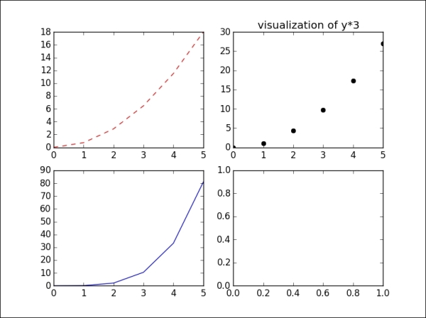
In this case, we currently have the figure a. If we want to modify any subplot in figure a, we first call the command to select the figure and subplot, and then execute the function to modify the subplot. Here, for example, we change the title of the second plot of our four-plot figure:
>>> plt.figure('a')
>>> plt.subplot(222)
>>> plt.title('visualization of y*3')
>>> plt.show()
The output for the preceding command is as follows:
There is a convenience method, plt.subplots(), to creating a figure that contains a given number of subplots. As inthe previous example, we can use the plt.subplots(2,2) command to create a 2x2 figure that consists of four subplots.
We can also create the axes manually, instead of rectangular grid, by using the plt.axes([left, bottom, width, height]) command, where all input parameters are in the fractional [0, 1] coordinates:
>>> plt.figure('b')    # create another figure, named 'b'
>>> ax1 = plt.axes([0.05, 0.1, 0.4, 0.32])
>>> ax2 = plt.axes([0.52, 0.1, 0.4, 0.32])
>>> ax3 = plt.axes([0.05, 0.53, 0.87, 0.44])
>>> plt.show()
The output for the preceding command is as follows:
However, when you manually create axes, it takes more time to balance coordinates and sizes between subplots to arrive at a well-proportioned figure.
We have looked at how to create simple line plots so far. The matplotlib library supports many more plot types that are useful for data visualization. However, our goal is to provide the basic knowledge that will help you to understand and use the library for visualizing data in the most common situations. Therefore, we will only focus on four kinds of plot types: scatter plots, bar plots, contour plots, and histograms.
A scatter plot is used to visualize the relationship between variables measured in the same dataset. It is easy to plot a simple scatter plot, using the plt.scatter() function, that requires numeric columns for both the x and y axis:
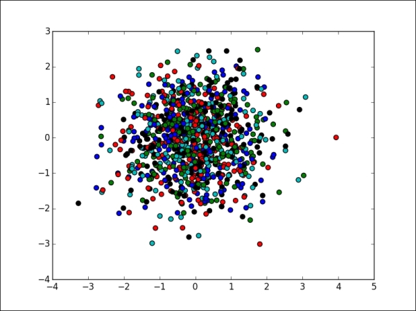
Let's take a look at the command for the preceding output:
>>> X = np.random.normal(0, 1, 1000)
>>> Y = np.random.normal(0, 1, 1000)
>>> plt.scatter(X, Y, c = ['b', 'g', 'k', 'r', 'c'])
>>> plt.show()
A bar plot is used to present grouped data with rectangular bars, which can be either vertical or horizontal, with the lengths of the bars corresponding to their values. We use the plt.bar() command to visualize a vertical bar, and the plt.barh() command for the other:
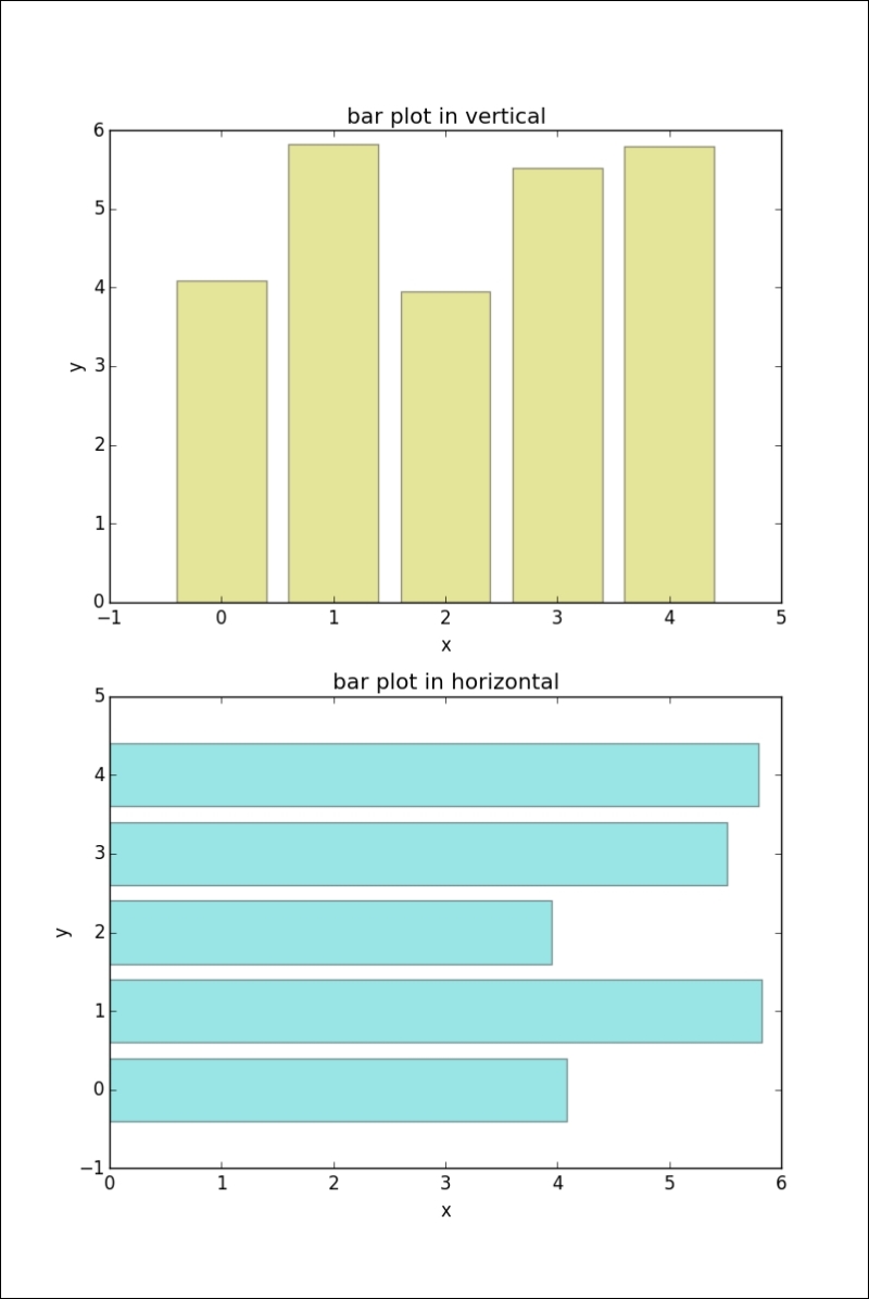
The command for the preceding output is as follows:
>>> X = np.arange(5)
>>> Y = 3.14 + 2.71 * np.random.rand(5)
>>> plt.subplots(2)
>>> # the first subplot
>>> plt.subplot(211)
>>> plt.bar(X, Y, align='center', alpha=0.4, color='y')
>>> plt.xlabel('x')
>>> plt.ylabel('y')
>>> plt.title('bar plot in vertical')
>>> # the second subplot
>>> plt.subplot(212)
>>> plt.barh(X, Y, align='center', alpha=0.4, color='c')
>>> plt.xlabel('x')
>>> plt.ylabel('y')
>>> plt.title('bar plot in horizontal')
>>> plt.show()
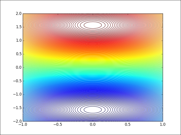
We use contour plots to present the relationship between three numeric variables in two dimensions. Two variables are drawn along the x and y axes, and the third variable, z, is used for contour levels that are plotted as curves in different colors:
>>> x = np.linspace(-1, 1, 255)
>>> y = np.linspace(-2, 2, 300)
>>> z = np.sin(y[:, np.newaxis]) * np.cos(x)
>>> plt.contour(x, y, z, 255, linewidth=2)
>>> plt.show()
Let's take a look at the contour plot in the following image:
A histogram represents the distribution of numerical data graphically. Usually, the range of values is partitioned into bins of equal size, with the height of each bin corresponding to the frequency of values within that bin:
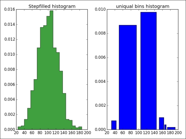
The command for the preceding output is as follows:
>>> mu, sigma = 100, 25
>>> fig, (ax0, ax1) = plt.subplots(ncols=2)
>>> x = mu + sigma * np.random.randn(1000)
>>> ax0.hist(x,20, normed=1, histtype='stepfilled',
               facecolor='g', alpha=0.75)
>>> ax0.set_title('Stepfilled histogram')
>>> ax1.hist(x, bins=[100,150, 165, 170, 195] normed=1,
             histtype='bar', rwidth=0.8)
>>> ax1.set_title('uniquel bins histogram')
>>> # automatically adjust subplot parameters to give specified padding
>>> plt.tight_layout()
>>> plt.show()
Scatter plots
A scatter plot is used to visualize the relationship between variables measured in the same dataset. It is easy to plot a simple scatter plot, using the plt.scatter() function, that requires numeric columns for both the x and y axis:
Let's take a look at the command for the preceding output:
>>> X = np.random.normal(0, 1, 1000)
>>> Y = np.random.normal(0, 1, 1000)
>>> plt.scatter(X, Y, c = ['b', 'g', 'k', 'r', 'c'])
>>> plt.show()
A bar plot is used to present grouped data with rectangular bars, which can be either vertical or horizontal, with the lengths of the bars corresponding to their values. We use the plt.bar() command to visualize a vertical bar, and the plt.barh() command for the other:
The command for the preceding output is as follows:
>>> X = np.arange(5)
>>> Y = 3.14 + 2.71 * np.random.rand(5)
>>> plt.subplots(2)
>>> # the first subplot
>>> plt.subplot(211)
>>> plt.bar(X, Y, align='center', alpha=0.4, color='y')
>>> plt.xlabel('x')
>>> plt.ylabel('y')
>>> plt.title('bar plot in vertical')
>>> # the second subplot
>>> plt.subplot(212)
>>> plt.barh(X, Y, align='center', alpha=0.4, color='c')
>>> plt.xlabel('x')
>>> plt.ylabel('y')
>>> plt.title('bar plot in horizontal')
>>> plt.show()
We use contour plots to present the relationship between three numeric variables in two dimensions. Two variables are drawn along the x and y axes, and the third variable, z, is used for contour levels that are plotted as curves in different colors:
>>> x = np.linspace(-1, 1, 255)
>>> y = np.linspace(-2, 2, 300)
>>> z = np.sin(y[:, np.newaxis]) * np.cos(x)
>>> plt.contour(x, y, z, 255, linewidth=2)
>>> plt.show()
Let's take a look at the contour plot in the following image:
A histogram represents the distribution of numerical data graphically. Usually, the range of values is partitioned into bins of equal size, with the height of each bin corresponding to the frequency of values within that bin:
The command for the preceding output is as follows:
>>> mu, sigma = 100, 25
>>> fig, (ax0, ax1) = plt.subplots(ncols=2)
>>> x = mu + sigma * np.random.randn(1000)
>>> ax0.hist(x,20, normed=1, histtype='stepfilled',
               facecolor='g', alpha=0.75)
>>> ax0.set_title('Stepfilled histogram')
>>> ax1.hist(x, bins=[100,150, 165, 170, 195] normed=1,
             histtype='bar', rwidth=0.8)
>>> ax1.set_title('uniquel bins histogram')
>>> # automatically adjust subplot parameters to give specified padding
>>> plt.tight_layout()
>>> plt.show()
Bar plots
A bar plot is used to present grouped data with rectangular bars, which can be either vertical or horizontal, with the lengths of the bars corresponding to their values. We use the plt.bar() command to visualize a vertical bar, and the plt.barh() command for the other:
The command for the preceding output is as follows:
>>> X = np.arange(5)
>>> Y = 3.14 + 2.71 * np.random.rand(5)
>>> plt.subplots(2)
>>> # the first subplot
>>> plt.subplot(211)
>>> plt.bar(X, Y, align='center', alpha=0.4, color='y')
>>> plt.xlabel('x')
>>> plt.ylabel('y')
>>> plt.title('bar plot in vertical')
>>> # the second subplot
>>> plt.subplot(212)
>>> plt.barh(X, Y, align='center', alpha=0.4, color='c')
>>> plt.xlabel('x')
>>> plt.ylabel('y')
>>> plt.title('bar plot in horizontal')
>>> plt.show()
We use contour plots to present the relationship between three numeric variables in two dimensions. Two variables are drawn along the x and y axes, and the third variable, z, is used for contour levels that are plotted as curves in different colors:
>>> x = np.linspace(-1, 1, 255)
>>> y = np.linspace(-2, 2, 300)
>>> z = np.sin(y[:, np.newaxis]) * np.cos(x)
>>> plt.contour(x, y, z, 255, linewidth=2)
>>> plt.show()
Let's take a look at the contour plot in the following image:
A histogram represents the distribution of numerical data graphically. Usually, the range of values is partitioned into bins of equal size, with the height of each bin corresponding to the frequency of values within that bin:
The command for the preceding output is as follows:
>>> mu, sigma = 100, 25
>>> fig, (ax0, ax1) = plt.subplots(ncols=2)
>>> x = mu + sigma * np.random.randn(1000)
>>> ax0.hist(x,20, normed=1, histtype='stepfilled',
               facecolor='g', alpha=0.75)
>>> ax0.set_title('Stepfilled histogram')
>>> ax1.hist(x, bins=[100,150, 165, 170, 195] normed=1,
             histtype='bar', rwidth=0.8)
>>> ax1.set_title('uniquel bins histogram')
>>> # automatically adjust subplot parameters to give specified padding
>>> plt.tight_layout()
>>> plt.show()
Contour plots
We use contour plots to present the relationship between three numeric variables in two dimensions. Two variables are drawn along the x and y axes, and the third variable, z, is used for contour levels that are plotted as curves in different colors:
>>> x = np.linspace(-1, 1, 255)
>>> y = np.linspace(-2, 2, 300)
>>> z = np.sin(y[:, np.newaxis]) * np.cos(x)
>>> plt.contour(x, y, z, 255, linewidth=2)
>>> plt.show()
Let's take a look at the contour plot in the following image:
A histogram represents the distribution of numerical data graphically. Usually, the range of values is partitioned into bins of equal size, with the height of each bin corresponding to the frequency of values within that bin:
The command for the preceding output is as follows:
>>> mu, sigma = 100, 25
>>> fig, (ax0, ax1) = plt.subplots(ncols=2)
>>> x = mu + sigma * np.random.randn(1000)
>>> ax0.hist(x,20, normed=1, histtype='stepfilled',
               facecolor='g', alpha=0.75)
>>> ax0.set_title('Stepfilled histogram')
>>> ax1.hist(x, bins=[100,150, 165, 170, 195] normed=1,
             histtype='bar', rwidth=0.8)
>>> ax1.set_title('uniquel bins histogram')
>>> # automatically adjust subplot parameters to give specified padding
>>> plt.tight_layout()
>>> plt.show()
Histogram plots
A histogram represents the distribution of numerical data graphically. Usually, the range of values is partitioned into bins of equal size, with the height of each bin corresponding to the frequency of values within that bin:
The command for the preceding output is as follows:
>>> mu, sigma = 100, 25
>>> fig, (ax0, ax1) = plt.subplots(ncols=2)
>>> x = mu + sigma * np.random.randn(1000)
>>> ax0.hist(x,20, normed=1, histtype='stepfilled',
               facecolor='g', alpha=0.75)
>>> ax0.set_title('Stepfilled histogram')
>>> ax1.hist(x, bins=[100,150, 165, 170, 195] normed=1,
             histtype='bar', rwidth=0.8)
>>> ax1.set_title('uniquel bins histogram')
>>> # automatically adjust subplot parameters to give specified padding
>>> plt.tight_layout()
>>> plt.show()
Legends are an important element that is used to identify the plot elements in a figure. The easiest way to show a legend inside a figure is to use the label argument of the plot function, and show the labels by calling the plt.legend() method:
>>> x = np.linspace(0, 1, 20)
>>> y1 = np.sin(x)
>>> y2 = np.cos(x)
>>> y3 = np.tan(x)
>>> plt.plot(x, y1, 'c', label='y=sin(x)')
>>> plt.plot(x, y2, 'y', label='y=cos(x)')
>>> plt.plot(x, y3, 'r', label='y=tan(x)')
>>> plt.lengend(loc='upper left')
>>> plt.show()
The output for the preceding command as follows:
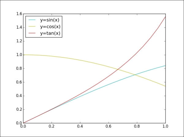
The loc argument in the legend command is used to figure out the position of the label box. There are several valid location options: lower left, right, upper left, lower center, upper right, center, lower right, upper right, center right, best, upper center, and center left. The default position setting is upper right. However, when we set an invalid location option that does not exist in the above list, the function automatically falls back to the best option.
If we want to split the legend into multiple boxes in a figure, we can manually set our expected labels for plot lines, as shown in the following image:
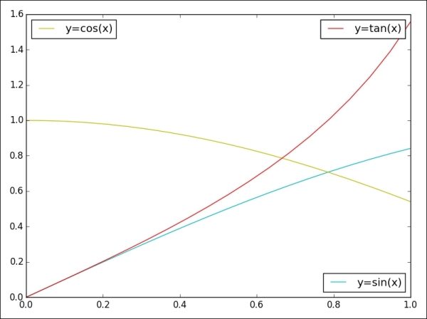
The output for the preceding command is as follows:
>>> p1 = plt.plot(x, y1, 'c', label='y=sin(x)')
>>> p2 = plt.plot(x, y2, 'y', label='y=cos(x)')
>>> p3 = plt.plot(x, y3, 'r', label='y=tan(x)')
>>> lsin = plt.legend(handles=p1, loc='lower right')
>>> lcos = plt.legend(handles=p2, loc='upper left')
>>> ltan = plt.legend(handles=p3, loc='upper right')
>>> # with above code, only 'y=tan(x)' legend appears in the figure
>>> # fix: add lsin, lcos as separate artists to the axes
>>> plt.gca().add_artist(lsin)
>>> plt.gca().add_artist(lcos)
>>> # automatically adjust subplot parameters to specified padding
>>> plt.tight_layout()
>>> plt.show()
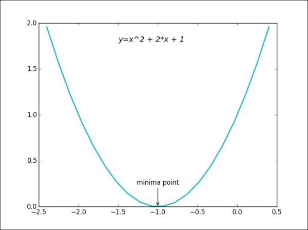
The other element in a figure that we want to introduce is the annotations which can consist of text, arrows, or other shapes to explain parts of the figure in detail, or to emphasize some special data points. There are different methods for showing annotations, such as text, arrow, and
annotation.
- The
textmethod draws text at the given coordinates(x, y)on the plot; optionally with custom properties. There are some common arguments in the function:x,y, label text, and font-related properties that can be passed in viafontdict, such asfamily,fontsize, andstyle. - The
annotatemethod can draw both text and arrows arranged appropriately. Arguments of this function ares(label text),xy(the position of element to annotation),xytext(the position of the labels),xycoords(the string that indicates what type of coordinatexyis), andarrowprops(the dictionary of line properties for the arrow that connects the annotation).
Here is a simple example to illustrate the annotate and text functions:
>>> x = np.linspace(-2.4, 0.4, 20)
>>> y = x*x + 2*x + 1
>>> plt.plot(x, y, 'c', linewidth=2.0)
>>> plt.text(-1.5, 1.8, 'y=x^2 + 2*x + 1',
             fontsize=14, style='italic')
>>> plt.annotate('minima point', xy=(-1, 0),
                 xytext=(-1, 0.3),
                 horizontalalignment='center',
                 verticalalignment='top',
                 arrowprops=dict(arrowstyle='->',
                 connectionstyle='arc3'))
>>> plt.show()
The output for the preceding command is as follows:
We have covered most of the important components in a plot figure using matplotlib. In this section, we will introduce another powerful plotting method for directly creating standard visualization from Pandas data objects that are often used to manipulate data.
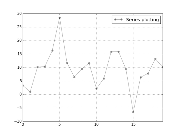
For Series or DataFrame objects in Pandas, most plotting types are supported, such as line, bar, box, histogram, and scatter plots, and pie charts. To select a plot type, we use the kind argument of the plot function. With no kind of plot specified, the plot function will generate a line style visualization by default , as in the following example:
>>> s = pd.Series(np.random.normal(10, 8, 20))
>>> s.plot(style='ko—', alpha=0.4, label='Series plotting')
>>> plt.legend()
>>> plt.show()
The output for the preceding command is as follows:
Another example will visualize the data of a DataFrame object consisting of multiple columns:
>>> data = {'Median_Age': [24.2, 26.4, 28.5, 30.3],
         'Density': [244, 256, 268, 279]}
>>> index_label = ['2000', '2005', '2010', '2014'];
>>> df1 = pd.DataFrame(data, index=index_label)
>>> df1.plot(kind='bar', subplots=True, sharex=True)
>>> plt.tight_layout();
>>> plt.show()
The output for the preceding command is as follows:
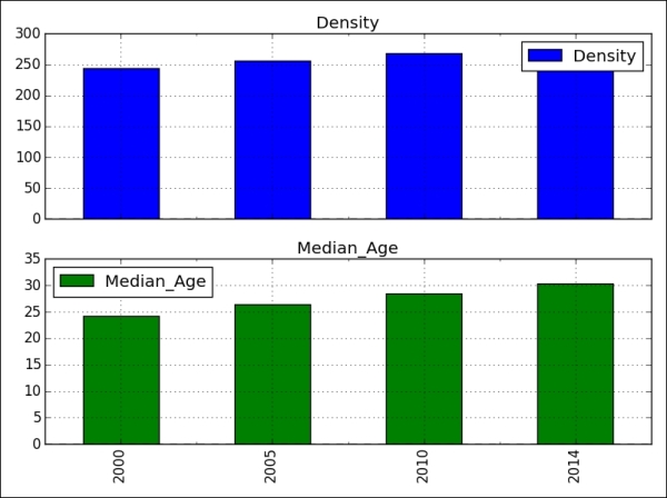
The plot method of the DataFrame has a number of options that allow us to handle the plotting of the columns. For example, in the above DataFrame visualization, we chose to plot the columns in separate subplots. The following table lists more options:
|
Argument |
Value |
Description |
|---|---|---|
|
|
|
The plots each data column in a separate subplot |
|
|
|
The gets a log-scale |
|
|
|
The plots data on a secondary |
|
|
|
The shares the same |
Besides matplotlib, there are other powerful data visualization toolkits based on Python. While we cannot dive deeper into these libraries, we would like to at least briefly introduce them in this session.
Bokeh is a project by Peter Wang, Hugo Shi, and others at Continuum Analytics. It aims to provide elegant and engaging visualizations in the style of D3.js. The library can quickly and easily create interactive plots, dashboards, and data applications. Here are a few differences between matplotlib and Bokeh:
- Bokeh achieves cross-platform ubiquity through IPython's new model of in-browser client-side rendering
- Bokeh uses a syntax familiar to R and ggplot users, while matplotlib is more familiar to Matlab users
- Bokeh has a coherent vision to build a ggplot-inspired in-browser interactive visualization tool, while Matplotlib has a coherent vision of focusing on 2D cross-platform graphics.
The basic steps for creating plots with Bokeh are as follows:
- Prepare some data in a list, series, and Dataframe
- Tell Bokeh where you want to generate the output
- Call
figure()to create a plot with some overall options, similar to the matplotlib options discussed earlier - Add renderers for your data, with visual customizations such as colors, legends, and width
- Ask Bokeh to
show()orsave()the results
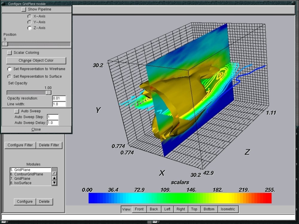
MayaVi is a library for interactive scientific data visualization and 3D plotting, built on top of the award-winning visualization toolkit (VTK), which is a traits-based wrapper for the open-source visualization library. It offers the following:
- The possibility to interact with the data and object in the visualization through dialogs.
- An interface in Python for scripting. MayaVi can work with Numpy and scipy for 3D plotting out of the box and can be used within IPython notebooks, which is similar to matplotlib.
- An abstraction over VTK that offers a simpler programming model.
Let's view an illustration made entirely using MayaVi based on VTK examples and their provided data:
Bokeh
Bokeh is a project by Peter Wang, Hugo Shi, and others at Continuum Analytics. It aims to provide elegant and engaging visualizations in the style of D3.js. The library can quickly and easily create interactive plots, dashboards, and data applications. Here are a few differences between matplotlib and Bokeh:
- Bokeh achieves cross-platform ubiquity through IPython's new model of in-browser client-side rendering
- Bokeh uses a syntax familiar to R and ggplot users, while matplotlib is more familiar to Matlab users
- Bokeh has a coherent vision to build a ggplot-inspired in-browser interactive visualization tool, while Matplotlib has a coherent vision of focusing on 2D cross-platform graphics.
The basic steps for creating plots with Bokeh are as follows:
- Prepare some data in a list, series, and Dataframe
- Tell Bokeh where you want to generate the output
- Call
figure()to create a plot with some overall options, similar to the matplotlib options discussed earlier - Add renderers for your data, with visual customizations such as colors, legends, and width
- Ask Bokeh to
show()orsave()the results
MayaVi is a library for interactive scientific data visualization and 3D plotting, built on top of the award-winning visualization toolkit (VTK), which is a traits-based wrapper for the open-source visualization library. It offers the following:
- The possibility to interact with the data and object in the visualization through dialogs.
- An interface in Python for scripting. MayaVi can work with Numpy and scipy for 3D plotting out of the box and can be used within IPython notebooks, which is similar to matplotlib.
- An abstraction over VTK that offers a simpler programming model.
Let's view an illustration made entirely using MayaVi based on VTK examples and their provided data:
MayaVi
MayaVi is a library for interactive scientific data visualization and 3D plotting, built on top of the award-winning visualization toolkit (VTK), which is a traits-based wrapper for the open-source visualization library. It offers the following:
- The possibility to interact with the data and object in the visualization through dialogs.
- An interface in Python for scripting. MayaVi can work with Numpy and scipy for 3D plotting out of the box and can be used within IPython notebooks, which is similar to matplotlib.
- An abstraction over VTK that offers a simpler programming model.
Let's view an illustration made entirely using MayaVi based on VTK examples and their provided data:
We finished covering most of the basics, such as functions, arguments, and properties for data visualization, based on the matplotlib library. We hope that, through the examples, you will be able to understand and apply them to your own problems. In general, to visualize data, we need to consider five steps- that is, getting data into suitable Python or Pandas data structures, such as lists, dictionaries, Series, or DataFrames. We explained in the previous chapters, how to accomplish this step. The second step is defining plots and subplots for the data object in question. We discussed this in the figures and subplots session. The third step is selecting a plot style and its attributes to show in the subplots such as: line, bar, histogram, scatter plot, line style, and color. The fourth step is adding extra components to the subplots, like legends, annotations and text. The fifth step is displaying or saving the results.
By now, you can do quite a few things with a dataset; for example, manipulation, cleaning, exploration, and visualization based on Python libraries such as Numpy, Pandas, and matplotlib. You can now combine this knowledge and practice with these libraries to get more and more familiar with Python data analysis.
Practice exercises:
- Name two real or fictional datasets and explain which kind of plot would best fit the data: line plots, bar charts, scatter plots, contour plots, or histograms. Name one or two applications, where each of the plot type is common (for example, histograms are often used in image editing applications).
- We only focused on the most common plot types of matplotlib. After a bit of research, can you name a few more plot types that are available in matplotlib?
- Take one Pandas data structure from Chapter 3, Data Analysis with Pandas and plot the data in a suitable way. Then, save it as a PNG image to the disk.