
One of the greatest advantages of the KIE workbench adoption of UberFire is not the components it provides, but how easy it is to integrate new custom components into an existing workbench.
Since all of the jBPM6 tooling is based on UberFire, adding new components becomes a great advantage for adopters of the tooling. It is also a very significant improvement from the previous versions, where the jBPM tooling was very difficult to change due to its complexity and highly-coupled code. In this version, adding new components is very easy, and we will show how to create new screens for an existing workbench and how to integrate them together.
Before we fully dive into the code, we need to understand how it is composed and designed. UberFire component design is based on a very useful design pattern used for building user interfaces called Model View Presenter (MVP). MVP is based on a highly used pattern called Model View Controller (MVC), but is devoid of one of its biggest issues, regarding component intercommunication. The idea behind MVP is twofold:
Each component in a user interface project should have three classes with very specific responsibilities:
Each different MVP group should communicate with other components (and, to some measure, even with itself) by listening and firing events
This creates a very distinctive structure of classes that can be easily changed, to provide different representations by allowing them to be completely detached from the business logic and from other visual components. The following diagram of MVP shows the basic interactions that happen with this pattern:
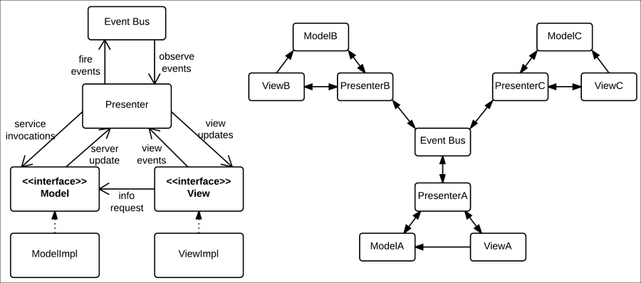
In the preceding figure, we can see how the classes inside one single MVP group interact on the left and how multiple MVP groups interact with each other on the right. We can see how communication is always managed through an event bus that distributes events to their relevant listeners, even with multiple MVP groups. This allows the application to grow exponentially without having to increase the complexity of its already existing components. Each MVP group only has to worry about the events that they care about.
This presents a significant improvement over MVP's predecessor pattern, called MVC. It is similar to MVP, except that it doesn't adopt intercommunication using an event bus. Without said component, each MVC group (as opposed to MVP) should know any other MVC group that requires notification of a particular action, and communication between controllers becomes hard to maintain. In the following figure, we can see an example of this with only five different MVC and MVP groups. Views and models were removed to reduce complexity.
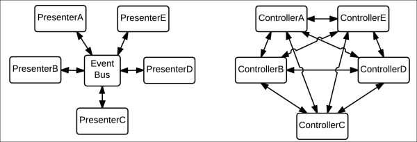
Model View Controller versus Model View Presenter intercommunication channels
As you can see, no matter how many presenters exist, or what events they await, existing presenters that fire said events don't have to change to adjust to a growing component. With controllers, on the other hand, complexity can grow exponentially.
Now that we understand MVP and its advantages, we will make an example component using the UberFire framework and the MVP pattern.
In this section, we will learn how to configure our own visual components inside an UberFire-based application. In order to understand how to build them, we need to understand which types are available, and what are they used for. In the following subsections, we will discuss four of UberFire's most used components for defining user interfaces:
Workbench screens
Workbench pop ups
Workbench editors
Workbench perspectives
Once we get to know how they work and what they do, we will learn how to build our own user interfaces. Each visual representation in our demonstration will be based on the MVP pattern, and will be marked by annotations added to the Presenter class. All the components we will describe here are going to be implemented in the code files of this book in the appendix/uberfire-demo folder.
Workbench screens are pieces of visual representation that are fitted in a particular window. From a UI point of view, they are nonfloating components that fit in the display window of the web application. They are simple UI containers, so they can define virtually anything inside them. Classes that should be used as workbench screens in the UberFire framework are marked with a class-level annotation and a couple of method-level annotations, as shown in the following code fragment:
@Dependent
@WorkbenchScreen(identifier = "myParticularScreenID")
public class MyParticularScreenPresenter {
    …
    @WorkbenchPartTitle
    public String getTitle() {
        return "My Particular Screen";
    }
    …
    @WorkbenchPartView
    public IsWidget getView() {
        …
    }
    …
    @WorkbenchMenu
    public WorkbenchMenuBar getBar() {
        …
    }
}
There is a lot to comment about the annotations used in the preceding code fragment. Let's analyze them briefly:
@Dependent: This annotation is not part of UberFire API, but a part of CDI. CDI marks this class as a dependent scoped CDI bean that should be freshly instantiated every time a new instance is called for. This annotation is in contrast with@ApplicationScoped, which marks a CDI bean that should be created only one time over the life of the application.@WorkbenchScreen: This annotation is used to declare that the class defines a screen in the application. It has one attribute calledidentifierthat defines a unique name for this screen, which is used later for external reference by other components.@WorkbenchPartTitle: This annotation denotes the method that returns the screen's title. Every screen must have a@WorkbenchPartTitlemethod.@WorkbenchPartView: This annotation denotes the method that returns the panel's view. The view can be any class that extends GWT'sWidgetclass or implements GWT'sIsWidgetinterface (a basic interface to refer to a UI component built in GWT). Every screen must have an@WorkbenchPartViewmethod.@WorkbenchMenu: This is an optional annotation to mark a method that will return a menu for the specific screen. It helps to make all menus in all screens appear in a similar fashion. The returned type of the annotated method should be an instance of theorg.uberfire.client.workbench.widgets.menu.WorkbenchMenuBarclass.
Using these annotations, we can define different components in any part of the code, without the need to depend on specific aggregations or class hierarchies and still add new screens in an easy way.
Workbench pop ups are very similar to workbench screens, with the single difference of appearing on a pop-up window instead of as a part of a composite screen. Pop ups will become modal from the UberFire perspective, not letting the user click on any other component of the particular screen until the pop up is closed.
It also requires a @WorkbenchPartTitle and a @WorkbenchPartView annotation to register a title and a view for the pop up and an identifier to invoke it from outside, just like screens. Because those methods can be implemented by any class, creating widgets that could be used both from a screen or a pop up becomes very simple. This is shown in the following code example:
@Dependent
@WorkbenchPopup(identifier = "myOwnPopupID")
public class MyOwnPopupPresenter {
    …
    @WorkbenchPartTitle
    public String getTitle() {
        return "My Own Popup";
    }
    …
    @WorkbenchPartView
    public IsWidget getView() {
        …
    }
}
As you can see from the comparison of the last two code fragments, workbench screens and pop ups are virtually the same except for the final layout in the UberFire framework.
Workbench editors are special kinds of UI components that perform some kind of editing functionality for a specific file type or group of file types. It extends the functionality of common screens to associate the opening of an editor with a specific file that needs to be stored on the server side. They provide some extra needed configuration to bind a specific editor with a particular file and file type. Here's an example:
@WorkbenchEditor(identifier = "myEditorForTypeX", supportedTypes = { XClientType.class })
public class MyEditor {
    @WorkbenchPartTitle
    public String getTitle() {
        return "MyEditor";
    }
    @WorkbenchPartView
    public IsWidget getEditorView() {
        …
    }
    @OnStartup
    public void onStart(final Path path) {
        …
    }
    …
}
In the preceding code, there are a few things that are different from workbench screens:
@WorkbenchEditor: This annotation is used to declare that the class defines an editor in the application. It has two attributes—one calledidentifierthat defines a unique name for this editor and for external reference by other tools and another calledsupportedTypes, which should receive an array of all file types that the editor can work with. File types are represented using theorg.uberfire.client.workbench.type.ClientResourceTypeclass that can be extended to add support for new file types.@OnStartup: This is one of UberFire's lifecycle annotations. They are better explained in the next subsection. It marks a method that will be called when the editor is created. For the special case of editors, the annotated method can receive a parameter of typeorg.uberfire.backend.vfs.Path, which denotes the file with which the editor will be working.
UberFire workbench UI components are arranged as Workbench | Perspective | Panel | Workbench screen. Perspectives dictate the position and size of workbench panels, and therefore provide a place to put our workbench screens and editors. Defining a perspective is very simple:
@ApplicationScoped
@WorkbenchPerspective(
    identifier = "myCustomPerspective",
    isDefault = false)
public class CustomPerspective {

    @Perspective
    public PerspectiveDefinition getPerspective() {
        final PerspectiveDefinition p =
            new PerspectiveDefinitionImpl(
                PanelType.ROOT_LIST);
        p.setTransient(true);
        p.setName(getClass().getName());
        p.getRoot().addPart(
            new PartDefinitionImpl(
                new DefaultPlaceRequest("myParticularScreenID")
             )
         );
        return p;
    }
}
The preceding code defines a perspective that will contain our previously defined screen with the identifier "myParticularScreenID". The necessary components of a perspective are as follows:
@WorkbenchPerspective: This annotation is used to declare that the class defines a perspective in the application. It has two attributes—one calledidentifierthat defines a unique name for this perspective and for external reference by other tools and another calledisDefault, which determines whether it should be opened by default when the workbench loads. Only one default perspective is allowed in each workbench.@Perspective: This annotated method must return anorg.uberfire.workbench.model.PerspectiveDefinitionobject. These objects will allow different layout dispositions to be formed in a tree-like structure, and they will reference different screens by their identifier using aPlaceRequestobject.
In this way, when the workbench opens a perspective, it will know that it should open a series of particular screens, all referenced by an ID and placed in special places of the open window.
All the visible UberFire components (perspectives, editors, pop ups, and screens) are defined in a way that makes them very detached from any core UberFire functionality. All you have to do is annotate certain methods to let UberFire connect them for you to all the right places. However, we just started with configuration annotations, and we still have to see a very important group of annotations that are used to define what to do on specific events that the workbench will send to your components.
Whenever a perspective changes, a screen is created, an editor is closed, or when the workbench needs to shut down, we need a way to tell our components how to react or even pass specific information about the event. For events as common as opening, closing, or focusing on a component, UberFire provides us with a series of lifecycle annotations that are visible in the following diagram:
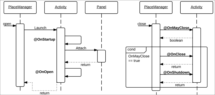
The annotations shown in the preceding diagram are as follows:
@OnStartup: When the component is initialized, methods marked with this annotation are called. For workbench editors, the method should have a VFS path object as a parameter and for all other workbench parts it should have zero parameters. It is commonly used to initialize server components.
@OnOpen: When the workbench component is displayed, this method will be called. The method should have zero arguments and return void, and is commonly used to start visual representations.
@OnFocus: Methods annotated with this will be called when the workbench component receives focus. It should also have zero arguments and return void.
@OnLostFocus: Whenever the user clicks on another component, the current one will lose focus and the method annotated with this will be called.
@OnMayClose: Methods annotated with this should return a Boolean value. They should decide whether the component is in a state where it can be closed or not. Based on that, the workbench will decide whether to continue closing the component.
@OnClose: When a component is closed, the method annotated with this will be called—usually to clean visual resources.
@OnShutdown: This annotation is called to release resources on both the client and server side regarding the current component.
Using these annotations, we can define user interactions that are very detached from the actual workbench's final implementation. This helps a lot in making scalable UI components with a lot of embedded functionality.
Now that we have seen all the UberFire annotation components, we can start seeing in detail the components created in the uberfire-demo project provided with the book.
In our example, we create a user interface to show a very simple functionality; a screen that shows us a list of messages with a pop up that allows us to create a new message. Messages are stored as simple String elements. The project is divided into three subprojects:
uberfire-demo-api: This subproject defines a service interface for reading all messages and adding a new one (called
DemoServiceEntryPoint) and an event type for sending a new message back and forth (calledNewMessageEvent). You can see in the code that the event class is marked with the@Portableannotation, to make it accessible through both Java and GWT JavaScript code. Also, the service interface is marked with the@Remoteannotation, which lets Errai know that the GWT code will try to invoke it.uberfire-demo-backend: This subproject defines an implementation for the service interface defined in the
uberfire-demo-apiproject. The implementation is based on holding a list in memory and adding values to it. What's really interesting about it is that it's marked with a@Serviceannotation that lets Errai know this is an implementation for an Errai server-side service.uberfire-demo-client: This subproject defines the user interfaces. Here's where we will use most of the UberFire components previously explained.
For this example, uberfire-demo-client is the subproject that will be most useful for us. We have created two components in it, a screen (to display a message list) and a popup (to create a new message). Let's take a look at specific utilities that the Message List screen uses by looking at a code fragment of MessageListPresenter:
@Dependent
@WorkbenchScreen(identifier = "uberFireDemo.MessageListScreen")
public class MessageListPresenter {
    public interface MessageListView extends
                UberView<MessageListPresenter> {
        void displayNotification(String text);
        DataGrid<String> getDataGrid();
    }
    @Inject
    private PlaceManager placeManager;
    @Inject
    private MessageListView view;
    …
    @WorkbenchMenu
    public Menus getMenus() {
       return MenuFactory
           .newTopLevelMenu(constants.NewMessage())
           .respondsWith(new Command() {
               @Override
               public void execute() {
                   placeManager.goTo(
                       new DefaultPlaceRequest(
                           "uberFireDemo.NewMessagePopup" ) );
               }
           }).endMenu().build();
    }
  }
}
There are a few components in this code fragment that we still haven't seen and are very useful when working with UberFire components:
UberView interface: This is an extension of the
IsWidgetinterface, which adds a method to initialize a view based on a presenter object. You can see that we extend it to add methods that will be useful for our specific case.Injection of MessageListView instance: This is because the view object is also generated and injected through Errai and CDI. As you can see in the code, the view implementation is template-based and we're working with an HTML file (
MessageListViewImpl.html). The templating is handled by mappings between both the files marked bydata-fieldattributes in the HTML file, and@DataFieldannotated attributes in the Java class.WorkbenchMenu generation: This is to show how we can create menus that have any commands we wish. In the preceding code, we show how to use a very useful utility called
PlaceManager(which is also injected through Errai and CDI), which is a utility manager to tell the workbench to go to another particular view or to get parameters from the current URL. In our case, we're using it to go to the popup for creating a new message.
The code in the view implementation is then only an initialization and exposure of GWT components (in our case, those components are just a table with strings in it).
The other component, the pop up, has a very similar structure. Let's analyze this code fragment of the NewMessagePresenter class:
@Dependent
@WorkbenchPopup(identifier = "uberFireDemo.NewMessagePopup")
public class NewMessagePresenter {

    ...
    @Inject
    private Caller<DemoServiceEntryPoint> demoService;
    @Inject
    private Event<NewMessageEvent> newMsgEvent;
    …
    public void sendMessage(String message) {
        this.demoService.call( new RemoteCallback<Void>() {
            @Override
            public void callback( Void response ) {
                //send event
                newMsgEvent.fire(
                    new NewMessageEvent( view.getMessage() ) );
            }
        } ).sendMessage( message );
    }
}
For brevity's sake, we removed the most similar parts to the previous component. Let's discuss what's new in this class:
Caller: This interface is a wrapper from Errai to handle server-side service invocations as an asynchronous communication. As we have mentioned, GWT code will be translated by a compiler into JavaScript code. This means that service calls will eventually be made through JavaScript using Ajax, and their behavior should be asynchronous. Later on, in thesendMessagemethod, we will learn how we use that wrapper with aRemoteCallbackparameter to handle the response.Event: This interface is a way to let Errai handle event firing. We're using it to communicate with the message list presenter in a detached fashion.
Creating a perspective is done exactly as explained before. In our case, we create a perspective to include only our message list screen. Here's the code found in our MessageListPerspective class:
@ApplicationScoped
@WorkbenchPerspective(
    identifier = "uberFireDemo.MessageListPerspective",
    isDefault = false)
public class MessageListPerspective {
    @Perspective
    public PerspectiveDefinition getPerspective() {
        final PerspectiveDefinition p =
            new PerspectiveDefinitionImpl(PanelType.ROOT_LIST);
        p.setTransient(true);
        p.setName("My Customized panel of Messages");
        p.getRoot().addPart(new PartDefinitionImpl(
            new DefaultPlaceRequest(
                "uberFireDemo.MessageListScreen")));
        return p;
    }
}
As you can see, all we do is create a method annotated with @Perspective to return a PerspectiveDefinition instance that will have our message list screen in it, and we mark it to not be the default perspective.
Workbenches are Maven-based web projects that depend extensively on UberFire and its internal configurations to work. Due to UberFire being in an alpha state, workbench definition is something that might still change a lot. It is because of this reason that we will not see how to create our own workbenches in detail. Instead, we are going to see the necessary steps to add new components built with UberFire in an already existing workbench. This is less prone to change to keep compatibility with already defined components. If you wish to build your own workbench from scratch, visit http://www.uberfireframework.org for more help with that aspect.
Review the jbpm-console-ng-showcase project inside the uberfire-demo folder. This is one workbench already available in the open source jBPM6 repositories to which we have added uberfire-demo as an extra component.
The steps taken to add new components to an UberFire based workbench are as follows:
The first step needed to let GWT compile our Java components into JavaScript modules in the workbench is to add the component release IDs to the workbench as dependencies. In this case, we can do this by adding
uberfire-demo-clientanduberfire-demo-backenddependencies into a particular workbench'spom.xmlfile.Maven will trigger the GWT code translation to JavaScript, but will need to know all the dependencies that need to be translated to JavaScript. To do so, we need to add two
compileSourcesArtifacttags to the GWT Maven plugin configuration—one foruberfire-demo-api, and one foruberfire-demo-client.GWT uses special XML files to define modules and dependencies between them. We have defined two of them in our demonstration projects (
UberfireDemoAPI.gwt.xmlandUberfireDemoClient.gwt.xml). In order to make the GWT code know that it will use those modules, we need to make the specific workbench GWT XML file that has those modules (and any other we define) as dependencies, using theinheritstag:<inherits name="path.to.my.UberfireModule"/>
GWT projects define one class as an entry point for all incoming user calls (marked with the
@EntryPointannotation) where we will need to add some form of linking to our components. In the case of ourjbpm-console-ng-showcaseproject, we added a navigation bar item calledMY ADDED ITEMSin theShowcaseEntryPointclass.Thanks to the project being a Maven-based GWT web project, we can test it directly by running the following command from the
uberfire-demo/jbpm-console-ng-showcasefolder:mvn clean install gwt:run
Tip
By running the web project like this, you will be using a special plugin component for quick development of GWT applications, and you will need a plugin in your navigator to see the application running. In order to not need this plugin, you will need to do a full compilation of the GWT application to JavaScript. You can do this by passing the system property
Dfullto the maven command previously mentioned. Now, the WAR file compiled will be runnable without that extra plugin, but in order to run it you'll need to deploy it in an application server.
As this book is being written, there are three Drools and jBPM6-related workbench applications that you can use to add your own components:
org.drools...drools-wb-webapp for Drools 6 UI components
org.jbpm...jbpm-console-ng-showcase for jBPM6 UI components
org.kie...kie-wb-webapp for both Drools and jBPM6 UI components at the same time
All of them could be extended to add new UberFire components in the way we explained in this section.