


In the previous project, we created the main basic layout. Later on, we created photo and sharing events. In this project, we will work with the use of SVG icons, which are infinitely smaller in size in relation to the allocation of space.
SVG is an XML-based vector graphics format that can scale to any size without losing clarity. SVG images and their characteristics are defined in XML text files. That is, they can be searched, indexed, scripted, and compressed. Like XML files, SVG images can be produced and modified with any editing software.
We will use 100% native components in order to use an SVG image. To do this, follow this step by step:
- From the Tool Pallet, select TRectangle. Add in the toolbar created previously, use the property, and align the rectangle by setting it to the center. You will now have a rectangle centered in the toolbar.
- Add a speed button inside this same rectangle. Note that in the Structure pane, the button is contained within the shape. Do the same with the TPath component, but leave it as the child of the speed button. Align both to Center.
- Clear the Text property of the new speed button:
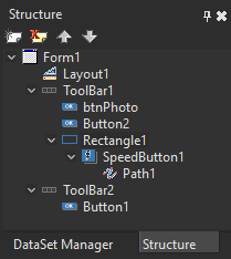
The structure of your application should be like this, with the components nested.
- Okay, now that you have the basic structure assembled on your form, it's time to choose an SVG icon to illustrate this button. The purpose of this button is to execute the share function when clicked. So, we can now share a photo. You can search the internet for various SVG icons. In this example, you can copy the SVG code at http://materialdesignicons.com/ to use in our application.
- The icon used is Instagram. It is important to note that in certain tools or websites, such as materialdesignicons.com, you have the functionality to view the SVG code and also to be able to download the binary file. A simpler way to get the SVG code is to view it online:
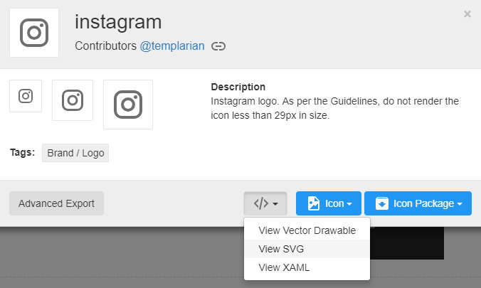
In this case, to copy the correct information from the SVG vector, go directly to the d= property and copy its content. This property contains the icon code:

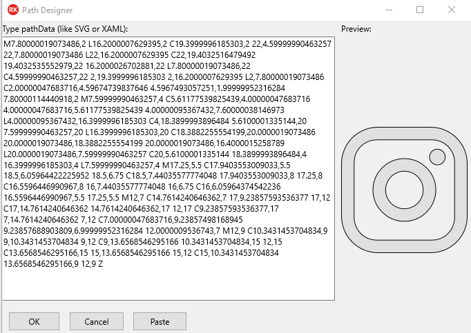
- Once you have the content of the SVG vector, you can include it in your Delphi application using the TPath component. To do so, follow these steps:
- Select the TPath component.
- Select the Data property.
- Input the SVG content and save as shown in the following screenshot:
This is what the Instagram icon looks like:
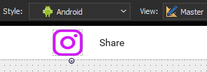
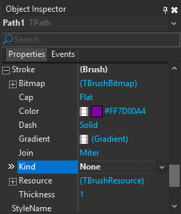
You can color the icon in the Fill property, including Gradient. To remove the border, just leave it as None in the Stroke.Kind property at Object Inspector:
In the first two steps, we created a new button and centered the toolbar. Notice that this button has a new component, the TPath. The TPath is inside our button. This causes the image, which we copy from the internet appears contained in the component. In steps three, four, and six, we located the SVG icon and copied its content through the d property. With the contents of the image copied, we then go to the TPath component, making it display the same icon that was selected, in this case, Instagram.


