Sign In Start Free Trial
Account

Add to playlist

Create a Playlist

Modal Close icon
You need to login to use this feature.
  • Book Overview & Buying Mastering Responsive Web Design
  • Table Of Contents Toc
Mastering Responsive Web Design

Mastering Responsive Web Design

By : Ricardo Zea
3.9 (10)
close
close
Mastering Responsive Web Design

Mastering Responsive Web Design

3.9 (10)
By: Ricardo Zea

Overview of this book

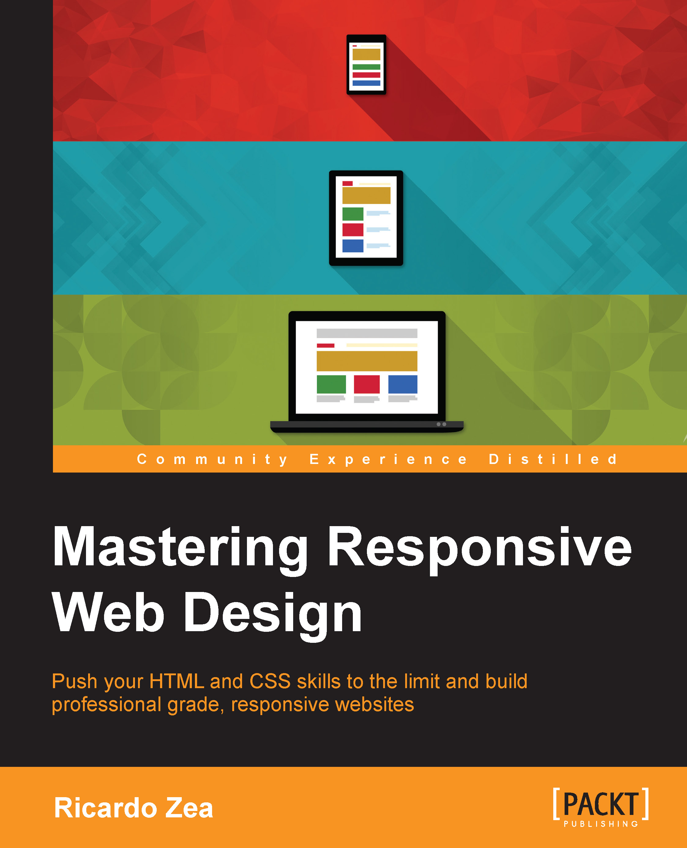
Building powerful and accessible websites and apps using HTML5 and CSS3 is a must if we want to create memorable experiences for our users. In the ever-changing world of web design and development, being proficient in responsive web design is no longer an option: it is mandatory. Each chapter will take you one step closer to becoming an expert in RWD. Right from the start your skills will be pushed as we introduce you to the power of Sass, the CSS preprocessor, to increase the speed of writing repetitive CSS tasks. We’ll then use simple but meaningful HTML examples, and add ARIA roles to increase accessibility. We’ll also cover when desktop-first or mobile-first approaches are ideal, and strategies to implement a mobile-first approach in your HTML builds. After this we will learn how to use an easily scalable CSS grid or, if you prefer, how to use Flexbox instead. We also cover how to implement images and video in both responsive and responsible ways. Finally, we build a solid and elegant typographic scale, and make sure your messages and communications display correctly with responsive emails.
Table of Contents (10 chapters)
close
close
9
Index

Conventions

In this book, you will find a number of styles of text that distinguish between different kinds of information. Here are some examples of these styles, and an explanation of their meaning.

Code words in text, folder names, filenames, file extensions, pathnames, dummy URLs, user input, and Twitter handles are shown as follows: "The sizes attribute can also be used with the <picture> element, but we're going to focus on using the sizes attribute with the <img> tag."

A block of code is set as follows:

*, *:before, *:after {
    box-sizing: border-box;
}

//Moble-first Media Queries Mixin
@mixin forLargeScreens($width) {
    @media (min-width: $width/16+em) { @content }
}

When we wish to draw your attention to a particular part of a code block, the relevant lines or items are set in bold:

*, *:before, *:after {
    box-sizing: border-box;
}

//Moble-first Media Queries Mixin
@mixin forLargeScreens($width) {
    @media (min-width: $width/16+em) { @content }
}

Any command-line input or output is written as follows:

gem install sass

New terms and important words are shown in bold. Words that you see on the screen, in menus or dialog boxes for example, appear in the text like this: "clicking the Next button moves you to the next screen".

Note

Warnings or important notes appear in a box like this.

Tip

Tips and tricks appear like this.

CONTINUE READING
83
Tech Concepts
36
Programming languages
73
Tech Tools
Icon Unlimited access to the largest independent learning library in tech of over 8,000 expert-authored tech books and videos.
Icon Innovative learning tools, including AI book assistants, code context explainers, and text-to-speech.
Icon 50+ new titles added per month and exclusive early access to books as they are being written.
Mastering Responsive Web Design
notes
bookmark Notes and Bookmarks search Search in title playlist Add to playlist font-size Font size

Change the font size

margin-width Margin width

Change margin width

day-mode Day/Sepia/Night Modes

Change background colour

Close icon Search
Country selected

Close icon Your notes and bookmarks

Confirmation

Modal Close icon
claim successful

Buy this book with your credits?

Modal Close icon
Are you sure you want to buy this book with one of your credits?
Close
YES, BUY

Submit Your Feedback

Modal Close icon
Modal Close icon
Modal Close icon