
Now that we've gone through some of the theory behind SproutCore, let's jump right in to see it in action. Don't be concerned if some of this first application seems like magic, we'll go into much more detail in the later chapters. For now it's good enough to get SproutCore installed and to gain a feel for SproutCore web app development.
SproutCore is made of two parts: the JavaScript framework and the build tools. The JavaScript framework runs in the browser and powers your application, while the build tools provide a development environment and the ability to build your application so that it may be most efficiently deployed.
Note
The build tools are written in Ruby, but you do not need to know Ruby in order to use SproutCore. It is simply the language that the command-line tools were written in and how the framework is distributed. It does mean that you will need to have the Ruby interpreter installed.
Although SproutCore's build tools should technically work on Ruby 1.8, the better support, inclusion of RubyGems and large performance gain of 1.9 means it's best if you install the latter. If you already have Ruby 1.9 installed, you can skip this section.
Since there are many options for installing Ruby, rather than attempting to provide instructions for every system out there, it is best if you choose the method that best suits your environment from the official Ruby website: http://www.ruby-lang.org/en/downloads/.
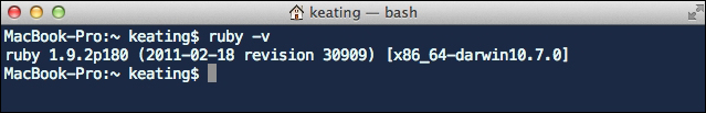
To verify your Ruby installation, simply run the following from the command line as shown in the following screenshot:
$ ruby –v
Tip
I prefer using Ruby 1.9.2 rather than 1.9.3, because 1.9.3 has problems including libyaml and has deprecated some of the code used by RubyGems. It doesn't seem to affect anything, but the warnings are annoying.
Once you've got Ruby installed, it's time to get SproutCore.
The SproutCore gem includes the command-line build tools as well as the JavaScript framework. At the time of this writing, the latest version of SproutCore was 1.10. To install it, simply run the following from the command line:
$ gem install sproutcore
Once it completes, you can verify the installation with the following:
$ sproutcore version
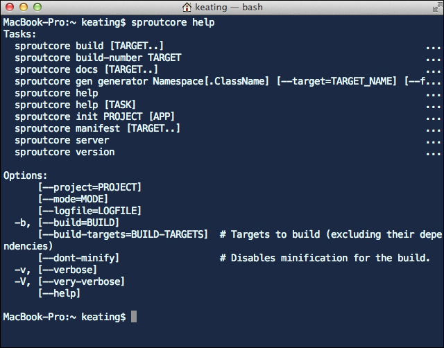
To learn of more options available to use with the sproutcore command, use:
$ sproutcore help
Every SproutCore application belongs to a SproutCore project. This allows you to create multiple apps as part of a single project and share resources among them (more on this later). A SproutCore project is simply a directory that contains the related apps, frameworks and themes as well as a Buildfile for the entire project.
To generate an empty project directory that we can use for experimentation, we can use the
sproutcore gen command.
For a project, we will use the project generator and so we will simply run sproutcore gen project from the command line. If you have a directory used for development projects, you may want to cd to it first.
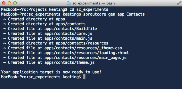
Let's create a new project called sc_experiments. To create the project, open a terminal window and type the following as shown in the following screenshot:
$ sproutcore gen project sc_experiments
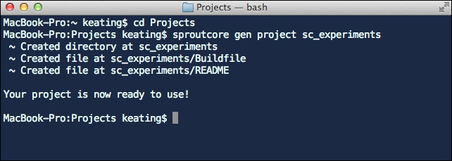
As we can see from the output, the discussed command created a directory called sc_experiments as well as two files: Buildfile and README.
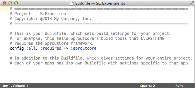
The README file is for your own documentation. Feel free to rename it, remove it or replace it with whatever you like. The Buildfile is important however and must be included. This file is used to instruct the build tools as to how to build the apps within your project. By default it simply requires the complete SproutCore framework for all the apps in the project. This is illustrated in the following screenshot:
We will look at more sophisticated Buildfile settings in Chapter 6, Testing, Building and Deploying, but for now we can leave it as it is.
Now that we have SproutCore installed and a project directory to work with, it's time to create our first app. Let's start with a simple address book app, that we'll call Contacts. Our address book will contain individual contacts and we'll be able to view and group the contacts. You'll also be able to add, remove, and modify the contacts and the groups.
To generate a skeleton for Contacts, we'll turn once more to the sproutcore gen command. Go back to the terminal and run the following as shown:
$ cd sc_experiments
$ sproutcore gen app Contacts
Now let's launch the app and see what we have. To serve the web app locally for debugging purposes, we use the SproutCore development server. To start it, open up another terminal window and type the following:
$ sproutcore server
Go ahead and open http://localhost:4020/contacts in your favorite browser as shown in the following screenshot:
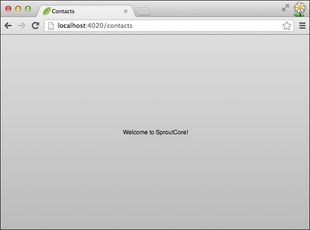
SproutCore apps are just static files, but these static files still need to be served to a browser in order to load correctly. The development server, sproutcore server or sc-server for short, does a simple build of your project and serves it locally at http://localhost:4020. The server also proxies requests to remote servers as indicated by your Buildfile. This allows you to avoid the Same Origin Policy rule that would otherwise prevent your locally running app in the localhost domain from connecting with APIs on your production domain. We will see more on this in Chapter 6, Testing, Building and Deploying.
Now just as when we generated a project, sproutcore gen app also created some basic folders and files for us to use. Here is a brief description of each file and directory:
apps/: This directory houses all the apps within your projectBuildfile: This is similar to the project's Buildfile, but contains instructions specific to the Contacts appcore.js: This contains yourSC.Applicationinstance and is the first file loaded from the application codemain.js: This file launches your application once the browser is ready and all JavaScript has been loadedresources/: This directory contains all the images, style sheets and other assets that you wish to bundle with your application. It also contains page files, which house the preconfigured UI panes and viewsresources/_theme.css: This style sheet simply defines the$themevariable for use with the CSS stylesresources/loading.rhtml: The contents of this file will be inserted into the builtindex.htmlfile while the the application code loads and is removed when the application launchesresources/main_page.css: This style sheet contains a basic style for the main page defined inmain_page.jsresources/main_page.js: This file defines anSC.Pagecontainer that holds all the panes and views that will make up the main page of your appresources/theme.js: This file defines theSC.Themeinstance for the app. By default it extends theSC.AceThemeinstance
In user-focused development, it's often good to build the interface pieces first and enable them behind the scenes later one component at a time. As a side benefit, this gives us something to get into people's hands early on in order to get valuable feedback.
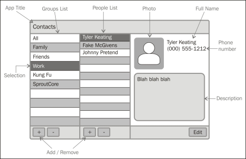
For our Contacts app, we will follow a tried and true address book layout such as the following:
To create an interface with SproutCore we use a declarative approach in JavaScript, which may seem normal if you're coming from native software development, but new if you're accustomed to working directly with HTML. Although SproutCore has toyed with using templates in the past, these attempts have always turned out to perform worse from both an execution performance and a developer performance point of view. For now, I ask you to trust that the style we'll use ends up both faster to write and faster to run.
When starting to lay out a page, the best approach is to start from the outside and work our way in. From the previous figure, it appears that we have four major containing boxes: the toolbar, the groups list, the contacts list, and the contact detail.
Open up main_page.js in a text editor of your choice and replace the content of mainPane with the following:
mainPane: SC.MainPane.design({

  childViews: ['toolbarView', 'splitView'],

  // The top header of the page.
  toolbarView: SC.ToolbarView.design({}),

  // Flexible container for the lists and details.
  splitView: SC.SplitView.design({
    // Place this below the toolbarView.
    layout: { top: 32 },

    childViews: ['groupsPanel', 'contactsPanel', 'detailPanel'],

    // The list of groups and group control buttons.
    groupsPanel: SC.View.design(SC.SplitChild, {
      minimumSize: 200,
      size: 250
    }),

    // The list of contacts for the group and contact control
buttons.
    contactsPanel: SC.View.design(SC.SplitChild, {
      minimumSize: 200,
      size: 250
    }),

    // The details for the selected contact.
    detailPanel: SC.View.design(SC.SplitChild, {
      autoResizeStyle: SC.RESIZE_AUTOMATIC,
      minimumSize: 400
    })

  })

})
Tip
Downloading the example code
You can download the example code files for all Packt books you have purchased from your account at http://www.packtpub.com. If you purchased this book elsewhere, you can visit http://www.packtpub.com/support and register to have the files e-mailed directly to you.
The preceding code gives us our four containing views: toolbarView, groupsPanel, contactsPanel, and detailPanel. You will have noticed that the child views are defined by name in the parent view's childViews array. We also used a couple pre-defined SproutCore views, SC.ToolbarView and SC.SplitView. The SC.ToolbarView just adds some nice default styling while the SC.SplitView will allow the user to resize the width of each panel. In order to make the split view work properly, we mix the SC.SplitChild mixin to each of these child views and define a few settings for how each child should behave. A mixin is a collection of properties and methods that can be added to an object or class. Mixins and the use of design, extend, and create will be covered in detail in Chapter 2, The Runtime Environment.
Let's add all the remaining components of our page. First we'll add the title to the toolbar and give it the value of "Contacts".
// The top header of the page.
toolbarView: SC.ToolbarView.design({
  childViews: ['titleView'],

  titleView: SC.LabelView.design({
    controlSize: SC.LARGE_CONTROL_SIZE,
    layout: { centerY: 0, height: 24, left: 10, width: 200 },
    value: "Contacts"
  })
}),
Notice that we declare the layout of the titleView at the same time. By default all instances of SC.View (which includes SC.ToolbarView and SC.LabelView in this case) will be positioned absolutely according to the layout property. Absolute positioning allows the browser to avoid any reflow when the DOM is updated and is therefore much faster to use. It's actually a very flexible approach when used with single page apps.
You'll also notice that we use the controlSize property. Several SproutCore controls, such as SC.LabelView, use the controlSize property to affect the style applied. In this case, we use SC.LARGE_CONTROL_SIZE to give us a label style that will fit a height of 24 pixels. We can override this in CSS later if we wish.
Next we'll add both of the lists with their respective control bars as shown in the following code:
// The list of groups and group control buttons.
groupsPanel: SC.View.design(SC.SplitChild, {
  minimumSize: 100,
  size: 250,

  childViews: ['list', 'controlBar'],

  list: SC.ScrollView.design({
    layout: { bottom: 44 },
    contentView: SC.ListView.design({
      content: ["A", "B", "C", "D", "E", "F"]
    })
  }),

  controlBar: SC.ToolbarView.design({
    anchorLocation: SC.ANCHOR_BOTTOM
  })
}),

// The list of contacts for the group and contact control buttons.
contactsPanel: SC.View.design(SC.SplitChild, {
  minimumSize: 100,
  size: 250,

  childViews: ['list', 'controlBar'],

  list: SC.ScrollView.design({
    layout: { bottom: 44 },
    contentView: SC.ListView.design({
      content: ["1", "2", "3", "4", "5", "6", "7", "8", "9", "10"]
    })
  }),

  controlBar: SC.ToolbarView.design({
    anchorLocation: SC.ANCHOR_BOTTOM
  })
}),
Since we know that we want our lists to scroll, we've placed each SC.ListView within an SC.ScrollView. We also gave our lists some placeholder content to use while we're still designing the page.
Let's add the buttons to the next view. Insert the following into both the controlBar views as shown in the following code:
controlBar: SC.ToolbarView.design({
  anchorLocation: SC.ANCHOR_BOTTOM,

  childViews: ['addButton', 'removeButton'],

  addButton: SC.ButtonView.design({
    controlSize: SC.HUGE_CONTROL_SIZE,
    layout: { centerY: 0, left: 10, width: 40, height: 30 },
    title: '+'
  }),

  removeButton: SC.ButtonView.design({
    controlSize: SC.HUGE_CONTROL_SIZE,
    layout: { centerY: 0, left: 60, width: 40, height: 30 },
    title: '-'
  })
})
Here we're going to use SC.ButtonView to get nice buttons. This is probably a good time to mention that all of the pre-built SproutCore views and controls along with code snippets for each can be previewed on the SproutCore Showcase page (http://showcase.sproutcore.com). When you're done with this tutorial, you may want to browse and see what other views you may want to use.
Finally, we just need to create the detail panel. Considering the many options for presenting all the data that can be attached to a contact, this could become very complicated. For now, we'll keep it simple and use an image, first name, last name, telephone number, and description.
Go ahead and add the following to detailPanel as shown in the following code:
detailPanel: SC.View.design(SC.SplitChild, {
  autoResizeStyle: SC.RESIZE_AUTOMATIC,
  minimumSize: 350,

  childViews: ['image', 'fullName', 'telNumber', 'description',
'controlBar'],

  image: SC.ImageView.design({
    layout: { left: 20, top: 20, height: 120, width: 120 },
    scale: SC.BEST_FIT,
    value: sc_static('sproutcore-128.png')
  }),
  fullName: SC.LabelView.design({
    layout: { left: 160, top: 50, height: 25, width: 150 },
    value: "Tyler Keating"
  }),

  telNumber: SC.LabelView.design({
    layout: { left: 160, top: 75, height: 25, width: 100 },
    value: "(000) 555-1212"
  }),

  description: SC.TextFieldView.design({
    isEditable: false,
    isTextArea: true,
    layout: { left: 20, top: 160, bottom: 52, right: 20 },
    value: "Author of the amazing Beginner's Guide to SproutCore
book and just generally an all around nice human being."
  }),

  controlBar: SC.ToolbarView.design({
    anchorLocation: SC.ANCHOR_BOTTOM,

    childViews: ['editButton'],

    editButton: SC.ButtonView.design({
      layout: { centerY: 0, right: 10, width: 80, height: 24 },
      title: 'Edit'
    })

  })
})
We should point out the two new views we introduced here: SC.ImageView and SC.TextFieldView. As you can guess, SC.ImageView displays an image and in this case we are using a SproutCore build tools command, sc_static() to get the path to an image included in the framework as our placeholder value.
Note
By the way, you might not know it yet, but we also solved the problem of fitting a source image into the aspect ratio of the frame we want to use, by setting the scale property. In this case we're using best fit scaling, which ensures the source image fits within the frame without stretching. Again, the SproutCore Showcase page has examples of the different image options.
The other new control we used is SC.TextFieldView, which we set to behave as a text area (isTextArea: true) and which we set to be non-editable (isEditable: false).
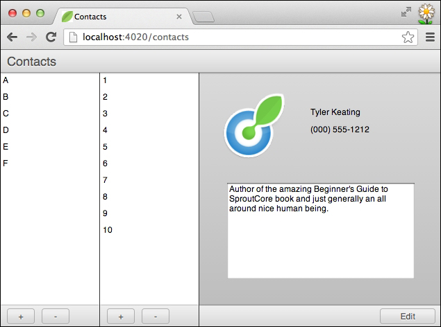
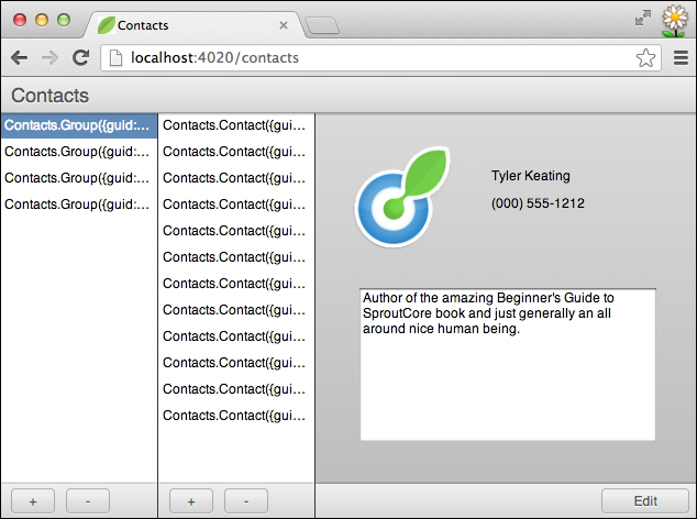
And that completes our basic user interface. Why don't you reload http://localhost:4020/contacts in your browser and have a look at what we've got. I think you'll agree that in very little time, we have made a decent looking prototype for our Contacts app as illustrated in the following screenshot:
SproutCore contains an extremely powerful Model layer made up of records, data stores, and data sources. When you use the command line generator to create a new project, the default core.js file contains a fixtures-backed data store, which is a powerful development tool.
Now it's often the case that the server API is being defined at the same time as the application is being built or it may be the case that we want to use fixed data for development and testing. In either event, we'll see how easy it is to define records and provide fixture data in SproutCore for us to work with.
From the brief description of our Contacts app we came up with earlier, we can deduce that we'll need at least two models to start with: Groups and Contacts. Each group will contain many contacts and to keep it simple, we'll allow a contact to belong to only one group.
First, let's generate the records. From within your project run the following two commands:
$ sproutcore gen model Contacts.Group
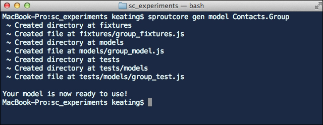
$ sproutcore gen model Contacts.Contact
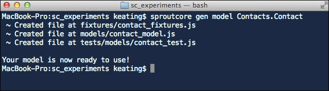
As we've come to expect, this generated a few directories and files for us according to the SproutCore convention. On the first run, it added a models directory, a tests directory with a models sub-directory and a fixtures directory.
The purpose of each directory should be fairly self-explanatory. Our model classes go in models, our unit tests go in tests and our fixture data goes in fixtures. In fact, you'll notice that the command already generated stub files in each of these places for our two new record classes: Contacts.Group and Contacts.Contact.
Now, let's open up the group_model.js file inside of the models directory and define its attributes. We know that our groups need at least one attribute, a name. You define attributes on the record, using SC.Record.attr. Add the name attribute to the Contacts.Group model as shown:
Contacts.Group = SC.Record.extend(
/** @scope Contacts.Group.prototype */ {

  name: SC.Record.attr(String)

});
We can similarly add firstName, lastName, telNumber, imageURI and description attributes to Contacts.Contact.
Contacts.Contact = SC.Record.extend(
/** @scope Contacts.Contact.prototype */ {

  firstName: SC.Record.attr(String),

  lastName: SC.Record.attr(String),

  telNumber: SC.Record.attr(String),

  imageURI: SC.Record.attr(String),

  description: SC.Record.attr(String)

});
Finally, we can add the relationship between the two. First in Contacts.Group, indicate that each group has a to-many relationship to its contacts with a contacts attribute.
// …

// Each group has many contacts.
contacts: SC.Record.toMany('Contacts.Contact', {
  inverse: 'group'
})

// …
Then add the to-one relationship in Contacts.Contact back to the group.
// …

// Each contact has one group.
group: SC.Record.toOne('Contacts.Group', {
  inverse: 'contacts'
})

// …
Next we'll add placeholder data in fixtures that we can work with. Fixtures are simply an array of objects (that is hashes) containing the raw attribute value of each record. You can create whatever data you like to use, provided it has the correct attributes. In a real project, you would tend to start with a small amount of fixture and grow and improve it as the project progresses. Here's an example of one group with two contacts:
// Groups
Contacts.Group.FIXTURES = [

  {
    guid: 'family',
    name: 'Family',
    contacts: ['tyler', 'juanjuan']
  }

];

// Contacts
Contacts.Contact.FIXTURES = [

  {
    guid: 'tyler',
    firstName: 'Tyler',
    lastName: 'Keating',
    telNumber: '0005551212',
    description: 'Me.',
    group: 'family'
  },

  {
    guid: 'juanjuan',
    firstName: 'Juanjuan',
    lastName: 'Zhao',
    telNumber: '0005552323',
    description: 'Lovely!',
    group: 'family'
  }

];
Creating fixtures is fairly straightforward, except for one thing. Did you notice that we never defined a guid attribute on our record classes? So where did that come from? It turns out that guid is the default primary key attribute for all subclasses of SC.Record. To identify records, each needs a primary key, which normally would have been set by the server. In this case we make up our own primary keys and use them as references in the contacts and group relationships.
To save your time, we've created a large set of fixtures that you can download from <link>. Simply replace the group_fixtures.js and contact_fixtures.js files in your project with those found in the downloaded directory.
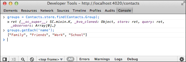
Finally, we're ready to peruse our new data. At this point we have a client side data store, Contacts.store (defined in core.js), and if you've added the fixture data, we also have several records of type Contacts.Group and Contacts.Contact.
We haven't connected it to anything, so we won't see any changes in the UI, but we can do everything we need from the browser console. Let's try a few tests.
After you reload the app and open up the browser console, please query the local store for all the groups as shown:
> groups = Contacts.store.find(Contacts.Group);
See how when we pass the record type that we want to find in the store, we are returned SC.RecordArray of all the matching records. Now we'll use one of SproutCore's enumerable helper methods to do a quick inspection of the groups as shown:
> groups.getEach('name');
Does everything look in order? You should see an array of names for all the fixture groups that you provided. If you're not seeing results similar to the following you should look for syntax errors in the console and double-check your code so far.
Next let's test the relationship between groups and contacts. In the browser's console, have a go with the following:
> group = groups.objectAt(0);
> contacts = group.get('contacts');
> contacts.getEach('firstName');
Again, this is a good time to check that our fixture data matches what we believe we had written. Because we usually create most of the fixture data manually, it's easy to make typing mistakes.
Note
SproutCore methods almost always return the caller, allowing you to chain them together. For example, the previous three calls could just as easily have been:
> groups.objectAt(0).get('contacts').getEach('firstName')
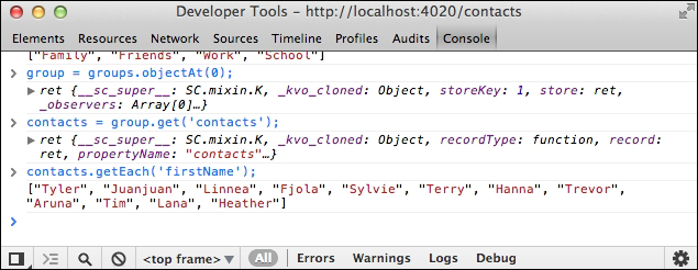
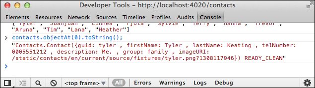
Finally, lets take a peak at one of our records, using toString():
> contacts.objectAt(0).toString();
At this point we have a functioning View layer and a functioning Model layer, but no logic tying it all together into a functioning application. This is where the Controller layer comes into play.
Although you can create advanced application state logic with SproutCore, for our app we are only concerned right now with mapping our Model layer data to our View layer views.
We'll start at the highest point in the data hierarchy, which is the collection of groups.
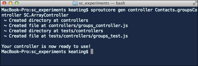
To manage the group records, we will want to use SC.ArrayController, so turning once more to sproutcore gen, use the following command to generate a groupsController singleton of type SC.ArrayController:
$ sproutcore gen controller Contacts.groupsController
SC.ArrayController
Note
The gen controller command creates singleton objects of type SC.ObjectController by default. Passing a class name as the last argument allows us to have it use SC.ArrayController in this case.
As usual, these statements generated a couple new directories for us according to the SproutCore conventions (./controllers/ and ./tests/controllers/) as well as a couple skeleton files.
Fortunately, since we have mentioned in the command what class of controller we wanted to create, this file doesn't actually need to be changed at all.
Next, we will need a controller for a single selected group, a controller for the contacts of the selected group, and a controller for a single selected contact. In this manner we will have controllers to represent our full data hierarchy.
These commands will create the other controller instances we need:
$ sproutcore gen controller Contacts.groupController
$ sproutcore gen controller Contacts.contactsController
SC.ArrayController
$ sproutcore gen controller Contacts.contactController
It's a good idea at this point to inspect each file and make sure that you've got the names all correct. I'm sure I'm not the first person that mistyped "contactController" or "contactsController".
As was mentioned earlier, the top of our data hierarchy will be managed by groupsController and therefore this is the controller whose content we will actually set directly. To do this we will set the content to the results of a query on our client side data store. If you haven't guessed it yet, the query will be the same one we first tried out in the browser's console.
Open up main.js inside your app and simply uncomment the example labeled "Step 2". It just so happens that the main.js template contains exactly the code we need. In case the main.js template changes in the future, here is what your main.js should look like for reference:
Contacts.main = function main() {

  // Step 1: Instantiate Your Views
  // The default code here will make the mainPane for your
application visible
  // on screen.  If you app gets any level of complexity, you will
probably
  // create multiple pages and panes.
  Contacts.getPath('mainPage.mainPane').append() ;

  // Step 2. Set the content property on your primary controller.
  // This will make your app come alive!
  var content = Contacts.store.find(Contacts.Group);
  Contacts.groupsController.set('content', content);

};
Now we'll use SproutCore's incredible binding support to chain our controllers together. Bindings allow changes from one object to propagate to its bound counterparts in an extremely efficient manner. We will use bindings to ensure that our other controller's contents are always in sync.
First, we want our groupController to represent the selected group in the groupsController. One of the primary functions of an array controller is to manage the selection of its items. To ensure that our groupController's content is the currently selected group in groupsController, we will simply bind groupController's content property to groupsController's selection property.
From within group_controller.js add the following binding:
Contacts.groupController = SC.ObjectController.create(
/** @scope Contacts.groupController.prototype */ {

  contentBinding: 'Contacts.groupsController.selection'

});
While we're at it, you may as well update contacts_controller.js. Its content should be the contacts array of the current group in groupController as shown in the following code:
Contacts.contactsController = SC.ArrayController.create(
/** @scope Contacts.contactsController.prototype */ {

  contentBinding: 'Contacts.groupController.contacts'

});
And contact_controller.js can be updated just like groupController was:
Contacts.contactController = SC.ObjectController.create(
/** @scope Contacts.contactController.prototype */ {

  contentBinding: 'Contacts.contactsController.selection'

});
There is one more step that we should do before we stop and review and that is to also connect our controllers to our view. Similar to how we connected our controllers to each other, we can bind our views to their relevant controllers and everything will just work.
Let's start with our two lists: one of groups and one of contacts for the selected group. Fortunately we have two controllers that fit the bill exactly and so now you should return to main_page.js and update your two list views as shown:
// … inside of groupsPanel
list: SC.ScrollView.design({
  layout: { bottom: 32 },

  contentView: SC.ListView.design({
    // The content for this list is contained in
Contacts.groupsController.
    contentBinding: 'Contacts.groupsController.arrangedObjects',

    // If the list selection changes, update the selection on the
controller.
    selectionBinding: 'Contacts.groupsController.selection'
  })
}),
// …

// … inside of contactsPanel
list: SC.ScrollView.design({
  layout: { bottom: 32 },

  contentView: SC.ListView.design({
    // The content for this list is contained in
Contacts.contactsController.
    contentBinding: 'Contacts.contactsController.arrangedObjects',

    // If the list selection changes, update the selection on the
controller.
    selectionBinding: 'Contacts.contactsController.selection'
  })
}),
Alright, this seems like a great time to head back to the browser and have a look. What you should see is that our first list is now populated with strange looking references to Contacts.Group. These are actually the result of calling toString() on each group record and although it may not look like it yet, this is exactly what we want. If you select one of the items from the groups list, you'll see the contacts list update with a similar list of references to Contacts.Contact.
The reason that the list items aren't properly formatted is because we haven't specified what property of our record should be used as the list item's display value. SC.ListItemView, the default view used by SC.ListView, will use the property named in contentValueKey as its value to display.
Since our group records have a name property already, we'll simply use that in our list of groups as shown in the following code:
// … inside of groupsPanel
contentView: SC.ListView.design({
  // Display the name of each group in the list.
  contentValueKey: 'name',

  // The content for this list is contained in
Contacts.groupsController.
  contentBinding: 'Contacts.groupsController.arrangedObjects',

  // If the list selection changes, update the selection on the controller.
  selectionBinding: 'Contacts.groupsController.selection'
})
But as often is the case, we don't have a direct property to use for display from our other record. For contacts, we really want to use a full name, but the record has two properties: firstName and lastName that make up the full name. It turns out that SproutCore already has an elegant solution to this type of problem, called computed properties.
We can add a new property fullName and make it computed from firstName and lastName. Inside of contact_model.js, add the following property as shown in the following code:
fullName: function () {
  var firstName = this.get('firstName'),
  lastName = this.get('lastName');

  return [firstName, lastName].compact().join(' ');
}.property()
Now we can set the proper contentValueKey for our other list to be the fullName property of our content as shown in the following code:
// … inside of contactsPanel
contentView: SC.ListView.design({
  // Display the full name of each contact in the list.
  contentValueKey: 'fullName',

  // The content for this list is contained in Contacts.contactsController.
  contentBinding: 'Contacts.contactsController.arrangedObjects',

  // If the list selection changes, update the selection on the controller.
  selectionBinding: 'Contacts.contactsController.selection'
})
Presto! We now have nice looking lists and all that's left is to bind up our detail panel views to the contact controller.
Simply replace the placeholder values in the views with value bindings to Contacts.contactController instead as shown in the following code:
// … inside of detailPanel
image: SC.ImageView.design({
  layout: { left: 20, top: 20, height: 120, width: 120 },
  scale: SC.BEST_FIT,
  valueBinding: 'Contacts.contactController.imageURI'
}),

fullName: SC.LabelView.design({
  layout: { left: 160, top: 50, height: 25, width: 150 },
  valueBinding: 'Contacts.contactController.fullName'
}),

telNumber: SC.LabelView.design({
  layout: { left: 160, top: 75, height: 25, width: 100 },
  valueBinding: 'Contacts.contactController.telNumber'
}),

description: SC.TextFieldView.design({
  isEditable: false,
  isTextArea: true,
  layout: { left: 20, top: 160, bottom: 52, right: 20 },
  valueBinding: 'Contacts.contactController.description'
}),
And with that, we've connected all of our data to our view. All that's left now is to allow the user to modify the data, which brings us to our last task.
Our application is looking really good, but there's no way yet for the user to modify the data. We'll rectify this situation now.
Starting at the top of our data tree again, we want to add the ability to add a new group. Let's enable the + button in the groups column. Open up main_page.js and add the following:
addButton: SC.ButtonView.design({
  action: 'addGroup',
  layout: { centerY: 0, left: 10, width: 40, height: 24 },
  target: Contacts,
  title: '+'
}),
This indicates that the action, addGroup should be run on the target, Contacts (that is our application instance).
Note
Later we'll use SC.Statechart to better organize our application logic, but for now since Contacts is our highest level of application "state", I think it's a good place to put the addGroup function.
To implement addGroup, add the following to core.js:
// …
addGroup: function (sender) {
  var dataHash,
    tempGuid;

  // Define data for a new group.
  dataHash = {
    name: 'New Group',
    contacts: []
  };

  // Give our record a temporary unique guid.  If we committed the
record back to the
  // server, the server would generate its own primary key which
would replace this.
  tempGuid = SC.guidFor(dataHash);

  // Simply create the record in the store and our
groupsController content will update
  // automatically.
  Contacts.store.createRecord(Contacts.Group, dataHash, tempGuid);
},
// …
That's all there is to it. Each time the groups add button is clicked a new Contacts.Group will be created in the store. Go ahead and try it in the browser if you like. Notice that we don't have to modify the groups list or groups controller code at all to have our user interface update automatically. Isn't that spectacular?
We can implement the addcontact action in a similar manner. Starting in main_page.js, add the action and target to the button as shown in the following code:
addButton: SC.ButtonView.design({
  action: 'addContact',
  layout: { centerY: 0, left: 10, width: 40, height: 24 },
  target: Contacts.groupController,
  title: '+'
}),
With groups, the application instance was one level higher than the array of groups. For contacts, groupController is one level higher than the array of contacts and is a suitable place for the addContact action.
Then we implement the action in group_controller.js:
// …
addContact: function (sender) {
  var contacts,
    content = this.get('content'),
    group,
    dataHash,
    newContact,
    tempGuid;

  // Content is a 'selection'. Only add a contact if that
selection is a single group.
  if (content && content.get('length') === 1) {
    // There is only one group selected, get it.
    group = content.get('firstObject');

    // Define data for a new contact.
    dataHash = {
      firstName: 'New',
      lastName: 'Person',
      group: group.get('id')
    };

    // Give our record a unique guid.  If we committed the record
back to the
    // server, the server would generate its own primary key which
we would
    // replace this with.
    tempGuid = SC.guidFor(dataHash);

    // Simply create the record in the store and our
groupsController content will
    // update automatically.
    newContact = Contacts.store.createRecord(Contacts.Contact,
dataHash, tempGuid);

    // Add the newContact to the group's contacts array.
    contacts = group.get('contacts');
    contacts.pushObject(newContact);
  }
}
Adding a contact is a bit more complex, because we can only add a contact if a single group is selected and we need to update the group's list of contacts at the same time. Once you've tried that out, let's implement our remove actions.
Add actions and targets to the buttons in main_page.js as shown in the following code:
// … inside of groupsPanel
removeButton: SC.ButtonView.design({
  action: 'removeGroup',
  layout: { centerY: 0, left: 60, width: 40, height: 24 },
  target: Contacts.groupsController,
  title: '-'
})
// … inside of contactsPanel
removeButton: SC.ButtonView.design({
  action: 'removeContact',
  layout: { centerY: 0, left: 60, width: 40, height: 24 },
  target: Contacts.contactsController,
  title: '-'
})
Notice that we're using different controllers for the targets of these actions. This will make more sense once we've implemented the action methods.
First in groups_controller.js:
// …
removeGroup: function (sender) {
  var selection = this.get('selection');

  // Iterate through the selected groups.
  selection.forEach(function (group) {
    // Destroy each group.
    group.destroy();
  });
}
and in contacts_controller.js:
// …
removeContact: function (sender) {
  var content = this.get('content'),
    selection = this.get('selection');

  // Iterate through the selected contacts.
  selection.forEach(function (contact) {
    // Remove the contact from the group's contacts (i.e. our content).
    content.removeObject(contact);

    // Destroy each contact.
    contact.destroy();
  });
}
Hopefully the target of these actions makes more sense now. We chose these controllers because the scope of "removing" depends on the selection that these controllers manage.
Lastly, we want the user to be able to edit the records. SC.ListView allows us to edit its displayed property values directly, so we can use it to edit the group names. Simply add canEditContent: true to the groups list definition. For example:
// … inside of groupsPanel
contentView: SC.ListView.design({
  // Allow the group name to be modified within the list.
  canEditContent: true,
})
  // …
Editing a full contact is a bit more difficult. There are multiple fields to edit and we want to support committing and canceling the edit as well as uploading images. For now, I hope that you've seen enough of what you can achieve so quickly in SproutCore and that your appetite has been wetted to delve deeper as we look at SproutCore in greater detail in the later chapters.