
Creating mobile friendly themes will help the gallery switch seamlessly between different devices, landscape and portrait mode, and other device screen sizes. Responsive web design is a very powerful technique to style websites for various screen sizes. It allows you to provide CSS rules that are only applied when certain media queries match. Use this recipe to modify settings for Galleria to utilize responsive web techniques.
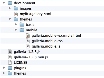
Before we start working on the code, we'll need to copy the basic gallery example code from the previous example and rename the folder and files to be prefixed with mobile. After this is done, our folder and file structure should look like the following screenshot:
We'll start off with our
galleria.mobile.jstheme JavaScript file:(function($) { Galleria.addTheme({ name: 'mobile', author: 'Galleria How-to', css: 'galleria.mobile.css', defaults: { transition: 'fade', swipe: true, responsive: true }, init: function(options) { } }); }(jQuery));The only difference here from our basic theme example is that we've enabled the
swipeparameter for navigating images and theresponsiveparameter so we can use different styles for different device sizes.Then, we'll provide the additional CSS file using media queries to match only smartphones. Add the following rules in the already present code in the
galleria.mobile.cssfile:/* for smartphones */ @media only screen and (max-width : 480px){ .galleria-stage, .galleria-thumbnails-container, .galleria-thumbnails-container, .galleria-image-nav, .galleria-info { width: 320px; } #galleria{ height: 300px; } .galleria-stage { max-height: 410px; } }Here, we're targeting any device size with a width less than 480 pixels. This should match smartphones in landscape and portrait mode. These styles will override the default styles when the width of the browser is less than 480 pixels.
Then, we wire it up just like the previous theme example. Modify the
galleria.mobile-example.htmlfile to include the following code snippet for bootstrapping the gallery:<script> $(document).ready(function(){ Galleria.loadTheme('galleria.mobile.js'); Galleria.run('#galleria'); }); </script>
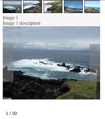
We should now have a gallery that scales well for smaller device sizes, as shown in the following screenshot:
The responsive option tells Galleria to actively detect screen size changes and to redraw the gallery when they are detected.
Then, our responsive CSS rules style the gallery differently for different device sizes. You can also provide additional rules so the gallery is styled differently when in portrait versus landscape mode. Galleria will detect when the device screen orientation has changed and apply the new styles accordingly.
A very good list of media queries that can be used to target different devices for responsive web design is available at http://css-tricks.com/snippets/css/media-queries-for-standard-devices/.
The easiest way to test the mobile theme is to simply resize the browser window to the size of the mobile device. This simulates the mobile device screen size and allows the use of standard web development tools that modern browsers provide.
In order for this to work effectively with existing websites, the existing styles will also have to play nicely with mobile devices. This means that an existing site, if trying to integrate a mobile gallery, will also need to have its own styles scale correctly to mobile devices. If this is not the case and the mobile devices switch to zoom-like navigation mode for the site, the mobile gallery styles won't ever kick in.