
Now that we already know how to run a responsive layout, let's dive into this challenging field and use some CSS3 properties to give a better design and look to our table.
First add the following lines at the bottom of the HTML page:
<!-- JavaScript at the bottom for fast page loading with just one js file -->
  <script src="http://ajax.googleapis.com/ajax/libs/jquery/1.8.3/jquery.min.js"></script>
  <script src="https://raw.github.com/scottjehl/Respond/master/respond.min.js"></script>
Open the example file, Chapter03_Codes_1. We need to apply our CSS to make a responsive table as follows:
Add a round corner to our
containerclass withborder-radiusand usemax-widthto increase thecontainerwidth to800px.Use the browser vendor prefix (
-mozand-webkit) to make some browsers understand gradient CSS property.Add another new feature from CSS3,
box-shadow.Use pseudo-classes
nth-child(odd)andnth-child(even)to "zebra" the table rows as follows:.container { max-width: 800px; margin: 0 auto; font-family: 'Crimison Text', Arial, sans-serif; padding: 0.5em 1em 1em 1em; border-radius: 10px; background-color: #808080; background: -webkit-gradient(linear, left top, left bottom, from(#333), to(#ccc)); background: -moz-linear-gradient(top, #606060, #808080); -moz-box-shadow: 5px 5px 10px rgba(0,0,0,0.3); -webkit-box-shadow: 5px 5px 10px rgba(0,0,0,0.3); box-shadow: 5px 5px 10px rgba(0,0,0,0.3); } h1 {color:#fff; font-size:1.5em; text-align: center;} table.tableCss3 { width: 100%; border-collapse:collapse; text-align:left; color: #000000; } table.tableCss3 thead tr td { background-color: White; vertical-align:middle; padding: 0.6em; font-size:0.8em; } table.tableCss3 thead tr th { padding: 0.5em; /* add gradient */ background-color: #bdbdbd; background: -webkit-gradient(linear, left top, left bottom, from(#d6d6d6), to(#bdbdbd)); background: -moz-linear-gradient(top, #d6d6d6, #bdbdbd); color: #000000; } table.tableCss3 tbody tr:nth-child(odd) { background-color: #fafafa; } table.tableCss3 tbody tr:nth-child(odd):hover { cursor:pointer; /* add gradient */ background-color: #fafafa; background: -webkit-gradient(linear, left top, left bottom, from(#fafafa), to(#e0e0e0)); background: -moz-linear-gradient(top, #fafafa, #e0e0e0); color: #333; } table.tableCss3 tbody tr:nth-child(even) { background-color: #efefef; } table.tableCss3 tbody tr:nth-child(even):hover { cursor:pointer; /* add gradient */ background-color: #808080; background: -webkit-gradient(linear, left top, left bottom, from(#e0e0e0), to(#f1f1f1)); background: -moz-linear-gradient(top, #ebebeb, #f7f7f7); color: #333; } table.tableCss3 tbody tr:last-child { border-bottom: solid 1px #838383; } table.tableCss3 td { vertical-align:middle; padding: 0.5em; } table.tableCss3 tfoot{ text-align:center; color:#303030; text-shadow: 0 1px 1px rgba(255,255,255,0.3); }We set
max-widthof thecontainerto800pxandwidthof the table to100%to adjust the table width to all screen size. The800pxfrom div container is only for the example here but can be of any size.After incorporating these minimal changes, our table is shown throughout our browser.
We add a
.tableCss3class just to illustrate the new CSS3 selectors and pseudo-classes.
The preceding screenshot is of the browser at 1024 px – 768 px.
And when we resize the browser window, our table adjusts to fit their new size:

The preceding screenshot is of the browser at 320px – 480px.
So far so good, but how can we improve this result with more columns?
We can filter the data columns that are less important to the user. But remember you should always allow your user tp to choose what is most important to him, so be flexible.
Find more information about CSS3 selector here: http://www.w3.org/TR/selectors/#selectors
Browser prefix is a technique used in the stylesheets to warn browsers that have not yet implemented certain property that it is being used through a prefix placed before the property.
For example, -ms for Internet Explorer, -webkit for Safari and Chrome, and so on.
You will find a complete reference guide of prefixes and properties at http://www.w3schools.com/cssref/css3_browsersupport.asp.
In the following example, we will see how to apply a filter and select some columns to be displayed in smaller devices, and gradually show all columns in larger devices.
We'll use the example code, Chapter03_Codes_2.
Hands on and add the following tag to the bottom of our file:
<script src="https://raw.github.com/thepeg/MediaTable/master/jquery.mediaTable.js">
</script>
Also, add the following script tag just after the preceding line of code:
<script>
  $(document).ready(function(){
    $('.mediaTable').mediaTable();
  });
</script>
Now add the following script to the head of our page, just after the <style> tag:
<link rel="stylesheet" type="text/css" media="all" href="mediatable.css" />
Here is a short description of the code, it's a jQuery plugin that helps us with the table filters. We apply them to our columns, so this way we can give options to our users to filter the content themselves.
We can choose a solution using only pure JavaScript or even write a new jQuery plugin, but it is not necessary to reinvent the wheel.
Note
JavaScript is the fastest growing language today. We have an infinity of snippets and plugins available to us everyday, and a very active community.
We recommend that you do a little search on github at https://github.com and explore the endless existing codes on it.
Here's a very simple piece of code, we will add some classes to our markup just to prefilter some options and we will set some columns as optional and others as essential:
      <tr>
    <th scope="col" class="essential persist">BAND</th>
    <th scope="col" class="essential">ALBUM</th>
    <th scope="col" class="essential">CLASSIC</th>
    <th scope="col" class="essential">YEAR</th>
    <th scope="col" class="optional">SALES 1981</th>
    <th scope="col" class="optional">SALES 1982</th>
    <th scope="col" class="optional">SALES 1983</th>
    <th scope="col" class="optional">SALES 1984</th>
    </tr>
Now on resizing, we see the three essential columns and a link on top-right corner:
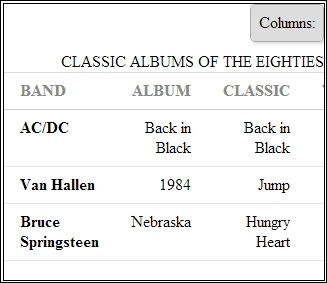
The preceding screenshot is of the browser at 320px.
When we press the link, we can see the filter, as shown in the following screenshot:
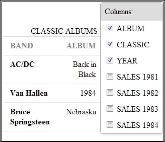
Browser screenshot at 320 px, now with the filter.
Note that we are not taking into account the height of the table, we are only considering the width. We will have the scroll bar down later and it does not affect the way in which we provide the data.
After append mediatable.css, we introduce the breakpoints from our media queries. Breakpoints means that we can set a new size with a expression like this:
@media screen and (min-width: 768px) {...your code here}This means that the style between the brackets will be interpreted by the browser if the screen resolution is less than 768px. And the same will apply to any other resolution when we define our size in the min or max width.