
SCSS is a syntax variation of a CSS preprocessor named Sass. The Sass original syntax uses indentation formatting that makes the codes look neat. SCSS, on the other hand, uses curly braces and semicolons just like regular CSS. The similarity helps everyone to quickly grasp the syntax, in particular those who are new to Sass.
This might sound challenging. And if you like a challenge, we can just get started right away.
This chapter will revolve around the following topics:
- Exploring Sass features and learning the syntax
- Looking into Bourbon, a Sass mixins library
- Organizing the style sheet structure and using the Import directive to include partial style sheets
- Setting up Koala to compile SCSS into CSS
- Customizing Foundation's default styles through variables
- Composing the website custom styles
- Optimizing the website layout for various viewport sizes
- Turning the website live by compiling the JavaScripts
Sass (http://sass-lang.com/) is a CSS preprocessor created by Hampton Catlin, Natalie Weizenbaum, and Chris Eppstein, which is the same team that also created Haml (http://haml.info/). Foundation, as mentioned at the beginning of this chapter, uses Sass to generate its CSS, and so will we. So, before we get our hands dirty, first we will delve into several Sass features, such as nesting, variables, mixins, functions, and others, that will allow us to write style rules more efficiently.
Sass allows us to nest style rules into one another. This feature eventually allows us to write style rules that resemble the HTML structure of the web page. That way, the style rules can be more concise and more easy to scan through. Say, we added the header markup of our website, as follows:
With Sass, we can construct the style rules, as follows:
Consider it before nesting style rules. The main objective of this feature is to make the style rules look simpler, more concise, easier to scan through, and not to make it unnecessarily look more complex.
A variable is one useful piece in programming language that allows us to define a value once within a specified name. Each language has a slightly different way to declare a variable. For example, JavaScript uses the keyword var, LESS uses @, and Sass in this case uses the $ sign.
When compiled to regular CSS, these variables are replaced with the defined value, as follows:
We can use a variable to store a number or a length:
We can use a variable to inherit the value of another variable:
We can use a variable to define the output of a function:
There are certain circumstances when a variable is not applicable, such as when it is inserted within a string (plain text), as follows:
There are a few cases where we have to use interpolation to declare a variable. Variable interpolation happens to other programming languages, such as PHP, Ruby, and Swift. But I'm not going into the details of the technicalities of its workings, as I don't exactly know either. Simply put, interpolation allows us to embed a variable in a situation where it does not allow the variable to work—especially where it is a string that is actually expected.
And the result will be as follows:
Note
Follow Hugo Giraudel posts (https://webdesign.tutsplus.com/tutorials/all-you-ever-need-to-know-about-sass-interpolation--cms-21375) for further assistance about variable interpolation in Sass.
Now, we are going to look into Sass mixins. If you followed and accomplished the second project, you should know about LESS mixins. Mixins, both in Sass and LESS, have similar purposes; they allow developers to reuse code blocks and style rules within the entire style sheet and thus comply with the DRY principle (http://programmer.97things.oreilly.com/wiki/index.php/Don't_Repeat_Yourself). However, it is slightly different in terms of how we declare and reuse the mixins. This is how we declare a mixin in LESS:
.buttons {
  color: @link-color;
  font-weight: normal;
  border-radius: 0;
}
In Sass, we use the @mixins directive to create a mixin, for example:
$linkColor: $tertiary;
@mixin buttons {
  color: $linkColor;
  font-weight: normal;
  border-radius: 0;
}
Sass uses the @include directive to reuse the preceding code block within style rules. Given the preceding example, we can write:
.button {
   @include buttons;
}
The following is the output when the preceding example is compiled to CSS:
.button {
  color: #2ecc71;
  font-weight: normal;
  border-radius: 0;
}
That is a basic example of the application of Sass mixins.
Some CSS3 syntaxes are so complex that writing them can be really tedious work. And this is where mixins can be particularly useful. Fortunately, with Sass being so popular and supported by so many generous developers, we don't have to port all CSS3 syntax into Sass mixins on our own. Instead, we can simply employ Sass's mixin library that makes our work as a web developer more enjoyable.
The Sass library comes with a collection of useful mixins and functions (we will talk about functions shortly) that we can use right away out-of-the-box. There are dozens of popular libraries available, and one that we are going to use herein is called Bourbon (http://bourbon.io/).
Bourbon compiles a number of mixins in a library that simplifies the way we declare CSS3 syntax, including syntax that is still marked as experimental, such as image-rendering, filter, and the CSS3 calc function. Now, which do you think is easier and faster to write when it comes to specifying the Hi-DPI Media Query?
- High DPI Images for Variable Pixel Densities by Boris Smus (http://www.html5rocks.com/en/mobile/high-dpi/).
- Towards A Retina Web by Reda Lemeden (http://www.smashingmagazine.com/2012/08/20/towards-retina-web/).
Is the following standard syntax?
@media only screen and (-webkit-min-device-pixel-ratio: 2),
only screen and (min--moz-device-pixel-ratio: 2),
only screen and (-o-min-device-pixel-ratio: 2 / 1),
only screen and (min-resolution: 192dpi),
only screen and (min-resolution: 2dppx) {
  width: 500px;
}
Or, will it be the following one with the Bourbon mixin?:
@include hidpi(2) {
  width: 500px;
}
Without spending years researching, we can commonly agree that using the mixin should be a lot easier to write, as well as easier to remember.
Note
As mentioned, in addition to CSS3 mixins, Bourbon also ships with a couple of Sass functions, such as Triangle, which allows us to create CSS-based triangles. However, I'm not going to mention all the bits that are there in the Bourbon library. Since the library collection will most likely be updated or revised along with the introduction of new CSS specifications, it is better to refer to the list on the official documentation page (http://bourbon.io/docs/).
A function is one piece of a feature that makes creating style rules more dynamic. A function in Sass is declared using the @function directive, which is then followed by the function name, a parameter with preferably its default value. In its simplest form, a Sass function may look as follows:
This function, however, won't output anything yet. To generate a result of this function, we need to add a @return value. Given the preceding example, we want to output the default value parameter, which says "hello". To do so, we write the @return value, which is then followed by $parameter, as follows:
Use this function within a selector, as follows:
Compile it, and you get the following output:
Customize the output by specifying a new value out of the default one, as follows:
We will get a new output, as shown in the following code:
Note
This example merely shows the basic functionality of a function. There are a lot more examples on how we can utilize it in real cases to build reusable code series. So, I recommend you head over to the following references for further advanced discussion and find more examples.
Using pure Sass functions to make reusable logic more useful (http://thesassway.com/advanced/pure-sass-functions).
A couple of Sass functions (http://hugogiraudel.com/2013/08/12/sass-functions/).
One thing that I love about using CSS preprocessors such as Sass, is how easy it is to determine and alter colors. Sass, in this case, provides a bunch of built-in functions to manipulate colors seamlessly. The following is a list of a few Sass color functions for your reference, which may be useful to manipulate colors in the website later on:
|
Functions |
Description |
Example |
|---|---|---|
|
|
Turns a color lighter by the specified amount. |
In this example, we lighten |
|
|
Turns a color darker than the specified amount. |
In this example, we darken |
|
|
Turns the color to be more transparent than the specified amount. |
|
Note
Please follow the Sass official documentation (http://sass-lang.com/documentation/Sass/Script/Functions.html) to find out the full list of the color functions available.
The Foundation framework comes with an array of its own functions. Foundation uses these functions to build its own default styles, and we can also use them to build our own. One such useful function therein is rem-calc(), which allows us to calculate the rem unit with less hassle.
The rem unit is a relative value that inherited concepts similar to em. Here is what Ian Yates expounded about the origin of em in his post (https://webdesign.tutsplus.com/articles/taking-the-erm-out-of-ems--webdesign-12321):
But the problem with the em unit, as Jonathan Snook described in his post (http://snook.ca/archives/html_and_css/font-size-with-rem), is its compounding nature. Since the size is relative to its closest parent, in my experience the size output can be unpredictably frustrating at best; the size will be varying depending on where it is specified. Examine the following example:
body {
    font-size:16px;
}
div {
    font-size: 1.2em; /* 19px */
}
ul {
    font-size: 1em; /* 19px */
}
ul li {
    font-size: 1.2em; /* 23px */
}
This is where the rem unit comes in. The rem unit measures the calculation directly against the font size of <html>, the root element of an HTML document—thus, it is also dubbed as root em. Regardless of where the unit is specified, the result will be precise, consistent, and more importantly, easy to figure out (it's like the px unit, but it's relative).
The rem-calc function accepts both integer and length. Hence, the following code examples work:
There is a lot more about Sass than we are able to cover In this module, such as placeholder, conditional statement, and operators, just to name a few. Thankfully, there are enough good references and books that have covered Sass, as well as its supporting utilities in greater depth, into which you can dig into on your own. The following are some of my best recommendations:
- Sass and Compass for Designers, Ben Frain, Packt Publishing (https://www.packtpub.com/web-development/sass-and-compass-designers)
- Sass for Web Designers, Dan Cederholm, A Book Apart (http://www.abookapart.com/products/sass-for-web-designers)
- The Sass Way—tutorials and tips on using Sass (http://thesassway.com/)
- A dedicated category on web design tutorials and for covering anything related to Sass (https://webdesign.tutsplus.com/categories/sass)
Before we resume the work, let's end this section with a couple of quizzes, shall we?
In Chapter 7, A Responsive Website for Business with Foundation, we installed Foundation and Foundation Icons, along with their dependencies (jQuery, Fastclick, Modernizr, and so on) through Bower (http://bower.io/). We also prepared the website assets, namely, the images, image icons, and the website logo. In the last section of the chapter, we created index.html for the website home page, and we also constructed the markup using a couple of new HTML5 tags. So, the files and folders that are currently in the working directory are shown in the following screenshot:

Files that are still missing from our working directories are the style sheets to compose our customized styles for the website, and the Bourbon library that we briefly mentioned in the preceding section to provide us with some ready-to-use mixins and functions. This is what we are going to do in this section. We are going to create style sheets and organize them in a way to make them easily maintainable in the future.
Perform the following steps right to the end to properly organize the style sheets and compile them into CSS.
- We need to install Bourbon. Launch a terminal or the command prompt, and type the following command:
bower install bourbon --saveThis command installs the Bourbon package through the Bower registry and registers it within the
bower.jsonfile of the project. - Create new style sheets named
main.scss,responsive.scss, andstyles.scssin thescssfolder. - The
_main.scssstyle sheet is the one where we will put all our own style rules. We will use the_responsive.scssfile to exclusively put in the media queries of the website. And thestyles.scssfile is where we will compile those style sheets together. - Still within the
scssfolder, create two more style sheets. This time, name them_config.scssandfoundation.scss. - The
_config.scsswill contain a copy of all the variables used in Foundation, whilefoundation.scsswill contain imported partials of Foundation style sheets. These copies will prevent us from directly modifying the original files, which will eventually be overridden when we update to the newest version. - Next, copy the whole content of the Foundation
_settings.scssfile to the_config.scssfile that we recently created. In our case, the_settings.scssfile is located in the/components/foundation/scss/foundation/directory. - Also, copy the whole content of Foundation's own
foundation.scssand paste it to our ownfoundation.scssthat we also recently created. - Then, we need to correct the path of the imported partials in our
foundation.scssfile. At this stage, all paths are pointing to thefoundationfolder, as follows:@import "foundation/components/grid"; @import "foundation/components/accordion"; @import "foundation/components/alert-boxes"; ... /* other imports */
This certainly is incorrect because we don't have a folder named
foundationin thescssfolder. Herein, we need to direct the path to thecomponentsfolder instead, where the partials actually reside. So, change the path to be as follows:@import "../../components/foundation/scss/foundation/components/grid"; @import "../../components/foundation/scss/foundation/components/accordion"; @import "../../components/foundation/scss/foundation/components/alert-boxes"; ... /* other imports */
- Another path that we have to correct is the path referring to the Foundation,
_functions.scss, which contains therem-calc()function. Open the_config.scssfile, and change the line@import "foundation/functions";to@import "../../components/foundation/scss/foundation/functions";. - We are going to compile these style sheets into CSS using Koala. Launch Koala and add the working directory:

- Within the style list in Koala, you won't find the SCSS style sheets with the underscore prefix. Koala, by default, ignores this file since it eventually won't be compiled into CSS.
- However, you should find the two primary style sheets of the project listed therein, namely,
styles.scssandfoundation.scss. Be sure that this output is set to thecssfolder, as shown in the following screenshot:
- Then, make sure that the option of
Auto Compileis checked so that they will be automatically compiled into CSS, as we've made changes. Also, check theSource Mapoption to make debugging the style sheet easier. Have a look at the following screenshot:
- Click the Compile button of
styles.scssandfoundation.scssto compile them into CSS. - Open
index.htmland link both the compiled CSSs within the<head>tag, as follows:<link rel="stylesheet" href="assets/css/foundation.css"> <link rel="stylesheet" href="assets/css/styles.css">
index.html. Hence, as you can see in the following screenshot, the website is now starting to take place—with the Foundation default styles:
With the style sheets organized and compiled, now comes the time to customize the website's styles. As it happens, we don't have to write every bit of the style rules on our own. In this case, since we are using a framework (Foundation), sometimes customizing the website styles can be as easy as changing the default value in a variable.
Styling the website will involve multiple style sheets. Hence, follow the following steps carefully:
- Import the following style sheets in
foundation.scss:@import "config"; @import "../../components/foundation/scss/normalize"; @import "../../components/foundation-icons/foundation_icons_social/sass/social_foundicons.scss"; ... /* other partials */
That way, the variables, as well as the changes within
_config.scss, will affect other component style sheets through Foundation. Thenormalizevariable will standardize basic element styles,social_foundicons.scss; as you can guess, this allows us to apply Foundation's social icons. - Open
styles.scssand import Bourbon,_config.scss,main.scss, andresponsive.scss, as follows:@import "../../components/bourbon/dist/bourbon"; @import "config"; @import "main"; @import "responsive";
- Then, I want to apply a custom font from Google Font simply because the custom fonts look better than the average font system, such as Arial or Times. Herein, I picked a font named Varela Round (https://www.google.com/fonts/specimen/Varela+Round).
- Open
index.html, and add the font style sheet within the<head>tag, as follows:<link rel='stylesheet' href='http://fonts.googleapis.com/css?family=Varela+Round' type='text/css'>
- Now, we will change the
font-familystack, which is currently specified as the Foundation default font, to use Varela Round. - To do so, open
_config.scss, uncomment the variable named$body-font-family, and insert"Varela Round", as follows:$body-font-family: "Varela Round", "Helvetica Neue", "Helvetica", Helvetica, Arial, sans-serif;
- We will style each of the website sections. To begin with, we will focus on the website header, and then, subsequently down to the footer. Let's start off by adding an image background. Open
_main.scssand then add the following lines:.startup-header { background: url('../img/banner.jpg') no-repeat center center fixed; background-size: cover; }Note
Background size is a special CSS3 property that controls the background stretch. The value of the cover that we used in the preceding snippets will proportionally stretch the background image to entirely cover the container. Head to the following references for further assistance on the CSS3 Background Size:
- CSS Backgrounds and Borders Module Level 3 (http://www.w3.org/TR/css3-background/#the-background-size)
- Perfect Full Page Background Image by Chris Coyier (http://css-tricks.com/perfect-full-page-background-image/)
- Can I Use CSS3 Background Size? (http://caniuse.com/#feat=background-img-opts)
The image, however, is currently hidden at the back of the background color that applies to the top bar and a section in which Foundation named it Panel (http://foundation.zurb.com/docs/components/panels.html), as shown in the following screenshot:

- Remove these background colors so that we can see through the background image. To do so, open the
_config.scssfile and uncomment the following lines:$topbar-bg-color: #333; $topbar-bg: $topbar-bg-color;
Change the value of the
$topbar-bg-colorvariable from#333totransparent$topbar-bg: transparent;
- Uncomment this following line, which specifies the panel's background color:
$panel-bg: scale-color($white, $lightness: -5%);
Then, change the value to
transparentas well:$panel-bg: transparent;
Now, we can see the background image, which is shown in the following screenshot:

- From the preceding screenshot, it is evident that the top bar and the panel background color have been removed, but some of the menu items still have it.
- Let's remove these background colors. In
_config.scss, uncomment the following line:$topbar-dropdown-bg: #333;
And change the value to use the value of the
$topbar-bgvariable, as follows:$topbar-dropdown-bg: $topbar-bg;
- Save it and let a few seconds pass for the files to be compiled, and you should see now that the background color of those menu items are removed, as shown in the following screenshot:

- Add
padding-topto give more distance between the top bar and the upper boundary of the browser viewport:.startup-header { ... .startup-top-bar { padding-top: rem-calc(30); } }And now, as you can see, there is more breadth therein:

The left-half of the image is before we add the padding-top, and the right-half definitely is after we add the padding-top.
- Give more padding at the top and bottom of the panel section; hence, we can view more of the background image. Nest the style rules under the
.startup-header, as follows:.startup-header { ... .startup-hero { padding-top: rem-calc(150px); padding-bottom: rem-calc(150px); } } - Add the logo image, as follows:
.startup-name {
  max-width: 60px;
  a {
    text-indent: 100%;
    white-space: nowrap;
    overflow: hidden;
    background: url('../img/logo.svg') no-repeat center left;
    background-size: auto 90%;
    opacity: 0.9;
  }
}
Now we have the logo added, as follows:

- Hover over the menu links in the top bar, and you will find it with a dark background color, as follows:

This background color is not quite right when it comes to the website's aesthetic as a whole, so let's remove that. In
_config.scss, uncomment the following lines:$topbar-link-bg-hover: #272727;
Then, change the value to transparent by inheriting the value of the
$topbar-bgvariable, as follows:$topbar-link-bg-hover: $topbar-bg;
- Turn the menu links to uppercase so that it looks slightly bigger. Set the variable named
$topbar-link-text-transformin_config.scssfrom none touppercase:$topbar-link-text-transform: uppercase;
- The next thing we will do is change the styles of the two buttons:
LoginandSign Up. We will make it just a little bit more fashionable, and the following are all the new styles for these buttons; nest these lines under the.startup-header:.startup-header { ... .startup-top-bar { padding-top: rem-calc(30); ul { $color: fade-out(#fff, 0.8); $color-hover: fade-out(#fff, 0.5); background-color: transparent; .button { @include transition (border 300ms ease-out, background-color 300ms ease-out); } .log-in { padding-right: 0; > .button { background-color: transparent; border: 2px solid $color; color: #fff; &:hover { background-color: transparent; border: 2px solid $color-hover; color: #fff; } } } .sign-up { > .button { background-color: $color; border: 2px solid transparent; color: #fff; &:hover { background-color: $color-hover; border: 2px solid transparent; } } } } } }Now, the buttons should look as shown in the following screenshot. Hover over the button, and you will see nice little transition effects that we added through the
transition()mixin of Bourbon:
However, it's worth noticing that I consider this merely as decoration. It's up to you to customize the button styles.
- With buttons on a transparent background, let's make three menu link items on the left-hand side, namely, PRICES, PRICING, and BLOG, slightly transparent as well. To do so, uncomment and change the variable named
$topbar-link-colorin_config.scsstofade-out(#fff, 0.3), as follows:$topbar-link-color: fade-out(#fff, 0.3);
- Then, let's give the links a transition effect. Add the following lines in
_main.scss:.startup-header { ... .startup-top-bar { ... a { @include transition(color 300ms ease-out); } } } - Next, we will add a dark transparent layer on the header. By adding this dark layer, the text in the header can be more distinct over the background image.
Add the following lines in
_main.scss:.startup-header { ... .startup-top-bar, .startup-hero { background-color: fade-out(#000, 0.5); } } - Add the following lines as our last touch for the header section:
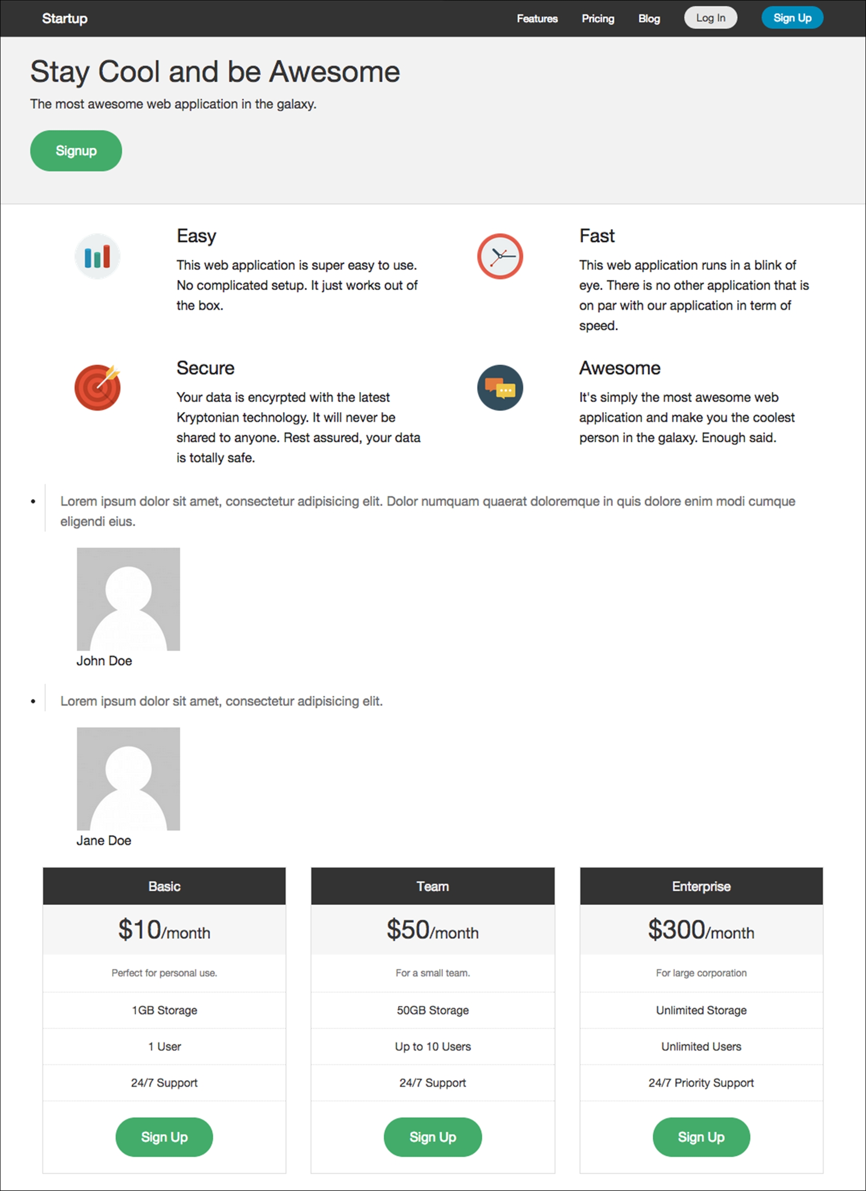
.startup-header {
...
  .startup-hero {
    padding-top: rem-calc(150px);
    padding-bottom: rem-calc(150px);
    .hero-lead {
      color: darken(#fff, 30%);
    }
  }
...
}
Now, we have a nice header for the website, as you can see in the following screenshot:

- With the website styled, we will move to the next section. Below the header, we have the feature section that contains a number of key features of our products and services. And these are all the styles for the feature section:
...
.startup-features {
  padding: rem-calc(90 0);
  figure {
    margin: 0;
  }
  .columns {
    margin-bottom: rem-calc(15);
  }
}
In the preceding snippet, we remove the margin from the figure element that wraps the image icon. This will give the image icons figure more room to span, as you can see in the following screenshot:

Other than that,
margin-bottom, as well as the padding we added in conjunction with it, simply gives this section more whitespace. - Below the feature section, we have the section that shows happy customers speaking. We call it the testimonial section. Add the following style rules to build on it:
.startup-testimonial { padding: rem-calc(90 0); text-align: center; background-color: darken(#fff, 2%); blockquote { font-size: rem-calc(24); } figure { margin-top: 0; margin-bottom: 0; .avatar { border-radius: 50%; display: inline-block; width: 64px; } } figcaption { margin-top: rem-calc(20); color: darken(#fff, 30%);; } } - Also, remove the
blockquoteelement's left-hand side border by changing the value of$blockquote-borderin_config.scss, as follows:$blockquote-border: 0 solid #ddd;
Note that the preceding styles are merely decoration. At this stage, this is how the testimonial section looks:

Don't freak out, it's not broken. The remaining styles will be added through the Orbit Slider plugin once it is enabled. We will take a look at the steps for this shortly.
- Next, we will style the price and plan tables. These are all the styles for the table price, and their main purpose is to give each table a distinct color.
.startup-pricing { $basic-bg : #85c1d0; $team-bg : #9489a3; $enterprise-bg : #d04040; padding-top: rem-calc(120); padding-bottom: rem-calc(120); .pricing-table { background-color: darken(#fff, 2%); } .pricing-basic { .title { background-color: $basic-bg; } .price { background-color: lighten($basic-bg, 25%); } } .pricing-team { .title { background-color: $team-bg; } .price { background-color: lighten($team-bg, 25%); } } .pricing-enterprise { .title { background-color: $enterprise-bg; } .price { background-color: lighten($enterprise-bg, 25%); } } } - The footer section is bare and straightforward. There's nothing prominent. There is just a bunch of style rules to make the footer look nicer, as follows:
.startup-footer {
  $footer-bg: darken(#fff, 5%);
  text-align: center;
  padding: rem-calc(60 0 30);
  background-color: $footer-bg;
  border-top: 1px solid darken($footer-bg, 15%);
  .footer-nav {
    ul {
      margin-left: 0;
    }
    li {
      display: inline-block;
      margin: rem-calc(0 10);
    }
    a {
      color: darken($footer-bg, 30%);
      @include transition (color 300ms ease-out);
      &:hover {
        color: darken($footer-bg, 70%);
      }
    }
  }
  .social-nav {
    li a:before {
      margin-right: rem-calc(5);
      position: relative;
      top: 2px;
    }
    .foundicon-facebook:hover {
      color: #3b5998;
    }
    .foundicon-twitter:hover {
      color: #55acee;
    }
  }
  .footer-copyright {
    margin-top: rem-calc(30);
    color: darken($footer-bg, 15%);
  }
}
In this section, we focused on the website's appearance. We just added styles that eventually make the website look a lot nicer from the header and down to the footer. However, a few things are not workable at this stage, such as Orbit, and we have yet to test how the website looks in the smaller viewport size. So, that is exactly what we are going to address in the next section. This is how the website should now look at this stage:

As mentioned, there are a couple of things we need to do before we call the website done. First, we are going to enable Orbit and the toggle function of the top bar, and optimize the website styles, such as the positioning and the sizing, for smaller viewport size. It's time for action again.
Perform the following steps to compile the JavaScript files and optimize the website for a small viewport size:
- Create a new JavaScript file in the
assets/jsdirectory namedfoundation.js. - In
foundation.js, import the following JavaScript files:// @koala-prepend "../../components/foundation/js/vendor/jquery.js" // @koala-prepend "../../components/foundation/js/foundation/foundation.js" // @koala-prepend "../../components/foundation/js/foundation/foundation.topbar.js" // @koala-prepend "../../components/foundation/js/foundation/foundation.orbit.js"
- Via Koala, compile
foundation.js. - Then, open
index.htmland add the following lines right before</body>to enable the Orbit Slider functionalities:<script src="assets/js/foundation.min.js"></script> <script> $(document).foundation({ orbit: { timer_speed: 3000, pause_on_hover: true, resume_on_mouseout: true, slide_number: false } }); </script> - Now, we will refine the website layout for smaller viewport viewing with media queries. To do so, we need to uncomment the variables that define the media query ranges used in Foundation, so that we can use them in our style sheets as well:
$small-range: (0em, 40em); $medium-range: (40.063em, 64em); $large-range: (64.063em, 90em); $xlarge-range: (90.063em, 120em); $xxlarge-range: (120.063em, 99999999em); $screen: "only screen"; $landscape: "#{$screen} and (orientation: landscape)"; $portrait: "#{$screen} and (orientation: portrait)"; $small-up: $screen; $small-only: "#{$screen} and (max-width: #{upper-bound($small-range)})"; $medium-up: "#{$screen} and (min-width:#{lower-bound($medium-range)})"; $medium-only: "#{$screen} and (min-width:#{lower-bound($medium-range)}) and (max-width:#{upper-bound($medium-range)})"; $large-up: "#{$screen} and (min-width:#{lower-bound($large-range)})"; $large-only: "#{$screen} and (min-width:#{lower-bound($large-range)}) and (max-width:#{upper-bound($large-range)})"; $xlarge-up: "#{$screen} and (min-width:#{lower-bound($xlarge-range)})"; $xlarge-only: "#{$screen} and (min-width:#{lower-bound($xlarge-range)}) and (max-width:#{upper-bound($xlarge-range)})"; $xxlarge-up: "#{$screen} and (min-width:#{lower-bound($xxlarge-range)})"; $xxlarge-only: "#{$screen} and (min-width:#{lower-bound($xxlarge-range)}) and (max-width:#{upper-bound($xxlarge-range)})"; - Now, we will define a couple of style rules through these media queries to adjust the website's styles, particularly the sizing, positioning, and whitespace.
- And these are all the style rules to add in
_responsive.scss.@media #{$small-up} { .startup-name a { position: relative; left: rem-calc(15); } } @media #{$small-only} { .startup-header { .startup-name a { background-size: auto 80%; } .startup-top-bar { padding-top: rem-calc(15); .top-bar-section { text-align: center; } .sign-up { padding-top: 0; } } .startup-hero { text-align: center; } } .startup-footer { .secondary-nav { li, a { display: block; } a { padding: rem-calc(10); } } } } @media #{$medium-up} { .startup-top-bar { .log-in { padding-right: 3px; } .sign-up { padding-left: 3px; } } } @media #{$large-only} { .startup-name a { position: relative; left: rem-calc(0); } }
We just compiled the JavaScript to enable the Orbit Slider and the toggle function of the top bar. And we also refined the website layout for a smaller viewport size. And the following screenshot shows how the website looks in a small viewport:

JavaScript to enable the Orbit Slider and the toggle function of the top bar. And we also refined the website layout for a smaller viewport size. And the following screenshot shows how the website looks in a small viewport:
_foundation.scss, and comment the @import components that we do not need (at least at this moment) and recompile the style sheets.