
Many of the concepts set in this chapter will help provide you with a foundation to build highly customized controls that are sharp and provide various user feedback. We are all aware of how buttons react when you mouse over them in a standard windows application; most of the time they change color or highlight. This change of state is similar to using the ViewStateManger in a Windows Phone application.
The various controls that are included with Silverlight for Windows Phone have visual states associated with them. These states can be customized easily through the templates, but what if you want to create different states for your custom control? We do this with the Visual State Manager. For our first example, we will customize our current navigation example to build different states when selecting a location on the location screen. This is a way to add visual differences without creating another control for the different content.
We are going to carry our navigation example through to this example. We will be taking the Location.xaml and adding a few custom states to it. We will also introduce the concept of behaviors in this recipe so that we can switch between our custom visual states.
Let's start by opening the CompanyLocations.xaml in Expression Blend. We want to create a simple way to hide and show the location details once they are clicked. Traditionally in other types of development, you might do this by creating code that manually changes the visibility properties of the details and moves the other pieces out of the way. But instead we are going to actually use unique view states for this:
1. Now that we have the
CompanyLocations.xamlopen, let's drag four text block controls onto the design surface, two for the headers and two for the details. Let's lay it out to look something like the following screenshot:
2. As you can see, this isn't very exciting. So let's do a little more to it by adding two more text blocks that are rotated 90 degrees that also say the location name. As well as that, let's move the address information off screen and make the text larger for the headers so it looks more like this:

Now what we want to do is make it so that when you touch the Corporate Office text, the appropriate information displays the corporate office information. Then when you click on the Satellite Office, the information for it displays the satellite office information. And on top of that we are going to pretty much do this with zero code (actually, there is code in the XAML but we will show you that afterwards).
3. To create the states, we have to go to the States window in the top left of Blend to create a new state group. Click on the Add state group button in the top-right side of that window and name the state group as LocationStates. Then add two states, namely, CorporateState and SatelliteState. This will cause your state group to look something like the next screenshot:

4. To make the states, select the CorporateState, which will put this into a recording mode for the state, as seen by the red dot in the top right of the design surface. This does not mean it is recording your every move, but does mean it is recording any changes to the selected state compared to the base state. So let's lay out both the CorporateState and SatelliteState. You can lay them out as shown in the following screenshot:

And the Satellite Office view is shown in the following screenshot:

5. Now that we have the individual states, we need to make it to where you actually touch the text that it switches. First let's switch back to the base state so that any changes we make effect all states.
6. Now let's begin to create the way we want it to change once clicked. To do this, we are going to use a behavior that is included with Blend. So from your assets window, search for GotoStateAction and drag that to both the Corporate Office and Satellite Office text. Now let's set the options for this. As you can see in your objects and timeline window, it adds the child elements to the text. You can select these objects and set the
StateNameproperty to the appropriate state for the text.7. At this time, let's run the application. From what you can see now when you click the individual text on the location, it will swap to the appropriate state.
The concept of visual state manager is actually quite simple and very flexible. The XAML markup it creates is actually very simple, as we can see below:
<VisualStateManager.VisualStateGroups>
<VisualStateGroup x:Name="LocationStates">
<VisualState x:Name="CorporateState">
<Storyboard>
<DoubleAnimation Duration="0" To="-54" Storyboard.TargetProperty="(UIElement.RenderTransform).(CompositeTransform.TranslateY)" Storyboard.TargetName="textBlock" d:IsOptimized="True"/>
<DoubleAnimation Duration="0" To="208" Storyboard.TargetProperty="(UIElement.RenderTransform).(CompositeTransform.TranslateY)" Storyboard.TargetName="textBlock1" d:IsOptimized="True"/>
<DoubleAnimation Duration="0" To="264" Storyboard.TargetProperty="(UIElement.RenderTransform).(CompositeTransform.TranslateX)" Storyboard.TargetName="textBlock2" d:IsOptimized="True"/>
<DoubleAnimation Duration="0" To="-50.219" Storyboard.TargetProperty="(UIElement.RenderTransform).(CompositeTransform.TranslateX)" Storyboard.TargetName="textBlock3" d:IsOptimized="True"/>
<DoubleAnimation Duration="0" To="-69.781" Storyboard.TargetProperty="(UIElement.RenderTransform).(CompositeTransform.TranslateY)" Storyboard.TargetName="textBlock3" d:IsOptimized="True"/>
<DoubleAnimation Duration="0" To="0.4" Storyboard.TargetProperty="(UIElement.Opacity)" Storyboard.TargetName="textBlock1" d:IsOptimized="True"/>
</Storyboard>
</VisualState>
<VisualState x:Name="SatelliteState">
<Storyboard>
<DoubleAnimation Duration="0" To="0.4" Storyboard.TargetProperty="(UIElement.Opacity)" Storyboard.TargetName="textBlock" d:IsOptimized="True"/>
<DoubleAnimation Duration="0" To="-84" Storyboard.TargetProperty="(UIElement.RenderTransform).(CompositeTransform.TranslateY)" Storyboard.TargetName="textBlock" d:IsOptimized="True"/>
<DoubleAnimation Duration="0" To="-28" Storyboard.TargetProperty="(UIElement.RenderTransform).(CompositeTransform.TranslateY)" Storyboard.TargetName="textBlock1" d:IsOptimized="True"/>
<DoubleAnimation Duration="0" To="282" Storyboard.TargetProperty="(UIElement.RenderTransform).(CompositeTransform.TranslateX)" Storyboard.TargetName="textBlock4" d:IsOptimized="True"/>
<DoubleAnimation Duration="0" To="-46.219" Storyboard.TargetProperty="(UIElement.RenderTransform).(CompositeTransform.TranslateX)" Storyboard.TargetName="textBlock5" d:IsOptimized="True"/>
<DoubleAnimation Duration="0" To="-69.781" Storyboard.TargetProperty="(UIElement.RenderTransform).(CompositeTransform.TranslateY)" Storyboard.TargetName="textBlock5" d:IsOptimized="True"/>
</Storyboard>
</VisualState>
</VisualStateGroup>
</VisualStateManager.VisualStateGroups>
What you will notice is that for every element we moved in a state, it is actually creating DoubleAnimation for the movement with the new value in the To property. So, let's take one animation and break it down:
<DoubleAnimation Duration="0" To="-54" Storyboard.TargetProperty="(UIElement.RenderTransform).(CompositeTransform.TranslateY)" Storyboard.TargetName="textBlock" d:IsOptimized="True"/>
It is broken down to these items:
Duration: Currently set to 0, this is the time period that this animation should play for.
To: This is the new value of the property being set in the animation. In this case, we are changing the TranslateY property.
Storyboard.TargetProperty: This gives the dependency property reference that needs to be set.
Storyboard.TargetName: The name of the element being animated.
ViewStateManager is probably one of my favorite things to use in Blend, mostly because it has a nice feature to create simple animations without really having to know how to animate. To do this, you need to do two things, change the EasingFunction on the state group and the duration. We will change the duration to one second and to an exponential easing function, as you can see below:
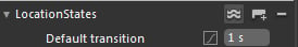
As with any change in Blend, this also adds the following to your XAML:
<VisualStateGroup.Transitions>
<VisualTransition GeneratedDuration="0:0:1">
<VisualTransition.GeneratedEasingFunction>
<ExponentialEase EasingMode="EaseInOut"/>
</VisualTransition.GeneratedEasingFunction>
</VisualTransition>
</VisualStateGroup.Transitions>
Now when you run your application, you will get a simple animation that adds a nice finishing touch to your locations screen. The two best things to do are play with the timings and change the easing functions. Each easing function will give you a pretty different animation that can be tweaked for your specific desired outcome.