
Building web applications using Vue or any other JavaScript SPA framework revolves around the concept of breaking the UI down into the smallest possible chunks of functionality. These chunks are referred to as components, and can be likened to Razor view components, tag helpers, and partial views in ASP.NET Core MVC. However, in most SPAs, you'll end up breaking the UI down into far more pieces than you would in a traditional MVC application.
Thinking in components
What is a component?
We can think of components as the building blocks of a UI. Each one is a self-contained piece of functionality, usually combined with a host of other components in a tree-like structure to form the UI of the entire web application. These components are also often reusable, and can be simply dropped into any part of the application where required.
A component in Vue is made up of two fundamental parts: presentation and behavior. The presentation part is simply the HTML template that is used to represent the data we are trying to display in the UI. The behavior part is a JavaScript object containing only the data relevant to that specific component, and any JavaScript functions necessary to manipulate that data and interact with the browser. This interaction includes handling the events raised by the browser, as well as refreshing certain portions of the UI depending on how the data has actually changed. Vue is smart enough to only refresh the parts of the UI that need to be, and doesn't bother refreshing the parts where the data hasn't changed.
In many SPA frameworks, this results in a single component being split into at least two, potentially three, separate physical files; a HTML file for the template; a JavaScript file for the data and behavioral functions; and an optional CSS file for styling the presentation of the component. In Vue, we have the concept of a single file component. We can use a custom file extension that allows us to combine these three aspects into a single file that contains three root elements: template, script, and style. In the following code snippet, we can see an example of a single file component:
<template>
  <div class="product">
    {{ name }}
  </div>
</template>


<script>
export default {
  name: 'product',
  data () {
    return {
      name: 'Hands on ASP.NET Core and Vue.js'
    }
  }
}
</script>

<style>
.product {
  font-size: 12px;
  font-weight: bold;
  color: teal;
}
</style>
The presentation part of this component, that is, the template and style sections, are incredibly simple. All we do is render a standard div element with a product class, and set the font size, weight, and color of that specific class using CSS. Inside the div element, we're using Vue's standard handlebar syntax to dynamically render a name variable. This variable is declared within the behavior part of the component, which again means the script section. Standard component data properties are declared inside a plain JavaScript object, which must be returned from a function named data. In this case, we return a simple object with a single name property, initialized with the Hands on ASP.NET Core and Vue.js value. This will subsequently be the text rendered inside the div element of template.
Each component should adhere to the SOLID principles of software design, and as such should only have a single responsibility. As soon as any single component starts to become overly complicated and difficult to see at a glance what its purpose is, it's probably time to refactor and extract a new component. Components are more often than not used in parent-child relationships, and Vue provides mechanisms for allowing related components to communicate with one another. Parents can pass data down into their children, and children can notify their parents of changes to their data. These parent-child relationships are the branches of our component tree, and there are many different ways that we could choose to break a UI down into this structure.
UI composition
Let's look at an example that most web developers will be familiar with. Imagine a web page with the Holy Grail layout—that is Header, Footer, left and right sidebars, and Main Content in the middle. When architecting this layout with components, the obvious composition is to start by creating a component for each major section of this layout:
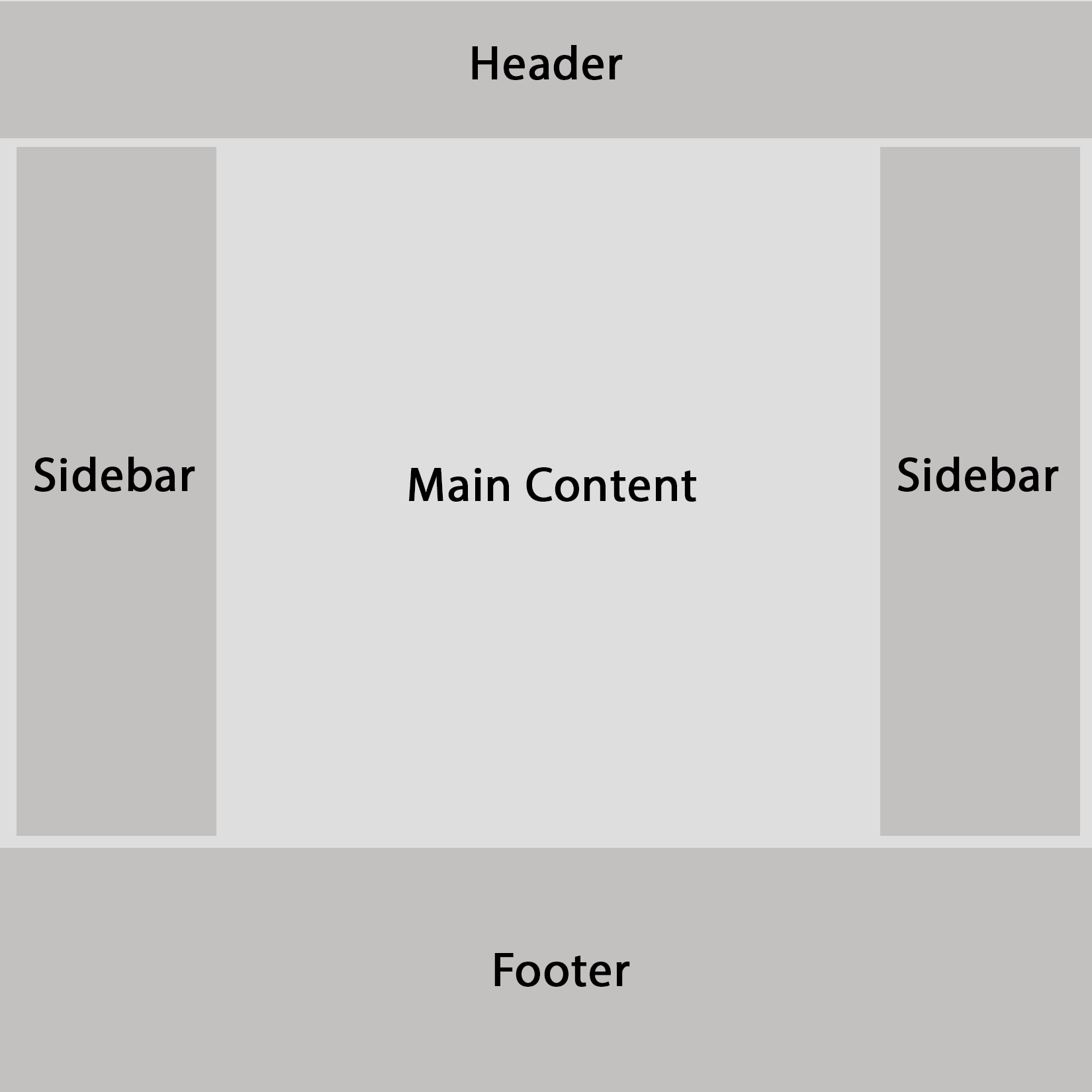
Holy Grail web layout
This is a good start, and in a typical MVC application, we might have done something similar using layout and partial views. However, we already know that a component is the smallest possible chunk of functionality that forms part of the UI. We need to break things down further, and be far more granular with our component boundaries. How we do this will obviously be highly dependent on the type of content we actually have contained within these major page sections. Let's expand on the previous layout with some standard UI features we'd expect in a typical e-commerce product listing page.
The header section would likely contain some kind of branding or Logo, along with a Navigation menu of some sorts and potentially a Search bar. The left sidebar is a common place to find any secondary navigation menus and some Filters to control which products are visible. The main content section will contain our Product List, along with some UI elements above to control the display order and maybe even switch between a grid and list view; there would also usually be a standard Pagination control at the bottom of the page. Finally, the right sidebar can hold a widget that displays a summary of the user's shopping cart contents, a widget to display a set of featured or most popular products, and a newsletter signup form. The following diagram shows how we could start composing this UI into a component tree:
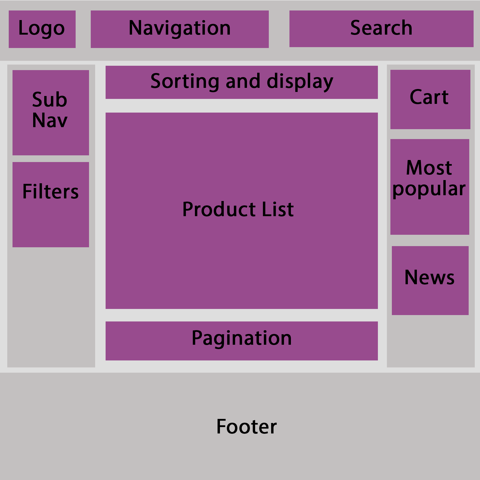
Holy Grail layout in components
We could—and probably would—still break this down further as we were actually building these components; it's almost impossible to get things right the first time round. However, this is the beauty of component-based architectures. There is no right or wrong way of composing a UI; we simply try it one way, and if it doesn't work, we refactor our component tree until we find a way that does work!