

"If we have data, let's look at data. If all we have are opinions, let's go with mine." | ||
| --Jim Barksdale, former Netscape CEO | ||
Data science is a very broad term, and can assume several different meanings according to context, understanding, tools, and so on. There are countless books about this subject, which is not suitable for the faint-hearted.
In order to do proper data science, you need to know mathematics and statistics at the very least. Then, you may want to dig into other subjects such as pattern recognition and machine learning and, of course, there is a plethora of languages and tools you can choose from.
Unless I transform into The Amazing Fabrizio in the next few minutes, I won't be able to talk about everything; I won't even get close to it. Therefore, in order to render this chapter meaningful, we're going to work on a cool project together.
About 3 years ago, I was working for a top-tier social media company in London. I stayed there for 2 years, and I was privileged to work with several people whose brilliance I can only start to describe. We were the first in the world to have access to the Twitter Ads API, and we were partners with Facebook as well. That means a lot of data.
Our analysts were dealing with a huge number of campaigns and they were struggling with the amount of work they had to do, so the development team I was a part of tried to help by introducing them to Python and to the tools Python gives you to deal with data. It was a very interesting journey that led me to mentor several people in the company and eventually to Manila where, for 2 weeks, I gave intensive training in Python and data science to our analysts there.
The project we're going to do together in this chapter is a lightweight version of the final example I presented to my Manila students. I have rewritten it to a size that will fit this chapter, and made a few adjustments here and there for teaching purposes, but all the main concepts are there, so it should be fun and instructional for you to code along.
On our journey, we're going to meet a few of the tools you can find in the Python ecosystem when it comes to dealing with data, so let's start by talking about Roman gods.
In 2001, Fernando Perez was a graduate student in physics at CU Boulder, and was trying to improve the Python shell so that he could have some niceties like those he was used to when he was working with tools such as Mathematica and Maple. The result of that effort took the name IPython.
In a nutshell, that small script began as an enhanced version of the Python shell and, through the effort of other coders and eventually proper funding from several different companies, it became the wonderful and successful project it is today. Some 10 years after its birth, a notebook environment was created, powered by technologies like WebSockets, the Tornado web server, jQuery, CodeMirror, and MathJax. The ZeroMQ library was also used to handle the messages between the notebook interface and the Python core that lies behind it.
The IPython notebook has become so popular and widely used that eventually, all sorts of goodies have been added to it. It can handle widgets, parallel computing, all sorts of media formats, and much, much more. Moreover, at some point, it became possible to code in languages other than Python from within the notebook.
This has led to a huge project that only recently has been split into two: IPython has been stripped down to focus more on the kernel part and the shell, while the notebook has become a brand new project called Jupyter. Jupyter allows interactive scientific computations to be done in more than 40 languages.
This chapter's project will all be coded and run in a Jupyter notebook, so let me explain in a few words what a notebook is.
A notebook environment is a web page that exposes a simple menu and the cells in which you can run Python code. Even though the cells are separate entities that you can run individually, they all share the same Python kernel. This means that all the names that you define in a cell (the variables, functions, and so on) will be available in any other cell.
Apart from all the graphical advantages, the beauty to have such an environment consists in the ability of running a Python script in chunks, and this can be a tremendous advantage. Take a script that is connecting to a database to fetch data and then manipulate that data. If you do it in the conventional way, with a Python script, you have to fetch the data every time you want to experiment with it. Within a notebook environment, you can fetch the data in a cell and then manipulate and experiment with it in other cells, so fetching it every time is not necessary.
The notebook environment is also extremely helpful for data science because it allows for step-by-step introspection. You do one chunk of work and then verify it. You then do another chunk and verify again, and so on.
It's also invaluable for prototyping because the results are there, right in front of your eyes, immediately available.
If you want to know more about these tools, please check out http://ipython.org/ and http://jupyter.org/.
I have created a very simple example notebook with a fibonacci function that gives you the list of all Fibonacci numbers smaller than a given N. In my browser, it looks like this:
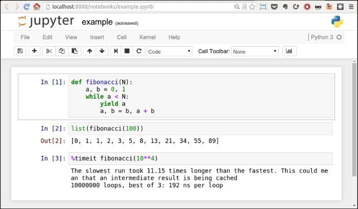
Every cell has an In [] label. If there's nothing between the braces, it means that cell has never been executed. If there is a number, it means that the cell has been executed, and the number represents the order in which the cell was executed. Finally, a * means that the cell is currently being executed.
You can see in the picture that in the first cell I have defined the fibonacci function, and I have executed it. This has the effect of placing the fibonacci name in the global frame associated with the notebook, therefore the fibonacci function is now available to the other cells as well. In fact, in the second cell, I can run fibonacci(100) and see the results in Out [2]. In the third cell, I have shown you one of the several magic functions you can find in a notebook in the second cell. %timeit runs the code several times and provides you with a nice benchmark for it. All the measurements for the list comprehensions and generators I did in Chapter 5, Saving Time and Memory were carried out with this nice feature.
You can execute a cell as many times as you want, and change the order in which you run them. Cells are very malleable, you can also put in markdown text or render them as headers.
Also, whatever you place in the last row of a cell will be automatically printed for you. This is very handy because you're not forced to write print(...) explicitly.
Feel free to explore the notebook environment; once you're friends with it, it's a long-lasting relationship, I promise.
In order to run the notebook, you have to install a handful of libraries, each of which collaborates with the others to make the whole thing work. Alternatively, you can just install Jupyter and it will take care of everything for you. For this chapter, there are a few other dependencies that we need to install, so please run the following command:
$ pip install jupyter pandas matplotlib fake-factory delorean xlwt
Don't worry, I'll introduce you to each of these gradually. Now, when you're done installing these libraries (it may take a few minutes), you can start the notebook:
$ jupyter notebook
This will open a page in your browser at this address: http://localhost:8888/.
Go to that page and create a new notebook using the menu. When you have it and you're comfortable with it, we're ready to go.
Tip
If you experience any issues setting up the notebook environment, please don't get discouraged. If you get an error, it's usually just a matter of searching a little bit on the web and you'll end up on a page where someone else has had the same issue, and they have explained how to fix it. Try your best to have the notebook environment up and running before continuing with the chapter.
Our project will take place in a notebook, therefore I will tag each code snippet with the cell number it belongs to, so that you can easily reproduce the code and follow along.
Typically, when you deal with data, this is the path you go through: you fetch it, you clean and manipulate it, then you inspect it and present results as values, spreadsheets, graphs, and so on. I want you to be in charge of all three steps of the process without having any external dependency on a data provider, so we're going to do the following:
- We're going to create the data, simulating the fact that it comes in a format which is not perfect or ready to be worked on.
- We're going to clean it and feed it to the main tool we'll use in the project: DataFrame of
pandas. - We're going to manipulate the data in the DataFrame.
- We're going to save the DataFrame to a file in different formats.
- Finally, we're going to inspect the data and get some results out of it.
First things first, we need to set up the notebook. This means imports and a bit of configuration.
#1
import json
import calendar
import random
from datetime import date, timedelta
import faker
import numpy as np
from pandas import DataFrame
from delorean import parse
import pandas as pd
# make the graphs nicer
pd.set_option('display.mpl_style', 'default')Cell #1 takes care of the imports. There are quite a few new things here: the calendar, random and datetime modules are part of the standard library. Their names are self-explanatory, so let's look at faker. The fake-factory library gives you this module, which you can use to prepare fake data. It's very useful in tests, when you prepare your fixtures, to get all sorts of things such as names, e-mail addresses, phone numbers, credit card details, and much more. It is all fake, of course.
numpy is the NumPy library, the fundamental package for scientific computing with Python. I'll spend a few words on it later on in the chapter.
pandas is the very core upon which the whole project is based. It stands for Python Data Analysis Library. Among many others, it provides the DataFrame, a matrix-like data structure with advanced processing capabilities. It's customary to import the DataFrame separately and then do import pandas as pd.
delorean is a nice third-party library that speeds up dealing with dates dramatically. Technically, we could do it with the standard library, but I see no reason not to expand a bit the range of the example and show you something different.
Finally, we have an instruction on the last line that will make our graphs at the end a little bit nicer, which doesn't hurt.
We want to achieve the following data structure: we're going to have a list of user objects. Each user object will be linked to a number of campaign objects.
In Python, everything is an object, so I'm using this term in a generic way. The user object may be a string, a dict, or something else.
A campaign in the social media world is a promotional campaign that a media agency runs on social media networks on behalf of a client.
Remember that we're going to prepare this data so that it's not in perfect shape (but it won't be so bad either...).
#2
fake = faker.Faker()
Firstly, we instantiate the Faker that we'll use to create the data.
#3
usernames = set()
usernames_no = 1000
# populate the set with 1000 unique usernames
while len(usernames) < usernames_no:
usernames.add(fake.user_name())Then we need usernames. I want 1,000 unique usernames, so I loop over the length of the usernames set until it has 1,000 elements. A set doesn't allow duplicated elements, therefore uniqueness is guaranteed.
#4
def get_random_name_and_gender():
skew = .6 # 60% of users will be female
male = random.random() > skew
if male:
return fake.name_male(), 'M'
else:
return fake.name_female(), 'F'
def get_users(usernames):
users = []
for username in usernames:
name, gender = get_random_name_and_gender()
user = {
'username': username,
'name': name,
'gender': gender,
'email': fake.email(),
'age': fake.random_int(min=18, max=90),
'address': fake.address(),
}
users.append(json.dumps(user))
return users
users = get_users(usernames)
users[:3]Here, we create a list of users. Each username has now been augmented to a full-blown user dict, with other details such as name, gender, e-mail, and so on. Each user dict is then dumped to JSON and added to the list. This data structure is not optimal, of course, but we're simulating a scenario where users come to us like that.
Note the skewed use of random.random() to make 60% of users female. The rest of the logic should be very easy for you to understand.
Note also the last line. Each cell automatically prints what's on the last line; therefore, the output of this is a list with the first three users:
Out #4
['{"gender": "F", "age": 48, "email": "[email protected]", "address": "2006 Sawayn Trail Apt. 207\\nHyattview, MO 27278", "username": "darcy00", "name": "Virgia Hilpert"}', '{"gender": "F", "age": 58, "email": "[email protected]", "address": "5176 Andres Plains Apt. 040\\nLakinside, GA 92446", "username": "renner.virgie", "name": "Miss Clarabelle Kertzmann MD"}', '{"gender": "M", "age": 33, "email": "[email protected]", "address": "1218 Jacobson Fort\\nNorth Doctor, OK 04469", "username": "hettinger.alphonsus", "name": "Ludwig Prosacco"}']
#5
# campaign name format:
# InternalType_StartDate_EndDate_TargetAge_TargetGender_Currency
def get_type():
# just some gibberish internal codes
types = ['AKX', 'BYU', 'GRZ', 'KTR']
return random.choice(types)
def get_start_end_dates():
duration = random.randint(1, 2 * 365)
offset = random.randint(-365, 365)
start = date.today() - timedelta(days=offset)
end = start + timedelta(days=duration)
def _format_date(date_):
return date_.strftime("%Y%m%d")
return _format_date(start), _format_date(end)
def get_age():
age = random.randint(20, 45)
age -= age % 5
diff = random.randint(5, 25)
diff -= diff % 5
return '{}-{}'.format(age, age + diff)
def get_gender():
return random.choice(('M', 'F', 'B'))
def get_currency():
return random.choice(('GBP', 'EUR', 'USD'))
def get_campaign_name():
separator = '_'
type_ = get_type()
start_end = separator.join(get_start_end_dates())
age = get_age()
gender = get_gender()
currency = get_currency()
return separator.join(
(type_, start_end, age, gender, currency))In #5, we define the logic to generate a campaign name. Analysts use spreadsheets all the time and they come up with all sorts of coding techniques to compress as much information as possible into the campaign names. The format I chose is a simple example of that technique: there is a code that tells the campaign type, then start and end dates, then the target age and gender, and finally the currency. All values are separated by an underscore.
In the get_type function, I use random.choice() to get one value randomly out of a collection. Probably more interesting is get_start_end_dates. First, I get the duration for the campaign, which goes from 1 day to 2 years (randomly), then I get a random offset in time which I subtract from today's date in order to get the start date. Given that the offset is a random number between -365 and 365, would anything be different if I added it to today's date instead of subtracting it?
When I have both the start and end dates, I return a stringified version of them, joined by an underscore.
Then, we have a bit of modular trickery going on with the age calculation. I hope you remember the modulo operator (%) from Chapter 2, Built-in Data Types.
What happens here is that I want a date range that has multiples of 5 as extremes. So, there are many ways to do it, but what I do is to get a random number between 20 and 45 for the left extreme, and remove the remainder of the division by 5. So, if, for example, I get 28, I will remove 28 % 5 = 3 to it, getting 25. I could have just used random.randrange(), but it's hard to resist modular division.
The rest of the functions are just some other applications of random.choice() and the last one, get_campaign_name, is nothing more than a collector for all these puzzle pieces that returns the final campaign name.
#6
def get_campaign_data():
name = get_campaign_name()
budget = random.randint(10**3, 10**6)
spent = random.randint(10**2, budget)
clicks = int(random.triangular(10**2, 10**5, 0.2 * 10**5))
impressions = int(random.gauss(0.5 * 10**6, 2))
return {
'cmp_name': name,
'cmp_bgt': budget,
'cmp_spent': spent,
'cmp_clicks': clicks,
'cmp_impr': impressions
}In #6, we write a function that creates a complete campaign object. I used a few different functions from the random module. random.randint() gives you an integer between two extremes. The problem with it is that it follows a uniform probability distribution, which means that any number in the interval has the same probability of coming up.
Therefore, when dealing with a lot of data, if you distribute your fixtures using a uniform distribution, the results you will get will all look similar. For this reason, I chose to use triangular and gauss, for clicks and impressions. They use different probability distributions so that we'll have something more interesting to see in the end.
Just to make sure we're on the same page with the terminology: clicks represents the number of clicks on a campaign advertisement, budget is the total amount of money allocated for the campaign, spent is how much of that money has already been spent, and impressions is the number of times the campaign has been fetched, as a resource, from its source, regardless of the amount of clicks that were performed on the campaign. Normally, the amount of impressions is greater than the amount of clicks.
Now that we have the data, it's time to put it all together:
#7
def get_data(users):
data = []
for user in users:
campaigns = [get_campaign_data()
for _ in range(random.randint(2, 8))]
data.append({'user': user, 'campaigns': campaigns})
return dataAs you can see, each item in data is a dict with a user and a list of campaigns that are associated with that user.
Let's start cleaning the data:
#8
rough_data = get_data(users) rough_data[:2] # let's take a peek
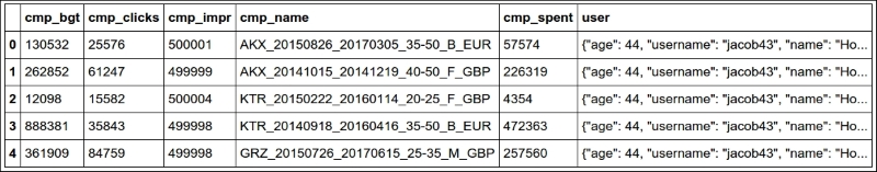
We simulate fetching the data from a source and then inspect it. The notebook is the perfect tool to inspect your steps. You can vary the granularity to your needs. The first item in rough_data looks like this:
[{'campaigns': [{'cmp_bgt': 130532, 'cmp_clicks': 25576, 'cmp_impr': 500001, 'cmp_name': 'AKX_20150826_20170305_35-50_B_EUR', 'cmp_spent': 57574}, ... omit ... {'cmp_bgt': 884396, 'cmp_clicks': 10955, 'cmp_impr': 499999, 'cmp_name': 'KTR_20151227_20151231_45-55_B_GBP', 'cmp_spent': 318887}], 'user': '{"age": 44, "username": "jacob43", "name": "Holland Strosin", "email": "[email protected]", "address": "1038 Runolfsdottir Parks\\nElmapo...", "gender": "M"}'}]
So, we now start working with it.
#9
data = []
for datum in rough_data:
for campaign in datum['campaigns']:
campaign.update({'user': datum['user']})
data.append(campaign)
data[:2] # let's take another peekThe first thing we need to do in order to be able to feed a DataFrame with this data is to denormalize it. This means transforming the data into a list whose items are campaign dicts, augmented with their relative user dict. Users will be duplicated in each campaign they belong to. The first item in data looks like this:
[{'cmp_bgt': 130532, 'cmp_clicks': 25576, 'cmp_impr': 500001, 'cmp_name': 'AKX_20150826_20170305_35-50_B_EUR', 'cmp_spent': 57574, 'user': '{"age": 44, "username": "jacob43", "name": "Holland Strosin", "email": "[email protected]", "address": "1038 Runolfsdottir Parks\\nElmaport...", "gender": "M"}'}]
You can see that the user object has been brought into the campaign dict which was repeated for each campaign.
Now it's time to create the DataFrame:
#10
df = DataFrame(data) df.head()
Finally, we will create the DataFrame and inspect the first five rows using the head method. You should see something like this:
Jupyter renders the output of the df.head() call as HTML automatically. In order to have a text-based output, simply wrap df.head() in a print call.
The DataFrame structure is very powerful. It allows us to do a great deal of manipulation on its contents. You can filter by rows, columns, aggregate on data, and many other operations. You can operate with rows or columns without suffering the time penalty you would have to pay if you were working on data with pure Python. This happens because, under the covers, pandas is harnessing the power of the NumPy library, which itself draws its incredible speed from the low-level implementation of its core. NumPy stands for Numeric Python, and it is one of the most widely used libraries in the data science environment.
Using a DataFrame allows us to couple the power of NumPy with spreadsheet-like capabilities so that we'll be able to work on our data in a fashion that is similar to what an analyst could do. Only, we do it with code.
But let's go back to our project. Let's see two ways to quickly get a bird's eye view of the data:
#11
df.count()
count yields a count of all the non-empty cells in each column. This is good to help you understand how sparse your data can be. In our case, we have no missing values, so the output is:
cmp_bgt 4974 cmp_clicks 4974 cmp_impr 4974 cmp_name 4974 cmp_spent 4974 user 4974 dtype: int64
Nice! We have 4,974 rows, and the data type is integers (dtype: int64 means long integers because they take 64 bits each). Given that we have 1,000 users and the amount of campaigns per user is a random number between 2 and 8, we're exactly in line with what I was expecting.
#12
df.describe()
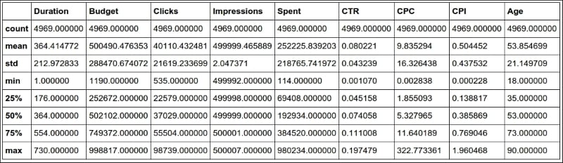
describe is a nice and quick way to introspect a bit further:
cmp_bgt cmp_clicks cmp_impr cmp_spent count 4974.000000 4974.000000 4974.000000 4974.000000 mean 503272.706876 40225.764978 499999.495979 251150.604343 std 289393.747465 21910.631950 2.035355 220347.594377 min 1250.000000 609.000000 499992.000000 142.000000 25% 253647.500000 22720.750000 499998.000000 67526.750000 50% 508341.000000 36561.500000 500000.000000 187833.000000 75% 757078.250000 55962.750000 500001.000000 385803.750000 max 999631.000000 98767.000000 500006.000000 982716.000000
As you can see, it gives us several measures such as count, mean, std (standard deviation), min, max, and shows how data is distributed in the various quadrants. Thanks to this method, we could already have a rough idea of how our data is structured.
Let's see which are the three campaigns with the highest and lowest budgets:
#13
df.sort_index(by=['cmp_bgt'], ascending=False).head(3)
This gives the following output (truncated):
cmp_bgt cmp_clicks cmp_impr cmp_name 4655 999631 15343 499997 AKX_20160814_20180226_40 3708 999606 45367 499997 KTR_20150523_20150527_35 1995 999445 12580 499998 AKX_20141102_20151009_30
And (#14) a call to .tail(3), shows us the ones with the lowest budget.
Now it's time to increase the complexity up a bit. First of all, we want to get rid of that horrible campaign name (cmp_name). We need to explode it into parts and put each part in one dedicated column. In order to do this, we'll use the apply method of the Series object.
The pandas.core.series.Series class is basically a powerful wrapper around an array (think of it as a list with augmented capabilities). We can extrapolate a Series object from a DataFrame by accessing it in the same way we do with a key in a dict, and we can call apply on that Series object, which will run a function feeding each item in the Series to it. We compose the result into a new DataFrame, and then join that DataFrame with our beloved df.
#15
def unpack_campaign_name(name):
# very optimistic method, assumes data in campaign name
# is always in good state
type_, start, end, age, gender, currency = name.split('_')
start = parse(start).date
end = parse(end).date
return type_, start, end, age, gender, currency
campaign_data = df['cmp_name'].apply(unpack_campaign_name)
campaign_cols = [
'Type', 'Start', 'End', 'Age', 'Gender', 'Currency']
campaign_df = DataFrame(
campaign_data.tolist(), columns=campaign_cols, index=df.index)
campaign_df.head(3)Within unpack_campaign_name, we split the campaign name in parts. We use delorean.parse() to get a proper date object out of those strings (delorean makes it really easy to do it, doesn't it?), and then we return the objects. A quick peek at the last line reveals:
Type Start End Age Gender Currency 0 KTR 2016-06-16 2017-01-24 20-30 M EUR 1 BYU 2014-10-25 2015-07-31 35-50 B USD 2 BYU 2015-10-26 2016-03-17 35-50 M EUR
Nice! One important thing: even if the dates appear as strings, they are just the representation of the real date objects that are hosted in the DataFrame.
Another very important thing: when joining two DataFrame instances, it's imperative that they have the same index, otherwise pandas won't be able to know which rows go with which. Therefore, when we create campaign_df, we set its index to the one from df. This enables us to join them. When creating this DataFrame, we also pass the columns names.
#16
df = df.join(campaign_df)
And after the join, we take a peek, hoping to see matching data (output truncated):
#17
df[['cmp_name'] + campaign_cols].head(3)
Gives:
cmp_name Type Start End 0 KTR_20160616_20170124_20-30_M_EUR KTR 2016-06-16 2017-01-24 1 BYU_20141025_20150731_35-50_B_USD BYU 2014-10-25 2015-07-31 2 BYU_20151026_20160317_35-50_M_EUR BYU 2015-10-26 2016-03-17
As you can see, the join was successful; the campaign name and the separate columns expose the same data. Did you see what we did there? We're accessing the DataFrame using the square brackets syntax, and we pass a list of column names. This will produce a brand new DataFrame, with those columns (in the same order), on which we then call head().
We now do the exact same thing for each piece of user JSON data. We call apply on the user Series, running the unpack_user_json function, which takes a JSON user object and transforms it into a list of its fields, which we can then inject into a brand new DataFrame user_df. After that, we'll join user_df back with df, like we did with campaign_df.
#18
def unpack_user_json(user):
# very optimistic as well, expects user objects
# to have all attributes
user = json.loads(user.strip())
return [
user['username'],
user['email'],
user['name'],
user['gender'],
user['age'],
user['address'],
]
user_data = df['user'].apply(unpack_user_json)
user_cols = [
'username', 'email', 'name', 'gender', 'age', 'address']
user_df = DataFrame(
user_data.tolist(), columns=user_cols, index=df.index)Very similar to the previous operation, isn't it? We should also note here that, when creating user_df, we need to instruct DataFrame about the column names and, very important, the index. Let's join (#19) and take a quick peek (#20):
df = df.join(user_df) df[['user'] + user_cols].head(2)
The output shows us that everything went well. We're good, but we're not done yet.
If you call df.columns in a cell, you'll see that we still have ugly names for our columns. Let's change that:
#21
better_columns = [
'Budget', 'Clicks', 'Impressions',
'cmp_name', 'Spent', 'user',
'Type', 'Start', 'End',
'Target Age', 'Target Gender', 'Currency',
'Username', 'Email', 'Name',
'Gender', 'Age', 'Address',
]
df.columns = better_columnsGood! Now, with the exception of 'cmp_name' and 'user', we only have nice names.
Completing the datasetNext step will be to add some extra columns. For each campaign, we have the amount of clicks and impressions, and we have the spent. This allows us to introduce three measurement ratios: CTR, CPC, and CPI. They stand for Click Through Rate, Cost Per Click, and Cost Per Impression, respectively.
The last two are easy to understand, but CTR is not. Suffice it to say that it is the ratio between clicks and impressions. It gives you a measure of how many clicks were performed on a campaign advertisement per impression: the higher this number, the more successful the advertisement is in attracting users to click on it.
#22
def calculate_extra_columns(df):
# Click Through Rate
df['CTR'] = df['Clicks'] / df['Impressions']
# Cost Per Click
df['CPC'] = df['Spent'] / df['Clicks']
# Cost Per Impression
df['CPI'] = df['Spent'] / df['Impressions']
calculate_extra_columns(df)I wrote this as a function, but I could have just written the code in the cell. It's not important. What I want you to notice here is that we're adding those three columns with one line of code each, but the DataFrame applies the operation automatically (the division, in this case) to each pair of cells from the appropriate columns. So, even if they are masked as three divisions, these are actually 4974 * 3 divisions, because they are performed for each row. Pandas does a lot of work for us, and also does a very good job in hiding the complexity of it.
The function, calculate_extra_columns, takes a DataFrame, and works directly on it. This mode of operation is called in-place. Do you remember how list.sort() was sorting the list? It is the same deal.
We can take a look at the results by filtering on the relevant columns and calling head.
#23
df[['Spent', 'Clicks', 'Impressions',
'CTR', 'CPC', 'CPI']].head(3)This shows us that the calculations were performed correctly on each row:
Spent Clicks Impressions CTR CPC CPI 0 57574 25576 500001 0.051152 2.251095 0.115148 1 226319 61247 499999 0.122494 3.695185 0.452639 2 4354 15582 500004 0.031164 0.279425 0.008708
Now, I want to verify the accuracy of the results manually for the first row:
#24
clicks = df['Clicks'][0]
impressions = df['Impressions'][0]
spent = df['Spent'][0]
CTR = df['CTR'][0]
CPC = df['CPC'][0]
CPI = df['CPI'][0]
print('CTR:', CTR, clicks / impressions)
print('CPC:', CPC, spent / clicks)
print('CPI:', CPI, spent / impressions)It yields the following output:
CTR: 0.0511518976962 0.0511518976962 CPC: 2.25109477635 2.25109477635 CPI: 0.115147769704 0.115147769704
This is exactly what we saw in the previous output. Of course, I wouldn't normally need to do this, but I wanted to show you how can you perform calculations this way. You can access a Series (a column) by passing its name to the DataFrame, in square brackets, and then you access each row by its position, exactly as you would with a regular list or tuple.
We're almost done with our DataFrame. All we are missing now is a column that tells us the duration of the campaign and a column that tells us which day of the week corresponds to the start date of each campaign. This allows me to expand on how to play with date objects.
#25
def get_day_of_the_week(day):
number_to_day = dict(enumerate(calendar.day_name, 1))
return number_to_day[day.isoweekday()]
def get_duration(row):
return (row['End'] - row['Start']).days
df['Day of Week'] = df['Start'].apply(get_day_of_the_week)
df['Duration'] = df.apply(get_duration, axis=1)We used two different techniques here but first, the code.
get_day_of_the_week takes a date object. If you cannot understand what it does, please take a few moments to try and understand for yourself before reading the explanation. Use the inside-out technique like we've done a few times before.
So, as I'm sure you know by now, if you put calendar.day_name in a list call, you get ['Monday', 'Tuesday', 'Wednesday', 'Thursday', 'Friday', 'Saturday', 'Sunday']. This means that, if we enumerate calendar.day_name starting from 1, we get pairs such as (1, 'Monday'), (2, 'Tuesday'), and so on. If we feed these pairs to a dict, we get a mapping between the days of the week as numbers (1, 2, 3, ...) and their names. When the mapping is created, in order to get the name of a day, we just need to know its number. To get it, we call date.isoweekday(), which tells us which day of the week that date is (as a number). You feed that into the mapping and, boom! You have the name of the day.
get_duration is interesting as well. First, notice it takes an entire row, not just a single value. What happens in its body is that we perform a subtraction between a campaign end and start dates. When you subtract date objects the result is a timedelta object, which represents a given amount of time. We take the value of its .days property. It is as simple as that.
Now, we can introduce the fun part, the application of those two functions.
The first application is performed on a Series object, like we did before for 'user' and 'cmp_name', there is nothing new here.
The second one is applied to the whole DataFrame and, in order to instruct Pandas to perform that operation on the rows, we pass axis=1.
We can verify the results very easily, as shown here:
#26
df[['Start', 'End', 'Duration', 'Day of Week']].head(3)
Yields:
Start End Duration Day of Week 0 2015-08-26 2017-03-05 557 Wednesday 1 2014-10-15 2014-12-19 65 Wednesday 2 2015-02-22 2016-01-14 326 Sunday
So, we now know that between the 26th of August 2015 and the 5th of March 2017 there are 557 days, and that the 26th of August 2015 was a Wednesday.
If you're wondering what the purpose of this is, I'll provide an example. Imagine that you have a campaign that is tied to a sports event that usually takes place on a Sunday. You may want to inspect your data according to the days so that you can correlate them to the various measurements you have. We're not going to do it in this project, but it was useful to see, if only for the different way of calling apply() on a DataFrame.
Now that we have everything we want, it's time to do the final cleaning: remember we still have the 'cmp_name' and 'user' columns. Those are useless now, so they have to go. Also, I want to reorder the columns in the DataFrame so that it is more relevant to the data it now contains. In order to do this, we just need to filter df on the column list we want. We'll get back a brand new DataFrame that we can reassign to df itself.
#27
final_columns = [
'Type', 'Start', 'End', 'Duration', 'Day of Week', 'Budget',
'Currency', 'Clicks', 'Impressions', 'Spent', 'CTR', 'CPC',
'CPI', 'Target Age', 'Target Gender', 'Username', 'Email',
'Name', 'Gender', 'Age'
]
df = df[final_columns]I have grouped the campaign information at the beginning, then the measurements, and finally the user data at the end. Now our DataFrame is clean and ready for us to inspect.
Before we start going crazy with graphs, what about taking a snapshot of our DataFrame so that we can easily reconstruct it from a file, rather than having to redo all the steps we did to get here. Some analysts may want to have it in spreadsheet form, to do a different kind of analysis than the one we want to do, so let's see how to save a DataFrame to a file. It's easier done than said.
We can save a DataFrame in many different ways. You can type df.to_ and then press Tab to make auto-completion pop up, to see all the possible options.
We're going to save our DataFrame in three different formats, just for fun: comma-separated values (CSV), JSON, and Excel spreadsheet.
#28
df.to_csv('df.csv')#29
df.to_json('df.json')#30
df.to_excel('df.xls')The CSV file looks like this (output truncated):
Type,Start,End,Duration,Day of Week,Budget,Currency,Clicks,Impres 0,GRZ,2015-03-15,2015-11-10,240,Sunday,622551,GBP,35018,500002,787 1,AKX,2016-06-19,2016-09-19,92,Sunday,148219,EUR,45185,499997,6588 2,BYU,2014-09-25,2016-07-03,647,Thursday,537760,GBP,55771,500001,3
And the JSON one like this (again, output truncated):
{ "Type": { "0": "GRZ", "1": "AKX", "2": "BYU",
So, it's extremely easy to save a DataFrame in many different formats, and the good news is that the opposite is also true: it's very easy to load a spreadsheet into a DataFrame. The programmers behind Pandas went a long way to ease our tasks, something to be grateful for.
Finally, the juicy bits. In this section, we're going to visualize some results. From a data science perspective, I'm not very interested in going deep into analysis, especially because the data is completely random, but nonetheless, this code will get you started with graphs and other features.
Something I learned in my life—and this may come as a surprise to you—is that looks also counts so it's very important that when you present your results, you do your best to make them pretty.
I won't try to prove to you how truthful that last statement is, but I really do believe in it. If you recall the last line of cell #1:
# make the graphs nicer
pd.set_option('display.mpl_style', 'default')Its purpose is to make the graphs we will look at in this section a little bit prettier.
Okay, so, first of all we have to instruct the notebook that we want to use matplotlib inline. This means that when we ask Pandas to plot something, we will have the result rendered in the cell output frame. In order to do this, we just need one simple instruction:
#31
%matplotlib inline
You can also instruct the notebook to do this when you start it from the console by passing a parameter, but I wanted to show you this way too, since it can be annoying to have to restart the notebook just because you want to plot something. In this way, you can do it on the fly and then keep working.
Next, we're going to set some parameters on pylab. This is for plotting purposes and it will remove a warning that a font hasn't been found. I suggest that you do not execute this line and keep going. If you get a warning that a font is missing, come back to this cell and run it.
#32
import pylab
pylab.rcParams.update({'font.family' : 'serif'})This basically tells Pylab to use the first available serif font. It is simple but effective, and you can experiment with other fonts too.
Now that the DataFrame is complete, let's run df.describe() (#33) again. The results should look something like this:
This kind of quick result is perfect to satisfy those managers who have 20 seconds to dedicate to you and just want rough numbers.
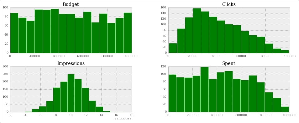
Alternatively, a graph is usually much better than a table with numbers because it's much easier to read it and it gives you immediate feedback. So, let's graph out the four pieces of information we have on each campaign: budget, spent, clicks, and impressions.
#34
df[['Budget', 'Spent', 'Clicks', 'Impressions']].hist(
bins=16, figsize=(16, 6));We extrapolate those four columns (this will give us another DataFrame made with only those columns) and call the histogram hist() method on it. We give some measurements on the bins and figure sizes, but basically everything is done automatically.
One important thing: since this instruction is the only one in this cell (which also means, it's the last one), the notebook will print its result before drawing the graph. To suppress this behavior and have only the graph drawn with no printing, just add a semicolon at the end (you thought I was reminiscing about Java, didn't you?). Here are the graphs:
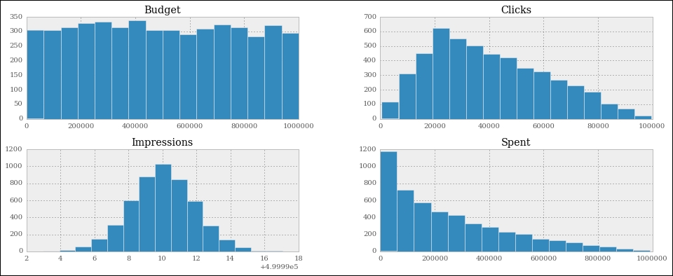
They are beautiful, aren't they? Did you notice the serif font? How about the meaning of those figures? If you go back to #6 and take a look at the way we generate the data, you will see that all these graphs make perfect sense.
Budget is simply a random integer in an interval, therefore we were expecting a uniform distribution, and there we have it; it's practically a constant line.
Spent is a uniform distribution as well, but the high end of its interval is the budget, which is moving, this means we should expect something like a quadratic hyperbole that decreases to the right. And there it is as well.
Clicks was generated with a triangular distribution with mean roughly 20% of the interval size, and you can see that the peak is right there, at about 20% to the left.
Finally, Impressions was a Gaussian distribution, which is the one that assumes the famous bell shape. The mean was exactly in the middle and we had standard deviation of 2. You can see that the graph matches those parameters.
Good! Let's plot out the measures we calculated:
#35
df[['CTR', 'CPC', 'CPI']].hist(
bins=20, figsize=(16, 6));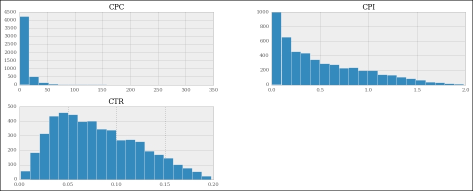
We can see that the cost per click is highly skewed to the left, meaning that most of the CPC values are very low. The cost per impression has a similar shape, but less extreme.
Now, all this is nice, but if you wanted to analyze only a particular segment of the data, how would you do it? We can apply a mask to a DataFrame, so that we get another one with only the rows that satisfy the mask condition. It's like applying a global row-wise if clause.
#36
mask = (df.Spent > 0.75 * df.Budget)
df[mask][['Budget', 'Spent', 'Clicks', 'Impressions']].hist(
bins=15, figsize=(16, 6), color='g');In this case, I prepared a mask to filter out all the rows for which the spent is less than or equal to 75% of the budget. In other words, we'll include only those campaigns for which we have spent at least three quarters of the budget. Notice that in the mask I am showing you an alternative way of asking for a DataFrame column, by using direct property access (object.property_name), instead of dict-like access (object['property_name']). If property_name is a valid Python name, you can use both ways interchangeably (JavaScript works like this as well).
The mask is applied in the same way that we access a dict with a key. When you apply a mask to a DataFrame, you get back another one and we select only the relevant columns on this, and call hist() again. This time, just for fun, we want the results to be painted green:
Note that the shapes of the graphs haven't changed much, apart from the spent, which is quite different. The reason for this is that we've asked only for the rows where spent is at least 75% of the budget. This means that we're including only the rows where spent is close to the budget. The budget numbers come from a uniform distribution. Therefore, it is quite obvious that the spent is now assuming that kind of shape. If you make the boundary even tighter, and ask for 85% or more, you'll see spent become more and more like budget.
Let's now ask for something different. How about the measure of spent, click, and impressions grouped by day of the week?
#37
df_weekday = df.groupby(['Day of Week']).sum()
df_weekday[['Impressions', 'Spent', 'Clicks']].plot(
figsize=(16, 6), subplots=True);The first line creates a new DataFrame, df_weekday, by asking for a grouping by 'Day of Week' on df. The function used to aggregate the data is addition.
The second line gets a slice of df_weekday using a list of column names, something we're accustomed to by now. On the result we call plot(), which is a bit different to hist(). The option subplots=True makes plot draw three independent graphs:
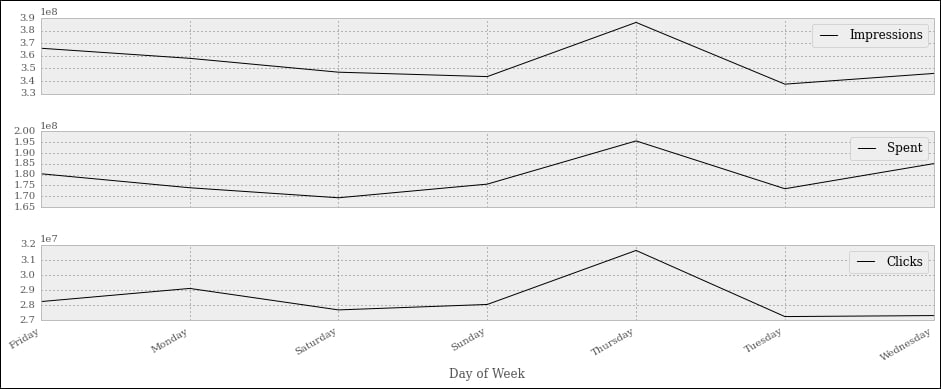
Interestingly enough, we can see that most of the action happens on Thursdays. If this were meaningful data, this would potentially be important information to give to our clients, and this is the reason I'm showing you this example.
Note that the days are sorted alphabetically, which scrambles them up a bit. Can you think of a quick solution that would fix the issue? I'll leave it to you as an exercise to come up with something.
Let's finish this presentation section with a couple more things. First, a simple aggregation. We want to aggregate on 'Target Gender' and 'Target Age', and show 'Impressions' and 'Spent'. For both, we want to see the mean and the standard deviation.
#38
agg_config = {
'Impressions': {
'Mean Impr': 'mean',
'Std Impr': 'std',
},
'Spent': ['mean', 'std'],
}
df.groupby(['Target Gender', 'Target Age']).agg(agg_config)It's very easy to do it. We will prepare a dictionary that we'll use as a configuration. I'm showing you two options to do it. We use a nicer format for 'Impressions', where we pass a nested dict with description/function as key/value pairs. On the other hand, for 'Spent', we just use a simpler list with just the function names.
Then, we perform a grouping on the 'Target Gender' and 'Target Age' columns, and we pass our configuration dict to the agg() method. The result is truncated and rearranged a little bit to make it fit, and shown here:
Impressions Spent Mean Impr Std Impr mean std Target Target Gender Age B 20-25 500000 2.189102 239882 209442.168488 20-30 500000 2.245317 271285 236854.155720 20-35 500000 1.886396 243725 174268.898935 20-40 499999 2.100786 247740 211540.133771 20-45 500000 1.772811 148712 118603.932051 ... ... ... ... ... M 20-25 500000 2.022023 212520 215857.323228 20-30 500000 2.111882 292577 231663.713956 20-35 499999 1.965177 255651 222790.960907 20-40 499999 1.932473 282515 250023.393334 20-45 499999 1.905746 271077 219901.462405
This is the textual representation, of course, but you can also have the HTML one. You can see that Spent has the mean and std columns whose labels are simply the function names, while Impressions features the nice titles we added to the configuration dict.
Let's do one more thing before we wrap this chapter up. I want to show you something called a pivot table. It's kind of a buzzword in the data environment, so an example such as this one, albeit very simple, is a must.
#39
pivot = df.pivot_table(
values=['Impressions', 'Clicks', 'Spent'],
index=['Target Age'],
columns=['Target Gender'],
aggfunc=np.sum
)
pivotWe create a pivot table that shows us the correlation between the target age and impressions, clicks, and spent. These last three will be subdivided according to the target gender. The aggregation function used to calculate the results is the numpy.sum function (numpy.mean would be the default, had I not specified anything).
After creating the pivot table, we simply print it with the last line in the cell, and here's a crop of the result:
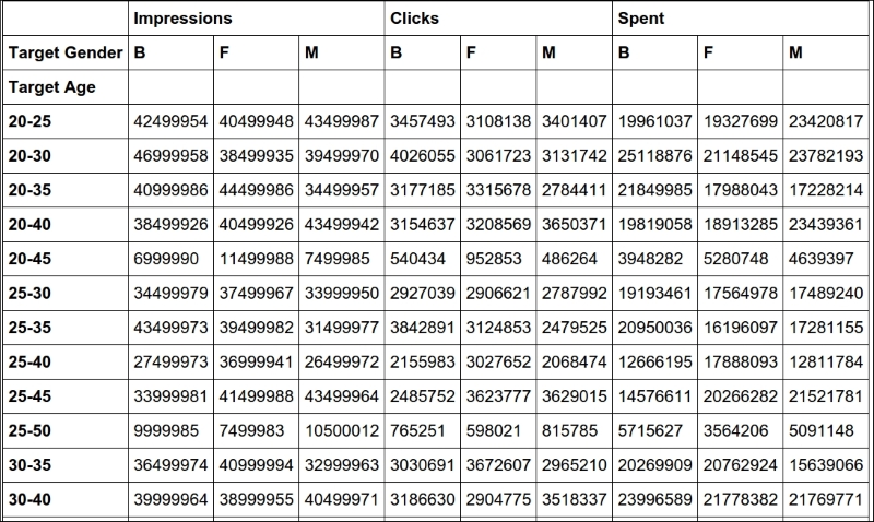
It's pretty clear and provides very useful information when the data is meaningful.
That's it! I'll leave you to discover more about the wonderful world of IPython, Jupyter, and data science. I strongly encourage you to get comfortable with the notebook environment. It's much better than a console, it's extremely practical and fun to use, and you can even do slides and documents with it.
Setting up the notebook
First things first, we need to set up the notebook. This means imports and a bit of configuration.
#1
import json
import calendar
import random
from datetime import date, timedelta
import faker
import numpy as np
from pandas import DataFrame
from delorean import parse
import pandas as pd
# make the graphs nicer
pd.set_option('display.mpl_style', 'default')Cell #1 takes care of the imports. There are quite a few new things here: the calendar, random and datetime modules are part of the standard library. Their names are self-explanatory, so let's look at faker. The fake-factory library gives you this module, which you can use to prepare fake data. It's very useful in tests, when you prepare your fixtures, to get all sorts of things such as names, e-mail addresses, phone numbers, credit card details, and much more. It is all fake, of course.
numpy is the NumPy library, the fundamental package for scientific computing with Python. I'll spend a few words on it later on in the chapter.
pandas is the very core upon which the whole project is based. It stands for Python Data Analysis Library. Among many others, it provides the DataFrame, a matrix-like data structure with advanced processing capabilities. It's customary to import the DataFrame separately and then do import pandas as pd.
delorean is a nice third-party library that speeds up dealing with dates dramatically. Technically, we could do it with the standard library, but I see no reason not to expand a bit the range of the example and show you something different.
Finally, we have an instruction on the last line that will make our graphs at the end a little bit nicer, which doesn't hurt.
We want to achieve the following data structure: we're going to have a list of user objects. Each user object will be linked to a number of campaign objects.
In Python, everything is an object, so I'm using this term in a generic way. The user object may be a string, a dict, or something else.
A campaign in the social media world is a promotional campaign that a media agency runs on social media networks on behalf of a client.
Remember that we're going to prepare this data so that it's not in perfect shape (but it won't be so bad either...).
#2
fake = faker.Faker()
Firstly, we instantiate the Faker that we'll use to create the data.
#3
usernames = set()
usernames_no = 1000
# populate the set with 1000 unique usernames
while len(usernames) < usernames_no:
usernames.add(fake.user_name())Then we need usernames. I want 1,000 unique usernames, so I loop over the length of the usernames set until it has 1,000 elements. A set doesn't allow duplicated elements, therefore uniqueness is guaranteed.
#4
def get_random_name_and_gender():
skew = .6 # 60% of users will be female
male = random.random() > skew
if male:
return fake.name_male(), 'M'
else:
return fake.name_female(), 'F'
def get_users(usernames):
users = []
for username in usernames:
name, gender = get_random_name_and_gender()
user = {
'username': username,
'name': name,
'gender': gender,
'email': fake.email(),
'age': fake.random_int(min=18, max=90),
'address': fake.address(),
}
users.append(json.dumps(user))
return users
users = get_users(usernames)
users[:3]Here, we create a list of users. Each username has now been augmented to a full-blown user dict, with other details such as name, gender, e-mail, and so on. Each user dict is then dumped to JSON and added to the list. This data structure is not optimal, of course, but we're simulating a scenario where users come to us like that.
Note the skewed use of random.random() to make 60% of users female. The rest of the logic should be very easy for you to understand.
Note also the last line. Each cell automatically prints what's on the last line; therefore, the output of this is a list with the first three users:
Out #4
['{"gender": "F", "age": 48, "email": "[email protected]", "address": "2006 Sawayn Trail Apt. 207\\nHyattview, MO 27278", "username": "darcy00", "name": "Virgia Hilpert"}', '{"gender": "F", "age": 58, "email": "[email protected]", "address": "5176 Andres Plains Apt. 040\\nLakinside, GA 92446", "username": "renner.virgie", "name": "Miss Clarabelle Kertzmann MD"}', '{"gender": "M", "age": 33, "email": "[email protected]", "address": "1218 Jacobson Fort\\nNorth Doctor, OK 04469", "username": "hettinger.alphonsus", "name": "Ludwig Prosacco"}']
#5
# campaign name format:
# InternalType_StartDate_EndDate_TargetAge_TargetGender_Currency
def get_type():
# just some gibberish internal codes
types = ['AKX', 'BYU', 'GRZ', 'KTR']
return random.choice(types)
def get_start_end_dates():
duration = random.randint(1, 2 * 365)
offset = random.randint(-365, 365)
start = date.today() - timedelta(days=offset)
end = start + timedelta(days=duration)
def _format_date(date_):
return date_.strftime("%Y%m%d")
return _format_date(start), _format_date(end)
def get_age():
age = random.randint(20, 45)
age -= age % 5
diff = random.randint(5, 25)
diff -= diff % 5
return '{}-{}'.format(age, age + diff)
def get_gender():
return random.choice(('M', 'F', 'B'))
def get_currency():
return random.choice(('GBP', 'EUR', 'USD'))
def get_campaign_name():
separator = '_'
type_ = get_type()
start_end = separator.join(get_start_end_dates())
age = get_age()
gender = get_gender()
currency = get_currency()
return separator.join(
(type_, start_end, age, gender, currency))In #5, we define the logic to generate a campaign name. Analysts use spreadsheets all the time and they come up with all sorts of coding techniques to compress as much information as possible into the campaign names. The format I chose is a simple example of that technique: there is a code that tells the campaign type, then start and end dates, then the target age and gender, and finally the currency. All values are separated by an underscore.
In the get_type function, I use random.choice() to get one value randomly out of a collection. Probably more interesting is get_start_end_dates. First, I get the duration for the campaign, which goes from 1 day to 2 years (randomly), then I get a random offset in time which I subtract from today's date in order to get the start date. Given that the offset is a random number between -365 and 365, would anything be different if I added it to today's date instead of subtracting it?
When I have both the start and end dates, I return a stringified version of them, joined by an underscore.
Then, we have a bit of modular trickery going on with the age calculation. I hope you remember the modulo operator (%) from Chapter 2, Built-in Data Types.
What happens here is that I want a date range that has multiples of 5 as extremes. So, there are many ways to do it, but what I do is to get a random number between 20 and 45 for the left extreme, and remove the remainder of the division by 5. So, if, for example, I get 28, I will remove 28 % 5 = 3 to it, getting 25. I could have just used random.randrange(), but it's hard to resist modular division.
The rest of the functions are just some other applications of random.choice() and the last one, get_campaign_name, is nothing more than a collector for all these puzzle pieces that returns the final campaign name.
#6
def get_campaign_data():
name = get_campaign_name()
budget = random.randint(10**3, 10**6)
spent = random.randint(10**2, budget)
clicks = int(random.triangular(10**2, 10**5, 0.2 * 10**5))
impressions = int(random.gauss(0.5 * 10**6, 2))
return {
'cmp_name': name,
'cmp_bgt': budget,
'cmp_spent': spent,
'cmp_clicks': clicks,
'cmp_impr': impressions
}In #6, we write a function that creates a complete campaign object. I used a few different functions from the random module. random.randint() gives you an integer between two extremes. The problem with it is that it follows a uniform probability distribution, which means that any number in the interval has the same probability of coming up.
Therefore, when dealing with a lot of data, if you distribute your fixtures using a uniform distribution, the results you will get will all look similar. For this reason, I chose to use triangular and gauss, for clicks and impressions. They use different probability distributions so that we'll have something more interesting to see in the end.
Just to make sure we're on the same page with the terminology: clicks represents the number of clicks on a campaign advertisement, budget is the total amount of money allocated for the campaign, spent is how much of that money has already been spent, and impressions is the number of times the campaign has been fetched, as a resource, from its source, regardless of the amount of clicks that were performed on the campaign. Normally, the amount of impressions is greater than the amount of clicks.
Now that we have the data, it's time to put it all together:
#7
def get_data(users):
data = []
for user in users:
campaigns = [get_campaign_data()
for _ in range(random.randint(2, 8))]
data.append({'user': user, 'campaigns': campaigns})
return dataAs you can see, each item in data is a dict with a user and a list of campaigns that are associated with that user.
Let's start cleaning the data:
#8
rough_data = get_data(users) rough_data[:2] # let's take a peek
We simulate fetching the data from a source and then inspect it. The notebook is the perfect tool to inspect your steps. You can vary the granularity to your needs. The first item in rough_data looks like this:
[{'campaigns': [{'cmp_bgt': 130532, 'cmp_clicks': 25576, 'cmp_impr': 500001, 'cmp_name': 'AKX_20150826_20170305_35-50_B_EUR', 'cmp_spent': 57574}, ... omit ... {'cmp_bgt': 884396, 'cmp_clicks': 10955, 'cmp_impr': 499999, 'cmp_name': 'KTR_20151227_20151231_45-55_B_GBP', 'cmp_spent': 318887}], 'user': '{"age": 44, "username": "jacob43", "name": "Holland Strosin", "email": "[email protected]", "address": "1038 Runolfsdottir Parks\\nElmapo...", "gender": "M"}'}]
So, we now start working with it.
#9
data = []
for datum in rough_data:
for campaign in datum['campaigns']:
campaign.update({'user': datum['user']})
data.append(campaign)
data[:2] # let's take another peekThe first thing we need to do in order to be able to feed a DataFrame with this data is to denormalize it. This means transforming the data into a list whose items are campaign dicts, augmented with their relative user dict. Users will be duplicated in each campaign they belong to. The first item in data looks like this:
[{'cmp_bgt': 130532, 'cmp_clicks': 25576, 'cmp_impr': 500001, 'cmp_name': 'AKX_20150826_20170305_35-50_B_EUR', 'cmp_spent': 57574, 'user': '{"age": 44, "username": "jacob43", "name": "Holland Strosin", "email": "[email protected]", "address": "1038 Runolfsdottir Parks\\nElmaport...", "gender": "M"}'}]
You can see that the user object has been brought into the campaign dict which was repeated for each campaign.
Now it's time to create the DataFrame:
#10
df = DataFrame(data) df.head()
Finally, we will create the DataFrame and inspect the first five rows using the head method. You should see something like this:
Jupyter renders the output of the df.head() call as HTML automatically. In order to have a text-based output, simply wrap df.head() in a print call.
The DataFrame structure is very powerful. It allows us to do a great deal of manipulation on its contents. You can filter by rows, columns, aggregate on data, and many other operations. You can operate with rows or columns without suffering the time penalty you would have to pay if you were working on data with pure Python. This happens because, under the covers, pandas is harnessing the power of the NumPy library, which itself draws its incredible speed from the low-level implementation of its core. NumPy stands for Numeric Python, and it is one of the most widely used libraries in the data science environment.
Using a DataFrame allows us to couple the power of NumPy with spreadsheet-like capabilities so that we'll be able to work on our data in a fashion that is similar to what an analyst could do. Only, we do it with code.
But let's go back to our project. Let's see two ways to quickly get a bird's eye view of the data:
#11
df.count()
count yields a count of all the non-empty cells in each column. This is good to help you understand how sparse your data can be. In our case, we have no missing values, so the output is:
cmp_bgt 4974 cmp_clicks 4974 cmp_impr 4974 cmp_name 4974 cmp_spent 4974 user 4974 dtype: int64
Nice! We have 4,974 rows, and the data type is integers (dtype: int64 means long integers because they take 64 bits each). Given that we have 1,000 users and the amount of campaigns per user is a random number between 2 and 8, we're exactly in line with what I was expecting.
#12
df.describe()
describe is a nice and quick way to introspect a bit further:
cmp_bgt cmp_clicks cmp_impr cmp_spent count 4974.000000 4974.000000 4974.000000 4974.000000 mean 503272.706876 40225.764978 499999.495979 251150.604343 std 289393.747465 21910.631950 2.035355 220347.594377 min 1250.000000 609.000000 499992.000000 142.000000 25% 253647.500000 22720.750000 499998.000000 67526.750000 50% 508341.000000 36561.500000 500000.000000 187833.000000 75% 757078.250000 55962.750000 500001.000000 385803.750000 max 999631.000000 98767.000000 500006.000000 982716.000000
As you can see, it gives us several measures such as count, mean, std (standard deviation), min, max, and shows how data is distributed in the various quadrants. Thanks to this method, we could already have a rough idea of how our data is structured.
Let's see which are the three campaigns with the highest and lowest budgets:
#13
df.sort_index(by=['cmp_bgt'], ascending=False).head(3)
This gives the following output (truncated):
cmp_bgt cmp_clicks cmp_impr cmp_name 4655 999631 15343 499997 AKX_20160814_20180226_40 3708 999606 45367 499997 KTR_20150523_20150527_35 1995 999445 12580 499998 AKX_20141102_20151009_30
And (#14) a call to .tail(3), shows us the ones with the lowest budget.
Now it's time to increase the complexity up a bit. First of all, we want to get rid of that horrible campaign name (cmp_name). We need to explode it into parts and put each part in one dedicated column. In order to do this, we'll use the apply method of the Series object.
The pandas.core.series.Series class is basically a powerful wrapper around an array (think of it as a list with augmented capabilities). We can extrapolate a Series object from a DataFrame by accessing it in the same way we do with a key in a dict, and we can call apply on that Series object, which will run a function feeding each item in the Series to it. We compose the result into a new DataFrame, and then join that DataFrame with our beloved df.
#15
def unpack_campaign_name(name):
# very optimistic method, assumes data in campaign name
# is always in good state
type_, start, end, age, gender, currency = name.split('_')
start = parse(start).date
end = parse(end).date
return type_, start, end, age, gender, currency
campaign_data = df['cmp_name'].apply(unpack_campaign_name)
campaign_cols = [
'Type', 'Start', 'End', 'Age', 'Gender', 'Currency']
campaign_df = DataFrame(
campaign_data.tolist(), columns=campaign_cols, index=df.index)
campaign_df.head(3)Within unpack_campaign_name, we split the campaign name in parts. We use delorean.parse() to get a proper date object out of those strings (delorean makes it really easy to do it, doesn't it?), and then we return the objects. A quick peek at the last line reveals:
Type Start End Age Gender Currency 0 KTR 2016-06-16 2017-01-24 20-30 M EUR 1 BYU 2014-10-25 2015-07-31 35-50 B USD 2 BYU 2015-10-26 2016-03-17 35-50 M EUR
Nice! One important thing: even if the dates appear as strings, they are just the representation of the real date objects that are hosted in the DataFrame.
Another very important thing: when joining two DataFrame instances, it's imperative that they have the same index, otherwise pandas won't be able to know which rows go with which. Therefore, when we create campaign_df, we set its index to the one from df. This enables us to join them. When creating this DataFrame, we also pass the columns names.
#16
df = df.join(campaign_df)
And after the join, we take a peek, hoping to see matching data (output truncated):
#17
df[['cmp_name'] + campaign_cols].head(3)
Gives:
cmp_name Type Start End 0 KTR_20160616_20170124_20-30_M_EUR KTR 2016-06-16 2017-01-24 1 BYU_20141025_20150731_35-50_B_USD BYU 2014-10-25 2015-07-31 2 BYU_20151026_20160317_35-50_M_EUR BYU 2015-10-26 2016-03-17
As you can see, the join was successful; the campaign name and the separate columns expose the same data. Did you see what we did there? We're accessing the DataFrame using the square brackets syntax, and we pass a list of column names. This will produce a brand new DataFrame, with those columns (in the same order), on which we then call head().
We now do the exact same thing for each piece of user JSON data. We call apply on the user Series, running the unpack_user_json function, which takes a JSON user object and transforms it into a list of its fields, which we can then inject into a brand new DataFrame user_df. After that, we'll join user_df back with df, like we did with campaign_df.
#18
def unpack_user_json(user):
# very optimistic as well, expects user objects
# to have all attributes
user = json.loads(user.strip())
return [
user['username'],
user['email'],
user['name'],
user['gender'],
user['age'],
user['address'],
]
user_data = df['user'].apply(unpack_user_json)
user_cols = [
'username', 'email', 'name', 'gender', 'age', 'address']
user_df = DataFrame(
user_data.tolist(), columns=user_cols, index=df.index)Very similar to the previous operation, isn't it? We should also note here that, when creating user_df, we need to instruct DataFrame about the column names and, very important, the index. Let's join (#19) and take a quick peek (#20):
df = df.join(user_df) df[['user'] + user_cols].head(2)
The output shows us that everything went well. We're good, but we're not done yet.
If you call df.columns in a cell, you'll see that we still have ugly names for our columns. Let's change that:
#21
better_columns = [
'Budget', 'Clicks', 'Impressions',
'cmp_name', 'Spent', 'user',
'Type', 'Start', 'End',
'Target Age', 'Target Gender', 'Currency',
'Username', 'Email', 'Name',
'Gender', 'Age', 'Address',
]
df.columns = better_columnsGood! Now, with the exception of 'cmp_name' and 'user', we only have nice names.
Completing the datasetNext step will be to add some extra columns. For each campaign, we have the amount of clicks and impressions, and we have the spent. This allows us to introduce three measurement ratios: CTR, CPC, and CPI. They stand for Click Through Rate, Cost Per Click, and Cost Per Impression, respectively.
The last two are easy to understand, but CTR is not. Suffice it to say that it is the ratio between clicks and impressions. It gives you a measure of how many clicks were performed on a campaign advertisement per impression: the higher this number, the more successful the advertisement is in attracting users to click on it.
#22
def calculate_extra_columns(df):
# Click Through Rate
df['CTR'] = df['Clicks'] / df['Impressions']
# Cost Per Click
df['CPC'] = df['Spent'] / df['Clicks']
# Cost Per Impression
df['CPI'] = df['Spent'] / df['Impressions']
calculate_extra_columns(df)I wrote this as a function, but I could have just written the code in the cell. It's not important. What I want you to notice here is that we're adding those three columns with one line of code each, but the DataFrame applies the operation automatically (the division, in this case) to each pair of cells from the appropriate columns. So, even if they are masked as three divisions, these are actually 4974 * 3 divisions, because they are performed for each row. Pandas does a lot of work for us, and also does a very good job in hiding the complexity of it.
The function, calculate_extra_columns, takes a DataFrame, and works directly on it. This mode of operation is called in-place. Do you remember how list.sort() was sorting the list? It is the same deal.
We can take a look at the results by filtering on the relevant columns and calling head.
#23
df[['Spent', 'Clicks', 'Impressions',
'CTR', 'CPC', 'CPI']].head(3)This shows us that the calculations were performed correctly on each row:
Spent Clicks Impressions CTR CPC CPI 0 57574 25576 500001 0.051152 2.251095 0.115148 1 226319 61247 499999 0.122494 3.695185 0.452639 2 4354 15582 500004 0.031164 0.279425 0.008708
Now, I want to verify the accuracy of the results manually for the first row:
#24
clicks = df['Clicks'][0]
impressions = df['Impressions'][0]
spent = df['Spent'][0]
CTR = df['CTR'][0]
CPC = df['CPC'][0]
CPI = df['CPI'][0]
print('CTR:', CTR, clicks / impressions)
print('CPC:', CPC, spent / clicks)
print('CPI:', CPI, spent / impressions)It yields the following output:
CTR: 0.0511518976962 0.0511518976962 CPC: 2.25109477635 2.25109477635 CPI: 0.115147769704 0.115147769704
This is exactly what we saw in the previous output. Of course, I wouldn't normally need to do this, but I wanted to show you how can you perform calculations this way. You can access a Series (a column) by passing its name to the DataFrame, in square brackets, and then you access each row by its position, exactly as you would with a regular list or tuple.
We're almost done with our DataFrame. All we are missing now is a column that tells us the duration of the campaign and a column that tells us which day of the week corresponds to the start date of each campaign. This allows me to expand on how to play with date objects.
#25
def get_day_of_the_week(day):
number_to_day = dict(enumerate(calendar.day_name, 1))
return number_to_day[day.isoweekday()]
def get_duration(row):
return (row['End'] - row['Start']).days
df['Day of Week'] = df['Start'].apply(get_day_of_the_week)
df['Duration'] = df.apply(get_duration, axis=1)We used two different techniques here but first, the code.
get_day_of_the_week takes a date object. If you cannot understand what it does, please take a few moments to try and understand for yourself before reading the explanation. Use the inside-out technique like we've done a few times before.
So, as I'm sure you know by now, if you put calendar.day_name in a list call, you get ['Monday', 'Tuesday', 'Wednesday', 'Thursday', 'Friday', 'Saturday', 'Sunday']. This means that, if we enumerate calendar.day_name starting from 1, we get pairs such as (1, 'Monday'), (2, 'Tuesday'), and so on. If we feed these pairs to a dict, we get a mapping between the days of the week as numbers (1, 2, 3, ...) and their names. When the mapping is created, in order to get the name of a day, we just need to know its number. To get it, we call date.isoweekday(), which tells us which day of the week that date is (as a number). You feed that into the mapping and, boom! You have the name of the day.
get_duration is interesting as well. First, notice it takes an entire row, not just a single value. What happens in its body is that we perform a subtraction between a campaign end and start dates. When you subtract date objects the result is a timedelta object, which represents a given amount of time. We take the value of its .days property. It is as simple as that.
Now, we can introduce the fun part, the application of those two functions.
The first application is performed on a Series object, like we did before for 'user' and 'cmp_name', there is nothing new here.
The second one is applied to the whole DataFrame and, in order to instruct Pandas to perform that operation on the rows, we pass axis=1.
We can verify the results very easily, as shown here:
#26
df[['Start', 'End', 'Duration', 'Day of Week']].head(3)
Yields:
Start End Duration Day of Week 0 2015-08-26 2017-03-05 557 Wednesday 1 2014-10-15 2014-12-19 65 Wednesday 2 2015-02-22 2016-01-14 326 Sunday
So, we now know that between the 26th of August 2015 and the 5th of March 2017 there are 557 days, and that the 26th of August 2015 was a Wednesday.
If you're wondering what the purpose of this is, I'll provide an example. Imagine that you have a campaign that is tied to a sports event that usually takes place on a Sunday. You may want to inspect your data according to the days so that you can correlate them to the various measurements you have. We're not going to do it in this project, but it was useful to see, if only for the different way of calling apply() on a DataFrame.
Now that we have everything we want, it's time to do the final cleaning: remember we still have the 'cmp_name' and 'user' columns. Those are useless now, so they have to go. Also, I want to reorder the columns in the DataFrame so that it is more relevant to the data it now contains. In order to do this, we just need to filter df on the column list we want. We'll get back a brand new DataFrame that we can reassign to df itself.
#27
final_columns = [
'Type', 'Start', 'End', 'Duration', 'Day of Week', 'Budget',
'Currency', 'Clicks', 'Impressions', 'Spent', 'CTR', 'CPC',
'CPI', 'Target Age', 'Target Gender', 'Username', 'Email',
'Name', 'Gender', 'Age'
]
df = df[final_columns]I have grouped the campaign information at the beginning, then the measurements, and finally the user data at the end. Now our DataFrame is clean and ready for us to inspect.
Before we start going crazy with graphs, what about taking a snapshot of our DataFrame so that we can easily reconstruct it from a file, rather than having to redo all the steps we did to get here. Some analysts may want to have it in spreadsheet form, to do a different kind of analysis than the one we want to do, so let's see how to save a DataFrame to a file. It's easier done than said.
We can save a DataFrame in many different ways. You can type df.to_ and then press Tab to make auto-completion pop up, to see all the possible options.
We're going to save our DataFrame in three different formats, just for fun: comma-separated values (CSV), JSON, and Excel spreadsheet.
#28
df.to_csv('df.csv')#29
df.to_json('df.json')#30
df.to_excel('df.xls')The CSV file looks like this (output truncated):
Type,Start,End,Duration,Day of Week,Budget,Currency,Clicks,Impres 0,GRZ,2015-03-15,2015-11-10,240,Sunday,622551,GBP,35018,500002,787 1,AKX,2016-06-19,2016-09-19,92,Sunday,148219,EUR,45185,499997,6588 2,BYU,2014-09-25,2016-07-03,647,Thursday,537760,GBP,55771,500001,3
And the JSON one like this (again, output truncated):
{ "Type": { "0": "GRZ", "1": "AKX", "2": "BYU",
So, it's extremely easy to save a DataFrame in many different formats, and the good news is that the opposite is also true: it's very easy to load a spreadsheet into a DataFrame. The programmers behind Pandas went a long way to ease our tasks, something to be grateful for.
Finally, the juicy bits. In this section, we're going to visualize some results. From a data science perspective, I'm not very interested in going deep into analysis, especially because the data is completely random, but nonetheless, this code will get you started with graphs and other features.
Something I learned in my life—and this may come as a surprise to you—is that looks also counts so it's very important that when you present your results, you do your best to make them pretty.
I won't try to prove to you how truthful that last statement is, but I really do believe in it. If you recall the last line of cell #1:
# make the graphs nicer
pd.set_option('display.mpl_style', 'default')Its purpose is to make the graphs we will look at in this section a little bit prettier.
Okay, so, first of all we have to instruct the notebook that we want to use matplotlib inline. This means that when we ask Pandas to plot something, we will have the result rendered in the cell output frame. In order to do this, we just need one simple instruction:
#31
%matplotlib inline
You can also instruct the notebook to do this when you start it from the console by passing a parameter, but I wanted to show you this way too, since it can be annoying to have to restart the notebook just because you want to plot something. In this way, you can do it on the fly and then keep working.
Next, we're going to set some parameters on pylab. This is for plotting purposes and it will remove a warning that a font hasn't been found. I suggest that you do not execute this line and keep going. If you get a warning that a font is missing, come back to this cell and run it.
#32
import pylab
pylab.rcParams.update({'font.family' : 'serif'})This basically tells Pylab to use the first available serif font. It is simple but effective, and you can experiment with other fonts too.
Now that the DataFrame is complete, let's run df.describe() (#33) again. The results should look something like this:
This kind of quick result is perfect to satisfy those managers who have 20 seconds to dedicate to you and just want rough numbers.
Alternatively, a graph is usually much better than a table with numbers because it's much easier to read it and it gives you immediate feedback. So, let's graph out the four pieces of information we have on each campaign: budget, spent, clicks, and impressions.
#34
df[['Budget', 'Spent', 'Clicks', 'Impressions']].hist(
bins=16, figsize=(16, 6));We extrapolate those four columns (this will give us another DataFrame made with only those columns) and call the histogram hist() method on it. We give some measurements on the bins and figure sizes, but basically everything is done automatically.
One important thing: since this instruction is the only one in this cell (which also means, it's the last one), the notebook will print its result before drawing the graph. To suppress this behavior and have only the graph drawn with no printing, just add a semicolon at the end (you thought I was reminiscing about Java, didn't you?). Here are the graphs:
They are beautiful, aren't they? Did you notice the serif font? How about the meaning of those figures? If you go back to #6 and take a look at the way we generate the data, you will see that all these graphs make perfect sense.
Budget is simply a random integer in an interval, therefore we were expecting a uniform distribution, and there we have it; it's practically a constant line.
Spent is a uniform distribution as well, but the high end of its interval is the budget, which is moving, this means we should expect something like a quadratic hyperbole that decreases to the right. And there it is as well.
Clicks was generated with a triangular distribution with mean roughly 20% of the interval size, and you can see that the peak is right there, at about 20% to the left.
Finally, Impressions was a Gaussian distribution, which is the one that assumes the famous bell shape. The mean was exactly in the middle and we had standard deviation of 2. You can see that the graph matches those parameters.
Good! Let's plot out the measures we calculated:
#35
df[['CTR', 'CPC', 'CPI']].hist(
bins=20, figsize=(16, 6));We can see that the cost per click is highly skewed to the left, meaning that most of the CPC values are very low. The cost per impression has a similar shape, but less extreme.
Now, all this is nice, but if you wanted to analyze only a particular segment of the data, how would you do it? We can apply a mask to a DataFrame, so that we get another one with only the rows that satisfy the mask condition. It's like applying a global row-wise if clause.
#36
mask = (df.Spent > 0.75 * df.Budget)
df[mask][['Budget', 'Spent', 'Clicks', 'Impressions']].hist(
bins=15, figsize=(16, 6), color='g');In this case, I prepared a mask to filter out all the rows for which the spent is less than or equal to 75% of the budget. In other words, we'll include only those campaigns for which we have spent at least three quarters of the budget. Notice that in the mask I am showing you an alternative way of asking for a DataFrame column, by using direct property access (object.property_name), instead of dict-like access (object['property_name']). If property_name is a valid Python name, you can use both ways interchangeably (JavaScript works like this as well).
The mask is applied in the same way that we access a dict with a key. When you apply a mask to a DataFrame, you get back another one and we select only the relevant columns on this, and call hist() again. This time, just for fun, we want the results to be painted green:
Note that the shapes of the graphs haven't changed much, apart from the spent, which is quite different. The reason for this is that we've asked only for the rows where spent is at least 75% of the budget. This means that we're including only the rows where spent is close to the budget. The budget numbers come from a uniform distribution. Therefore, it is quite obvious that the spent is now assuming that kind of shape. If you make the boundary even tighter, and ask for 85% or more, you'll see spent become more and more like budget.
Let's now ask for something different. How about the measure of spent, click, and impressions grouped by day of the week?
#37
df_weekday = df.groupby(['Day of Week']).sum()
df_weekday[['Impressions', 'Spent', 'Clicks']].plot(
figsize=(16, 6), subplots=True);The first line creates a new DataFrame, df_weekday, by asking for a grouping by 'Day of Week' on df. The function used to aggregate the data is addition.
The second line gets a slice of df_weekday using a list of column names, something we're accustomed to by now. On the result we call plot(), which is a bit different to hist(). The option subplots=True makes plot draw three independent graphs:
Interestingly enough, we can see that most of the action happens on Thursdays. If this were meaningful data, this would potentially be important information to give to our clients, and this is the reason I'm showing you this example.
Note that the days are sorted alphabetically, which scrambles them up a bit. Can you think of a quick solution that would fix the issue? I'll leave it to you as an exercise to come up with something.
Let's finish this presentation section with a couple more things. First, a simple aggregation. We want to aggregate on 'Target Gender' and 'Target Age', and show 'Impressions' and 'Spent'. For both, we want to see the mean and the standard deviation.
#38
agg_config = {
'Impressions': {
'Mean Impr': 'mean',
'Std Impr': 'std',
},
'Spent': ['mean', 'std'],
}
df.groupby(['Target Gender', 'Target Age']).agg(agg_config)It's very easy to do it. We will prepare a dictionary that we'll use as a configuration. I'm showing you two options to do it. We use a nicer format for 'Impressions', where we pass a nested dict with description/function as key/value pairs. On the other hand, for 'Spent', we just use a simpler list with just the function names.
Then, we perform a grouping on the 'Target Gender' and 'Target Age' columns, and we pass our configuration dict to the agg() method. The result is truncated and rearranged a little bit to make it fit, and shown here:
Impressions Spent Mean Impr Std Impr mean std Target Target Gender Age B 20-25 500000 2.189102 239882 209442.168488 20-30 500000 2.245317 271285 236854.155720 20-35 500000 1.886396 243725 174268.898935 20-40 499999 2.100786 247740 211540.133771 20-45 500000 1.772811 148712 118603.932051 ... ... ... ... ... M 20-25 500000 2.022023 212520 215857.323228 20-30 500000 2.111882 292577 231663.713956 20-35 499999 1.965177 255651 222790.960907 20-40 499999 1.932473 282515 250023.393334 20-45 499999 1.905746 271077 219901.462405
This is the textual representation, of course, but you can also have the HTML one. You can see that Spent has the mean and std columns whose labels are simply the function names, while Impressions features the nice titles we added to the configuration dict.
Let's do one more thing before we wrap this chapter up. I want to show you something called a pivot table. It's kind of a buzzword in the data environment, so an example such as this one, albeit very simple, is a must.
#39
pivot = df.pivot_table(
values=['Impressions', 'Clicks', 'Spent'],
index=['Target Age'],
columns=['Target Gender'],
aggfunc=np.sum
)
pivotWe create a pivot table that shows us the correlation between the target age and impressions, clicks, and spent. These last three will be subdivided according to the target gender. The aggregation function used to calculate the results is the numpy.sum function (numpy.mean would be the default, had I not specified anything).
After creating the pivot table, we simply print it with the last line in the cell, and here's a crop of the result:
It's pretty clear and provides very useful information when the data is meaningful.
That's it! I'll leave you to discover more about the wonderful world of IPython, Jupyter, and data science. I strongly encourage you to get comfortable with the notebook environment. It's much better than a console, it's extremely practical and fun to use, and you can even do slides and documents with it.
Preparing the data
We want to achieve the following data structure: we're going to have a list of user objects. Each user object will be linked to a number of campaign objects.
In Python, everything is an object, so I'm using this term in a generic way. The user object may be a string, a dict, or something else.
A campaign in the social media world is a promotional campaign that a media agency runs on social media networks on behalf of a client.
Remember that we're going to prepare this data so that it's not in perfect shape (but it won't be so bad either...).
#2
fake = faker.Faker()
Firstly, we instantiate the Faker that we'll use to create the data.
#3
usernames = set()
usernames_no = 1000
# populate the set with 1000 unique usernames
while len(usernames) < usernames_no:
usernames.add(fake.user_name())Then we need usernames. I want 1,000 unique usernames, so I loop over the length of the usernames set until it has 1,000 elements. A set doesn't allow duplicated elements, therefore uniqueness is guaranteed.
#4
def get_random_name_and_gender():
skew = .6 # 60% of users will be female
male = random.random() > skew
if male:
return fake.name_male(), 'M'
else:
return fake.name_female(), 'F'
def get_users(usernames):
users = []
for username in usernames:
name, gender = get_random_name_and_gender()
user = {
'username': username,
'name': name,
'gender': gender,
'email': fake.email(),
'age': fake.random_int(min=18, max=90),
'address': fake.address(),
}
users.append(json.dumps(user))
return users
users = get_users(usernames)
users[:3]Here, we create a list of users. Each username has now been augmented to a full-blown user dict, with other details such as name, gender, e-mail, and so on. Each user dict is then dumped to JSON and added to the list. This data structure is not optimal, of course, but we're simulating a scenario where users come to us like that.
Note the skewed use of random.random() to make 60% of users female. The rest of the logic should be very easy for you to understand.
Note also the last line. Each cell automatically prints what's on the last line; therefore, the output of this is a list with the first three users:
Out #4
['{"gender": "F", "age": 48, "email": "[email protected]", "address": "2006 Sawayn Trail Apt. 207\\nHyattview, MO 27278", "username": "darcy00", "name": "Virgia Hilpert"}', '{"gender": "F", "age": 58, "email": "[email protected]", "address": "5176 Andres Plains Apt. 040\\nLakinside, GA 92446", "username": "renner.virgie", "name": "Miss Clarabelle Kertzmann MD"}', '{"gender": "M", "age": 33, "email": "[email protected]", "address": "1218 Jacobson Fort\\nNorth Doctor, OK 04469", "username": "hettinger.alphonsus", "name": "Ludwig Prosacco"}']
#5
# campaign name format:
# InternalType_StartDate_EndDate_TargetAge_TargetGender_Currency
def get_type():
# just some gibberish internal codes
types = ['AKX', 'BYU', 'GRZ', 'KTR']
return random.choice(types)
def get_start_end_dates():
duration = random.randint(1, 2 * 365)
offset = random.randint(-365, 365)
start = date.today() - timedelta(days=offset)
end = start + timedelta(days=duration)
def _format_date(date_):
return date_.strftime("%Y%m%d")
return _format_date(start), _format_date(end)
def get_age():
age = random.randint(20, 45)
age -= age % 5
diff = random.randint(5, 25)
diff -= diff % 5
return '{}-{}'.format(age, age + diff)
def get_gender():
return random.choice(('M', 'F', 'B'))
def get_currency():
return random.choice(('GBP', 'EUR', 'USD'))
def get_campaign_name():
separator = '_'
type_ = get_type()
start_end = separator.join(get_start_end_dates())
age = get_age()
gender = get_gender()
currency = get_currency()
return separator.join(
(type_, start_end, age, gender, currency))In #5, we define the logic to generate a campaign name. Analysts use spreadsheets all the time and they come up with all sorts of coding techniques to compress as much information as possible into the campaign names. The format I chose is a simple example of that technique: there is a code that tells the campaign type, then start and end dates, then the target age and gender, and finally the currency. All values are separated by an underscore.
In the get_type function, I use random.choice() to get one value randomly out of a collection. Probably more interesting is get_start_end_dates. First, I get the duration for the campaign, which goes from 1 day to 2 years (randomly), then I get a random offset in time which I subtract from today's date in order to get the start date. Given that the offset is a random number between -365 and 365, would anything be different if I added it to today's date instead of subtracting it?
When I have both the start and end dates, I return a stringified version of them, joined by an underscore.
Then, we have a bit of modular trickery going on with the age calculation. I hope you remember the modulo operator (%) from Chapter 2, Built-in Data Types.
What happens here is that I want a date range that has multiples of 5 as extremes. So, there are many ways to do it, but what I do is to get a random number between 20 and 45 for the left extreme, and remove the remainder of the division by 5. So, if, for example, I get 28, I will remove 28 % 5 = 3 to it, getting 25. I could have just used random.randrange(), but it's hard to resist modular division.
The rest of the functions are just some other applications of random.choice() and the last one, get_campaign_name, is nothing more than a collector for all these puzzle pieces that returns the final campaign name.
#6
def get_campaign_data():
name = get_campaign_name()
budget = random.randint(10**3, 10**6)
spent = random.randint(10**2, budget)
clicks = int(random.triangular(10**2, 10**5, 0.2 * 10**5))
impressions = int(random.gauss(0.5 * 10**6, 2))
return {
'cmp_name': name,
'cmp_bgt': budget,
'cmp_spent': spent,
'cmp_clicks': clicks,
'cmp_impr': impressions
}In #6, we write a function that creates a complete campaign object. I used a few different functions from the random module. random.randint() gives you an integer between two extremes. The problem with it is that it follows a uniform probability distribution, which means that any number in the interval has the same probability of coming up.
Therefore, when dealing with a lot of data, if you distribute your fixtures using a uniform distribution, the results you will get will all look similar. For this reason, I chose to use triangular and gauss, for clicks and impressions. They use different probability distributions so that we'll have something more interesting to see in the end.
Just to make sure we're on the same page with the terminology: clicks represents the number of clicks on a campaign advertisement, budget is the total amount of money allocated for the campaign, spent is how much of that money has already been spent, and impressions is the number of times the campaign has been fetched, as a resource, from its source, regardless of the amount of clicks that were performed on the campaign. Normally, the amount of impressions is greater than the amount of clicks.
Now that we have the data, it's time to put it all together:
#7
def get_data(users):
data = []
for user in users:
campaigns = [get_campaign_data()
for _ in range(random.randint(2, 8))]
data.append({'user': user, 'campaigns': campaigns})
return dataAs you can see, each item in data is a dict with a user and a list of campaigns that are associated with that user.
Let's start cleaning the data:
#8
rough_data = get_data(users) rough_data[:2] # let's take a peek
We simulate fetching the data from a source and then inspect it. The notebook is the perfect tool to inspect your steps. You can vary the granularity to your needs. The first item in rough_data looks like this:
[{'campaigns': [{'cmp_bgt': 130532, 'cmp_clicks': 25576, 'cmp_impr': 500001, 'cmp_name': 'AKX_20150826_20170305_35-50_B_EUR', 'cmp_spent': 57574}, ... omit ... {'cmp_bgt': 884396, 'cmp_clicks': 10955, 'cmp_impr': 499999, 'cmp_name': 'KTR_20151227_20151231_45-55_B_GBP', 'cmp_spent': 318887}], 'user': '{"age": 44, "username": "jacob43", "name": "Holland Strosin", "email": "[email protected]", "address": "1038 Runolfsdottir Parks\\nElmapo...", "gender": "M"}'}]
So, we now start working with it.
#9
data = []
for datum in rough_data:
for campaign in datum['campaigns']:
campaign.update({'user': datum['user']})
data.append(campaign)
data[:2] # let's take another peekThe first thing we need to do in order to be able to feed a DataFrame with this data is to denormalize it. This means transforming the data into a list whose items are campaign dicts, augmented with their relative user dict. Users will be duplicated in each campaign they belong to. The first item in data looks like this:
[{'cmp_bgt': 130532, 'cmp_clicks': 25576, 'cmp_impr': 500001, 'cmp_name': 'AKX_20150826_20170305_35-50_B_EUR', 'cmp_spent': 57574, 'user': '{"age": 44, "username": "jacob43", "name": "Holland Strosin", "email": "[email protected]", "address": "1038 Runolfsdottir Parks\\nElmaport...", "gender": "M"}'}]
You can see that the user object has been brought into the campaign dict which was repeated for each campaign.
Now it's time to create the DataFrame:
#10
df = DataFrame(data) df.head()
Finally, we will create the DataFrame and inspect the first five rows using the head method. You should see something like this:
Jupyter renders the output of the df.head() call as HTML automatically. In order to have a text-based output, simply wrap df.head() in a print call.
The DataFrame structure is very powerful. It allows us to do a great deal of manipulation on its contents. You can filter by rows, columns, aggregate on data, and many other operations. You can operate with rows or columns without suffering the time penalty you would have to pay if you were working on data with pure Python. This happens because, under the covers, pandas is harnessing the power of the NumPy library, which itself draws its incredible speed from the low-level implementation of its core. NumPy stands for Numeric Python, and it is one of the most widely used libraries in the data science environment.
Using a DataFrame allows us to couple the power of NumPy with spreadsheet-like capabilities so that we'll be able to work on our data in a fashion that is similar to what an analyst could do. Only, we do it with code.
But let's go back to our project. Let's see two ways to quickly get a bird's eye view of the data:
#11
df.count()
count yields a count of all the non-empty cells in each column. This is good to help you understand how sparse your data can be. In our case, we have no missing values, so the output is:
cmp_bgt 4974 cmp_clicks 4974 cmp_impr 4974 cmp_name 4974 cmp_spent 4974 user 4974 dtype: int64
Nice! We have 4,974 rows, and the data type is integers (dtype: int64 means long integers because they take 64 bits each). Given that we have 1,000 users and the amount of campaigns per user is a random number between 2 and 8, we're exactly in line with what I was expecting.
#12
df.describe()
describe is a nice and quick way to introspect a bit further:
cmp_bgt cmp_clicks cmp_impr cmp_spent count 4974.000000 4974.000000 4974.000000 4974.000000 mean 503272.706876 40225.764978 499999.495979 251150.604343 std 289393.747465 21910.631950 2.035355 220347.594377 min 1250.000000 609.000000 499992.000000 142.000000 25% 253647.500000 22720.750000 499998.000000 67526.750000 50% 508341.000000 36561.500000 500000.000000 187833.000000 75% 757078.250000 55962.750000 500001.000000 385803.750000 max 999631.000000 98767.000000 500006.000000 982716.000000
As you can see, it gives us several measures such as count, mean, std (standard deviation), min, max, and shows how data is distributed in the various quadrants. Thanks to this method, we could already have a rough idea of how our data is structured.
Let's see which are the three campaigns with the highest and lowest budgets:
#13
df.sort_index(by=['cmp_bgt'], ascending=False).head(3)
This gives the following output (truncated):
cmp_bgt cmp_clicks cmp_impr cmp_name 4655 999631 15343 499997 AKX_20160814_20180226_40 3708 999606 45367 499997 KTR_20150523_20150527_35 1995 999445 12580 499998 AKX_20141102_20151009_30
And (#14) a call to .tail(3), shows us the ones with the lowest budget.
Now it's time to increase the complexity up a bit. First of all, we want to get rid of that horrible campaign name (cmp_name). We need to explode it into parts and put each part in one dedicated column. In order to do this, we'll use the apply method of the Series object.
The pandas.core.series.Series class is basically a powerful wrapper around an array (think of it as a list with augmented capabilities). We can extrapolate a Series object from a DataFrame by accessing it in the same way we do with a key in a dict, and we can call apply on that Series object, which will run a function feeding each item in the Series to it. We compose the result into a new DataFrame, and then join that DataFrame with our beloved df.
#15
def unpack_campaign_name(name):
# very optimistic method, assumes data in campaign name
# is always in good state
type_, start, end, age, gender, currency = name.split('_')
start = parse(start).date
end = parse(end).date
return type_, start, end, age, gender, currency
campaign_data = df['cmp_name'].apply(unpack_campaign_name)
campaign_cols = [
'Type', 'Start', 'End', 'Age', 'Gender', 'Currency']
campaign_df = DataFrame(
campaign_data.tolist(), columns=campaign_cols, index=df.index)
campaign_df.head(3)Within unpack_campaign_name, we split the campaign name in parts. We use delorean.parse() to get a proper date object out of those strings (delorean makes it really easy to do it, doesn't it?), and then we return the objects. A quick peek at the last line reveals:
Type Start End Age Gender Currency 0 KTR 2016-06-16 2017-01-24 20-30 M EUR 1 BYU 2014-10-25 2015-07-31 35-50 B USD 2 BYU 2015-10-26 2016-03-17 35-50 M EUR
Nice! One important thing: even if the dates appear as strings, they are just the representation of the real date objects that are hosted in the DataFrame.
Another very important thing: when joining two DataFrame instances, it's imperative that they have the same index, otherwise pandas won't be able to know which rows go with which. Therefore, when we create campaign_df, we set its index to the one from df. This enables us to join them. When creating this DataFrame, we also pass the columns names.
#16
df = df.join(campaign_df)
And after the join, we take a peek, hoping to see matching data (output truncated):
#17
df[['cmp_name'] + campaign_cols].head(3)
Gives:
cmp_name Type Start End 0 KTR_20160616_20170124_20-30_M_EUR KTR 2016-06-16 2017-01-24 1 BYU_20141025_20150731_35-50_B_USD BYU 2014-10-25 2015-07-31 2 BYU_20151026_20160317_35-50_M_EUR BYU 2015-10-26 2016-03-17
As you can see, the join was successful; the campaign name and the separate columns expose the same data. Did you see what we did there? We're accessing the DataFrame using the square brackets syntax, and we pass a list of column names. This will produce a brand new DataFrame, with those columns (in the same order), on which we then call head().
We now do the exact same thing for each piece of user JSON data. We call apply on the user Series, running the unpack_user_json function, which takes a JSON user object and transforms it into a list of its fields, which we can then inject into a brand new DataFrame user_df. After that, we'll join user_df back with df, like we did with campaign_df.
#18
def unpack_user_json(user):
# very optimistic as well, expects user objects
# to have all attributes
user = json.loads(user.strip())
return [
user['username'],
user['email'],
user['name'],
user['gender'],
user['age'],
user['address'],
]
user_data = df['user'].apply(unpack_user_json)
user_cols = [
'username', 'email', 'name', 'gender', 'age', 'address']
user_df = DataFrame(
user_data.tolist(), columns=user_cols, index=df.index)Very similar to the previous operation, isn't it? We should also note here that, when creating user_df, we need to instruct DataFrame about the column names and, very important, the index. Let's join (#19) and take a quick peek (#20):
df = df.join(user_df) df[['user'] + user_cols].head(2)
The output shows us that everything went well. We're good, but we're not done yet.
If you call df.columns in a cell, you'll see that we still have ugly names for our columns. Let's change that:
#21
better_columns = [
'Budget', 'Clicks', 'Impressions',
'cmp_name', 'Spent', 'user',
'Type', 'Start', 'End',
'Target Age', 'Target Gender', 'Currency',
'Username', 'Email', 'Name',
'Gender', 'Age', 'Address',
]
df.columns = better_columnsGood! Now, with the exception of 'cmp_name' and 'user', we only have nice names.
Completing the datasetNext step will be to add some extra columns. For each campaign, we have the amount of clicks and impressions, and we have the spent. This allows us to introduce three measurement ratios: CTR, CPC, and CPI. They stand for Click Through Rate, Cost Per Click, and Cost Per Impression, respectively.
The last two are easy to understand, but CTR is not. Suffice it to say that it is the ratio between clicks and impressions. It gives you a measure of how many clicks were performed on a campaign advertisement per impression: the higher this number, the more successful the advertisement is in attracting users to click on it.
#22
def calculate_extra_columns(df):
# Click Through Rate
df['CTR'] = df['Clicks'] / df['Impressions']
# Cost Per Click
df['CPC'] = df['Spent'] / df['Clicks']
# Cost Per Impression
df['CPI'] = df['Spent'] / df['Impressions']
calculate_extra_columns(df)I wrote this as a function, but I could have just written the code in the cell. It's not important. What I want you to notice here is that we're adding those three columns with one line of code each, but the DataFrame applies the operation automatically (the division, in this case) to each pair of cells from the appropriate columns. So, even if they are masked as three divisions, these are actually 4974 * 3 divisions, because they are performed for each row. Pandas does a lot of work for us, and also does a very good job in hiding the complexity of it.
The function, calculate_extra_columns, takes a DataFrame, and works directly on it. This mode of operation is called in-place. Do you remember how list.sort() was sorting the list? It is the same deal.
We can take a look at the results by filtering on the relevant columns and calling head.
#23
df[['Spent', 'Clicks', 'Impressions',
'CTR', 'CPC', 'CPI']].head(3)This shows us that the calculations were performed correctly on each row:
Spent Clicks Impressions CTR CPC CPI 0 57574 25576 500001 0.051152 2.251095 0.115148 1 226319 61247 499999 0.122494 3.695185 0.452639 2 4354 15582 500004 0.031164 0.279425 0.008708
Now, I want to verify the accuracy of the results manually for the first row:
#24
clicks = df['Clicks'][0]
impressions = df['Impressions'][0]
spent = df['Spent'][0]
CTR = df['CTR'][0]
CPC = df['CPC'][0]
CPI = df['CPI'][0]
print('CTR:', CTR, clicks / impressions)
print('CPC:', CPC, spent / clicks)
print('CPI:', CPI, spent / impressions)It yields the following output:
CTR: 0.0511518976962 0.0511518976962 CPC: 2.25109477635 2.25109477635 CPI: 0.115147769704 0.115147769704
This is exactly what we saw in the previous output. Of course, I wouldn't normally need to do this, but I wanted to show you how can you perform calculations this way. You can access a Series (a column) by passing its name to the DataFrame, in square brackets, and then you access each row by its position, exactly as you would with a regular list or tuple.
We're almost done with our DataFrame. All we are missing now is a column that tells us the duration of the campaign and a column that tells us which day of the week corresponds to the start date of each campaign. This allows me to expand on how to play with date objects.
#25
def get_day_of_the_week(day):
number_to_day = dict(enumerate(calendar.day_name, 1))
return number_to_day[day.isoweekday()]
def get_duration(row):
return (row['End'] - row['Start']).days
df['Day of Week'] = df['Start'].apply(get_day_of_the_week)
df['Duration'] = df.apply(get_duration, axis=1)We used two different techniques here but first, the code.
get_day_of_the_week takes a date object. If you cannot understand what it does, please take a few moments to try and understand for yourself before reading the explanation. Use the inside-out technique like we've done a few times before.
So, as I'm sure you know by now, if you put calendar.day_name in a list call, you get ['Monday', 'Tuesday', 'Wednesday', 'Thursday', 'Friday', 'Saturday', 'Sunday']. This means that, if we enumerate calendar.day_name starting from 1, we get pairs such as (1, 'Monday'), (2, 'Tuesday'), and so on. If we feed these pairs to a dict, we get a mapping between the days of the week as numbers (1, 2, 3, ...) and their names. When the mapping is created, in order to get the name of a day, we just need to know its number. To get it, we call date.isoweekday(), which tells us which day of the week that date is (as a number). You feed that into the mapping and, boom! You have the name of the day.
get_duration is interesting as well. First, notice it takes an entire row, not just a single value. What happens in its body is that we perform a subtraction between a campaign end and start dates. When you subtract date objects the result is a timedelta object, which represents a given amount of time. We take the value of its .days property. It is as simple as that.
Now, we can introduce the fun part, the application of those two functions.
The first application is performed on a Series object, like we did before for 'user' and 'cmp_name', there is nothing new here.
The second one is applied to the whole DataFrame and, in order to instruct Pandas to perform that operation on the rows, we pass axis=1.
We can verify the results very easily, as shown here:
#26
df[['Start', 'End', 'Duration', 'Day of Week']].head(3)
Yields:
Start End Duration Day of Week 0 2015-08-26 2017-03-05 557 Wednesday 1 2014-10-15 2014-12-19 65 Wednesday 2 2015-02-22 2016-01-14 326 Sunday
So, we now know that between the 26th of August 2015 and the 5th of March 2017 there are 557 days, and that the 26th of August 2015 was a Wednesday.
If you're wondering what the purpose of this is, I'll provide an example. Imagine that you have a campaign that is tied to a sports event that usually takes place on a Sunday. You may want to inspect your data according to the days so that you can correlate them to the various measurements you have. We're not going to do it in this project, but it was useful to see, if only for the different way of calling apply() on a DataFrame.
Now that we have everything we want, it's time to do the final cleaning: remember we still have the 'cmp_name' and 'user' columns. Those are useless now, so they have to go. Also, I want to reorder the columns in the DataFrame so that it is more relevant to the data it now contains. In order to do this, we just need to filter df on the column list we want. We'll get back a brand new DataFrame that we can reassign to df itself.
#27
final_columns = [
'Type', 'Start', 'End', 'Duration', 'Day of Week', 'Budget',
'Currency', 'Clicks', 'Impressions', 'Spent', 'CTR', 'CPC',
'CPI', 'Target Age', 'Target Gender', 'Username', 'Email',
'Name', 'Gender', 'Age'
]
df = df[final_columns]I have grouped the campaign information at the beginning, then the measurements, and finally the user data at the end. Now our DataFrame is clean and ready for us to inspect.
Before we start going crazy with graphs, what about taking a snapshot of our DataFrame so that we can easily reconstruct it from a file, rather than having to redo all the steps we did to get here. Some analysts may want to have it in spreadsheet form, to do a different kind of analysis than the one we want to do, so let's see how to save a DataFrame to a file. It's easier done than said.
We can save a DataFrame in many different ways. You can type df.to_ and then press Tab to make auto-completion pop up, to see all the possible options.
We're going to save our DataFrame in three different formats, just for fun: comma-separated values (CSV), JSON, and Excel spreadsheet.
#28
df.to_csv('df.csv')#29
df.to_json('df.json')#30
df.to_excel('df.xls')The CSV file looks like this (output truncated):
Type,Start,End,Duration,Day of Week,Budget,Currency,Clicks,Impres 0,GRZ,2015-03-15,2015-11-10,240,Sunday,622551,GBP,35018,500002,787 1,AKX,2016-06-19,2016-09-19,92,Sunday,148219,EUR,45185,499997,6588 2,BYU,2014-09-25,2016-07-03,647,Thursday,537760,GBP,55771,500001,3
And the JSON one like this (again, output truncated):
{ "Type": { "0": "GRZ", "1": "AKX", "2": "BYU",
So, it's extremely easy to save a DataFrame in many different formats, and the good news is that the opposite is also true: it's very easy to load a spreadsheet into a DataFrame. The programmers behind Pandas went a long way to ease our tasks, something to be grateful for.
Finally, the juicy bits. In this section, we're going to visualize some results. From a data science perspective, I'm not very interested in going deep into analysis, especially because the data is completely random, but nonetheless, this code will get you started with graphs and other features.
Something I learned in my life—and this may come as a surprise to you—is that looks also counts so it's very important that when you present your results, you do your best to make them pretty.
I won't try to prove to you how truthful that last statement is, but I really do believe in it. If you recall the last line of cell #1:
# make the graphs nicer
pd.set_option('display.mpl_style', 'default')Its purpose is to make the graphs we will look at in this section a little bit prettier.
Okay, so, first of all we have to instruct the notebook that we want to use matplotlib inline. This means that when we ask Pandas to plot something, we will have the result rendered in the cell output frame. In order to do this, we just need one simple instruction:
#31
%matplotlib inline
You can also instruct the notebook to do this when you start it from the console by passing a parameter, but I wanted to show you this way too, since it can be annoying to have to restart the notebook just because you want to plot something. In this way, you can do it on the fly and then keep working.
Next, we're going to set some parameters on pylab. This is for plotting purposes and it will remove a warning that a font hasn't been found. I suggest that you do not execute this line and keep going. If you get a warning that a font is missing, come back to this cell and run it.
#32
import pylab
pylab.rcParams.update({'font.family' : 'serif'})This basically tells Pylab to use the first available serif font. It is simple but effective, and you can experiment with other fonts too.
Now that the DataFrame is complete, let's run df.describe() (#33) again. The results should look something like this:
This kind of quick result is perfect to satisfy those managers who have 20 seconds to dedicate to you and just want rough numbers.
Alternatively, a graph is usually much better than a table with numbers because it's much easier to read it and it gives you immediate feedback. So, let's graph out the four pieces of information we have on each campaign: budget, spent, clicks, and impressions.
#34
df[['Budget', 'Spent', 'Clicks', 'Impressions']].hist(
bins=16, figsize=(16, 6));We extrapolate those four columns (this will give us another DataFrame made with only those columns) and call the histogram hist() method on it. We give some measurements on the bins and figure sizes, but basically everything is done automatically.
One important thing: since this instruction is the only one in this cell (which also means, it's the last one), the notebook will print its result before drawing the graph. To suppress this behavior and have only the graph drawn with no printing, just add a semicolon at the end (you thought I was reminiscing about Java, didn't you?). Here are the graphs:
They are beautiful, aren't they? Did you notice the serif font? How about the meaning of those figures? If you go back to #6 and take a look at the way we generate the data, you will see that all these graphs make perfect sense.
Budget is simply a random integer in an interval, therefore we were expecting a uniform distribution, and there we have it; it's practically a constant line.
Spent is a uniform distribution as well, but the high end of its interval is the budget, which is moving, this means we should expect something like a quadratic hyperbole that decreases to the right. And there it is as well.
Clicks was generated with a triangular distribution with mean roughly 20% of the interval size, and you can see that the peak is right there, at about 20% to the left.
Finally, Impressions was a Gaussian distribution, which is the one that assumes the famous bell shape. The mean was exactly in the middle and we had standard deviation of 2. You can see that the graph matches those parameters.
Good! Let's plot out the measures we calculated:
#35
df[['CTR', 'CPC', 'CPI']].hist(
bins=20, figsize=(16, 6));We can see that the cost per click is highly skewed to the left, meaning that most of the CPC values are very low. The cost per impression has a similar shape, but less extreme.
Now, all this is nice, but if you wanted to analyze only a particular segment of the data, how would you do it? We can apply a mask to a DataFrame, so that we get another one with only the rows that satisfy the mask condition. It's like applying a global row-wise if clause.
#36
mask = (df.Spent > 0.75 * df.Budget)
df[mask][['Budget', 'Spent', 'Clicks', 'Impressions']].hist(
bins=15, figsize=(16, 6), color='g');In this case, I prepared a mask to filter out all the rows for which the spent is less than or equal to 75% of the budget. In other words, we'll include only those campaigns for which we have spent at least three quarters of the budget. Notice that in the mask I am showing you an alternative way of asking for a DataFrame column, by using direct property access (object.property_name), instead of dict-like access (object['property_name']). If property_name is a valid Python name, you can use both ways interchangeably (JavaScript works like this as well).
The mask is applied in the same way that we access a dict with a key. When you apply a mask to a DataFrame, you get back another one and we select only the relevant columns on this, and call hist() again. This time, just for fun, we want the results to be painted green:
Note that the shapes of the graphs haven't changed much, apart from the spent, which is quite different. The reason for this is that we've asked only for the rows where spent is at least 75% of the budget. This means that we're including only the rows where spent is close to the budget. The budget numbers come from a uniform distribution. Therefore, it is quite obvious that the spent is now assuming that kind of shape. If you make the boundary even tighter, and ask for 85% or more, you'll see spent become more and more like budget.
Let's now ask for something different. How about the measure of spent, click, and impressions grouped by day of the week?
#37
df_weekday = df.groupby(['Day of Week']).sum()
df_weekday[['Impressions', 'Spent', 'Clicks']].plot(
figsize=(16, 6), subplots=True);The first line creates a new DataFrame, df_weekday, by asking for a grouping by 'Day of Week' on df. The function used to aggregate the data is addition.
The second line gets a slice of df_weekday using a list of column names, something we're accustomed to by now. On the result we call plot(), which is a bit different to hist(). The option subplots=True makes plot draw three independent graphs:
Interestingly enough, we can see that most of the action happens on Thursdays. If this were meaningful data, this would potentially be important information to give to our clients, and this is the reason I'm showing you this example.
Note that the days are sorted alphabetically, which scrambles them up a bit. Can you think of a quick solution that would fix the issue? I'll leave it to you as an exercise to come up with something.
Let's finish this presentation section with a couple more things. First, a simple aggregation. We want to aggregate on 'Target Gender' and 'Target Age', and show 'Impressions' and 'Spent'. For both, we want to see the mean and the standard deviation.
#38
agg_config = {
'Impressions': {
'Mean Impr': 'mean',
'Std Impr': 'std',
},
'Spent': ['mean', 'std'],
}
df.groupby(['Target Gender', 'Target Age']).agg(agg_config)It's very easy to do it. We will prepare a dictionary that we'll use as a configuration. I'm showing you two options to do it. We use a nicer format for 'Impressions', where we pass a nested dict with description/function as key/value pairs. On the other hand, for 'Spent', we just use a simpler list with just the function names.
Then, we perform a grouping on the 'Target Gender' and 'Target Age' columns, and we pass our configuration dict to the agg() method. The result is truncated and rearranged a little bit to make it fit, and shown here:
Impressions Spent Mean Impr Std Impr mean std Target Target Gender Age B 20-25 500000 2.189102 239882 209442.168488 20-30 500000 2.245317 271285 236854.155720 20-35 500000 1.886396 243725 174268.898935 20-40 499999 2.100786 247740 211540.133771 20-45 500000 1.772811 148712 118603.932051 ... ... ... ... ... M 20-25 500000 2.022023 212520 215857.323228 20-30 500000 2.111882 292577 231663.713956 20-35 499999 1.965177 255651 222790.960907 20-40 499999 1.932473 282515 250023.393334 20-45 499999 1.905746 271077 219901.462405
This is the textual representation, of course, but you can also have the HTML one. You can see that Spent has the mean and std columns whose labels are simply the function names, while Impressions features the nice titles we added to the configuration dict.
Let's do one more thing before we wrap this chapter up. I want to show you something called a pivot table. It's kind of a buzzword in the data environment, so an example such as this one, albeit very simple, is a must.
#39
pivot = df.pivot_table(
values=['Impressions', 'Clicks', 'Spent'],
index=['Target Age'],
columns=['Target Gender'],
aggfunc=np.sum
)
pivotWe create a pivot table that shows us the correlation between the target age and impressions, clicks, and spent. These last three will be subdivided according to the target gender. The aggregation function used to calculate the results is the numpy.sum function (numpy.mean would be the default, had I not specified anything).
After creating the pivot table, we simply print it with the last line in the cell, and here's a crop of the result:
It's pretty clear and provides very useful information when the data is meaningful.
That's it! I'll leave you to discover more about the wonderful world of IPython, Jupyter, and data science. I strongly encourage you to get comfortable with the notebook environment. It's much better than a console, it's extremely practical and fun to use, and you can even do slides and documents with it.
Cleaning the data
Let's start cleaning the data:
#8
rough_data = get_data(users) rough_data[:2] # let's take a peek
We simulate fetching the data from a source and then inspect it. The notebook is the perfect tool to inspect your steps. You can vary the granularity to your needs. The first item in rough_data looks like this:
[{'campaigns': [{'cmp_bgt': 130532, 'cmp_clicks': 25576, 'cmp_impr': 500001, 'cmp_name': 'AKX_20150826_20170305_35-50_B_EUR', 'cmp_spent': 57574}, ... omit ... {'cmp_bgt': 884396, 'cmp_clicks': 10955, 'cmp_impr': 499999, 'cmp_name': 'KTR_20151227_20151231_45-55_B_GBP', 'cmp_spent': 318887}], 'user': '{"age": 44, "username": "jacob43", "name": "Holland Strosin", "email": "[email protected]", "address": "1038 Runolfsdottir Parks\\nElmapo...", "gender": "M"}'}]
So, we now start working with it.
#9
data = []
for datum in rough_data:
for campaign in datum['campaigns']:
campaign.update({'user': datum['user']})
data.append(campaign)
data[:2] # let's take another peekThe first thing we need to do in order to be able to feed a DataFrame with this data is to denormalize it. This means transforming the data into a list whose items are campaign dicts, augmented with their relative user dict. Users will be duplicated in each campaign they belong to. The first item in data looks like this:
[{'cmp_bgt': 130532, 'cmp_clicks': 25576, 'cmp_impr': 500001, 'cmp_name': 'AKX_20150826_20170305_35-50_B_EUR', 'cmp_spent': 57574, 'user': '{"age": 44, "username": "jacob43", "name": "Holland Strosin", "email": "[email protected]", "address": "1038 Runolfsdottir Parks\\nElmaport...", "gender": "M"}'}]
You can see that the user object has been brought into the campaign dict which was repeated for each campaign.
Now it's time to create the DataFrame:
#10
df = DataFrame(data) df.head()
Finally, we will create the DataFrame and inspect the first five rows using the head method. You should see something like this:
Jupyter renders the output of the df.head() call as HTML automatically. In order to have a text-based output, simply wrap df.head() in a print call.
The DataFrame structure is very powerful. It allows us to do a great deal of manipulation on its contents. You can filter by rows, columns, aggregate on data, and many other operations. You can operate with rows or columns without suffering the time penalty you would have to pay if you were working on data with pure Python. This happens because, under the covers, pandas is harnessing the power of the NumPy library, which itself draws its incredible speed from the low-level implementation of its core. NumPy stands for Numeric Python, and it is one of the most widely used libraries in the data science environment.
Using a DataFrame allows us to couple the power of NumPy with spreadsheet-like capabilities so that we'll be able to work on our data in a fashion that is similar to what an analyst could do. Only, we do it with code.
But let's go back to our project. Let's see two ways to quickly get a bird's eye view of the data:
#11
df.count()
count yields a count of all the non-empty cells in each column. This is good to help you understand how sparse your data can be. In our case, we have no missing values, so the output is:
cmp_bgt 4974 cmp_clicks 4974 cmp_impr 4974 cmp_name 4974 cmp_spent 4974 user 4974 dtype: int64
Nice! We have 4,974 rows, and the data type is integers (dtype: int64 means long integers because they take 64 bits each). Given that we have 1,000 users and the amount of campaigns per user is a random number between 2 and 8, we're exactly in line with what I was expecting.
#12
df.describe()
describe is a nice and quick way to introspect a bit further:
cmp_bgt cmp_clicks cmp_impr cmp_spent count 4974.000000 4974.000000 4974.000000 4974.000000 mean 503272.706876 40225.764978 499999.495979 251150.604343 std 289393.747465 21910.631950 2.035355 220347.594377 min 1250.000000 609.000000 499992.000000 142.000000 25% 253647.500000 22720.750000 499998.000000 67526.750000 50% 508341.000000 36561.500000 500000.000000 187833.000000 75% 757078.250000 55962.750000 500001.000000 385803.750000 max 999631.000000 98767.000000 500006.000000 982716.000000
As you can see, it gives us several measures such as count, mean, std (standard deviation), min, max, and shows how data is distributed in the various quadrants. Thanks to this method, we could already have a rough idea of how our data is structured.
Let's see which are the three campaigns with the highest and lowest budgets:
#13
df.sort_index(by=['cmp_bgt'], ascending=False).head(3)
This gives the following output (truncated):
cmp_bgt cmp_clicks cmp_impr cmp_name 4655 999631 15343 499997 AKX_20160814_20180226_40 3708 999606 45367 499997 KTR_20150523_20150527_35 1995 999445 12580 499998 AKX_20141102_20151009_30
And (#14) a call to .tail(3), shows us the ones with the lowest budget.
Now it's time to increase the complexity up a bit. First of all, we want to get rid of that horrible campaign name (cmp_name). We need to explode it into parts and put each part in one dedicated column. In order to do this, we'll use the apply method of the Series object.
The pandas.core.series.Series class is basically a powerful wrapper around an array (think of it as a list with augmented capabilities). We can extrapolate a Series object from a DataFrame by accessing it in the same way we do with a key in a dict, and we can call apply on that Series object, which will run a function feeding each item in the Series to it. We compose the result into a new DataFrame, and then join that DataFrame with our beloved df.
#15
def unpack_campaign_name(name):
# very optimistic method, assumes data in campaign name
# is always in good state
type_, start, end, age, gender, currency = name.split('_')
start = parse(start).date
end = parse(end).date
return type_, start, end, age, gender, currency
campaign_data = df['cmp_name'].apply(unpack_campaign_name)
campaign_cols = [
'Type', 'Start', 'End', 'Age', 'Gender', 'Currency']
campaign_df = DataFrame(
campaign_data.tolist(), columns=campaign_cols, index=df.index)
campaign_df.head(3)Within unpack_campaign_name, we split the campaign name in parts. We use delorean.parse() to get a proper date object out of those strings (delorean makes it really easy to do it, doesn't it?), and then we return the objects. A quick peek at the last line reveals:
Type Start End Age Gender Currency 0 KTR 2016-06-16 2017-01-24 20-30 M EUR 1 BYU 2014-10-25 2015-07-31 35-50 B USD 2 BYU 2015-10-26 2016-03-17 35-50 M EUR
Nice! One important thing: even if the dates appear as strings, they are just the representation of the real date objects that are hosted in the DataFrame.
Another very important thing: when joining two DataFrame instances, it's imperative that they have the same index, otherwise pandas won't be able to know which rows go with which. Therefore, when we create campaign_df, we set its index to the one from df. This enables us to join them. When creating this DataFrame, we also pass the columns names.
#16
df = df.join(campaign_df)
And after the join, we take a peek, hoping to see matching data (output truncated):
#17
df[['cmp_name'] + campaign_cols].head(3)
Gives:
cmp_name Type Start End 0 KTR_20160616_20170124_20-30_M_EUR KTR 2016-06-16 2017-01-24 1 BYU_20141025_20150731_35-50_B_USD BYU 2014-10-25 2015-07-31 2 BYU_20151026_20160317_35-50_M_EUR BYU 2015-10-26 2016-03-17
As you can see, the join was successful; the campaign name and the separate columns expose the same data. Did you see what we did there? We're accessing the DataFrame using the square brackets syntax, and we pass a list of column names. This will produce a brand new DataFrame, with those columns (in the same order), on which we then call head().
We now do the exact same thing for each piece of user JSON data. We call apply on the user Series, running the unpack_user_json function, which takes a JSON user object and transforms it into a list of its fields, which we can then inject into a brand new DataFrame user_df. After that, we'll join user_df back with df, like we did with campaign_df.
#18
def unpack_user_json(user):
# very optimistic as well, expects user objects
# to have all attributes
user = json.loads(user.strip())
return [
user['username'],
user['email'],
user['name'],
user['gender'],
user['age'],
user['address'],
]
user_data = df['user'].apply(unpack_user_json)
user_cols = [
'username', 'email', 'name', 'gender', 'age', 'address']
user_df = DataFrame(
user_data.tolist(), columns=user_cols, index=df.index)Very similar to the previous operation, isn't it? We should also note here that, when creating user_df, we need to instruct DataFrame about the column names and, very important, the index. Let's join (#19) and take a quick peek (#20):
df = df.join(user_df) df[['user'] + user_cols].head(2)
The output shows us that everything went well. We're good, but we're not done yet.
If you call df.columns in a cell, you'll see that we still have ugly names for our columns. Let's change that:
#21
better_columns = [
'Budget', 'Clicks', 'Impressions',
'cmp_name', 'Spent', 'user',
'Type', 'Start', 'End',
'Target Age', 'Target Gender', 'Currency',
'Username', 'Email', 'Name',
'Gender', 'Age', 'Address',
]
df.columns = better_columnsGood! Now, with the exception of 'cmp_name' and 'user', we only have nice names.
Completing the datasetNext step will be to add some extra columns. For each campaign, we have the amount of clicks and impressions, and we have the spent. This allows us to introduce three measurement ratios: CTR, CPC, and CPI. They stand for Click Through Rate, Cost Per Click, and Cost Per Impression, respectively.
The last two are easy to understand, but CTR is not. Suffice it to say that it is the ratio between clicks and impressions. It gives you a measure of how many clicks were performed on a campaign advertisement per impression: the higher this number, the more successful the advertisement is in attracting users to click on it.
#22
def calculate_extra_columns(df):
# Click Through Rate
df['CTR'] = df['Clicks'] / df['Impressions']
# Cost Per Click
df['CPC'] = df['Spent'] / df['Clicks']
# Cost Per Impression
df['CPI'] = df['Spent'] / df['Impressions']
calculate_extra_columns(df)I wrote this as a function, but I could have just written the code in the cell. It's not important. What I want you to notice here is that we're adding those three columns with one line of code each, but the DataFrame applies the operation automatically (the division, in this case) to each pair of cells from the appropriate columns. So, even if they are masked as three divisions, these are actually 4974 * 3 divisions, because they are performed for each row. Pandas does a lot of work for us, and also does a very good job in hiding the complexity of it.
The function, calculate_extra_columns, takes a DataFrame, and works directly on it. This mode of operation is called in-place. Do you remember how list.sort() was sorting the list? It is the same deal.
We can take a look at the results by filtering on the relevant columns and calling head.
#23
df[['Spent', 'Clicks', 'Impressions',
'CTR', 'CPC', 'CPI']].head(3)This shows us that the calculations were performed correctly on each row:
Spent Clicks Impressions CTR CPC CPI 0 57574 25576 500001 0.051152 2.251095 0.115148 1 226319 61247 499999 0.122494 3.695185 0.452639 2 4354 15582 500004 0.031164 0.279425 0.008708
Now, I want to verify the accuracy of the results manually for the first row:
#24
clicks = df['Clicks'][0]
impressions = df['Impressions'][0]
spent = df['Spent'][0]
CTR = df['CTR'][0]
CPC = df['CPC'][0]
CPI = df['CPI'][0]
print('CTR:', CTR, clicks / impressions)
print('CPC:', CPC, spent / clicks)
print('CPI:', CPI, spent / impressions)It yields the following output:
CTR: 0.0511518976962 0.0511518976962 CPC: 2.25109477635 2.25109477635 CPI: 0.115147769704 0.115147769704
This is exactly what we saw in the previous output. Of course, I wouldn't normally need to do this, but I wanted to show you how can you perform calculations this way. You can access a Series (a column) by passing its name to the DataFrame, in square brackets, and then you access each row by its position, exactly as you would with a regular list or tuple.
We're almost done with our DataFrame. All we are missing now is a column that tells us the duration of the campaign and a column that tells us which day of the week corresponds to the start date of each campaign. This allows me to expand on how to play with date objects.
#25
def get_day_of_the_week(day):
number_to_day = dict(enumerate(calendar.day_name, 1))
return number_to_day[day.isoweekday()]
def get_duration(row):
return (row['End'] - row['Start']).days
df['Day of Week'] = df['Start'].apply(get_day_of_the_week)
df['Duration'] = df.apply(get_duration, axis=1)We used two different techniques here but first, the code.
get_day_of_the_week takes a date object. If you cannot understand what it does, please take a few moments to try and understand for yourself before reading the explanation. Use the inside-out technique like we've done a few times before.
So, as I'm sure you know by now, if you put calendar.day_name in a list call, you get ['Monday', 'Tuesday', 'Wednesday', 'Thursday', 'Friday', 'Saturday', 'Sunday']. This means that, if we enumerate calendar.day_name starting from 1, we get pairs such as (1, 'Monday'), (2, 'Tuesday'), and so on. If we feed these pairs to a dict, we get a mapping between the days of the week as numbers (1, 2, 3, ...) and their names. When the mapping is created, in order to get the name of a day, we just need to know its number. To get it, we call date.isoweekday(), which tells us which day of the week that date is (as a number). You feed that into the mapping and, boom! You have the name of the day.
get_duration is interesting as well. First, notice it takes an entire row, not just a single value. What happens in its body is that we perform a subtraction between a campaign end and start dates. When you subtract date objects the result is a timedelta object, which represents a given amount of time. We take the value of its .days property. It is as simple as that.
Now, we can introduce the fun part, the application of those two functions.
The first application is performed on a Series object, like we did before for 'user' and 'cmp_name', there is nothing new here.
The second one is applied to the whole DataFrame and, in order to instruct Pandas to perform that operation on the rows, we pass axis=1.
We can verify the results very easily, as shown here:
#26
df[['Start', 'End', 'Duration', 'Day of Week']].head(3)
Yields:
Start End Duration Day of Week 0 2015-08-26 2017-03-05 557 Wednesday 1 2014-10-15 2014-12-19 65 Wednesday 2 2015-02-22 2016-01-14 326 Sunday
So, we now know that between the 26th of August 2015 and the 5th of March 2017 there are 557 days, and that the 26th of August 2015 was a Wednesday.
If you're wondering what the purpose of this is, I'll provide an example. Imagine that you have a campaign that is tied to a sports event that usually takes place on a Sunday. You may want to inspect your data according to the days so that you can correlate them to the various measurements you have. We're not going to do it in this project, but it was useful to see, if only for the different way of calling apply() on a DataFrame.
Now that we have everything we want, it's time to do the final cleaning: remember we still have the 'cmp_name' and 'user' columns. Those are useless now, so they have to go. Also, I want to reorder the columns in the DataFrame so that it is more relevant to the data it now contains. In order to do this, we just need to filter df on the column list we want. We'll get back a brand new DataFrame that we can reassign to df itself.
#27
final_columns = [
'Type', 'Start', 'End', 'Duration', 'Day of Week', 'Budget',
'Currency', 'Clicks', 'Impressions', 'Spent', 'CTR', 'CPC',
'CPI', 'Target Age', 'Target Gender', 'Username', 'Email',
'Name', 'Gender', 'Age'
]
df = df[final_columns]I have grouped the campaign information at the beginning, then the measurements, and finally the user data at the end. Now our DataFrame is clean and ready for us to inspect.
Before we start going crazy with graphs, what about taking a snapshot of our DataFrame so that we can easily reconstruct it from a file, rather than having to redo all the steps we did to get here. Some analysts may want to have it in spreadsheet form, to do a different kind of analysis than the one we want to do, so let's see how to save a DataFrame to a file. It's easier done than said.
We can save a DataFrame in many different ways. You can type df.to_ and then press Tab to make auto-completion pop up, to see all the possible options.
We're going to save our DataFrame in three different formats, just for fun: comma-separated values (CSV), JSON, and Excel spreadsheet.
#28
df.to_csv('df.csv')#29
df.to_json('df.json')#30
df.to_excel('df.xls')The CSV file looks like this (output truncated):
Type,Start,End,Duration,Day of Week,Budget,Currency,Clicks,Impres 0,GRZ,2015-03-15,2015-11-10,240,Sunday,622551,GBP,35018,500002,787 1,AKX,2016-06-19,2016-09-19,92,Sunday,148219,EUR,45185,499997,6588 2,BYU,2014-09-25,2016-07-03,647,Thursday,537760,GBP,55771,500001,3
And the JSON one like this (again, output truncated):
{ "Type": { "0": "GRZ", "1": "AKX", "2": "BYU",
So, it's extremely easy to save a DataFrame in many different formats, and the good news is that the opposite is also true: it's very easy to load a spreadsheet into a DataFrame. The programmers behind Pandas went a long way to ease our tasks, something to be grateful for.
Finally, the juicy bits. In this section, we're going to visualize some results. From a data science perspective, I'm not very interested in going deep into analysis, especially because the data is completely random, but nonetheless, this code will get you started with graphs and other features.
Something I learned in my life—and this may come as a surprise to you—is that looks also counts so it's very important that when you present your results, you do your best to make them pretty.
I won't try to prove to you how truthful that last statement is, but I really do believe in it. If you recall the last line of cell #1:
# make the graphs nicer
pd.set_option('display.mpl_style', 'default')Its purpose is to make the graphs we will look at in this section a little bit prettier.
Okay, so, first of all we have to instruct the notebook that we want to use matplotlib inline. This means that when we ask Pandas to plot something, we will have the result rendered in the cell output frame. In order to do this, we just need one simple instruction:
#31
%matplotlib inline
You can also instruct the notebook to do this when you start it from the console by passing a parameter, but I wanted to show you this way too, since it can be annoying to have to restart the notebook just because you want to plot something. In this way, you can do it on the fly and then keep working.
Next, we're going to set some parameters on pylab. This is for plotting purposes and it will remove a warning that a font hasn't been found. I suggest that you do not execute this line and keep going. If you get a warning that a font is missing, come back to this cell and run it.
#32
import pylab
pylab.rcParams.update({'font.family' : 'serif'})This basically tells Pylab to use the first available serif font. It is simple but effective, and you can experiment with other fonts too.
Now that the DataFrame is complete, let's run df.describe() (#33) again. The results should look something like this:
This kind of quick result is perfect to satisfy those managers who have 20 seconds to dedicate to you and just want rough numbers.
Alternatively, a graph is usually much better than a table with numbers because it's much easier to read it and it gives you immediate feedback. So, let's graph out the four pieces of information we have on each campaign: budget, spent, clicks, and impressions.
#34
df[['Budget', 'Spent', 'Clicks', 'Impressions']].hist(
bins=16, figsize=(16, 6));We extrapolate those four columns (this will give us another DataFrame made with only those columns) and call the histogram hist() method on it. We give some measurements on the bins and figure sizes, but basically everything is done automatically.
One important thing: since this instruction is the only one in this cell (which also means, it's the last one), the notebook will print its result before drawing the graph. To suppress this behavior and have only the graph drawn with no printing, just add a semicolon at the end (you thought I was reminiscing about Java, didn't you?). Here are the graphs:
They are beautiful, aren't they? Did you notice the serif font? How about the meaning of those figures? If you go back to #6 and take a look at the way we generate the data, you will see that all these graphs make perfect sense.
Budget is simply a random integer in an interval, therefore we were expecting a uniform distribution, and there we have it; it's practically a constant line.
Spent is a uniform distribution as well, but the high end of its interval is the budget, which is moving, this means we should expect something like a quadratic hyperbole that decreases to the right. And there it is as well.
Clicks was generated with a triangular distribution with mean roughly 20% of the interval size, and you can see that the peak is right there, at about 20% to the left.
Finally, Impressions was a Gaussian distribution, which is the one that assumes the famous bell shape. The mean was exactly in the middle and we had standard deviation of 2. You can see that the graph matches those parameters.
Good! Let's plot out the measures we calculated:
#35
df[['CTR', 'CPC', 'CPI']].hist(
bins=20, figsize=(16, 6));We can see that the cost per click is highly skewed to the left, meaning that most of the CPC values are very low. The cost per impression has a similar shape, but less extreme.
Now, all this is nice, but if you wanted to analyze only a particular segment of the data, how would you do it? We can apply a mask to a DataFrame, so that we get another one with only the rows that satisfy the mask condition. It's like applying a global row-wise if clause.
#36
mask = (df.Spent > 0.75 * df.Budget)
df[mask][['Budget', 'Spent', 'Clicks', 'Impressions']].hist(
bins=15, figsize=(16, 6), color='g');In this case, I prepared a mask to filter out all the rows for which the spent is less than or equal to 75% of the budget. In other words, we'll include only those campaigns for which we have spent at least three quarters of the budget. Notice that in the mask I am showing you an alternative way of asking for a DataFrame column, by using direct property access (object.property_name), instead of dict-like access (object['property_name']). If property_name is a valid Python name, you can use both ways interchangeably (JavaScript works like this as well).
The mask is applied in the same way that we access a dict with a key. When you apply a mask to a DataFrame, you get back another one and we select only the relevant columns on this, and call hist() again. This time, just for fun, we want the results to be painted green:
Note that the shapes of the graphs haven't changed much, apart from the spent, which is quite different. The reason for this is that we've asked only for the rows where spent is at least 75% of the budget. This means that we're including only the rows where spent is close to the budget. The budget numbers come from a uniform distribution. Therefore, it is quite obvious that the spent is now assuming that kind of shape. If you make the boundary even tighter, and ask for 85% or more, you'll see spent become more and more like budget.
Let's now ask for something different. How about the measure of spent, click, and impressions grouped by day of the week?
#37
df_weekday = df.groupby(['Day of Week']).sum()
df_weekday[['Impressions', 'Spent', 'Clicks']].plot(
figsize=(16, 6), subplots=True);The first line creates a new DataFrame, df_weekday, by asking for a grouping by 'Day of Week' on df. The function used to aggregate the data is addition.
The second line gets a slice of df_weekday using a list of column names, something we're accustomed to by now. On the result we call plot(), which is a bit different to hist(). The option subplots=True makes plot draw three independent graphs:
Interestingly enough, we can see that most of the action happens on Thursdays. If this were meaningful data, this would potentially be important information to give to our clients, and this is the reason I'm showing you this example.
Note that the days are sorted alphabetically, which scrambles them up a bit. Can you think of a quick solution that would fix the issue? I'll leave it to you as an exercise to come up with something.
Let's finish this presentation section with a couple more things. First, a simple aggregation. We want to aggregate on 'Target Gender' and 'Target Age', and show 'Impressions' and 'Spent'. For both, we want to see the mean and the standard deviation.
#38
agg_config = {
'Impressions': {
'Mean Impr': 'mean',
'Std Impr': 'std',
},
'Spent': ['mean', 'std'],
}
df.groupby(['Target Gender', 'Target Age']).agg(agg_config)It's very easy to do it. We will prepare a dictionary that we'll use as a configuration. I'm showing you two options to do it. We use a nicer format for 'Impressions', where we pass a nested dict with description/function as key/value pairs. On the other hand, for 'Spent', we just use a simpler list with just the function names.
Then, we perform a grouping on the 'Target Gender' and 'Target Age' columns, and we pass our configuration dict to the agg() method. The result is truncated and rearranged a little bit to make it fit, and shown here:
Impressions Spent Mean Impr Std Impr mean std Target Target Gender Age B 20-25 500000 2.189102 239882 209442.168488 20-30 500000 2.245317 271285 236854.155720 20-35 500000 1.886396 243725 174268.898935 20-40 499999 2.100786 247740 211540.133771 20-45 500000 1.772811 148712 118603.932051 ... ... ... ... ... M 20-25 500000 2.022023 212520 215857.323228 20-30 500000 2.111882 292577 231663.713956 20-35 499999 1.965177 255651 222790.960907 20-40 499999 1.932473 282515 250023.393334 20-45 499999 1.905746 271077 219901.462405
This is the textual representation, of course, but you can also have the HTML one. You can see that Spent has the mean and std columns whose labels are simply the function names, while Impressions features the nice titles we added to the configuration dict.
Let's do one more thing before we wrap this chapter up. I want to show you something called a pivot table. It's kind of a buzzword in the data environment, so an example such as this one, albeit very simple, is a must.
#39
pivot = df.pivot_table(
values=['Impressions', 'Clicks', 'Spent'],
index=['Target Age'],
columns=['Target Gender'],
aggfunc=np.sum
)
pivotWe create a pivot table that shows us the correlation between the target age and impressions, clicks, and spent. These last three will be subdivided according to the target gender. The aggregation function used to calculate the results is the numpy.sum function (numpy.mean would be the default, had I not specified anything).
After creating the pivot table, we simply print it with the last line in the cell, and here's a crop of the result:
It's pretty clear and provides very useful information when the data is meaningful.
That's it! I'll leave you to discover more about the wonderful world of IPython, Jupyter, and data science. I strongly encourage you to get comfortable with the notebook environment. It's much better than a console, it's extremely practical and fun to use, and you can even do slides and documents with it.
Creating the DataFrame
Now it's time to create the DataFrame:
#10
df = DataFrame(data) df.head()
Finally, we will create the DataFrame and inspect the first five rows using the head method. You should see something like this:
Jupyter renders the output of the df.head() call as HTML automatically. In order to have a text-based output, simply wrap df.head() in a print call.
The DataFrame structure is very powerful. It allows us to do a great deal of manipulation on its contents. You can filter by rows, columns, aggregate on data, and many other operations. You can operate with rows or columns without suffering the time penalty you would have to pay if you were working on data with pure Python. This happens because, under the covers, pandas is harnessing the power of the NumPy library, which itself draws its incredible speed from the low-level implementation of its core. NumPy stands for Numeric Python, and it is one of the most widely used libraries in the data science environment.
Using a DataFrame allows us to couple the power of NumPy with spreadsheet-like capabilities so that we'll be able to work on our data in a fashion that is similar to what an analyst could do. Only, we do it with code.
But let's go back to our project. Let's see two ways to quickly get a bird's eye view of the data:
#11
df.count()
count yields a count of all the non-empty cells in each column. This is good to help you understand how sparse your data can be. In our case, we have no missing values, so the output is:
cmp_bgt 4974 cmp_clicks 4974 cmp_impr 4974 cmp_name 4974 cmp_spent 4974 user 4974 dtype: int64
Nice! We have 4,974 rows, and the data type is integers (dtype: int64 means long integers because they take 64 bits each). Given that we have 1,000 users and the amount of campaigns per user is a random number between 2 and 8, we're exactly in line with what I was expecting.
#12
df.describe()
describe is a nice and quick way to introspect a bit further:
cmp_bgt cmp_clicks cmp_impr cmp_spent count 4974.000000 4974.000000 4974.000000 4974.000000 mean 503272.706876 40225.764978 499999.495979 251150.604343 std 289393.747465 21910.631950 2.035355 220347.594377 min 1250.000000 609.000000 499992.000000 142.000000 25% 253647.500000 22720.750000 499998.000000 67526.750000 50% 508341.000000 36561.500000 500000.000000 187833.000000 75% 757078.250000 55962.750000 500001.000000 385803.750000 max 999631.000000 98767.000000 500006.000000 982716.000000
As you can see, it gives us several measures such as count, mean, std (standard deviation), min, max, and shows how data is distributed in the various quadrants. Thanks to this method, we could already have a rough idea of how our data is structured.
Let's see which are the three campaigns with the highest and lowest budgets:
#13
df.sort_index(by=['cmp_bgt'], ascending=False).head(3)
This gives the following output (truncated):
cmp_bgt cmp_clicks cmp_impr cmp_name 4655 999631 15343 499997 AKX_20160814_20180226_40 3708 999606 45367 499997 KTR_20150523_20150527_35 1995 999445 12580 499998 AKX_20141102_20151009_30
And (#14) a call to .tail(3), shows us the ones with the lowest budget.
Now it's time to increase the complexity up a bit. First of all, we want to get rid of that horrible campaign name (cmp_name). We need to explode it into parts and put each part in one dedicated column. In order to do this, we'll use the apply method of the Series object.
The pandas.core.series.Series class is basically a powerful wrapper around an array (think of it as a list with augmented capabilities). We can extrapolate a Series object from a DataFrame by accessing it in the same way we do with a key in a dict, and we can call apply on that Series object, which will run a function feeding each item in the Series to it. We compose the result into a new DataFrame, and then join that DataFrame with our beloved df.
#15
def unpack_campaign_name(name):
# very optimistic method, assumes data in campaign name
# is always in good state
type_, start, end, age, gender, currency = name.split('_')
start = parse(start).date
end = parse(end).date
return type_, start, end, age, gender, currency
campaign_data = df['cmp_name'].apply(unpack_campaign_name)
campaign_cols = [
'Type', 'Start', 'End', 'Age', 'Gender', 'Currency']
campaign_df = DataFrame(
campaign_data.tolist(), columns=campaign_cols, index=df.index)
campaign_df.head(3)Within unpack_campaign_name, we split the campaign name in parts. We use delorean.parse() to get a proper date object out of those strings (delorean makes it really easy to do it, doesn't it?), and then we return the objects. A quick peek at the last line reveals:
Type Start End Age Gender Currency 0 KTR 2016-06-16 2017-01-24 20-30 M EUR 1 BYU 2014-10-25 2015-07-31 35-50 B USD 2 BYU 2015-10-26 2016-03-17 35-50 M EUR
Nice! One important thing: even if the dates appear as strings, they are just the representation of the real date objects that are hosted in the DataFrame.
Another very important thing: when joining two DataFrame instances, it's imperative that they have the same index, otherwise pandas won't be able to know which rows go with which. Therefore, when we create campaign_df, we set its index to the one from df. This enables us to join them. When creating this DataFrame, we also pass the columns names.
#16
df = df.join(campaign_df)
And after the join, we take a peek, hoping to see matching data (output truncated):
#17
df[['cmp_name'] + campaign_cols].head(3)
Gives:
cmp_name Type Start End 0 KTR_20160616_20170124_20-30_M_EUR KTR 2016-06-16 2017-01-24 1 BYU_20141025_20150731_35-50_B_USD BYU 2014-10-25 2015-07-31 2 BYU_20151026_20160317_35-50_M_EUR BYU 2015-10-26 2016-03-17
As you can see, the join was successful; the campaign name and the separate columns expose the same data. Did you see what we did there? We're accessing the DataFrame using the square brackets syntax, and we pass a list of column names. This will produce a brand new DataFrame, with those columns (in the same order), on which we then call head().
We now do the exact same thing for each piece of user JSON data. We call apply on the user Series, running the unpack_user_json function, which takes a JSON user object and transforms it into a list of its fields, which we can then inject into a brand new DataFrame user_df. After that, we'll join user_df back with df, like we did with campaign_df.
#18
def unpack_user_json(user):
# very optimistic as well, expects user objects
# to have all attributes
user = json.loads(user.strip())
return [
user['username'],
user['email'],
user['name'],
user['gender'],
user['age'],
user['address'],
]
user_data = df['user'].apply(unpack_user_json)
user_cols = [
'username', 'email', 'name', 'gender', 'age', 'address']
user_df = DataFrame(
user_data.tolist(), columns=user_cols, index=df.index)Very similar to the previous operation, isn't it? We should also note here that, when creating user_df, we need to instruct DataFrame about the column names and, very important, the index. Let's join (#19) and take a quick peek (#20):
df = df.join(user_df) df[['user'] + user_cols].head(2)
The output shows us that everything went well. We're good, but we're not done yet.
If you call df.columns in a cell, you'll see that we still have ugly names for our columns. Let's change that:
#21
better_columns = [
'Budget', 'Clicks', 'Impressions',
'cmp_name', 'Spent', 'user',
'Type', 'Start', 'End',
'Target Age', 'Target Gender', 'Currency',
'Username', 'Email', 'Name',
'Gender', 'Age', 'Address',
]
df.columns = better_columnsGood! Now, with the exception of 'cmp_name' and 'user', we only have nice names.
Completing the datasetNext step will be to add some extra columns. For each campaign, we have the amount of clicks and impressions, and we have the spent. This allows us to introduce three measurement ratios: CTR, CPC, and CPI. They stand for Click Through Rate, Cost Per Click, and Cost Per Impression, respectively.
The last two are easy to understand, but CTR is not. Suffice it to say that it is the ratio between clicks and impressions. It gives you a measure of how many clicks were performed on a campaign advertisement per impression: the higher this number, the more successful the advertisement is in attracting users to click on it.
#22
def calculate_extra_columns(df):
# Click Through Rate
df['CTR'] = df['Clicks'] / df['Impressions']
# Cost Per Click
df['CPC'] = df['Spent'] / df['Clicks']
# Cost Per Impression
df['CPI'] = df['Spent'] / df['Impressions']
calculate_extra_columns(df)I wrote this as a function, but I could have just written the code in the cell. It's not important. What I want you to notice here is that we're adding those three columns with one line of code each, but the DataFrame applies the operation automatically (the division, in this case) to each pair of cells from the appropriate columns. So, even if they are masked as three divisions, these are actually 4974 * 3 divisions, because they are performed for each row. Pandas does a lot of work for us, and also does a very good job in hiding the complexity of it.
The function, calculate_extra_columns, takes a DataFrame, and works directly on it. This mode of operation is called in-place. Do you remember how list.sort() was sorting the list? It is the same deal.
We can take a look at the results by filtering on the relevant columns and calling head.
#23
df[['Spent', 'Clicks', 'Impressions',
'CTR', 'CPC', 'CPI']].head(3)This shows us that the calculations were performed correctly on each row:
Spent Clicks Impressions CTR CPC CPI 0 57574 25576 500001 0.051152 2.251095 0.115148 1 226319 61247 499999 0.122494 3.695185 0.452639 2 4354 15582 500004 0.031164 0.279425 0.008708
Now, I want to verify the accuracy of the results manually for the first row:
#24
clicks = df['Clicks'][0]
impressions = df['Impressions'][0]
spent = df['Spent'][0]
CTR = df['CTR'][0]
CPC = df['CPC'][0]
CPI = df['CPI'][0]
print('CTR:', CTR, clicks / impressions)
print('CPC:', CPC, spent / clicks)
print('CPI:', CPI, spent / impressions)It yields the following output:
CTR: 0.0511518976962 0.0511518976962 CPC: 2.25109477635 2.25109477635 CPI: 0.115147769704 0.115147769704
This is exactly what we saw in the previous output. Of course, I wouldn't normally need to do this, but I wanted to show you how can you perform calculations this way. You can access a Series (a column) by passing its name to the DataFrame, in square brackets, and then you access each row by its position, exactly as you would with a regular list or tuple.
We're almost done with our DataFrame. All we are missing now is a column that tells us the duration of the campaign and a column that tells us which day of the week corresponds to the start date of each campaign. This allows me to expand on how to play with date objects.
#25
def get_day_of_the_week(day):
number_to_day = dict(enumerate(calendar.day_name, 1))
return number_to_day[day.isoweekday()]
def get_duration(row):
return (row['End'] - row['Start']).days
df['Day of Week'] = df['Start'].apply(get_day_of_the_week)
df['Duration'] = df.apply(get_duration, axis=1)We used two different techniques here but first, the code.
get_day_of_the_week takes a date object. If you cannot understand what it does, please take a few moments to try and understand for yourself before reading the explanation. Use the inside-out technique like we've done a few times before.
So, as I'm sure you know by now, if you put calendar.day_name in a list call, you get ['Monday', 'Tuesday', 'Wednesday', 'Thursday', 'Friday', 'Saturday', 'Sunday']. This means that, if we enumerate calendar.day_name starting from 1, we get pairs such as (1, 'Monday'), (2, 'Tuesday'), and so on. If we feed these pairs to a dict, we get a mapping between the days of the week as numbers (1, 2, 3, ...) and their names. When the mapping is created, in order to get the name of a day, we just need to know its number. To get it, we call date.isoweekday(), which tells us which day of the week that date is (as a number). You feed that into the mapping and, boom! You have the name of the day.
get_duration is interesting as well. First, notice it takes an entire row, not just a single value. What happens in its body is that we perform a subtraction between a campaign end and start dates. When you subtract date objects the result is a timedelta object, which represents a given amount of time. We take the value of its .days property. It is as simple as that.
Now, we can introduce the fun part, the application of those two functions.
The first application is performed on a Series object, like we did before for 'user' and 'cmp_name', there is nothing new here.
The second one is applied to the whole DataFrame and, in order to instruct Pandas to perform that operation on the rows, we pass axis=1.
We can verify the results very easily, as shown here:
#26
df[['Start', 'End', 'Duration', 'Day of Week']].head(3)
Yields:
Start End Duration Day of Week 0 2015-08-26 2017-03-05 557 Wednesday 1 2014-10-15 2014-12-19 65 Wednesday 2 2015-02-22 2016-01-14 326 Sunday
So, we now know that between the 26th of August 2015 and the 5th of March 2017 there are 557 days, and that the 26th of August 2015 was a Wednesday.
If you're wondering what the purpose of this is, I'll provide an example. Imagine that you have a campaign that is tied to a sports event that usually takes place on a Sunday. You may want to inspect your data according to the days so that you can correlate them to the various measurements you have. We're not going to do it in this project, but it was useful to see, if only for the different way of calling apply() on a DataFrame.
Now that we have everything we want, it's time to do the final cleaning: remember we still have the 'cmp_name' and 'user' columns. Those are useless now, so they have to go. Also, I want to reorder the columns in the DataFrame so that it is more relevant to the data it now contains. In order to do this, we just need to filter df on the column list we want. We'll get back a brand new DataFrame that we can reassign to df itself.
#27
final_columns = [
'Type', 'Start', 'End', 'Duration', 'Day of Week', 'Budget',
'Currency', 'Clicks', 'Impressions', 'Spent', 'CTR', 'CPC',
'CPI', 'Target Age', 'Target Gender', 'Username', 'Email',
'Name', 'Gender', 'Age'
]
df = df[final_columns]I have grouped the campaign information at the beginning, then the measurements, and finally the user data at the end. Now our DataFrame is clean and ready for us to inspect.
Before we start going crazy with graphs, what about taking a snapshot of our DataFrame so that we can easily reconstruct it from a file, rather than having to redo all the steps we did to get here. Some analysts may want to have it in spreadsheet form, to do a different kind of analysis than the one we want to do, so let's see how to save a DataFrame to a file. It's easier done than said.
We can save a DataFrame in many different ways. You can type df.to_ and then press Tab to make auto-completion pop up, to see all the possible options.
We're going to save our DataFrame in three different formats, just for fun: comma-separated values (CSV), JSON, and Excel spreadsheet.
#28
df.to_csv('df.csv')#29
df.to_json('df.json')#30
df.to_excel('df.xls')The CSV file looks like this (output truncated):
Type,Start,End,Duration,Day of Week,Budget,Currency,Clicks,Impres 0,GRZ,2015-03-15,2015-11-10,240,Sunday,622551,GBP,35018,500002,787 1,AKX,2016-06-19,2016-09-19,92,Sunday,148219,EUR,45185,499997,6588 2,BYU,2014-09-25,2016-07-03,647,Thursday,537760,GBP,55771,500001,3
And the JSON one like this (again, output truncated):
{ "Type": { "0": "GRZ", "1": "AKX", "2": "BYU",
So, it's extremely easy to save a DataFrame in many different formats, and the good news is that the opposite is also true: it's very easy to load a spreadsheet into a DataFrame. The programmers behind Pandas went a long way to ease our tasks, something to be grateful for.
Finally, the juicy bits. In this section, we're going to visualize some results. From a data science perspective, I'm not very interested in going deep into analysis, especially because the data is completely random, but nonetheless, this code will get you started with graphs and other features.
Something I learned in my life—and this may come as a surprise to you—is that looks also counts so it's very important that when you present your results, you do your best to make them pretty.
I won't try to prove to you how truthful that last statement is, but I really do believe in it. If you recall the last line of cell #1:
# make the graphs nicer
pd.set_option('display.mpl_style', 'default')Its purpose is to make the graphs we will look at in this section a little bit prettier.
Okay, so, first of all we have to instruct the notebook that we want to use matplotlib inline. This means that when we ask Pandas to plot something, we will have the result rendered in the cell output frame. In order to do this, we just need one simple instruction:
#31
%matplotlib inline
You can also instruct the notebook to do this when you start it from the console by passing a parameter, but I wanted to show you this way too, since it can be annoying to have to restart the notebook just because you want to plot something. In this way, you can do it on the fly and then keep working.
Next, we're going to set some parameters on pylab. This is for plotting purposes and it will remove a warning that a font hasn't been found. I suggest that you do not execute this line and keep going. If you get a warning that a font is missing, come back to this cell and run it.
#32
import pylab
pylab.rcParams.update({'font.family' : 'serif'})This basically tells Pylab to use the first available serif font. It is simple but effective, and you can experiment with other fonts too.
Now that the DataFrame is complete, let's run df.describe() (#33) again. The results should look something like this:
This kind of quick result is perfect to satisfy those managers who have 20 seconds to dedicate to you and just want rough numbers.
Alternatively, a graph is usually much better than a table with numbers because it's much easier to read it and it gives you immediate feedback. So, let's graph out the four pieces of information we have on each campaign: budget, spent, clicks, and impressions.
#34
df[['Budget', 'Spent', 'Clicks', 'Impressions']].hist(
bins=16, figsize=(16, 6));We extrapolate those four columns (this will give us another DataFrame made with only those columns) and call the histogram hist() method on it. We give some measurements on the bins and figure sizes, but basically everything is done automatically.
One important thing: since this instruction is the only one in this cell (which also means, it's the last one), the notebook will print its result before drawing the graph. To suppress this behavior and have only the graph drawn with no printing, just add a semicolon at the end (you thought I was reminiscing about Java, didn't you?). Here are the graphs:
They are beautiful, aren't they? Did you notice the serif font? How about the meaning of those figures? If you go back to #6 and take a look at the way we generate the data, you will see that all these graphs make perfect sense.
Budget is simply a random integer in an interval, therefore we were expecting a uniform distribution, and there we have it; it's practically a constant line.
Spent is a uniform distribution as well, but the high end of its interval is the budget, which is moving, this means we should expect something like a quadratic hyperbole that decreases to the right. And there it is as well.
Clicks was generated with a triangular distribution with mean roughly 20% of the interval size, and you can see that the peak is right there, at about 20% to the left.
Finally, Impressions was a Gaussian distribution, which is the one that assumes the famous bell shape. The mean was exactly in the middle and we had standard deviation of 2. You can see that the graph matches those parameters.
Good! Let's plot out the measures we calculated:
#35
df[['CTR', 'CPC', 'CPI']].hist(
bins=20, figsize=(16, 6));We can see that the cost per click is highly skewed to the left, meaning that most of the CPC values are very low. The cost per impression has a similar shape, but less extreme.
Now, all this is nice, but if you wanted to analyze only a particular segment of the data, how would you do it? We can apply a mask to a DataFrame, so that we get another one with only the rows that satisfy the mask condition. It's like applying a global row-wise if clause.
#36
mask = (df.Spent > 0.75 * df.Budget)
df[mask][['Budget', 'Spent', 'Clicks', 'Impressions']].hist(
bins=15, figsize=(16, 6), color='g');In this case, I prepared a mask to filter out all the rows for which the spent is less than or equal to 75% of the budget. In other words, we'll include only those campaigns for which we have spent at least three quarters of the budget. Notice that in the mask I am showing you an alternative way of asking for a DataFrame column, by using direct property access (object.property_name), instead of dict-like access (object['property_name']). If property_name is a valid Python name, you can use both ways interchangeably (JavaScript works like this as well).
The mask is applied in the same way that we access a dict with a key. When you apply a mask to a DataFrame, you get back another one and we select only the relevant columns on this, and call hist() again. This time, just for fun, we want the results to be painted green:
Note that the shapes of the graphs haven't changed much, apart from the spent, which is quite different. The reason for this is that we've asked only for the rows where spent is at least 75% of the budget. This means that we're including only the rows where spent is close to the budget. The budget numbers come from a uniform distribution. Therefore, it is quite obvious that the spent is now assuming that kind of shape. If you make the boundary even tighter, and ask for 85% or more, you'll see spent become more and more like budget.
Let's now ask for something different. How about the measure of spent, click, and impressions grouped by day of the week?
#37
df_weekday = df.groupby(['Day of Week']).sum()
df_weekday[['Impressions', 'Spent', 'Clicks']].plot(
figsize=(16, 6), subplots=True);The first line creates a new DataFrame, df_weekday, by asking for a grouping by 'Day of Week' on df. The function used to aggregate the data is addition.
The second line gets a slice of df_weekday using a list of column names, something we're accustomed to by now. On the result we call plot(), which is a bit different to hist(). The option subplots=True makes plot draw three independent graphs:
Interestingly enough, we can see that most of the action happens on Thursdays. If this were meaningful data, this would potentially be important information to give to our clients, and this is the reason I'm showing you this example.
Note that the days are sorted alphabetically, which scrambles them up a bit. Can you think of a quick solution that would fix the issue? I'll leave it to you as an exercise to come up with something.
Let's finish this presentation section with a couple more things. First, a simple aggregation. We want to aggregate on 'Target Gender' and 'Target Age', and show 'Impressions' and 'Spent'. For both, we want to see the mean and the standard deviation.
#38
agg_config = {
'Impressions': {
'Mean Impr': 'mean',
'Std Impr': 'std',
},
'Spent': ['mean', 'std'],
}
df.groupby(['Target Gender', 'Target Age']).agg(agg_config)It's very easy to do it. We will prepare a dictionary that we'll use as a configuration. I'm showing you two options to do it. We use a nicer format for 'Impressions', where we pass a nested dict with description/function as key/value pairs. On the other hand, for 'Spent', we just use a simpler list with just the function names.
Then, we perform a grouping on the 'Target Gender' and 'Target Age' columns, and we pass our configuration dict to the agg() method. The result is truncated and rearranged a little bit to make it fit, and shown here:
Impressions Spent Mean Impr Std Impr mean std Target Target Gender Age B 20-25 500000 2.189102 239882 209442.168488 20-30 500000 2.245317 271285 236854.155720 20-35 500000 1.886396 243725 174268.898935 20-40 499999 2.100786 247740 211540.133771 20-45 500000 1.772811 148712 118603.932051 ... ... ... ... ... M 20-25 500000 2.022023 212520 215857.323228 20-30 500000 2.111882 292577 231663.713956 20-35 499999 1.965177 255651 222790.960907 20-40 499999 1.932473 282515 250023.393334 20-45 499999 1.905746 271077 219901.462405
This is the textual representation, of course, but you can also have the HTML one. You can see that Spent has the mean and std columns whose labels are simply the function names, while Impressions features the nice titles we added to the configuration dict.
Let's do one more thing before we wrap this chapter up. I want to show you something called a pivot table. It's kind of a buzzword in the data environment, so an example such as this one, albeit very simple, is a must.
#39
pivot = df.pivot_table(
values=['Impressions', 'Clicks', 'Spent'],
index=['Target Age'],
columns=['Target Gender'],
aggfunc=np.sum
)
pivotWe create a pivot table that shows us the correlation between the target age and impressions, clicks, and spent. These last three will be subdivided according to the target gender. The aggregation function used to calculate the results is the numpy.sum function (numpy.mean would be the default, had I not specified anything).
After creating the pivot table, we simply print it with the last line in the cell, and here's a crop of the result:
It's pretty clear and provides very useful information when the data is meaningful.
That's it! I'll leave you to discover more about the wonderful world of IPython, Jupyter, and data science. I strongly encourage you to get comfortable with the notebook environment. It's much better than a console, it's extremely practical and fun to use, and you can even do slides and documents with it.
Unpacking the campaign name
Now it's time to increase the complexity up a bit. First of all, we want to get rid of that horrible campaign name (cmp_name). We need to explode it into parts and put each part in one dedicated column. In order to do this, we'll use the apply method of the Series object.
The pandas.core.series.Series class is basically a powerful wrapper around an array (think of it as a list with augmented capabilities). We can extrapolate a Series object from a DataFrame by accessing it in the same way we do with a key in a dict, and we can call apply on that Series object, which will run a function feeding each item in the Series to it. We compose the result into a new DataFrame, and then join that DataFrame with our beloved df.
#15
def unpack_campaign_name(name):
# very optimistic method, assumes data in campaign name
# is always in good state
type_, start, end, age, gender, currency = name.split('_')
start = parse(start).date
end = parse(end).date
return type_, start, end, age, gender, currency
campaign_data = df['cmp_name'].apply(unpack_campaign_name)
campaign_cols = [
'Type', 'Start', 'End', 'Age', 'Gender', 'Currency']
campaign_df = DataFrame(
campaign_data.tolist(), columns=campaign_cols, index=df.index)
campaign_df.head(3)Within unpack_campaign_name, we split the campaign name in parts. We use delorean.parse() to get a proper date object out of those strings (delorean makes it really easy to do it, doesn't it?), and then we return the objects. A quick peek at the last line reveals:
Type Start End Age Gender Currency 0 KTR 2016-06-16 2017-01-24 20-30 M EUR 1 BYU 2014-10-25 2015-07-31 35-50 B USD 2 BYU 2015-10-26 2016-03-17 35-50 M EUR
Nice! One important thing: even if the dates appear as strings, they are just the representation of the real date objects that are hosted in the DataFrame.
Another very important thing: when joining two DataFrame instances, it's imperative that they have the same index, otherwise pandas won't be able to know which rows go with which. Therefore, when we create campaign_df, we set its index to the one from df. This enables us to join them. When creating this DataFrame, we also pass the columns names.
#16
df = df.join(campaign_df)
And after the join, we take a peek, hoping to see matching data (output truncated):
#17
df[['cmp_name'] + campaign_cols].head(3)
Gives:
cmp_name Type Start End 0 KTR_20160616_20170124_20-30_M_EUR KTR 2016-06-16 2017-01-24 1 BYU_20141025_20150731_35-50_B_USD BYU 2014-10-25 2015-07-31 2 BYU_20151026_20160317_35-50_M_EUR BYU 2015-10-26 2016-03-17
As you can see, the join was successful; the campaign name and the separate columns expose the same data. Did you see what we did there? We're accessing the DataFrame using the square brackets syntax, and we pass a list of column names. This will produce a brand new DataFrame, with those columns (in the same order), on which we then call head().
We now do the exact same thing for each piece of user JSON data. We call apply on the user Series, running the unpack_user_json function, which takes a JSON user object and transforms it into a list of its fields, which we can then inject into a brand new DataFrame user_df. After that, we'll join user_df back with df, like we did with campaign_df.
#18
def unpack_user_json(user):
# very optimistic as well, expects user objects
# to have all attributes
user = json.loads(user.strip())
return [
user['username'],
user['email'],
user['name'],
user['gender'],
user['age'],
user['address'],
]
user_data = df['user'].apply(unpack_user_json)
user_cols = [
'username', 'email', 'name', 'gender', 'age', 'address']
user_df = DataFrame(
user_data.tolist(), columns=user_cols, index=df.index)Very similar to the previous operation, isn't it? We should also note here that, when creating user_df, we need to instruct DataFrame about the column names and, very important, the index. Let's join (#19) and take a quick peek (#20):
df = df.join(user_df) df[['user'] + user_cols].head(2)
The output shows us that everything went well. We're good, but we're not done yet.
If you call df.columns in a cell, you'll see that we still have ugly names for our columns. Let's change that:
#21
better_columns = [
'Budget', 'Clicks', 'Impressions',
'cmp_name', 'Spent', 'user',
'Type', 'Start', 'End',
'Target Age', 'Target Gender', 'Currency',
'Username', 'Email', 'Name',
'Gender', 'Age', 'Address',
]
df.columns = better_columnsGood! Now, with the exception of 'cmp_name' and 'user', we only have nice names.
Completing the datasetNext step will be to add some extra columns. For each campaign, we have the amount of clicks and impressions, and we have the spent. This allows us to introduce three measurement ratios: CTR, CPC, and CPI. They stand for Click Through Rate, Cost Per Click, and Cost Per Impression, respectively.
The last two are easy to understand, but CTR is not. Suffice it to say that it is the ratio between clicks and impressions. It gives you a measure of how many clicks were performed on a campaign advertisement per impression: the higher this number, the more successful the advertisement is in attracting users to click on it.
#22
def calculate_extra_columns(df):
# Click Through Rate
df['CTR'] = df['Clicks'] / df['Impressions']
# Cost Per Click
df['CPC'] = df['Spent'] / df['Clicks']
# Cost Per Impression
df['CPI'] = df['Spent'] / df['Impressions']
calculate_extra_columns(df)I wrote this as a function, but I could have just written the code in the cell. It's not important. What I want you to notice here is that we're adding those three columns with one line of code each, but the DataFrame applies the operation automatically (the division, in this case) to each pair of cells from the appropriate columns. So, even if they are masked as three divisions, these are actually 4974 * 3 divisions, because they are performed for each row. Pandas does a lot of work for us, and also does a very good job in hiding the complexity of it.
The function, calculate_extra_columns, takes a DataFrame, and works directly on it. This mode of operation is called in-place. Do you remember how list.sort() was sorting the list? It is the same deal.
We can take a look at the results by filtering on the relevant columns and calling head.
#23
df[['Spent', 'Clicks', 'Impressions',
'CTR', 'CPC', 'CPI']].head(3)This shows us that the calculations were performed correctly on each row:
Spent Clicks Impressions CTR CPC CPI 0 57574 25576 500001 0.051152 2.251095 0.115148 1 226319 61247 499999 0.122494 3.695185 0.452639 2 4354 15582 500004 0.031164 0.279425 0.008708
Now, I want to verify the accuracy of the results manually for the first row:
#24
clicks = df['Clicks'][0]
impressions = df['Impressions'][0]
spent = df['Spent'][0]
CTR = df['CTR'][0]
CPC = df['CPC'][0]
CPI = df['CPI'][0]
print('CTR:', CTR, clicks / impressions)
print('CPC:', CPC, spent / clicks)
print('CPI:', CPI, spent / impressions)It yields the following output:
CTR: 0.0511518976962 0.0511518976962 CPC: 2.25109477635 2.25109477635 CPI: 0.115147769704 0.115147769704
This is exactly what we saw in the previous output. Of course, I wouldn't normally need to do this, but I wanted to show you how can you perform calculations this way. You can access a Series (a column) by passing its name to the DataFrame, in square brackets, and then you access each row by its position, exactly as you would with a regular list or tuple.
We're almost done with our DataFrame. All we are missing now is a column that tells us the duration of the campaign and a column that tells us which day of the week corresponds to the start date of each campaign. This allows me to expand on how to play with date objects.
#25
def get_day_of_the_week(day):
number_to_day = dict(enumerate(calendar.day_name, 1))
return number_to_day[day.isoweekday()]
def get_duration(row):
return (row['End'] - row['Start']).days
df['Day of Week'] = df['Start'].apply(get_day_of_the_week)
df['Duration'] = df.apply(get_duration, axis=1)We used two different techniques here but first, the code.
get_day_of_the_week takes a date object. If you cannot understand what it does, please take a few moments to try and understand for yourself before reading the explanation. Use the inside-out technique like we've done a few times before.
So, as I'm sure you know by now, if you put calendar.day_name in a list call, you get ['Monday', 'Tuesday', 'Wednesday', 'Thursday', 'Friday', 'Saturday', 'Sunday']. This means that, if we enumerate calendar.day_name starting from 1, we get pairs such as (1, 'Monday'), (2, 'Tuesday'), and so on. If we feed these pairs to a dict, we get a mapping between the days of the week as numbers (1, 2, 3, ...) and their names. When the mapping is created, in order to get the name of a day, we just need to know its number. To get it, we call date.isoweekday(), which tells us which day of the week that date is (as a number). You feed that into the mapping and, boom! You have the name of the day.
get_duration is interesting as well. First, notice it takes an entire row, not just a single value. What happens in its body is that we perform a subtraction between a campaign end and start dates. When you subtract date objects the result is a timedelta object, which represents a given amount of time. We take the value of its .days property. It is as simple as that.
Now, we can introduce the fun part, the application of those two functions.
The first application is performed on a Series object, like we did before for 'user' and 'cmp_name', there is nothing new here.
The second one is applied to the whole DataFrame and, in order to instruct Pandas to perform that operation on the rows, we pass axis=1.
We can verify the results very easily, as shown here:
#26
df[['Start', 'End', 'Duration', 'Day of Week']].head(3)
Yields:
Start End Duration Day of Week 0 2015-08-26 2017-03-05 557 Wednesday 1 2014-10-15 2014-12-19 65 Wednesday 2 2015-02-22 2016-01-14 326 Sunday
So, we now know that between the 26th of August 2015 and the 5th of March 2017 there are 557 days, and that the 26th of August 2015 was a Wednesday.
If you're wondering what the purpose of this is, I'll provide an example. Imagine that you have a campaign that is tied to a sports event that usually takes place on a Sunday. You may want to inspect your data according to the days so that you can correlate them to the various measurements you have. We're not going to do it in this project, but it was useful to see, if only for the different way of calling apply() on a DataFrame.
Now that we have everything we want, it's time to do the final cleaning: remember we still have the 'cmp_name' and 'user' columns. Those are useless now, so they have to go. Also, I want to reorder the columns in the DataFrame so that it is more relevant to the data it now contains. In order to do this, we just need to filter df on the column list we want. We'll get back a brand new DataFrame that we can reassign to df itself.
#27
final_columns = [
'Type', 'Start', 'End', 'Duration', 'Day of Week', 'Budget',
'Currency', 'Clicks', 'Impressions', 'Spent', 'CTR', 'CPC',
'CPI', 'Target Age', 'Target Gender', 'Username', 'Email',
'Name', 'Gender', 'Age'
]
df = df[final_columns]I have grouped the campaign information at the beginning, then the measurements, and finally the user data at the end. Now our DataFrame is clean and ready for us to inspect.
Before we start going crazy with graphs, what about taking a snapshot of our DataFrame so that we can easily reconstruct it from a file, rather than having to redo all the steps we did to get here. Some analysts may want to have it in spreadsheet form, to do a different kind of analysis than the one we want to do, so let's see how to save a DataFrame to a file. It's easier done than said.
We can save a DataFrame in many different ways. You can type df.to_ and then press Tab to make auto-completion pop up, to see all the possible options.
We're going to save our DataFrame in three different formats, just for fun: comma-separated values (CSV), JSON, and Excel spreadsheet.
#28
df.to_csv('df.csv')#29
df.to_json('df.json')#30
df.to_excel('df.xls')The CSV file looks like this (output truncated):
Type,Start,End,Duration,Day of Week,Budget,Currency,Clicks,Impres 0,GRZ,2015-03-15,2015-11-10,240,Sunday,622551,GBP,35018,500002,787 1,AKX,2016-06-19,2016-09-19,92,Sunday,148219,EUR,45185,499997,6588 2,BYU,2014-09-25,2016-07-03,647,Thursday,537760,GBP,55771,500001,3
And the JSON one like this (again, output truncated):
{ "Type": { "0": "GRZ", "1": "AKX", "2": "BYU",
So, it's extremely easy to save a DataFrame in many different formats, and the good news is that the opposite is also true: it's very easy to load a spreadsheet into a DataFrame. The programmers behind Pandas went a long way to ease our tasks, something to be grateful for.
Finally, the juicy bits. In this section, we're going to visualize some results. From a data science perspective, I'm not very interested in going deep into analysis, especially because the data is completely random, but nonetheless, this code will get you started with graphs and other features.
Something I learned in my life—and this may come as a surprise to you—is that looks also counts so it's very important that when you present your results, you do your best to make them pretty.
I won't try to prove to you how truthful that last statement is, but I really do believe in it. If you recall the last line of cell #1:
# make the graphs nicer
pd.set_option('display.mpl_style', 'default')Its purpose is to make the graphs we will look at in this section a little bit prettier.
Okay, so, first of all we have to instruct the notebook that we want to use matplotlib inline. This means that when we ask Pandas to plot something, we will have the result rendered in the cell output frame. In order to do this, we just need one simple instruction:
#31
%matplotlib inline
You can also instruct the notebook to do this when you start it from the console by passing a parameter, but I wanted to show you this way too, since it can be annoying to have to restart the notebook just because you want to plot something. In this way, you can do it on the fly and then keep working.
Next, we're going to set some parameters on pylab. This is for plotting purposes and it will remove a warning that a font hasn't been found. I suggest that you do not execute this line and keep going. If you get a warning that a font is missing, come back to this cell and run it.
#32
import pylab
pylab.rcParams.update({'font.family' : 'serif'})This basically tells Pylab to use the first available serif font. It is simple but effective, and you can experiment with other fonts too.
Now that the DataFrame is complete, let's run df.describe() (#33) again. The results should look something like this:
This kind of quick result is perfect to satisfy those managers who have 20 seconds to dedicate to you and just want rough numbers.
Alternatively, a graph is usually much better than a table with numbers because it's much easier to read it and it gives you immediate feedback. So, let's graph out the four pieces of information we have on each campaign: budget, spent, clicks, and impressions.
#34
df[['Budget', 'Spent', 'Clicks', 'Impressions']].hist(
bins=16, figsize=(16, 6));We extrapolate those four columns (this will give us another DataFrame made with only those columns) and call the histogram hist() method on it. We give some measurements on the bins and figure sizes, but basically everything is done automatically.
One important thing: since this instruction is the only one in this cell (which also means, it's the last one), the notebook will print its result before drawing the graph. To suppress this behavior and have only the graph drawn with no printing, just add a semicolon at the end (you thought I was reminiscing about Java, didn't you?). Here are the graphs:
They are beautiful, aren't they? Did you notice the serif font? How about the meaning of those figures? If you go back to #6 and take a look at the way we generate the data, you will see that all these graphs make perfect sense.
Budget is simply a random integer in an interval, therefore we were expecting a uniform distribution, and there we have it; it's practically a constant line.
Spent is a uniform distribution as well, but the high end of its interval is the budget, which is moving, this means we should expect something like a quadratic hyperbole that decreases to the right. And there it is as well.
Clicks was generated with a triangular distribution with mean roughly 20% of the interval size, and you can see that the peak is right there, at about 20% to the left.
Finally, Impressions was a Gaussian distribution, which is the one that assumes the famous bell shape. The mean was exactly in the middle and we had standard deviation of 2. You can see that the graph matches those parameters.
Good! Let's plot out the measures we calculated:
#35
df[['CTR', 'CPC', 'CPI']].hist(
bins=20, figsize=(16, 6));We can see that the cost per click is highly skewed to the left, meaning that most of the CPC values are very low. The cost per impression has a similar shape, but less extreme.
Now, all this is nice, but if you wanted to analyze only a particular segment of the data, how would you do it? We can apply a mask to a DataFrame, so that we get another one with only the rows that satisfy the mask condition. It's like applying a global row-wise if clause.
#36
mask = (df.Spent > 0.75 * df.Budget)
df[mask][['Budget', 'Spent', 'Clicks', 'Impressions']].hist(
bins=15, figsize=(16, 6), color='g');In this case, I prepared a mask to filter out all the rows for which the spent is less than or equal to 75% of the budget. In other words, we'll include only those campaigns for which we have spent at least three quarters of the budget. Notice that in the mask I am showing you an alternative way of asking for a DataFrame column, by using direct property access (object.property_name), instead of dict-like access (object['property_name']). If property_name is a valid Python name, you can use both ways interchangeably (JavaScript works like this as well).
The mask is applied in the same way that we access a dict with a key. When you apply a mask to a DataFrame, you get back another one and we select only the relevant columns on this, and call hist() again. This time, just for fun, we want the results to be painted green:
Note that the shapes of the graphs haven't changed much, apart from the spent, which is quite different. The reason for this is that we've asked only for the rows where spent is at least 75% of the budget. This means that we're including only the rows where spent is close to the budget. The budget numbers come from a uniform distribution. Therefore, it is quite obvious that the spent is now assuming that kind of shape. If you make the boundary even tighter, and ask for 85% or more, you'll see spent become more and more like budget.
Let's now ask for something different. How about the measure of spent, click, and impressions grouped by day of the week?
#37
df_weekday = df.groupby(['Day of Week']).sum()
df_weekday[['Impressions', 'Spent', 'Clicks']].plot(
figsize=(16, 6), subplots=True);The first line creates a new DataFrame, df_weekday, by asking for a grouping by 'Day of Week' on df. The function used to aggregate the data is addition.
The second line gets a slice of df_weekday using a list of column names, something we're accustomed to by now. On the result we call plot(), which is a bit different to hist(). The option subplots=True makes plot draw three independent graphs:
Interestingly enough, we can see that most of the action happens on Thursdays. If this were meaningful data, this would potentially be important information to give to our clients, and this is the reason I'm showing you this example.
Note that the days are sorted alphabetically, which scrambles them up a bit. Can you think of a quick solution that would fix the issue? I'll leave it to you as an exercise to come up with something.
Let's finish this presentation section with a couple more things. First, a simple aggregation. We want to aggregate on 'Target Gender' and 'Target Age', and show 'Impressions' and 'Spent'. For both, we want to see the mean and the standard deviation.
#38
agg_config = {
'Impressions': {
'Mean Impr': 'mean',
'Std Impr': 'std',
},
'Spent': ['mean', 'std'],
}
df.groupby(['Target Gender', 'Target Age']).agg(agg_config)It's very easy to do it. We will prepare a dictionary that we'll use as a configuration. I'm showing you two options to do it. We use a nicer format for 'Impressions', where we pass a nested dict with description/function as key/value pairs. On the other hand, for 'Spent', we just use a simpler list with just the function names.
Then, we perform a grouping on the 'Target Gender' and 'Target Age' columns, and we pass our configuration dict to the agg() method. The result is truncated and rearranged a little bit to make it fit, and shown here:
Impressions Spent Mean Impr Std Impr mean std Target Target Gender Age B 20-25 500000 2.189102 239882 209442.168488 20-30 500000 2.245317 271285 236854.155720 20-35 500000 1.886396 243725 174268.898935 20-40 499999 2.100786 247740 211540.133771 20-45 500000 1.772811 148712 118603.932051 ... ... ... ... ... M 20-25 500000 2.022023 212520 215857.323228 20-30 500000 2.111882 292577 231663.713956 20-35 499999 1.965177 255651 222790.960907 20-40 499999 1.932473 282515 250023.393334 20-45 499999 1.905746 271077 219901.462405
This is the textual representation, of course, but you can also have the HTML one. You can see that Spent has the mean and std columns whose labels are simply the function names, while Impressions features the nice titles we added to the configuration dict.
Let's do one more thing before we wrap this chapter up. I want to show you something called a pivot table. It's kind of a buzzword in the data environment, so an example such as this one, albeit very simple, is a must.
#39
pivot = df.pivot_table(
values=['Impressions', 'Clicks', 'Spent'],
index=['Target Age'],
columns=['Target Gender'],
aggfunc=np.sum
)
pivotWe create a pivot table that shows us the correlation between the target age and impressions, clicks, and spent. These last three will be subdivided according to the target gender. The aggregation function used to calculate the results is the numpy.sum function (numpy.mean would be the default, had I not specified anything).
After creating the pivot table, we simply print it with the last line in the cell, and here's a crop of the result:
It's pretty clear and provides very useful information when the data is meaningful.
That's it! I'll leave you to discover more about the wonderful world of IPython, Jupyter, and data science. I strongly encourage you to get comfortable with the notebook environment. It's much better than a console, it's extremely practical and fun to use, and you can even do slides and documents with it.
Unpacking the user data
We now do the exact same thing for each piece of user JSON data. We call apply on the user Series, running the unpack_user_json function, which takes a JSON user object and transforms it into a list of its fields, which we can then inject into a brand new DataFrame user_df. After that, we'll join user_df back with df, like we did with campaign_df.
#18
def unpack_user_json(user):
# very optimistic as well, expects user objects
# to have all attributes
user = json.loads(user.strip())
return [
user['username'],
user['email'],
user['name'],
user['gender'],
user['age'],
user['address'],
]
user_data = df['user'].apply(unpack_user_json)
user_cols = [
'username', 'email', 'name', 'gender', 'age', 'address']
user_df = DataFrame(
user_data.tolist(), columns=user_cols, index=df.index)Very similar to the previous operation, isn't it? We should also note here that, when creating user_df, we need to instruct DataFrame about the column names and, very important, the index. Let's join (#19) and take a quick peek (#20):
df = df.join(user_df) df[['user'] + user_cols].head(2)
The output shows us that everything went well. We're good, but we're not done yet.
If you call df.columns in a cell, you'll see that we still have ugly names for our columns. Let's change that:
#21
better_columns = [
'Budget', 'Clicks', 'Impressions',
'cmp_name', 'Spent', 'user',
'Type', 'Start', 'End',
'Target Age', 'Target Gender', 'Currency',
'Username', 'Email', 'Name',
'Gender', 'Age', 'Address',
]
df.columns = better_columnsGood! Now, with the exception of 'cmp_name' and 'user', we only have nice names.
Completing the datasetNext step will be to add some extra columns. For each campaign, we have the amount of clicks and impressions, and we have the spent. This allows us to introduce three measurement ratios: CTR, CPC, and CPI. They stand for Click Through Rate, Cost Per Click, and Cost Per Impression, respectively.
The last two are easy to understand, but CTR is not. Suffice it to say that it is the ratio between clicks and impressions. It gives you a measure of how many clicks were performed on a campaign advertisement per impression: the higher this number, the more successful the advertisement is in attracting users to click on it.
#22
def calculate_extra_columns(df):
# Click Through Rate
df['CTR'] = df['Clicks'] / df['Impressions']
# Cost Per Click
df['CPC'] = df['Spent'] / df['Clicks']
# Cost Per Impression
df['CPI'] = df['Spent'] / df['Impressions']
calculate_extra_columns(df)I wrote this as a function, but I could have just written the code in the cell. It's not important. What I want you to notice here is that we're adding those three columns with one line of code each, but the DataFrame applies the operation automatically (the division, in this case) to each pair of cells from the appropriate columns. So, even if they are masked as three divisions, these are actually 4974 * 3 divisions, because they are performed for each row. Pandas does a lot of work for us, and also does a very good job in hiding the complexity of it.
The function, calculate_extra_columns, takes a DataFrame, and works directly on it. This mode of operation is called in-place. Do you remember how list.sort() was sorting the list? It is the same deal.
We can take a look at the results by filtering on the relevant columns and calling head.
#23
df[['Spent', 'Clicks', 'Impressions',
'CTR', 'CPC', 'CPI']].head(3)This shows us that the calculations were performed correctly on each row:
Spent Clicks Impressions CTR CPC CPI 0 57574 25576 500001 0.051152 2.251095 0.115148 1 226319 61247 499999 0.122494 3.695185 0.452639 2 4354 15582 500004 0.031164 0.279425 0.008708
Now, I want to verify the accuracy of the results manually for the first row:
#24
clicks = df['Clicks'][0]
impressions = df['Impressions'][0]
spent = df['Spent'][0]
CTR = df['CTR'][0]
CPC = df['CPC'][0]
CPI = df['CPI'][0]
print('CTR:', CTR, clicks / impressions)
print('CPC:', CPC, spent / clicks)
print('CPI:', CPI, spent / impressions)It yields the following output:
CTR: 0.0511518976962 0.0511518976962 CPC: 2.25109477635 2.25109477635 CPI: 0.115147769704 0.115147769704
This is exactly what we saw in the previous output. Of course, I wouldn't normally need to do this, but I wanted to show you how can you perform calculations this way. You can access a Series (a column) by passing its name to the DataFrame, in square brackets, and then you access each row by its position, exactly as you would with a regular list or tuple.
We're almost done with our DataFrame. All we are missing now is a column that tells us the duration of the campaign and a column that tells us which day of the week corresponds to the start date of each campaign. This allows me to expand on how to play with date objects.
#25
def get_day_of_the_week(day):
number_to_day = dict(enumerate(calendar.day_name, 1))
return number_to_day[day.isoweekday()]
def get_duration(row):
return (row['End'] - row['Start']).days
df['Day of Week'] = df['Start'].apply(get_day_of_the_week)
df['Duration'] = df.apply(get_duration, axis=1)We used two different techniques here but first, the code.
get_day_of_the_week takes a date object. If you cannot understand what it does, please take a few moments to try and understand for yourself before reading the explanation. Use the inside-out technique like we've done a few times before.
So, as I'm sure you know by now, if you put calendar.day_name in a list call, you get ['Monday', 'Tuesday', 'Wednesday', 'Thursday', 'Friday', 'Saturday', 'Sunday']. This means that, if we enumerate calendar.day_name starting from 1, we get pairs such as (1, 'Monday'), (2, 'Tuesday'), and so on. If we feed these pairs to a dict, we get a mapping between the days of the week as numbers (1, 2, 3, ...) and their names. When the mapping is created, in order to get the name of a day, we just need to know its number. To get it, we call date.isoweekday(), which tells us which day of the week that date is (as a number). You feed that into the mapping and, boom! You have the name of the day.
get_duration is interesting as well. First, notice it takes an entire row, not just a single value. What happens in its body is that we perform a subtraction between a campaign end and start dates. When you subtract date objects the result is a timedelta object, which represents a given amount of time. We take the value of its .days property. It is as simple as that.
Now, we can introduce the fun part, the application of those two functions.
The first application is performed on a Series object, like we did before for 'user' and 'cmp_name', there is nothing new here.
The second one is applied to the whole DataFrame and, in order to instruct Pandas to perform that operation on the rows, we pass axis=1.
We can verify the results very easily, as shown here:
#26
df[['Start', 'End', 'Duration', 'Day of Week']].head(3)
Yields:
Start End Duration Day of Week 0 2015-08-26 2017-03-05 557 Wednesday 1 2014-10-15 2014-12-19 65 Wednesday 2 2015-02-22 2016-01-14 326 Sunday
So, we now know that between the 26th of August 2015 and the 5th of March 2017 there are 557 days, and that the 26th of August 2015 was a Wednesday.
If you're wondering what the purpose of this is, I'll provide an example. Imagine that you have a campaign that is tied to a sports event that usually takes place on a Sunday. You may want to inspect your data according to the days so that you can correlate them to the various measurements you have. We're not going to do it in this project, but it was useful to see, if only for the different way of calling apply() on a DataFrame.
Now that we have everything we want, it's time to do the final cleaning: remember we still have the 'cmp_name' and 'user' columns. Those are useless now, so they have to go. Also, I want to reorder the columns in the DataFrame so that it is more relevant to the data it now contains. In order to do this, we just need to filter df on the column list we want. We'll get back a brand new DataFrame that we can reassign to df itself.
#27
final_columns = [
'Type', 'Start', 'End', 'Duration', 'Day of Week', 'Budget',
'Currency', 'Clicks', 'Impressions', 'Spent', 'CTR', 'CPC',
'CPI', 'Target Age', 'Target Gender', 'Username', 'Email',
'Name', 'Gender', 'Age'
]
df = df[final_columns]I have grouped the campaign information at the beginning, then the measurements, and finally the user data at the end. Now our DataFrame is clean and ready for us to inspect.
Before we start going crazy with graphs, what about taking a snapshot of our DataFrame so that we can easily reconstruct it from a file, rather than having to redo all the steps we did to get here. Some analysts may want to have it in spreadsheet form, to do a different kind of analysis than the one we want to do, so let's see how to save a DataFrame to a file. It's easier done than said.
We can save a DataFrame in many different ways. You can type df.to_ and then press Tab to make auto-completion pop up, to see all the possible options.
We're going to save our DataFrame in three different formats, just for fun: comma-separated values (CSV), JSON, and Excel spreadsheet.
#28
df.to_csv('df.csv')#29
df.to_json('df.json')#30
df.to_excel('df.xls')The CSV file looks like this (output truncated):
Type,Start,End,Duration,Day of Week,Budget,Currency,Clicks,Impres 0,GRZ,2015-03-15,2015-11-10,240,Sunday,622551,GBP,35018,500002,787 1,AKX,2016-06-19,2016-09-19,92,Sunday,148219,EUR,45185,499997,6588 2,BYU,2014-09-25,2016-07-03,647,Thursday,537760,GBP,55771,500001,3
And the JSON one like this (again, output truncated):
{ "Type": { "0": "GRZ", "1": "AKX", "2": "BYU",
So, it's extremely easy to save a DataFrame in many different formats, and the good news is that the opposite is also true: it's very easy to load a spreadsheet into a DataFrame. The programmers behind Pandas went a long way to ease our tasks, something to be grateful for.
Finally, the juicy bits. In this section, we're going to visualize some results. From a data science perspective, I'm not very interested in going deep into analysis, especially because the data is completely random, but nonetheless, this code will get you started with graphs and other features.
Something I learned in my life—and this may come as a surprise to you—is that looks also counts so it's very important that when you present your results, you do your best to make them pretty.
I won't try to prove to you how truthful that last statement is, but I really do believe in it. If you recall the last line of cell #1:
# make the graphs nicer
pd.set_option('display.mpl_style', 'default')Its purpose is to make the graphs we will look at in this section a little bit prettier.
Okay, so, first of all we have to instruct the notebook that we want to use matplotlib inline. This means that when we ask Pandas to plot something, we will have the result rendered in the cell output frame. In order to do this, we just need one simple instruction:
#31
%matplotlib inline
You can also instruct the notebook to do this when you start it from the console by passing a parameter, but I wanted to show you this way too, since it can be annoying to have to restart the notebook just because you want to plot something. In this way, you can do it on the fly and then keep working.
Next, we're going to set some parameters on pylab. This is for plotting purposes and it will remove a warning that a font hasn't been found. I suggest that you do not execute this line and keep going. If you get a warning that a font is missing, come back to this cell and run it.
#32
import pylab
pylab.rcParams.update({'font.family' : 'serif'})This basically tells Pylab to use the first available serif font. It is simple but effective, and you can experiment with other fonts too.
Now that the DataFrame is complete, let's run df.describe() (#33) again. The results should look something like this:
This kind of quick result is perfect to satisfy those managers who have 20 seconds to dedicate to you and just want rough numbers.
Alternatively, a graph is usually much better than a table with numbers because it's much easier to read it and it gives you immediate feedback. So, let's graph out the four pieces of information we have on each campaign: budget, spent, clicks, and impressions.
#34
df[['Budget', 'Spent', 'Clicks', 'Impressions']].hist(
bins=16, figsize=(16, 6));We extrapolate those four columns (this will give us another DataFrame made with only those columns) and call the histogram hist() method on it. We give some measurements on the bins and figure sizes, but basically everything is done automatically.
One important thing: since this instruction is the only one in this cell (which also means, it's the last one), the notebook will print its result before drawing the graph. To suppress this behavior and have only the graph drawn with no printing, just add a semicolon at the end (you thought I was reminiscing about Java, didn't you?). Here are the graphs:
They are beautiful, aren't they? Did you notice the serif font? How about the meaning of those figures? If you go back to #6 and take a look at the way we generate the data, you will see that all these graphs make perfect sense.
Budget is simply a random integer in an interval, therefore we were expecting a uniform distribution, and there we have it; it's practically a constant line.
Spent is a uniform distribution as well, but the high end of its interval is the budget, which is moving, this means we should expect something like a quadratic hyperbole that decreases to the right. And there it is as well.
Clicks was generated with a triangular distribution with mean roughly 20% of the interval size, and you can see that the peak is right there, at about 20% to the left.
Finally, Impressions was a Gaussian distribution, which is the one that assumes the famous bell shape. The mean was exactly in the middle and we had standard deviation of 2. You can see that the graph matches those parameters.
Good! Let's plot out the measures we calculated:
#35
df[['CTR', 'CPC', 'CPI']].hist(
bins=20, figsize=(16, 6));We can see that the cost per click is highly skewed to the left, meaning that most of the CPC values are very low. The cost per impression has a similar shape, but less extreme.
Now, all this is nice, but if you wanted to analyze only a particular segment of the data, how would you do it? We can apply a mask to a DataFrame, so that we get another one with only the rows that satisfy the mask condition. It's like applying a global row-wise if clause.
#36
mask = (df.Spent > 0.75 * df.Budget)
df[mask][['Budget', 'Spent', 'Clicks', 'Impressions']].hist(
bins=15, figsize=(16, 6), color='g');In this case, I prepared a mask to filter out all the rows for which the spent is less than or equal to 75% of the budget. In other words, we'll include only those campaigns for which we have spent at least three quarters of the budget. Notice that in the mask I am showing you an alternative way of asking for a DataFrame column, by using direct property access (object.property_name), instead of dict-like access (object['property_name']). If property_name is a valid Python name, you can use both ways interchangeably (JavaScript works like this as well).
The mask is applied in the same way that we access a dict with a key. When you apply a mask to a DataFrame, you get back another one and we select only the relevant columns on this, and call hist() again. This time, just for fun, we want the results to be painted green:
Note that the shapes of the graphs haven't changed much, apart from the spent, which is quite different. The reason for this is that we've asked only for the rows where spent is at least 75% of the budget. This means that we're including only the rows where spent is close to the budget. The budget numbers come from a uniform distribution. Therefore, it is quite obvious that the spent is now assuming that kind of shape. If you make the boundary even tighter, and ask for 85% or more, you'll see spent become more and more like budget.
Let's now ask for something different. How about the measure of spent, click, and impressions grouped by day of the week?
#37
df_weekday = df.groupby(['Day of Week']).sum()
df_weekday[['Impressions', 'Spent', 'Clicks']].plot(
figsize=(16, 6), subplots=True);The first line creates a new DataFrame, df_weekday, by asking for a grouping by 'Day of Week' on df. The function used to aggregate the data is addition.
The second line gets a slice of df_weekday using a list of column names, something we're accustomed to by now. On the result we call plot(), which is a bit different to hist(). The option subplots=True makes plot draw three independent graphs:
Interestingly enough, we can see that most of the action happens on Thursdays. If this were meaningful data, this would potentially be important information to give to our clients, and this is the reason I'm showing you this example.
Note that the days are sorted alphabetically, which scrambles them up a bit. Can you think of a quick solution that would fix the issue? I'll leave it to you as an exercise to come up with something.
Let's finish this presentation section with a couple more things. First, a simple aggregation. We want to aggregate on 'Target Gender' and 'Target Age', and show 'Impressions' and 'Spent'. For both, we want to see the mean and the standard deviation.
#38
agg_config = {
'Impressions': {
'Mean Impr': 'mean',
'Std Impr': 'std',
},
'Spent': ['mean', 'std'],
}
df.groupby(['Target Gender', 'Target Age']).agg(agg_config)It's very easy to do it. We will prepare a dictionary that we'll use as a configuration. I'm showing you two options to do it. We use a nicer format for 'Impressions', where we pass a nested dict with description/function as key/value pairs. On the other hand, for 'Spent', we just use a simpler list with just the function names.
Then, we perform a grouping on the 'Target Gender' and 'Target Age' columns, and we pass our configuration dict to the agg() method. The result is truncated and rearranged a little bit to make it fit, and shown here:
Impressions Spent Mean Impr Std Impr mean std Target Target Gender Age B 20-25 500000 2.189102 239882 209442.168488 20-30 500000 2.245317 271285 236854.155720 20-35 500000 1.886396 243725 174268.898935 20-40 499999 2.100786 247740 211540.133771 20-45 500000 1.772811 148712 118603.932051 ... ... ... ... ... M 20-25 500000 2.022023 212520 215857.323228 20-30 500000 2.111882 292577 231663.713956 20-35 499999 1.965177 255651 222790.960907 20-40 499999 1.932473 282515 250023.393334 20-45 499999 1.905746 271077 219901.462405
This is the textual representation, of course, but you can also have the HTML one. You can see that Spent has the mean and std columns whose labels are simply the function names, while Impressions features the nice titles we added to the configuration dict.
Let's do one more thing before we wrap this chapter up. I want to show you something called a pivot table. It's kind of a buzzword in the data environment, so an example such as this one, albeit very simple, is a must.
#39
pivot = df.pivot_table(
values=['Impressions', 'Clicks', 'Spent'],
index=['Target Age'],
columns=['Target Gender'],
aggfunc=np.sum
)
pivotWe create a pivot table that shows us the correlation between the target age and impressions, clicks, and spent. These last three will be subdivided according to the target gender. The aggregation function used to calculate the results is the numpy.sum function (numpy.mean would be the default, had I not specified anything).
After creating the pivot table, we simply print it with the last line in the cell, and here's a crop of the result:
It's pretty clear and provides very useful information when the data is meaningful.
That's it! I'll leave you to discover more about the wonderful world of IPython, Jupyter, and data science. I strongly encourage you to get comfortable with the notebook environment. It's much better than a console, it's extremely practical and fun to use, and you can even do slides and documents with it.
Cleaning everything up
Now that we have everything we want, it's time to do the final cleaning: remember we still have the 'cmp_name' and 'user' columns. Those are useless now, so they have to go. Also, I want to reorder the columns in the DataFrame so that it is more relevant to the data it now contains. In order to do this, we just need to filter df on the column list we want. We'll get back a brand new DataFrame that we can reassign to df itself.
#27
final_columns = [
'Type', 'Start', 'End', 'Duration', 'Day of Week', 'Budget',
'Currency', 'Clicks', 'Impressions', 'Spent', 'CTR', 'CPC',
'CPI', 'Target Age', 'Target Gender', 'Username', 'Email',
'Name', 'Gender', 'Age'
]
df = df[final_columns]I have grouped the campaign information at the beginning, then the measurements, and finally the user data at the end. Now our DataFrame is clean and ready for us to inspect.
Before we start going crazy with graphs, what about taking a snapshot of our DataFrame so that we can easily reconstruct it from a file, rather than having to redo all the steps we did to get here. Some analysts may want to have it in spreadsheet form, to do a different kind of analysis than the one we want to do, so let's see how to save a DataFrame to a file. It's easier done than said.
We can save a DataFrame in many different ways. You can type df.to_ and then press Tab to make auto-completion pop up, to see all the possible options.
We're going to save our DataFrame in three different formats, just for fun: comma-separated values (CSV), JSON, and Excel spreadsheet.
#28
df.to_csv('df.csv')#29
df.to_json('df.json')#30
df.to_excel('df.xls')The CSV file looks like this (output truncated):
Type,Start,End,Duration,Day of Week,Budget,Currency,Clicks,Impres 0,GRZ,2015-03-15,2015-11-10,240,Sunday,622551,GBP,35018,500002,787 1,AKX,2016-06-19,2016-09-19,92,Sunday,148219,EUR,45185,499997,6588 2,BYU,2014-09-25,2016-07-03,647,Thursday,537760,GBP,55771,500001,3
And the JSON one like this (again, output truncated):
{ "Type": { "0": "GRZ", "1": "AKX", "2": "BYU",
So, it's extremely easy to save a DataFrame in many different formats, and the good news is that the opposite is also true: it's very easy to load a spreadsheet into a DataFrame. The programmers behind Pandas went a long way to ease our tasks, something to be grateful for.
Finally, the juicy bits. In this section, we're going to visualize some results. From a data science perspective, I'm not very interested in going deep into analysis, especially because the data is completely random, but nonetheless, this code will get you started with graphs and other features.
Something I learned in my life—and this may come as a surprise to you—is that looks also counts so it's very important that when you present your results, you do your best to make them pretty.
I won't try to prove to you how truthful that last statement is, but I really do believe in it. If you recall the last line of cell #1:
# make the graphs nicer
pd.set_option('display.mpl_style', 'default')Its purpose is to make the graphs we will look at in this section a little bit prettier.
Okay, so, first of all we have to instruct the notebook that we want to use matplotlib inline. This means that when we ask Pandas to plot something, we will have the result rendered in the cell output frame. In order to do this, we just need one simple instruction:
#31
%matplotlib inline
You can also instruct the notebook to do this when you start it from the console by passing a parameter, but I wanted to show you this way too, since it can be annoying to have to restart the notebook just because you want to plot something. In this way, you can do it on the fly and then keep working.
Next, we're going to set some parameters on pylab. This is for plotting purposes and it will remove a warning that a font hasn't been found. I suggest that you do not execute this line and keep going. If you get a warning that a font is missing, come back to this cell and run it.
#32
import pylab
pylab.rcParams.update({'font.family' : 'serif'})This basically tells Pylab to use the first available serif font. It is simple but effective, and you can experiment with other fonts too.
Now that the DataFrame is complete, let's run df.describe() (#33) again. The results should look something like this:
This kind of quick result is perfect to satisfy those managers who have 20 seconds to dedicate to you and just want rough numbers.
Alternatively, a graph is usually much better than a table with numbers because it's much easier to read it and it gives you immediate feedback. So, let's graph out the four pieces of information we have on each campaign: budget, spent, clicks, and impressions.
#34
df[['Budget', 'Spent', 'Clicks', 'Impressions']].hist(
bins=16, figsize=(16, 6));We extrapolate those four columns (this will give us another DataFrame made with only those columns) and call the histogram hist() method on it. We give some measurements on the bins and figure sizes, but basically everything is done automatically.
One important thing: since this instruction is the only one in this cell (which also means, it's the last one), the notebook will print its result before drawing the graph. To suppress this behavior and have only the graph drawn with no printing, just add a semicolon at the end (you thought I was reminiscing about Java, didn't you?). Here are the graphs:
They are beautiful, aren't they? Did you notice the serif font? How about the meaning of those figures? If you go back to #6 and take a look at the way we generate the data, you will see that all these graphs make perfect sense.
Budget is simply a random integer in an interval, therefore we were expecting a uniform distribution, and there we have it; it's practically a constant line.
Spent is a uniform distribution as well, but the high end of its interval is the budget, which is moving, this means we should expect something like a quadratic hyperbole that decreases to the right. And there it is as well.
Clicks was generated with a triangular distribution with mean roughly 20% of the interval size, and you can see that the peak is right there, at about 20% to the left.
Finally, Impressions was a Gaussian distribution, which is the one that assumes the famous bell shape. The mean was exactly in the middle and we had standard deviation of 2. You can see that the graph matches those parameters.
Good! Let's plot out the measures we calculated:
#35
df[['CTR', 'CPC', 'CPI']].hist(
bins=20, figsize=(16, 6));We can see that the cost per click is highly skewed to the left, meaning that most of the CPC values are very low. The cost per impression has a similar shape, but less extreme.
Now, all this is nice, but if you wanted to analyze only a particular segment of the data, how would you do it? We can apply a mask to a DataFrame, so that we get another one with only the rows that satisfy the mask condition. It's like applying a global row-wise if clause.
#36
mask = (df.Spent > 0.75 * df.Budget)
df[mask][['Budget', 'Spent', 'Clicks', 'Impressions']].hist(
bins=15, figsize=(16, 6), color='g');In this case, I prepared a mask to filter out all the rows for which the spent is less than or equal to 75% of the budget. In other words, we'll include only those campaigns for which we have spent at least three quarters of the budget. Notice that in the mask I am showing you an alternative way of asking for a DataFrame column, by using direct property access (object.property_name), instead of dict-like access (object['property_name']). If property_name is a valid Python name, you can use both ways interchangeably (JavaScript works like this as well).
The mask is applied in the same way that we access a dict with a key. When you apply a mask to a DataFrame, you get back another one and we select only the relevant columns on this, and call hist() again. This time, just for fun, we want the results to be painted green:
Note that the shapes of the graphs haven't changed much, apart from the spent, which is quite different. The reason for this is that we've asked only for the rows where spent is at least 75% of the budget. This means that we're including only the rows where spent is close to the budget. The budget numbers come from a uniform distribution. Therefore, it is quite obvious that the spent is now assuming that kind of shape. If you make the boundary even tighter, and ask for 85% or more, you'll see spent become more and more like budget.
Let's now ask for something different. How about the measure of spent, click, and impressions grouped by day of the week?
#37
df_weekday = df.groupby(['Day of Week']).sum()
df_weekday[['Impressions', 'Spent', 'Clicks']].plot(
figsize=(16, 6), subplots=True);The first line creates a new DataFrame, df_weekday, by asking for a grouping by 'Day of Week' on df. The function used to aggregate the data is addition.
The second line gets a slice of df_weekday using a list of column names, something we're accustomed to by now. On the result we call plot(), which is a bit different to hist(). The option subplots=True makes plot draw three independent graphs:
Interestingly enough, we can see that most of the action happens on Thursdays. If this were meaningful data, this would potentially be important information to give to our clients, and this is the reason I'm showing you this example.
Note that the days are sorted alphabetically, which scrambles them up a bit. Can you think of a quick solution that would fix the issue? I'll leave it to you as an exercise to come up with something.
Let's finish this presentation section with a couple more things. First, a simple aggregation. We want to aggregate on 'Target Gender' and 'Target Age', and show 'Impressions' and 'Spent'. For both, we want to see the mean and the standard deviation.
#38
agg_config = {
'Impressions': {
'Mean Impr': 'mean',
'Std Impr': 'std',
},
'Spent': ['mean', 'std'],
}
df.groupby(['Target Gender', 'Target Age']).agg(agg_config)It's very easy to do it. We will prepare a dictionary that we'll use as a configuration. I'm showing you two options to do it. We use a nicer format for 'Impressions', where we pass a nested dict with description/function as key/value pairs. On the other hand, for 'Spent', we just use a simpler list with just the function names.
Then, we perform a grouping on the 'Target Gender' and 'Target Age' columns, and we pass our configuration dict to the agg() method. The result is truncated and rearranged a little bit to make it fit, and shown here:
Impressions Spent Mean Impr Std Impr mean std Target Target Gender Age B 20-25 500000 2.189102 239882 209442.168488 20-30 500000 2.245317 271285 236854.155720 20-35 500000 1.886396 243725 174268.898935 20-40 499999 2.100786 247740 211540.133771 20-45 500000 1.772811 148712 118603.932051 ... ... ... ... ... M 20-25 500000 2.022023 212520 215857.323228 20-30 500000 2.111882 292577 231663.713956 20-35 499999 1.965177 255651 222790.960907 20-40 499999 1.932473 282515 250023.393334 20-45 499999 1.905746 271077 219901.462405
This is the textual representation, of course, but you can also have the HTML one. You can see that Spent has the mean and std columns whose labels are simply the function names, while Impressions features the nice titles we added to the configuration dict.
Let's do one more thing before we wrap this chapter up. I want to show you something called a pivot table. It's kind of a buzzword in the data environment, so an example such as this one, albeit very simple, is a must.
#39
pivot = df.pivot_table(
values=['Impressions', 'Clicks', 'Spent'],
index=['Target Age'],
columns=['Target Gender'],
aggfunc=np.sum
)
pivotWe create a pivot table that shows us the correlation between the target age and impressions, clicks, and spent. These last three will be subdivided according to the target gender. The aggregation function used to calculate the results is the numpy.sum function (numpy.mean would be the default, had I not specified anything).
After creating the pivot table, we simply print it with the last line in the cell, and here's a crop of the result:
It's pretty clear and provides very useful information when the data is meaningful.
That's it! I'll leave you to discover more about the wonderful world of IPython, Jupyter, and data science. I strongly encourage you to get comfortable with the notebook environment. It's much better than a console, it's extremely practical and fun to use, and you can even do slides and documents with it.
Saving the DataFrame to a file
We can save a DataFrame in many different ways. You can type df.to_ and then press Tab to make auto-completion pop up, to see all the possible options.
We're going to save our DataFrame in three different formats, just for fun: comma-separated values (CSV), JSON, and Excel spreadsheet.
#28
df.to_csv('df.csv')#29
df.to_json('df.json')#30
df.to_excel('df.xls')The CSV file looks like this (output truncated):
Type,Start,End,Duration,Day of Week,Budget,Currency,Clicks,Impres 0,GRZ,2015-03-15,2015-11-10,240,Sunday,622551,GBP,35018,500002,787 1,AKX,2016-06-19,2016-09-19,92,Sunday,148219,EUR,45185,499997,6588 2,BYU,2014-09-25,2016-07-03,647,Thursday,537760,GBP,55771,500001,3
And the JSON one like this (again, output truncated):
{ "Type": { "0": "GRZ", "1": "AKX", "2": "BYU",
So, it's extremely easy to save a DataFrame in many different formats, and the good news is that the opposite is also true: it's very easy to load a spreadsheet into a DataFrame. The programmers behind Pandas went a long way to ease our tasks, something to be grateful for.
Finally, the juicy bits. In this section, we're going to visualize some results. From a data science perspective, I'm not very interested in going deep into analysis, especially because the data is completely random, but nonetheless, this code will get you started with graphs and other features.
Something I learned in my life—and this may come as a surprise to you—is that looks also counts so it's very important that when you present your results, you do your best to make them pretty.
I won't try to prove to you how truthful that last statement is, but I really do believe in it. If you recall the last line of cell #1:
# make the graphs nicer
pd.set_option('display.mpl_style', 'default')Its purpose is to make the graphs we will look at in this section a little bit prettier.
Okay, so, first of all we have to instruct the notebook that we want to use matplotlib inline. This means that when we ask Pandas to plot something, we will have the result rendered in the cell output frame. In order to do this, we just need one simple instruction:
#31
%matplotlib inline
You can also instruct the notebook to do this when you start it from the console by passing a parameter, but I wanted to show you this way too, since it can be annoying to have to restart the notebook just because you want to plot something. In this way, you can do it on the fly and then keep working.
Next, we're going to set some parameters on pylab. This is for plotting purposes and it will remove a warning that a font hasn't been found. I suggest that you do not execute this line and keep going. If you get a warning that a font is missing, come back to this cell and run it.
#32
import pylab
pylab.rcParams.update({'font.family' : 'serif'})This basically tells Pylab to use the first available serif font. It is simple but effective, and you can experiment with other fonts too.
Now that the DataFrame is complete, let's run df.describe() (#33) again. The results should look something like this:
This kind of quick result is perfect to satisfy those managers who have 20 seconds to dedicate to you and just want rough numbers.
Alternatively, a graph is usually much better than a table with numbers because it's much easier to read it and it gives you immediate feedback. So, let's graph out the four pieces of information we have on each campaign: budget, spent, clicks, and impressions.
#34
df[['Budget', 'Spent', 'Clicks', 'Impressions']].hist(
bins=16, figsize=(16, 6));We extrapolate those four columns (this will give us another DataFrame made with only those columns) and call the histogram hist() method on it. We give some measurements on the bins and figure sizes, but basically everything is done automatically.
One important thing: since this instruction is the only one in this cell (which also means, it's the last one), the notebook will print its result before drawing the graph. To suppress this behavior and have only the graph drawn with no printing, just add a semicolon at the end (you thought I was reminiscing about Java, didn't you?). Here are the graphs:
They are beautiful, aren't they? Did you notice the serif font? How about the meaning of those figures? If you go back to #6 and take a look at the way we generate the data, you will see that all these graphs make perfect sense.
Budget is simply a random integer in an interval, therefore we were expecting a uniform distribution, and there we have it; it's practically a constant line.
Spent is a uniform distribution as well, but the high end of its interval is the budget, which is moving, this means we should expect something like a quadratic hyperbole that decreases to the right. And there it is as well.
Clicks was generated with a triangular distribution with mean roughly 20% of the interval size, and you can see that the peak is right there, at about 20% to the left.
Finally, Impressions was a Gaussian distribution, which is the one that assumes the famous bell shape. The mean was exactly in the middle and we had standard deviation of 2. You can see that the graph matches those parameters.
Good! Let's plot out the measures we calculated:
#35
df[['CTR', 'CPC', 'CPI']].hist(
bins=20, figsize=(16, 6));We can see that the cost per click is highly skewed to the left, meaning that most of the CPC values are very low. The cost per impression has a similar shape, but less extreme.
Now, all this is nice, but if you wanted to analyze only a particular segment of the data, how would you do it? We can apply a mask to a DataFrame, so that we get another one with only the rows that satisfy the mask condition. It's like applying a global row-wise if clause.
#36
mask = (df.Spent > 0.75 * df.Budget)
df[mask][['Budget', 'Spent', 'Clicks', 'Impressions']].hist(
bins=15, figsize=(16, 6), color='g');In this case, I prepared a mask to filter out all the rows for which the spent is less than or equal to 75% of the budget. In other words, we'll include only those campaigns for which we have spent at least three quarters of the budget. Notice that in the mask I am showing you an alternative way of asking for a DataFrame column, by using direct property access (object.property_name), instead of dict-like access (object['property_name']). If property_name is a valid Python name, you can use both ways interchangeably (JavaScript works like this as well).
The mask is applied in the same way that we access a dict with a key. When you apply a mask to a DataFrame, you get back another one and we select only the relevant columns on this, and call hist() again. This time, just for fun, we want the results to be painted green:
Note that the shapes of the graphs haven't changed much, apart from the spent, which is quite different. The reason for this is that we've asked only for the rows where spent is at least 75% of the budget. This means that we're including only the rows where spent is close to the budget. The budget numbers come from a uniform distribution. Therefore, it is quite obvious that the spent is now assuming that kind of shape. If you make the boundary even tighter, and ask for 85% or more, you'll see spent become more and more like budget.
Let's now ask for something different. How about the measure of spent, click, and impressions grouped by day of the week?
#37
df_weekday = df.groupby(['Day of Week']).sum()
df_weekday[['Impressions', 'Spent', 'Clicks']].plot(
figsize=(16, 6), subplots=True);The first line creates a new DataFrame, df_weekday, by asking for a grouping by 'Day of Week' on df. The function used to aggregate the data is addition.
The second line gets a slice of df_weekday using a list of column names, something we're accustomed to by now. On the result we call plot(), which is a bit different to hist(). The option subplots=True makes plot draw three independent graphs:
Interestingly enough, we can see that most of the action happens on Thursdays. If this were meaningful data, this would potentially be important information to give to our clients, and this is the reason I'm showing you this example.
Note that the days are sorted alphabetically, which scrambles them up a bit. Can you think of a quick solution that would fix the issue? I'll leave it to you as an exercise to come up with something.
Let's finish this presentation section with a couple more things. First, a simple aggregation. We want to aggregate on 'Target Gender' and 'Target Age', and show 'Impressions' and 'Spent'. For both, we want to see the mean and the standard deviation.
#38
agg_config = {
'Impressions': {
'Mean Impr': 'mean',
'Std Impr': 'std',
},
'Spent': ['mean', 'std'],
}
df.groupby(['Target Gender', 'Target Age']).agg(agg_config)It's very easy to do it. We will prepare a dictionary that we'll use as a configuration. I'm showing you two options to do it. We use a nicer format for 'Impressions', where we pass a nested dict with description/function as key/value pairs. On the other hand, for 'Spent', we just use a simpler list with just the function names.
Then, we perform a grouping on the 'Target Gender' and 'Target Age' columns, and we pass our configuration dict to the agg() method. The result is truncated and rearranged a little bit to make it fit, and shown here:
Impressions Spent Mean Impr Std Impr mean std Target Target Gender Age B 20-25 500000 2.189102 239882 209442.168488 20-30 500000 2.245317 271285 236854.155720 20-35 500000 1.886396 243725 174268.898935 20-40 499999 2.100786 247740 211540.133771 20-45 500000 1.772811 148712 118603.932051 ... ... ... ... ... M 20-25 500000 2.022023 212520 215857.323228 20-30 500000 2.111882 292577 231663.713956 20-35 499999 1.965177 255651 222790.960907 20-40 499999 1.932473 282515 250023.393334 20-45 499999 1.905746 271077 219901.462405
This is the textual representation, of course, but you can also have the HTML one. You can see that Spent has the mean and std columns whose labels are simply the function names, while Impressions features the nice titles we added to the configuration dict.
Let's do one more thing before we wrap this chapter up. I want to show you something called a pivot table. It's kind of a buzzword in the data environment, so an example such as this one, albeit very simple, is a must.
#39
pivot = df.pivot_table(
values=['Impressions', 'Clicks', 'Spent'],
index=['Target Age'],
columns=['Target Gender'],
aggfunc=np.sum
)
pivotWe create a pivot table that shows us the correlation between the target age and impressions, clicks, and spent. These last three will be subdivided according to the target gender. The aggregation function used to calculate the results is the numpy.sum function (numpy.mean would be the default, had I not specified anything).
After creating the pivot table, we simply print it with the last line in the cell, and here's a crop of the result:
It's pretty clear and provides very useful information when the data is meaningful.
That's it! I'll leave you to discover more about the wonderful world of IPython, Jupyter, and data science. I strongly encourage you to get comfortable with the notebook environment. It's much better than a console, it's extremely practical and fun to use, and you can even do slides and documents with it.
Visualizing the results
Finally, the juicy bits. In this section, we're going to visualize some results. From a data science perspective, I'm not very interested in going deep into analysis, especially because the data is completely random, but nonetheless, this code will get you started with graphs and other features.
Something I learned in my life—and this may come as a surprise to you—is that looks also counts so it's very important that when you present your results, you do your best to make them pretty.
I won't try to prove to you how truthful that last statement is, but I really do believe in it. If you recall the last line of cell #1:
# make the graphs nicer
pd.set_option('display.mpl_style', 'default')Its purpose is to make the graphs we will look at in this section a little bit prettier.
Okay, so, first of all we have to instruct the notebook that we want to use matplotlib inline. This means that when we ask Pandas to plot something, we will have the result rendered in the cell output frame. In order to do this, we just need one simple instruction:
#31
%matplotlib inline
You can also instruct the notebook to do this when you start it from the console by passing a parameter, but I wanted to show you this way too, since it can be annoying to have to restart the notebook just because you want to plot something. In this way, you can do it on the fly and then keep working.
Next, we're going to set some parameters on pylab. This is for plotting purposes and it will remove a warning that a font hasn't been found. I suggest that you do not execute this line and keep going. If you get a warning that a font is missing, come back to this cell and run it.
#32
import pylab
pylab.rcParams.update({'font.family' : 'serif'})This basically tells Pylab to use the first available serif font. It is simple but effective, and you can experiment with other fonts too.
Now that the DataFrame is complete, let's run df.describe() (#33) again. The results should look something like this:
This kind of quick result is perfect to satisfy those managers who have 20 seconds to dedicate to you and just want rough numbers.
Alternatively, a graph is usually much better than a table with numbers because it's much easier to read it and it gives you immediate feedback. So, let's graph out the four pieces of information we have on each campaign: budget, spent, clicks, and impressions.
#34
df[['Budget', 'Spent', 'Clicks', 'Impressions']].hist(
bins=16, figsize=(16, 6));We extrapolate those four columns (this will give us another DataFrame made with only those columns) and call the histogram hist() method on it. We give some measurements on the bins and figure sizes, but basically everything is done automatically.
One important thing: since this instruction is the only one in this cell (which also means, it's the last one), the notebook will print its result before drawing the graph. To suppress this behavior and have only the graph drawn with no printing, just add a semicolon at the end (you thought I was reminiscing about Java, didn't you?). Here are the graphs:
They are beautiful, aren't they? Did you notice the serif font? How about the meaning of those figures? If you go back to #6 and take a look at the way we generate the data, you will see that all these graphs make perfect sense.
Budget is simply a random integer in an interval, therefore we were expecting a uniform distribution, and there we have it; it's practically a constant line.
Spent is a uniform distribution as well, but the high end of its interval is the budget, which is moving, this means we should expect something like a quadratic hyperbole that decreases to the right. And there it is as well.
Clicks was generated with a triangular distribution with mean roughly 20% of the interval size, and you can see that the peak is right there, at about 20% to the left.
Finally, Impressions was a Gaussian distribution, which is the one that assumes the famous bell shape. The mean was exactly in the middle and we had standard deviation of 2. You can see that the graph matches those parameters.
Good! Let's plot out the measures we calculated:
#35
df[['CTR', 'CPC', 'CPI']].hist(
bins=20, figsize=(16, 6));We can see that the cost per click is highly skewed to the left, meaning that most of the CPC values are very low. The cost per impression has a similar shape, but less extreme.
Now, all this is nice, but if you wanted to analyze only a particular segment of the data, how would you do it? We can apply a mask to a DataFrame, so that we get another one with only the rows that satisfy the mask condition. It's like applying a global row-wise if clause.
#36
mask = (df.Spent > 0.75 * df.Budget)
df[mask][['Budget', 'Spent', 'Clicks', 'Impressions']].hist(
bins=15, figsize=(16, 6), color='g');In this case, I prepared a mask to filter out all the rows for which the spent is less than or equal to 75% of the budget. In other words, we'll include only those campaigns for which we have spent at least three quarters of the budget. Notice that in the mask I am showing you an alternative way of asking for a DataFrame column, by using direct property access (object.property_name), instead of dict-like access (object['property_name']). If property_name is a valid Python name, you can use both ways interchangeably (JavaScript works like this as well).
The mask is applied in the same way that we access a dict with a key. When you apply a mask to a DataFrame, you get back another one and we select only the relevant columns on this, and call hist() again. This time, just for fun, we want the results to be painted green:
Note that the shapes of the graphs haven't changed much, apart from the spent, which is quite different. The reason for this is that we've asked only for the rows where spent is at least 75% of the budget. This means that we're including only the rows where spent is close to the budget. The budget numbers come from a uniform distribution. Therefore, it is quite obvious that the spent is now assuming that kind of shape. If you make the boundary even tighter, and ask for 85% or more, you'll see spent become more and more like budget.
Let's now ask for something different. How about the measure of spent, click, and impressions grouped by day of the week?
#37
df_weekday = df.groupby(['Day of Week']).sum()
df_weekday[['Impressions', 'Spent', 'Clicks']].plot(
figsize=(16, 6), subplots=True);The first line creates a new DataFrame, df_weekday, by asking for a grouping by 'Day of Week' on df. The function used to aggregate the data is addition.
The second line gets a slice of df_weekday using a list of column names, something we're accustomed to by now. On the result we call plot(), which is a bit different to hist(). The option subplots=True makes plot draw three independent graphs:
Interestingly enough, we can see that most of the action happens on Thursdays. If this were meaningful data, this would potentially be important information to give to our clients, and this is the reason I'm showing you this example.
Note that the days are sorted alphabetically, which scrambles them up a bit. Can you think of a quick solution that would fix the issue? I'll leave it to you as an exercise to come up with something.
Let's finish this presentation section with a couple more things. First, a simple aggregation. We want to aggregate on 'Target Gender' and 'Target Age', and show 'Impressions' and 'Spent'. For both, we want to see the mean and the standard deviation.
#38
agg_config = {
'Impressions': {
'Mean Impr': 'mean',
'Std Impr': 'std',
},
'Spent': ['mean', 'std'],
}
df.groupby(['Target Gender', 'Target Age']).agg(agg_config)It's very easy to do it. We will prepare a dictionary that we'll use as a configuration. I'm showing you two options to do it. We use a nicer format for 'Impressions', where we pass a nested dict with description/function as key/value pairs. On the other hand, for 'Spent', we just use a simpler list with just the function names.
Then, we perform a grouping on the 'Target Gender' and 'Target Age' columns, and we pass our configuration dict to the agg() method. The result is truncated and rearranged a little bit to make it fit, and shown here:
Impressions Spent Mean Impr Std Impr mean std Target Target Gender Age B 20-25 500000 2.189102 239882 209442.168488 20-30 500000 2.245317 271285 236854.155720 20-35 500000 1.886396 243725 174268.898935 20-40 499999 2.100786 247740 211540.133771 20-45 500000 1.772811 148712 118603.932051 ... ... ... ... ... M 20-25 500000 2.022023 212520 215857.323228 20-30 500000 2.111882 292577 231663.713956 20-35 499999 1.965177 255651 222790.960907 20-40 499999 1.932473 282515 250023.393334 20-45 499999 1.905746 271077 219901.462405
This is the textual representation, of course, but you can also have the HTML one. You can see that Spent has the mean and std columns whose labels are simply the function names, while Impressions features the nice titles we added to the configuration dict.
Let's do one more thing before we wrap this chapter up. I want to show you something called a pivot table. It's kind of a buzzword in the data environment, so an example such as this one, albeit very simple, is a must.
#39
pivot = df.pivot_table(
values=['Impressions', 'Clicks', 'Spent'],
index=['Target Age'],
columns=['Target Gender'],
aggfunc=np.sum
)
pivotWe create a pivot table that shows us the correlation between the target age and impressions, clicks, and spent. These last three will be subdivided according to the target gender. The aggregation function used to calculate the results is the numpy.sum function (numpy.mean would be the default, had I not specified anything).
After creating the pivot table, we simply print it with the last line in the cell, and here's a crop of the result:
It's pretty clear and provides very useful information when the data is meaningful.
That's it! I'll leave you to discover more about the wonderful world of IPython, Jupyter, and data science. I strongly encourage you to get comfortable with the notebook environment. It's much better than a console, it's extremely practical and fun to use, and you can even do slides and documents with it.
Data science is indeed a fascinating subject. As I said in the introduction, those who want to delve into its meanders need to be well trained in mathematics and statistics. Working with data that has been interpolated incorrectly renders any result about it useless. The same goes for data that has been extrapolated incorrectly or sampled with the wrong frequency. To give you an example, imagine a population of individuals that are aligned in a queue. If, for some reason, the gender of that population alternated between male and female, the queue would be something like this: F-M-F-M-F-M-F-M-F...
If you sampled it taking only the even elements, you would draw the conclusion that the population was made up only of males, while sampling the odd ones would tell you exactly the opposite.
Of course, this was just a silly example, I know, but believe me it's very easy to make mistakes in this field, especially when dealing with big data where sampling is mandatory and therefore, the quality of the introspection you make depends, first and foremost, on the quality of the sampling itself.
When it comes to data science and Python, these are the main tools you want to look at:
- NumPy (http://www.numpy.org/): This is the fundamental package for scientific computing with Python. It contains a powerful N-dimensional array object, sophisticated (broadcasting) functions, tools for integrating C/C++ and Fortran code, useful linear algebra, Fourier transform, random number capabilities, and much more.
- Scikit-Learn (http://scikit-learn.org/stable/): This is probably the most popular machine learning library in Python. It has simple and efficient tools for data mining and data analysis, accessible to everybody, and reusable in various contexts. It's built on NumPy, SciPy, and Matplotlib.
- Pandas (http://pandas.pydata.org/): This is an open source, BSD-licensed library providing high-performance, easy-to-use data structures, and data analysis tools. We've used it throughout this whole chapter.
- IPython (http://ipython.org/) / Jupyter (http://jupyter.org/): These provide a rich architecture for interactive computing.
- Matplotlib (http://matplotlib.org/): This is a Python 2D plotting library that produces publication-quality figures in a variety of hard copy formats and interactive environments across platforms. Matplotlib can be used in Python scripts, the Python and IPython shell and notebook, web application servers, and six graphical user interface toolkits.
- Numba (http://numba.pydata.org/): This gives you the power to speed up your applications with high performance functions written directly in Python. With a few annotations, array-oriented and math-heavy Python code can be just-in-time compiled to native machine instructions, similar in performance to C, C++, and Fortran, without having to switch languages or Python interpreters.
- Bokeh (http://bokeh.pydata.org/en/latest/): It's a Python-interactive visualization library that targets modern web browsers for presentation. Its goal is to provide elegant, concise construction of novel graphics in the style of D3.js, but also deliver this capability with high-performance interactivity over very large or streaming datasets.
Other than these single libraries, you can also find ecosystems such as SciPy (http://scipy.org/) and Anaconda (https://www.continuum.io/), which bundle several different packages in order to give you something that just works in an "out-of-the-box" fashion.
Installing all these tools and their several dependencies is hard on some systems, so I suggest that you try out ecosystems as well and see if you are comfortable with them. It may be worth it.
In this chapter, we talked about data science. Rather than attempting to explain anything about this extremely wide subject, we delved into a project. We familiarized ourselves with the Jupyter notebook, and with different libraries such as Pandas, Matplotlib, NumPy.
Of course, having to compress all this information into one single chapter means I could only touch briefly on the subjects I presented. I hope the project we've gone through together has been comprehensive enough to give you a good idea about what could potentially be the workflow you might follow when working in this field.
The next chapter is dedicated to web development. So, make sure you have a browser ready and let's go!