
Viewing Dynamics CRM data in charts is an excellent way to analyse data; however, sometimes you might also want to filter the raw data and have it dynamically adjust the accompanying chart. In Dynamics CRM 2011, just about every view (list) has the ability to show a related chart. This gives users the ability to start with a basic chart and list, and then filter or adjust records and see how the charts are affected.
Carry out the following steps in order to complete this recipe:
Select the Microsoft Dynamics CRM Overview dashboard from the list of available dashboards.
Locate the Sales Pipeline chart on this dashboard. Move your mouse cursor to the upper right-hand corner of the chart and you will see a small menu appear as shown in the following screenshot:
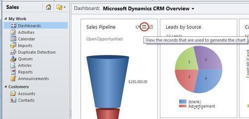
Click on the second menu item; the tooltip will read View the records that are used to generate the chart...