

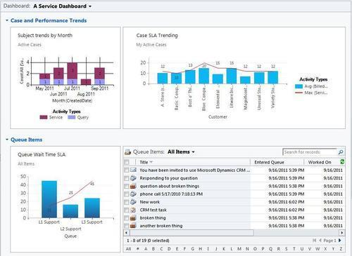
Microsoft Dynamics CRM comes standard with some excellent service-module dashboards and charts that let the user view data in many different ways. My take on the Service Dashboard is around trending and Service Level Agreements (SLA). There is a list included on the dashboard to let the service representative get access to open work items. The following screenshot shows a Service Dashboard:
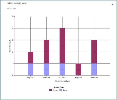
The Subject trends by Month visualization uses a stacked column chart showing total case counts, grouped by month, and stacked by the Subject field, as shown in the following screenshot. This sample only has two different subjects, but if you were to use a more elaborate subject tree, perhaps something such as shipping, manufacturing, and billing, the results would allow you to see growing trends in different Case subjects:
The Case SLA Trending visualization is a multi-series chart that uses the bar graph to show the average number of Billed Service Units against an Account, while the line graph shows the Service Units SLA number for the Account. This chart lets an account manager or service manager get an idea of how they are doing compared to the SLA they have with each account. In order to implement this chart, a custom field named serviceunitssla is added to the Account entity, as shown in the following code snippet. The trick was to include this field by using a <link-entity> parameter in the chart's FetchXML statement to pull the SLA value from the Account record related to the main Case (incident) entity that the chart is based on. More information about FetchXML is available in Chapter 9, Advanced Chart XML:
<fetch mapping="logical" aggregate="true">
 <entity name="incident">
  <attribute alias="aggregate_column" name="billedserviceunits" aggregate="avg" />
  <link-entity name="account" from="accountid" to="customerid" visible="false" link-type="outer" alias="a_4b5945b8a4a64613afc1ae1d5e6828c7">
    <attribute alias="aggregate_column2" name="new_serviceunitssla" aggregate="max" />
  </link-entity>
  <attribute groupby="true" alias="groupby_column" name="customerid" />
 </entity>
</fetch>
The following screenshot demonstrates the changes:

The Queue Wait Time SLA visualization is another multi-series chart that uses the bar graph to display the average wait time (in minutes) that an item sits in a queue before being assigned to someone directly. These queue items are grouped by queue, and the line graph shows the wait time SLA assigned to each queue. For example, the L1 Support queue has a Queue Wait Time SLA of 15 minutes, but the chart shows that they are averaging about 45 minutes (which is not good). In a similar approach to that mentioned for the chart earlier, this FetchXML uses a <link-entity> parameter to pull the SLA from a related entity:
<fetch mapping="logical" aggregate="true">
 <entity name="queueitem">
  <attribute alias="aggregate_column" name="new_waittime" aggregate="avg" />
  <link-entity name="queue" from="queueid" to="queueid" visible="false" link-type="outer" alias="a_4b5945b8a4a64613afc1ae1d5e6828c7">
    <attribute alias="aggregate_column2" name="new_waittimesla" aggregate="max" />
  </link-entity>
  <attribute groupby="true" alias="groupby_column" name="queueid" />
  </entity>
</fetch>
The following screenshot demonstrates the changes:
