Book Image

QlikView for Developers Cookbook

By : Stephen Redmond
Book Image

QlikView for Developers Cookbook

By: Stephen Redmond

Overview of this book

QlikView has been around since 1993, but has only really taken off in recent years as a leader in the in-memory BI space and, more recently, in the data discovery area. QlikView features the ability to consolidate relevant data from multiple sources into a single application, as well as an associative data model to allow you to explore the data to a way your brain works, state-of-the-art visualizations, dashboard, analysis and reports, and mobile data access. QlikView for Developers Cookbook builds on your initial training and experiences with QlikView to help you become a better developer. This book features plenty of hands-on examples of many challenging functions. Assuming a basic understanding of QlikView development, this book provides a range of step-by-step exercises to teach you different subjects to help build your QlikView developer expertise. From advanced charting and layout to set analysis; from advanced aggregations through to scripting, performance, and security, this book will cover all the areas that you need to know about. The recipes in this book will give you a lot of the information that you need to become an excellent QlikView developer.
Table of Contents (19 chapters)
QlikView for Developers Cookbook
Credits
Foreword
About the Author
About the Reviewers
www.PacktPub.com
Preface
Index

Using the wizard to create a box plot chart


With a simple data set, we want to see the median (or mean) values and different percentile values across the whole data set. But quite often, we want to look for a particular dimension (for example, Month), at the median and percentiles of the totals for another dimension (for example, Country). So, rather than the median for the individual values (say Sales), which could be quite small or quite large, we want to see the median for the total value by the second dimension.

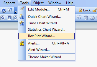
We can create this manually, but this can be achieved quickly using the Box Plot Wizard.

Getting ready

Load the following script:

LOAD * INLINE [
    Country, Value, Month
    USA, 12, 2013-01-01
    USA, 14.5, 2013-01-01
    USA, 6.6, 2013-02-01
    USA, 4.5, 2013-02-01
    USA, 7.8, 2013-03-01
    USA, 9.4, 2013-03-01
    UK, 11.3, 2013-01-01
    UK, 10.1, 2013-01-01
    UK, 3.2, 2013-02-01
    UK, 5.6, 2013-02-01
    UK, 3.9, 2013-03-01
    UK, 6.9, 2013-03-01
];

How to do it…

Use the following steps to create a box plot using the wizard:

  1. From the Tools menu, select Box Plot Wizard….

  2. On the introductory page, click on Next:

  3. Select the following values:

    Dimension

    Month

    Aggregator

    Country

    Expression

    Sum(Value)

  4. Click on Next.

  5. Select the following values:

    Display Mode

    Median

    Include Whiskers

    On or Min/Max

    Use Outliers

    On

  6. Click on Finish.

How it works…

The wizard takes care of creating the expressions that will be needed for this box plot. In this case, where there is an "aggregator"; that dimension is used as part of an Aggr expression.

There are two approaches to the box plot that can be achieved from the wizard:

  • Median mode

    • The central line is defined by the median (fiftieth percentile)

    • Top of the box is the seventy-fifth percentile

    • Bottom is the seventy-fifth percentile

    • Upper whisker is the maximum value

    • Lower whisker is the minimum value

  • Average mode

    • The central line is defined by the mean value

    • Top of the box is the Mean + the Standard Deviation

    • Bottom of the box is the Mean – the Standard Deviation

    Note

    Min/Max Whiskers may not be valid as they could lie inside the box!

There's more…

This recipe uses the AGGR function to see the average/median values of an aggregation. However, the box plot can be used for more than averages.

See also

  • The Creating a box plot chart for a simple data set recipe