
A simple way to make visualizations with NumPy is by using the library matplotlib. Let's make some visualizations quickly.
Plotting with NumPy and matplotlib
Getting ready
Start by importing numpy and matplotlib. You can view visualizations within an IPython Notebook using the %matplotlib inline command:
import numpy as np
 import matplotlib.pyplot as plt
 %matplotlib inline
How to do it...
- The main command in matplotlib, in pseudo code, is as follows:
plt.plot(numpy array, numpy array of same length)
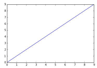
- Plot a straight line by placing two NumPy arrays of the same length:
plt.plot(np.arange(10), np.arange(10))
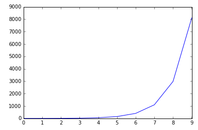
- Plot an exponential:
plt.plot(np.arange(10), np.exp(np.arange(10)))
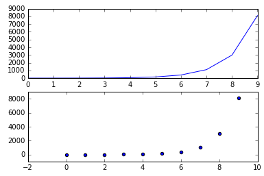
- Place the two graphs side by side:
plt.figure()
plt.subplot(121)
plt.plot(np.arange(10), np.exp(np.arange(10)))
plt.subplot(122)
plt.scatter(np.arange(10), np.exp(np.arange(10)))
Or top to bottom:
plt.figure()
plt.subplot(211)
plt.plot(np.arange(10), np.exp(np.arange(10)))
plt.subplot(212)
plt.scatter(np.arange(10), np.exp(np.arange(10)))
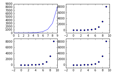
The first two numbers in the subplot command refer to the grid size in the figure instantiated by plt.figure(). The grid size referred to in plt.subplot(221) is 2 x 2, the first two digits. The last digit refers to traversing the grid in reading order: left to right and then up to down.
- Plot in a 2 x 2 grid traversing in reading order from one to four:
plt.figure()
plt.subplot(221)
plt.plot(np.arange(10), np.exp(np.arange(10)))
plt.subplot(222)
plt.scatter(np.arange(10), np.exp(np.arange(10)))
plt.subplot(223)
plt.scatter(np.arange(10), np.exp(np.arange(10)))
plt.subplot(224)
plt.scatter(np.arange(10), np.exp(np.arange(10)))
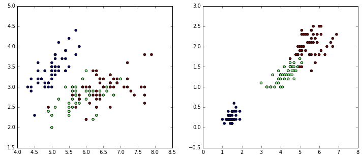
- Finally, with real data:
from sklearn.datasets import load_iris

iris = load_iris()
data = iris.data
target = iris.target

# Resize the figure for better viewing
plt.figure(figsize=(12,5))

# First subplot
plt.subplot(121)

# Visualize the first two columns of data:
plt.scatter(data[:,0], data[:,1], c=target)

# Second subplot
plt.subplot(122)

# Visualize the last two columns of data:
plt.scatter(data[:,2], data[:,3], c=target)
The c parameter takes an array of colors—in this case, the colors 0, 1, and 2 in the iris target: