Book Image

Big Data Analytics with Java

By : RAJAT MEHTA
Book Image

Big Data Analytics with Java

By: RAJAT MEHTA

Overview of this book

This book covers case studies such as sentiment analysis on a tweet dataset, recommendations on a movielens dataset, customer segmentation on an ecommerce dataset, and graph analysis on actual flights dataset. This book is an end-to-end guide to implement analytics on big data with Java. Java is the de facto language for major big data environments, including Hadoop. This book will teach you how to perform analytics on big data with production-friendly Java. This book basically divided into two sections. The first part is an introduction that will help the readers get acquainted with big data environments, whereas the second part will contain a hardcore discussion on all the concepts in analytics on big data. It will take you from data analysis and data visualization to the core concepts and advantages of machine learning, real-life usage of regression and classification using Naïve Bayes, a deep discussion on the concepts of clustering,and a review of simple neural networks on big data using deepLearning4j or plain Java Spark code. This book is a must-have book for Java developers who want to start learning big data analytics and want to use it in the real world.
Table of Contents (21 chapters)
Big Data Analytics with Java
Credits
About the Author
About the Reviewers
www.PacktPub.com
Customer Feedback
Preface
Free Chapter
1
Big Data Analytics with Java
8
Ensembling on Big Data
12
Real-Time Analytics on Big Data
Index

Histograms


A Histogram is a special kind of bar chart. A histogram depicts some quantitative value on the x axis and frequency of that value on the y axis. The main feature of a histogram is that in a histogram, the x axes are grouped into bins and we treat each bin as a category. Thus, for a particular value, we take both the x axis bin and the frequency on the y axis into account.

Let's try to understand a histogram using the same cars.json dataset, which we used earlier. For the quantitative variable on the x axis, we will be using the number of cars grouped by each country and depict that on the x axis. The Y axis will denote the frequency of the number of counts, that is, the percentage or probability of countries with that amount of cars in the dataset. The diagram is as shown next:

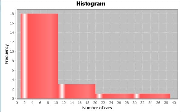
As you can see in the preceding chart, the maximum number of countries have a number of cars between 0 and 10 count. Next is the countries with cars between 10 and 20 count, and the remaining few between...