Book Image

101 UX Principles – 2nd edition - Second Edition

By : Will Grant
4 (2)
Book Image

101 UX Principles – 2nd edition - Second Edition

4 (2)
By: Will Grant

Overview of this book

“This updated version of 101 UX Principles is a delight. It's an educational and fun provocation to look at the world of UX differently – solidly from the user's point of view." -Elizabeth Churchill, Director of User Experience, Google “A phenomenal reference guide. Complete with case studies, a record of personal experience, and visual examples, Grant makes it clear why these techniques have found their way into the canon of UX best practices.” -Jeff Gothelf, Author of Lean UX “..I recommend it to anyone looking to learn the basics and also for more experienced designers - the author’s candid opinions will force you to revisit some of your established assumptions!" -Anne Marie-Leger, Staff Product Designer, Shopify “An absolute must-read, not only for UX designers, but this book is also super relevant for product managers trying to get better at product usability. Two enthusiastic thumbs up!" -Trent Blakely, Sr. Product Manager, Equinix This book is a manifesto of UX/UI design best practices to help you put the focus back on what really matters: the user. From UX laws to practical UI, color, typography, and accessibility advice, it’s all packed into this easy-to-consult and fun read: Essential UX laws Handy best practices Snippets of technical knowledge for anyone who wants to work in the digital space 101 UX Principles demonstrates the success from best-in-class products and leads the way to delight your users. Keep it on your desk for quick reference, send as a gift to colleagues to build allies, or brandish it as your weapon of choice during meetings to fight for your users’ right to a better digital experience. Sneak a peek at some of the new and updated principles in this UX design book: Work with user expectations, not against them Make interactive elements obvious and discoverable Optimize your interface for mobile Streamline creating and entering passwords Respect users' time and effort in your forms Use animation with care in user interfaces How to handle destructive user actions Chatbots are usually a bad idea – and how to make them better Use A/B testing to test your ideas Let users give feedback, but don't hassle them Make it clear to users if they're joining or signing-in Only use modal views for blocking actions How complexity can be good for some users
Table of Contents (18 chapters)
Preface
16
Other Books You May Enjoy
17
Index

Write Clear Labels for Controls

Another small change you can make, which will make the world of difference to your users using assistive technologies, is writing clear labels:

Write Clear Labels for Controls

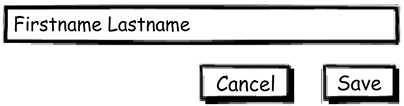
Figure 72.1: An example of bad labelling

Write Clear Labels for Controls

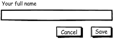
Figure 72.2: An example of good labelling

Pre-filling your field with placeholder (or watermark) text may look tidy, but it’s not supported in all browsers and disappears when the focus moves to the input field.

You can, however, include both, which allows the field to be identified and gives some assistance to users as to the kind of information that is needed for that input.

A word about alignment: from a logical “order of the content” point of view, it makes sense to add the label above the field and left align. All other alignments (right align, label to the left, and so on) have various visual and accessibility issues: your default should be above the field, left-aligned.

Write Clear Labels for Controls

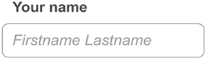
Figure 72.3: An input with a clear...