Book Image

101 UX Principles – 2nd edition - Second Edition

By : Will Grant
4 (2)
Book Image

101 UX Principles – 2nd edition - Second Edition

4 (2)
By: Will Grant

Overview of this book

“This updated version of 101 UX Principles is a delight. It's an educational and fun provocation to look at the world of UX differently – solidly from the user's point of view." -Elizabeth Churchill, Director of User Experience, Google “A phenomenal reference guide. Complete with case studies, a record of personal experience, and visual examples, Grant makes it clear why these techniques have found their way into the canon of UX best practices.” -Jeff Gothelf, Author of Lean UX “..I recommend it to anyone looking to learn the basics and also for more experienced designers - the author’s candid opinions will force you to revisit some of your established assumptions!" -Anne Marie-Leger, Staff Product Designer, Shopify “An absolute must-read, not only for UX designers, but this book is also super relevant for product managers trying to get better at product usability. Two enthusiastic thumbs up!" -Trent Blakely, Sr. Product Manager, Equinix This book is a manifesto of UX/UI design best practices to help you put the focus back on what really matters: the user. From UX laws to practical UI, color, typography, and accessibility advice, it’s all packed into this easy-to-consult and fun read: Essential UX laws Handy best practices Snippets of technical knowledge for anyone who wants to work in the digital space 101 UX Principles demonstrates the success from best-in-class products and leads the way to delight your users. Keep it on your desk for quick reference, send as a gift to colleagues to build allies, or brandish it as your weapon of choice during meetings to fight for your users’ right to a better digital experience. Sneak a peek at some of the new and updated principles in this UX design book: Work with user expectations, not against them Make interactive elements obvious and discoverable Optimize your interface for mobile Streamline creating and entering passwords Respect users' time and effort in your forms Use animation with care in user interfaces How to handle destructive user actions Chatbots are usually a bad idea – and how to make them better Use A/B testing to test your ideas Let users give feedback, but don't hassle them Make it clear to users if they're joining or signing-in Only use modal views for blocking actions How complexity can be good for some users
Table of Contents (18 chapters)
Preface
16
Other Books You May Enjoy
17
Index

Always Give Icons a Text Label

Now, I don’t mean text on the icon (see #37, Never Use Text on Icons)—I mean a text label near the icon, not just an icon on a button on its own.

Small, nondescript buttons, with obscure mystery icons on them, are next to useless and consistently perform terribly in user tests.

Always Give Icons a Text Label

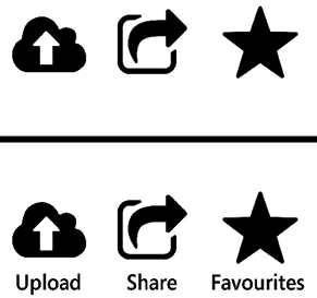
Figure 38.1: Which is easier to understand?

Let’s go back to the original purpose of an icon—to provide a quick visual shorthand by which the user can instantly recognize a control, and to provide a target for the user to click or tap. The icon isn’t meant to describe a button the first time that the user sees it—the user will need a text label for that. However, if the icon is distinct and recognizable, then the user will locate the control and recall its purpose more quickly with it.

Our old favorites, the Nielsen Norman Group, have a great shortcut for this, the “5-second rule”:

If it takes...