At this point, it would be really useful to visualize this graph. There are a number of different ways to visualize graphs. We'll use the JavaScript library D3 (data-driven documents, http://d3js.org/) to generate several graph visualizations on subgraphs of the Facebook network data, and we'll look at the pros and cons of each. Finally, we'll use a simple pie chart to visualize how much of the graph is affected as we move outward from a node through its degrees of separation.
As I just mentioned, D3 is a JavaScript library. JavaScripts are not bad, but this is a book about Clojure. There's an implementation of the Clojure compiler that takes Clojure and generates JavaScript. So, we'll use that to keep our focus on Clojure while we call JavaScript libraries and deploy them on a browser.
Before we can do that, however, we need to set up our system to use ClojureScript. The first thing we'll need to do is to add the configuration to our project.clj file for this project. This is fairly simple. We just need to declare lein-cljsbuild as a plugin for this project and then configure the ClojureScript compiler. Our project.clj file from earlier is shown as follows, with the relevant lines highlighted as follows:
The first line adds the lein-cljsbuild plugin to the project. The second block of lines tell Leiningen to watch the src-cljs directory for ClojureScript files. All of these files are then compiled into the www/js/main.js file.
We'll need an HTML file to frame the compiled JavaScript. In the code download, I've included a basic page that's modified from an HTML5 Boilerplate template (http://html5boilerplate.com/). The biggest change is that I've taken out everything that's in the div content.
Also, I added some script tags to load D3 and a D3 plugin for one of the types of graphs that we'll use later. After the tag that loads bootstrap.min.js, I added these:
Finally, to load the data files asynchronously with AJAX, the www directory will need to be accessible from a web server. There are a number of different options, but if you have Python installed, the easiest option is to probably navigate to the www directory and execute the following command:
Now we're ready to proceed. Let's make some charts!
One of the standard chart types to visualize graphs is a
force-directed layout. These charts use a dynamic-layout algorithm to generate charts that are more clear and look nice. They're modeled on springs. Each vertex repels all the other vertices, but the edges draw the vertices closer.
To have this graph compiled to JavaScript, we start by creating a file named src-cljs/network-six/force.cljs. We'll have a standard namespace declaration at the top of the file:
Generally, when we use D3, we first set up part of the graph. Then, we get the data. When the data is returned, we continue setting up the graph. In D3, this generally means selecting one or more elements currently in the tree and then selecting some of their children using selectAll. The elements in this new selection may or may not exist at this point. We join the selectAll elements with the data. From this point, we use the enter method most of the time to enter the data items and the nonexistent elements that we selected earlier. If we're updating the data, assuming that the elements already exist, then the process is slightly different. However, the process that uses the enter method, which I described, is the normal workflow that uses D3.
So, we'll start with a little setup for the graph by creating the color palette. In the graph that we're creating, colors will represent the node's distance from a central node. We'll take some time to understand this, because it illustrates some of the differences between Clojure and ClojureScript, and it shows us how to call JavaScript:
Let's take this bit by bit so that we can understand it all. I'll list a line and then point out what's interesting about it:
There are a couple of things that we need to notice about this line. First,.. is the standard member access macro that we use for Java's interoperability with the main Clojure implementation. In this case, we're using it to construct a series of access calls against a JavaScript object. In this case, the ClojureScript that the macro expands to would be (.domain (.category10 (.-scale js/d3)) (array 0 1 2 3 4 5 6)).
In this case, that object is the main D3 object. The js/ namespace is available by default. It's just an escape hatch to the main JavaScript scope. In this case, it would be the same as accessing a property on the JavaScript window object. You can use this to access anything from JavaScript without having to declare it. I regularly use it with js/console for debugging, for example:
This resolves into the JavaScript d3.scale call. The minus sign before scale just means that the call is a property and not a function that takes no arguments. As Clojure doesn't have properties and everything here would look like a function call, ClojureScript needs some way to know that this should not generate a function call. The dash does that as follows:
This line, combined with the preceding lines, generates JavaScript that looks like d3.scale.category10(). In this case, the call doesn't have a minus sign before it, so the ClojureScript compiler knows that it should generate a function call in this case:
Finally, this makes a call to the scale's domain method with an array that sets the domain to the integers between 0 and 6, inclusive of both. These are the values for the distances that we'll look at. The JavaScript for this would be d3.scale.category10().domain([0, 1, 2, 3, 4, 5, 6]).
This function creates and returns a color object. This object is callable, and when it acts as a function that takes a value and returns a color, this will consistently return the same color whenever it's called with a given value from the domain. For example, this way, the distance 1 will also be associated with the same color in the visualization.
This gives us an introduction to the rules for interoperability in ClojureScript. Before we make the call to get the data file, we'll also create the object that takes care of managing the force-directed layout and the D3 object for the svg element. However, you can check the code download provided on the Packt Publishing website for the functions that create these objects.
Next, we need to access the data. We'll see that in a minute, though. First, we need to define some more functions to work with the data once we have it.For the first function, we need to take the force-layout object and associate the data with it.
The data for all of the visualizations has the same format. Each visualization is a JSON object with three keys. The first one, nodes, is an array of JSON objects, each representing one vertex in the graph. The main property of these objects that we're interested in is the data property. This contains the distance of the current vertex from the origin vertex. Next, the links property is a list of JSON objects that represent the edges of the graph. Each link contains the index of a source vertex and a target vertex. Third, the graph property contains the entire graph using the same data structures as we did in Clojure.
The force-directed layout object expects to work with the data from the nodes and the links properties. We set this up and start the animation with the setup-force-layout function:
As the animation continues, the force-layout object will assign each node and link the object with one or more coordinates. We'll need to update the circles and paths with those values.
We'll do this with a handler for a tick event that the layout object will emit:
Also, at this stage, we create the circle and path elements that represent the vertices and edges. We won't list these functions here.
Finally, we tie everything together. First, we set up the initial objects, then we ask the server for the data, and finally, we create the HTML/SVG elements that represent the data. This is all tied together with the main function:
There are a couple of things that we need to notice about this function, and they're both highlighted in the preceding snippet. The first is that the function name has an :export metadata flag attached to it. This just signals that the ClojureScript compiler should make this function accessible from JavaScript outside this namespace. The second is the call to d3.json. This function takes a URL for a JSON data file and a function to handle the results. We'll see more of this function later.
Before we can use this, we need to call it from the HTML page. After the script tag that loads js/main.js, I added this script tag:
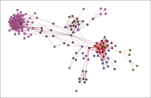
This loads the data file for vertex number 49. This vertex had a betweenness factor of 0.0015, and it could reach four percent of the larger network within six hops. This is small enough to create a meaningful, comprehensible graphic, as seen in the following figure:
The origin vertex (49) is the blue vertex on the lower-right section, almost the farthest-right node of the graph. All the nodes at each hop away from that node will be of a different color. The origin vertex branches to three orange vertices, which link to some green ones. One of the green vertices is in the middle of the larger cluster on the right.
Some aspects of this graph are very helpful. It makes it relatively easy to trace the nodes as they get farther from the origin. This is even easier when interacting with the node in the browser, because it's easy to grab a node and pull it away from its neighbors.
However, it distorts some other information. The graph that we're working with today is not weighted. Theoretically, the links in the graph should be the same length because all the edges have the same weight. In practice, however, it's impossible to display a graph in two dimensions. Force-directed layouts help you display the graph, but the cost is that it's hard to tell exactly what the line lengths and the several clear clusters of various sizes mean on this graph.
Also, the graphs themselves cannot be compared. If we then pulled out a subgraph around a different vertex and charted it, we wouldn't be able to tell much by comparing the two.
So what other options do we have?
The first option is a
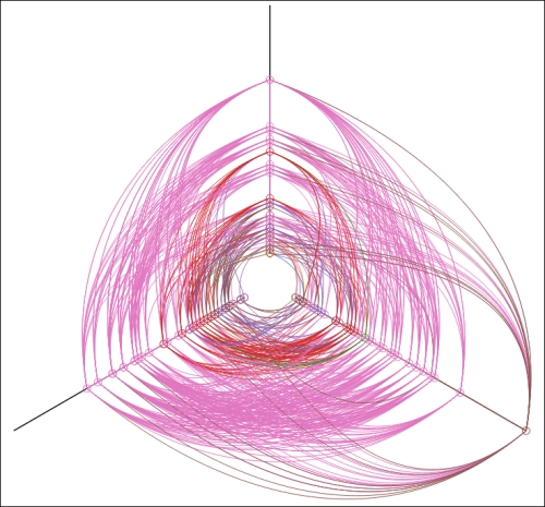
hive plot. This is a chart type developed by Martin Krzywinski (http://egweb.bcgsc.ca/). These charts are a little different, and reading them can take some time to get used to, but they pack in more meaningful information than force-directed layout or other similar chart types do.
In hive plots, the nodes are positioned along a number of radial axes, often three. Their positions on the axis and which axis they fall on are often meaningful, although the meanings may change between different charts in different domains.
For this, we'll have vertices with a higher degree (with more edges attached to them) be positioned farther out from the center. Vertices closer in will have fewer edges and fewer neighbors. Again, the color of the lines represent the distance of that node from the central node. In this case, we won't make the selection of the axis meaningful.
To create this plot, we'll open a new file, src-cljs/network-six/hive.cljs. At the top, we'll use this namespace declaration:
The axis on which a node falls on is an example of a D3 scale; its color from the force layout plot is another scale. Scales are functions that also have properties attached and are accessible via getter or setter functions. However, primarily, when they are passed a data object and a key function, they know how to assign that data object a position on the scale.
In this case, the make-angle function will be used to assign nodes to an axis:
We'll position the nodes along each axis with the get-radius function. This is another scale that takes a vertex and positions it in a range between 40 and 400 according to the number of edges that are connected to it:
We use these scales, along with a scale for color, to position and style the nodes:
I've highlighted the scales that we use in the preceding code snippet. The circle's stroke property comes from the color, which represents the distance of the vertex from the origin for this graph.
The angle is used to assign the circle to an axis using the circle's transform attribute. This is done more or less at random, based on the vertex's index in the data collection.
Finally, the radius scale positions the circle along the axis. This sets the circle's position on the x axis, which is then rotated using the transform attribute and the angle scale.
Again, everything is brought together in the main function. This sets up the scales, requests the data, and then creates and positions the nodes and edges:
Let's see what this graph looks like:
Again, the color represents the distance of the node from the central node. The distance from the center on each axis is the degree of the node.
It's clear from the predominance of the purple-pink color and the bands that the majority of the vertices are six hops from the origin vertex. From the vertices' position on the axes, we can also see that most nodes have a moderate number of edges attached to them. One has quite a few, but most are much closer to the center.
This graph is denser. Although the force-layout graph may have been problematic, it seemed more intuitive and easier to understand, whether it was meaningful or not. Hive plots are more meaningful, but they also take a bit more work to learn to read and to decipher.
Our needs today are simpler than the complex graph we just created; however, we're primarily interested in how much of the network is covered within six hops from a vertex. Neither of the two graphs that we've looked at so far conveyed that well, although they have presented other information and they're commonly used with graphs. We want to know proportions, and the go-to chart for proportions is the pie chart. Maybe it's a little boring, and it's does not strictly speak of a graph visualization per se, but it's clear, and we know what we're dealing with in it.
Generating a pie chart will look very similar to creating a force-directed layout graph or a hive plot. We'll go through the same steps, overall, even though some of the details will be different.
One of the first differences is the function to create an arc. This is similar to a scale, but its output is used to create the d (path description) attribute of the pie chart's wedges:
The pie layout controls the overall process and design of the chart. In this case, we say that we want no sorting, and we need to use the amount property of the data objects:
The other difference in this chart is that we'll need to preprocess the data before it's ready to be fed to the pie layout. Instead of a list of nodes and links, we'll need to give it categories and counts. To make this easier, we'll create a record type for these frequencies:
Also, we'll need a function that takes the same data as the other charts, counts it by distance from the origin vertex, and creates Freq instances to contain that data:
Again, we pull all these together in the main function, and we do things in the usual way. First, we set up the graph, then we retrieve the data, and finally, we put the two together to create the graph.
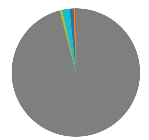
In this case, this should give us an idea of how much of the graph this vertex can easily touch. The graph for vertex 49 is shown as follows. We can see that it really doesn't touch much of the network at all. 3799 vertices, more than 95 percent of the network, aren't within six hops of vertex 49.
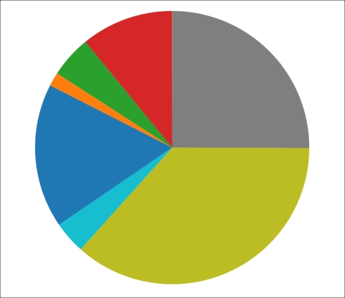
However, if we compare this with the pie chart for vertex 1085, which was the vertex with the highest betweenness factor, we see a very different picture. For that vertex, more than 95 percent of the network is reachable within 6 hops.
It's also interesting that most of the vertices are four edges away from the origin. For smaller networks, most vertices are further away. However, in this case, it's almost as if it had started running out of vertices in the network.


 Free Chapter