Sign In Start Free Trial
Account

Add to playlist

Create a Playlist

Modal Close icon
You need to login to use this feature.
  • Book Overview & Buying R Data Visualization Recipes
  • Table Of Contents Toc
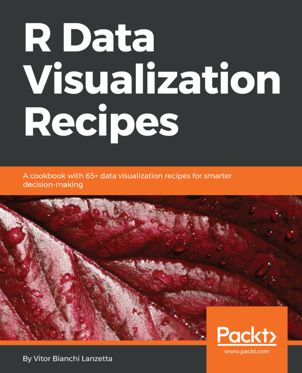
R Data Visualization Recipes

R Data Visualization Recipes

By : Vitor Bianchi Lanzetta
4 (1)
close
close
R Data Visualization Recipes

R Data Visualization Recipes

4 (1)
By: Vitor Bianchi Lanzetta

Overview of this book

R is an open source language for data analysis and graphics that allows users to load various packages for effective and better data interpretation. Its popularity has soared in recent years because of its powerful capabilities when it comes to turning different kinds of data into intuitive visualization solutions. This book is an update to our earlier R data visualization cookbook with 100 percent fresh content and covering all the cutting edge R data visualization tools. This book is packed with practical recipes, designed to provide you with all the guidance needed to get to grips with data visualization using R. It starts off with the basics of ggplot2, ggvis, and plotly visualization packages, along with an introduction to creating maps and customizing them, before progressively taking you through various ggplot2 extensions, such as ggforce, ggrepel, and gganimate. Using real-world datasets, you will analyze and visualize your data as histograms, bar graphs, and scatterplots, and customize your plots with various themes and coloring options. The book also covers advanced visualization aspects such as creating interactive dashboards using Shiny By the end of the book, you will be equipped with key techniques to create impressive data visualizations with professional efficiency and precision.
Table of Contents (13 chapters)
close
close

Using ggrepel to plot non-overlaying texts


Remember the times you wanted to plot texts or labels but feared that they would overlay? Fear no more, your troubles have met a sad end with ggrepel. This wonderful package shifts the text while adding a line segment to tell the audience from what place the text had come from.

This is wonderful for several reasons. When you want to plot pure text but over plotting is spoiling it or when text from your bubble plot is stealing the attention from some really small points, here is the solution. To understand it, we are back to our Armada bubble plot.

Getting Ready

Besides downloading ggrepel--as we are back to our armada plot--we need the HistData package again, so run the following:

> if(!require(ggrepel)){install.packages('ggrepel')}
> if(!require(HistData)){insertClassMethods('HistData')}

If everything went fine, you're are now locked and loaded.

How to do it...

For this recipe, we will be drawing a bubble plot and afterward making sure that the...

CONTINUE READING
83
Tech Concepts
36
Programming languages
73
Tech Tools
Icon Unlimited access to the largest independent learning library in tech of over 8,000 expert-authored tech books and videos.
Icon Innovative learning tools, including AI book assistants, code context explainers, and text-to-speech.
Icon 50+ new titles added per month and exclusive early access to books as they are being written.
R Data Visualization Recipes
notes
bookmark Notes and Bookmarks search Search in title playlist Add to playlist download Download options font-size Font size

Change the font size

margin-width Margin width

Change margin width

day-mode Day/Sepia/Night Modes

Change background colour

Close icon Search
Country selected

Close icon Your notes and bookmarks

Confirmation

Modal Close icon
claim successful

Buy this book with your credits?

Modal Close icon
Are you sure you want to buy this book with one of your credits?
Close
YES, BUY

Submit Your Feedback

Modal Close icon
Modal Close icon
Modal Close icon