

First use case – tracking images in Comet
For the first use case, we describe how to build a panel showing a time series related to some Italian performance indicators in Comet. The example uses the matplotlib library to build the graphs.
You can download the full code of this example from the official GitHub repository of the book, available at the following link: https://github.com/PacktPublishing/Comet-for-Data-Science/tree/main/01.
The dataset used is provided by the World Bank under the CC 4.0 license, and we can download it from the following link: https://api.worldbank.org/v2/en/country/ITA?downloadformat=csv.
The dataset contains more than 1,000 time series indicators regarding the performance of Italy's economy. Among them, we will focus on the 52 indicators related to Gross Domestic Product (GDP), as shown in the following table:
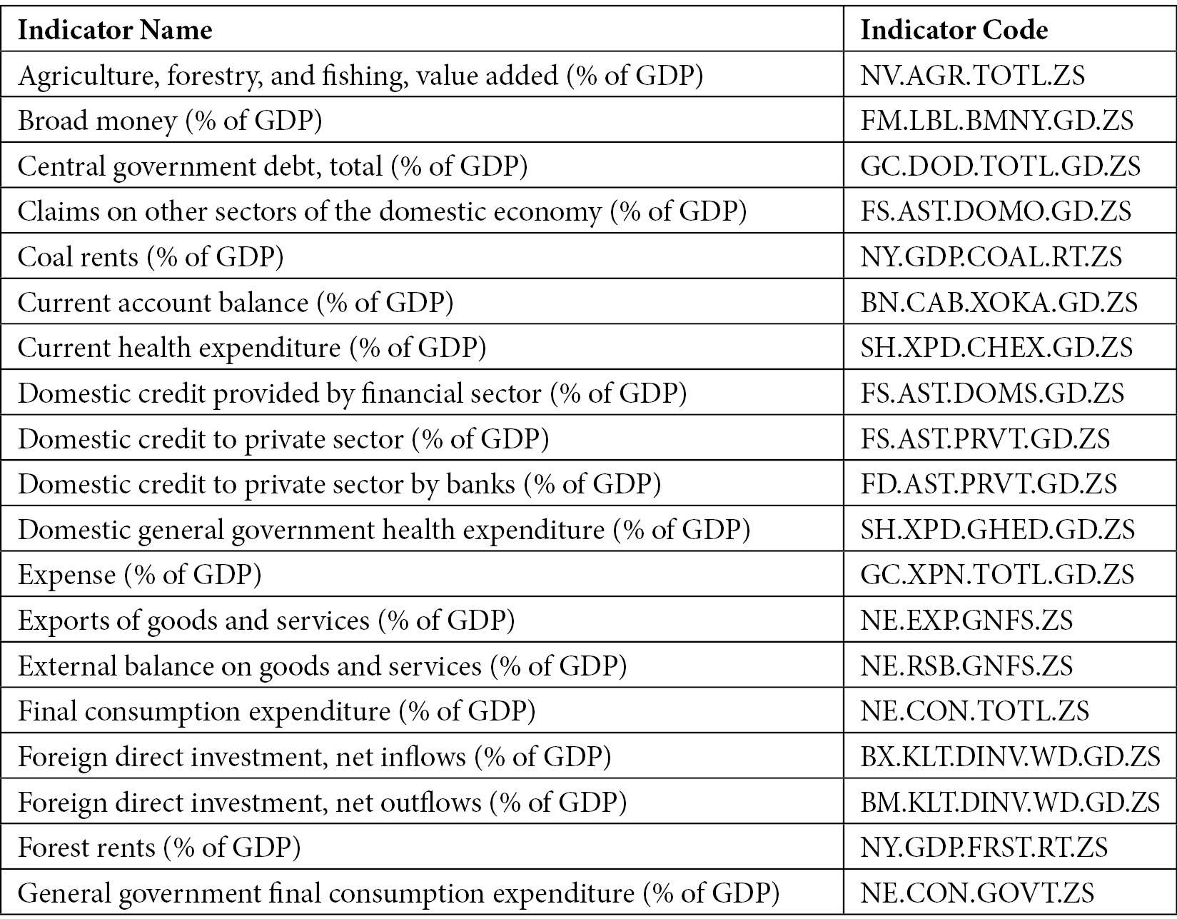
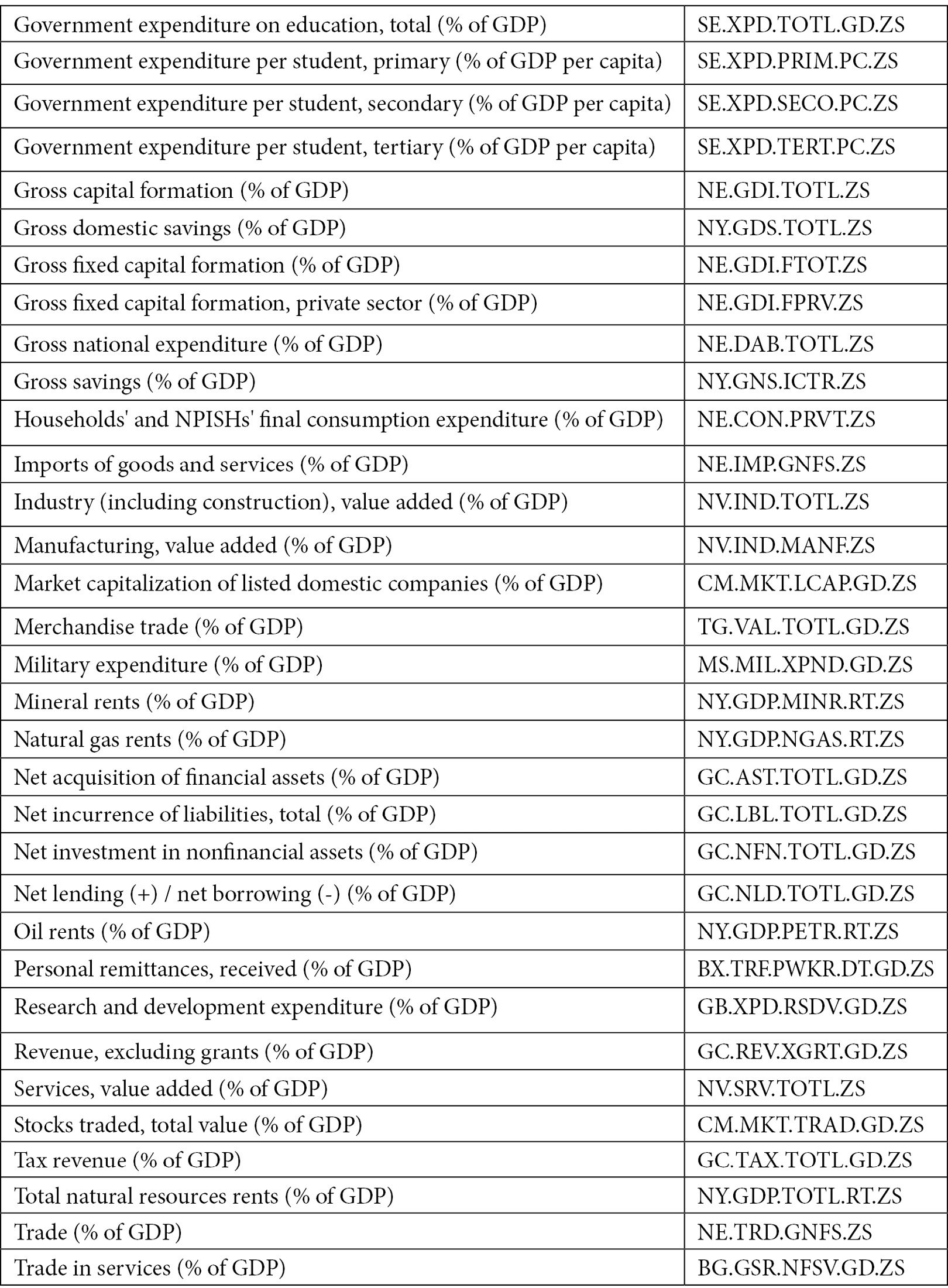
Figure 1.9 – Time series indicators related to GDP used to build the dashboard in Comet
The table shows the indicator name and its associated code.
We implement the Comet dashboard through the following steps:
- Download the dataset.
- Clean the dataset.
- Build the visualizations.
- Integrate the graphs in Comet.
- Build a panel.
So, let's move on to building your first use case in Comet, starting with the first steps, downloading and cleaning the dataset.
Downloading the dataset
As already said at the beginning of this section, we can download the dataset from this link: https://api.worldbank.org/v2/en/country/ITA?downloadformat=csv. Before we can use it, we must remove the first two lines from the file, because they are simply a header section. We can perform the following steps:
- Download the dataset from the previous link.
- Unzip the downloaded folder.
- Enter the unzipped directory and open the file named
API_ITA_DS2_en_csv_v2_3472313.csvwith a text editor. - Select and remove the first four lines, as shown in the following figure:
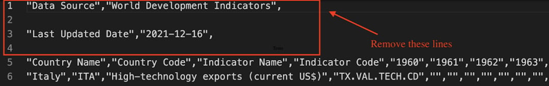
Figure 1.10 – Lines to be removed from the API_ITA_DS2_en_csv_v2_3472313.csv file
- Save and close the file. Now, we are ready to open and prepare the dataset for the next steps. Firstly, we load the dataset as a
pandasDataFrame:import pandas as pd df = pd.read_csv('API_ITA_DS2_en_csv_v2_3472313.csv')
We import the pandas library, and then we read the CSV file through the read_csv() method provided by pandas.
The following figure shows an extract of the table:
Figure 1.11 – An extract of the API_ITA_DS2_en_csv_v2_3472313.csv dataset
The dataset contains 66 columns, including the following:
- Country Name – Set to
Italyfor all the records. - Country Code – Set to
ITAfor all the records. - Indicator Name – Text describing the name of the indicator.
- Indicator Code – String specifying the unique code associated with the indicator.
- Columns from 1960 to 2020 – The specific value for a given indicator in that specific year.
- Empty column – An empty column. The
pandasDataFrame names this columnUnnamed: 65.
Now that we have downloaded and loaded the dataset as a pandas DataFrame, we can perform dataset cleaning.
Dataset cleaning
The dataset presents the following problems:
- Some columns are not necessary for our purpose.
- We need only indicators related to GDP.
- The dataset contains the years' names in the header.
- Some rows contain missing values.
We can solve the previous problems by cleaning the dataset with the following operations:
- Drop unnecessary columns.
- Filter only GDP-based indicators.
- Transpose the dataset to obtain years as a single column.
- Deal with missing values.
Now, we can start the data cleaning process from the first step – drop unnecessary columns. We should remove the following columns:
Country NameCountry CodeIndicator CodeUnnamed: 65
We can perform this operation with a single line of code, as follows:
df.drop(['Country Name', 'Country Code', 'Indicator Code','Unnamed: 65'], axis=1, inplace = True)
The previous code exploits the drop() method of the pandas DataFrame. As the first parameter, we pass the list of columns to be dropped. The second parameter, (axis = 1), specifies that we want to drop columns, and the last parameter, (inplace = True), specifies that all the changes must be stored in the original dataset.
Now that we have removed unnecessary columns, we can filter only GDP-based indicators. All the GDP-based indicators contain the following text: (% of GDP). So, we can select only these indicators by searching all the records where the Indicator Name column contains that text, as shown in the following piece of code:
df = df[df['Indicator Name'].str.contains('(% of GDP)')]
We can use the operation contained in square brackets (df['Indicator Name'].str.contains('(% of GDP)')) to extract only the rows that match our criteria, in this case, the rows that contain the string (% of GDP). We have exploited the str attribute of the DataFrame to extract all the strings of the Indicator Name column, and then we have matched each of them with the string (% of GDP). The contains() method returns True only if there is a match; otherwise, it returns False.
Now we have only the interesting metrics. So, we can move on to the next step: transposing the dataset to obtain years as a single column. We can perform this operation as follows:
df = df.transpose()
df.columns = df.iloc[0]
df = df[1:]
The transpose() method exchanges rows and columns. In addition, in the transposed DataFrame, we want to rename the columns to the indicator name. We can achieve this through the last two lines of code.
Now that we have transposed the dataset, we can proceed with missing values management. We could adopt different strategies, such as interpolation or average values. However, to keep the example simple, we decide to simply drop rows from 1960 to 1969 that do not contain values for almost all the analyzed indicators. In addition, we drop the indicators that contain less than 30 no-null values.
We can perform these operations through the following line of code:
df.dropna(thresh=30, axis=1, inplace = True)
df = df.iloc[10:]
Firstly, we drop all the columns (each representing a different indicator) with less than 30 non-null values. Then, we drop all the rows from 1960 to 1969.
Now, the dataset is cleaned and ready for further analysis. The following figure shows an extract of the final dataset:
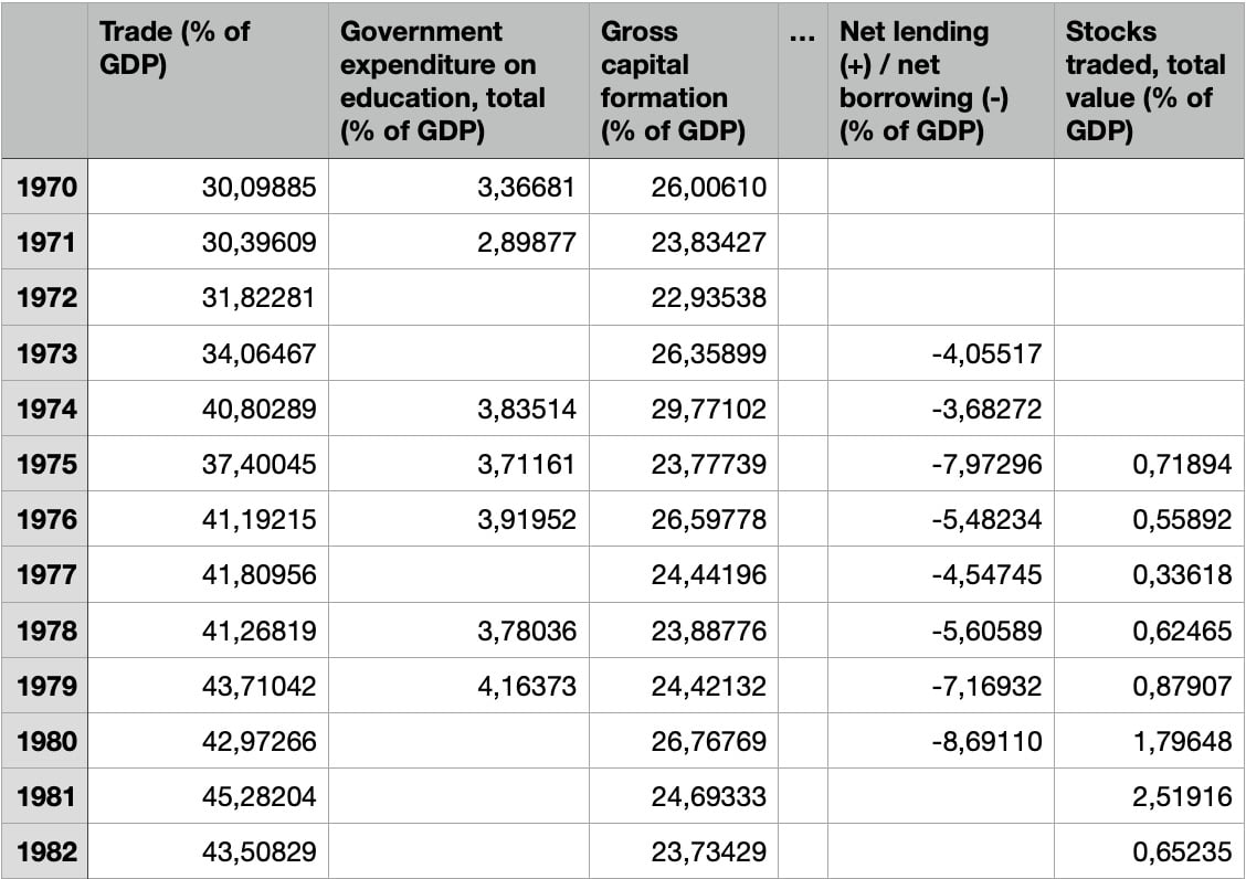
Figure 1.12 – The final dataset, after the cleaning operations
The figure shows that we have grouped years from different columns into a single column, as well as splitting indicators from one column into different columns. Before the dropping operation, the dataset before had 61 rows and 52 columns. After dropping, the resulting dataset has 51 rows and 39 columns.
We can save the final dataset, as follows:
df.to_csv('API_IT_GDP.csv')
We have exploited the to_csv() method provided by the pandas DataFrame.
Now that we have cleaned the dataset, we can move on to the next step – building the visualizations.
Building the visualizations
For each indicator, we build a separate graph that represents its trendline over time. We exploit the matplotlib library.
Firstly, we define a simple function that plots an indicator and saves the figure in a file:
import matplotlib.pyplot as plt
import numpy as np
def plot_indicator(ts, indicator):
    xmin = np.min(ts.index)
    xmax = np.max(ts.index)
    plt.xticks(np.arange(xmin, xmax+1, 1),rotation=45)
    plt.xlim(xmin,xmax)
    plt.title(indicator)
    plt.grid()
    plt.figure(figsize=(15,6))
    plt.plot(ts)
    fig_name = indicator.replace('/', "") + '.png'
    plt.savefig(fig_name)
    return fig_name
The plot_indicator() function receives a time series and the indicator name as input. Firstly, we set the range of the x axis through the xticks() method. Then, we set the title through the title() method. We also activate the grid through the grid() method, as well as setting the figure size, through the figure() method. Finally, we plot the time series (plt.plot(ts)) and save it to our local filesystem. If the indicator name contains a /, we replace it with an empty value. The function returns the figure name.
The previous code generates a figure like the following one:
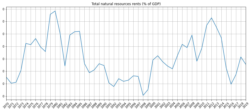
Figure 1.13 – An example of a figure generated by the plot_indicator() function
Now that we have set up the code to create the figures, we can move on to the last step: integrating the graphs in Comet.
Integrating the graphs in Comet
Now, we can create a project and an experiment by following the procedure described in the Getting started with workspaces, projects, experiments, and panels section. We copy the generated code and paste it into our script:
from comet-ml import Experiment
experiment = Experiment()
We have just created an experiment. We have stored the API key and the other parameters in the .comet.config file located in our working directory.
Now we are ready to plot the figures. We use the log_image() method provided by the Comet experiment to store every produced figure in Comet:
for indicator in df.columns:
    ts = df[indicator]
    ts.dropna(inplace=True)
    ts.index = ts.index.astype(int)
    fig = plot_indicator(ts,indicator)
    experiment.log_image(fig,name=indicator, image_format='png')
We iterate over the list of indicators, identified by the DataFrame columns (df.columns). Then, we extract the associated time series from the current indicator. After, we save the figure through the plot_indicator() function, previously defined. Finally, we load the image in Comet.
The code is complete, so we run it.
When the running phase is complete, the results of the experiments are available in Comet. To see the produced graphs, we perform the following steps:
- Open your Comet project.
- Select Experiments from the top menu.
- A table with all the experiments that have run appears. In our case, there is only one experiment.
- Click on the experiment name, in the first cell on the left. Since we have not set a specific name for the experiment, Comet will add it for us. An example of a name given by Comet is straight_contract_1272.
- Comet shows a dashboard with all the experiment details. Click on the Graphics section from the left menu. Comet shows all your produced graphs, as shown in the following figure:
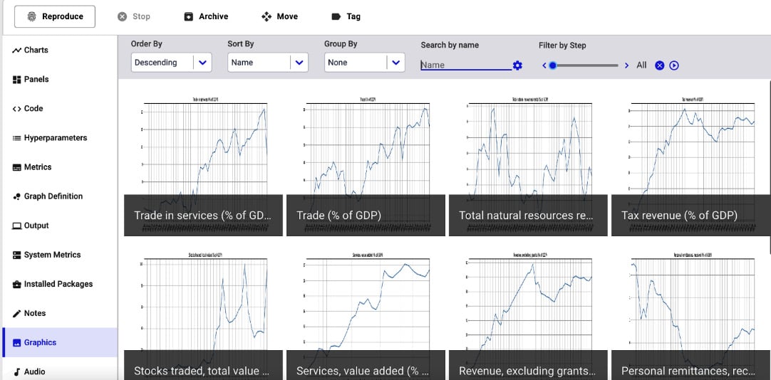
Figure 1.14 – A screenshot of the Graphics section
The figure shows all the indicators in descending order. Alternatively, you can display figures in ascending order and you can sort and group them.
Comet also stores the original images under the Assets & Artifacts section of the left menu, as shown in the following figure:
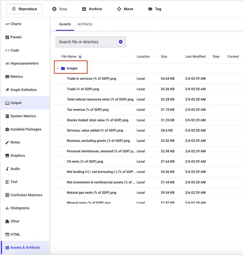
Figure 1.15 – A screenshot of the Assets & Artifacts section
The figure shows that all the images are stored in the images directory. The Assets & Artifacts directory also contains two directories, named notebooks and source-code.
Finally, the Code section shows the code that has generated the experiment. This is very useful when running different experiments.
Now that you have learned how to track images in Comet, we can build a panel with the created images.
Building a panel
To build the panel that shows all the tracked images, you can use the Show Images panel, which is available on the Featured Panels tab of the Comet panels. To add this panel, we perform the following steps:
- From the Comet main dashboard, click on the Add button in the top-right corner.
- Select New Panel.
- Select the Featured tab | Show Images | Add.
A new window opens, as shown in the following figure:
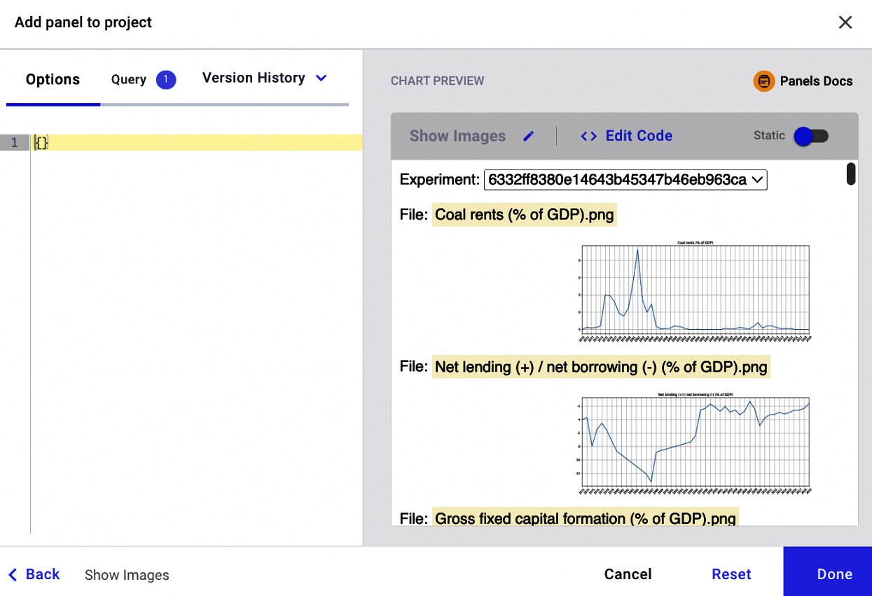
Figure 1.16 – The interface to build the Featured Panel called Show Images
The figure shows a preview of the panel with all the images. We can set some variables, through the key-value pairs, that contain only one image, by specifying the following parameters in the left text box:
{ "imageFileName": "Gross fixed capital formation (% of GDP).png" }
The "imageFileName" parameter allows us to specify exactly the image to be plotted. The following figure shows a preview of the resulting panel, after specifying the image filename:
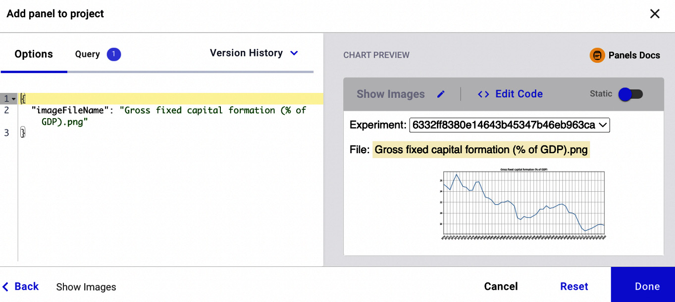
Figure 1.17 – A preview of the Show Images panel after specifying key-value pairs
The figure shows how we can manipulate the output of the panel on the basis of the key-value variables. The variables accepted by a panel depend on the specific panel. We will investigate this aspect more deeply in the next chapter.
Now that we have learned how to get started with Comet, we can move on to a more complex example that implements a simple linear regression model.