
We now have all the necessary concepts to be able to create any interface we want. This section describes the project that we will improve on, as we go through the following three chapters – the Comic Creator. The basic idea of the project is a simple application to draw a stickman. The following screenshot is a sketch (wireframe) of the GUI we are aiming for:
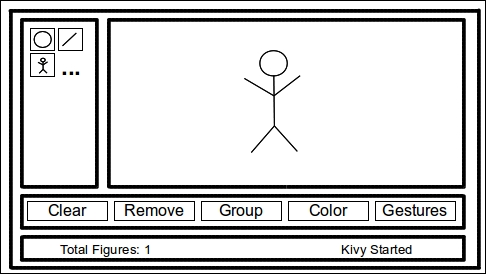
We can distinguish several areas in the sketch. First, we need a drawing space (top-right) for our comics. We need a tool box (top-left) with some drawing tools to draw our figures and also some general options (second from bottom to top) – clear the screen, remove the last element, group elements, change color, and use the gestures mode. Finally, it would be useful to have a status bar (center-bottom) to provide some information to the user – number of figures and last action performed. According to what we have learned in this chapter, there are multiple solutions to organize this screen. We will use the following:
AnchorLayoutfor the tool box area in the top-left corner. Inside it will be aGridLayoutof two columns for the drawing tools.AnchorLayoutfor the drawing space in the top-right corner. Inside it will be aRelativeLayoutto have a relative space to draw in.AnchorLayoutfor the general options and status bar area at the bottom. Inside it will be aBoxLayoutwith vertical orientation to organize the general options on top of the status bar:
We are going to use that structure by creating different files for each area – comiccreator.py, comiccreator.kv, toolbox.kv, generaltools.kv, drawingspace.kv, and statusbar.kv. Let's start with comiccreator.py:
198. # File name: comiccreator.py
199. from kivy.app import App
200. from kivy.lang import Builder
201. from kivy.uix.anchorlayout import AnchorLayout
200.
201. Builder.load_file('toolbox.kv')
202. Builder.load_file('drawingspace.kv')
203. Builder.load_file('generaloptions.kv')
204. Builder.load_file('statusbar.kv')
205.
206. class ComicCreator(AnchorLayout):
207.     pass
208.
209. class ComicCreatorApp(App):
210. def build(self):
211.         return ComicCreator()
212.
213. if __name__=="__main__":
214.     ComicCreatorApp().run()
Note that we are explicitly loading some of the files with the Builder.load_file instruction (lines 203 to 206). There is no need to explicitly load comiccreator.kv because Kivy automatically loads it by extracting the first part of the ComicCreatorApp name. For ComicCreator, we choose AnchorLayout. It is not the only option, but it gives clarity to the code, because the second level is also composed of AnchorLayout instances.
Even though using a simple widget would have been clear, it is not possible, because the Widget class doesn't honor the size_hint and pos_hint properties that are necessary in the AnchorLayout internals.
Here is the code for comiccreator.kv:
216. # File name: comiccreator.kv
217. <ComicCreator>:
218.     AnchorLayout:
219.         anchor_x: 'left'
220.         anchor_y: 'top'
221.         ToolBox:
222.             id: _tool_box
223.             size_hint: None, None
224.             width: 100
225.     AnchorLayout:
226.         anchor_x: 'right'
227.         anchor_y: 'top'
228.         DrawingSpace:
229.             size_hint: None, None
230.             width: root.width - _tool_box.width
231.             height: root.height - _general_options.height - _status_bar.height
232.     AnchorLayout:
233.         anchor_x: 'center'
234.         anchor_y: 'bottom'
235.         BoxLayout:
236.             orientation: 'vertical'
237.             GeneralOptions:
238.                 id: _general_options
239.                 size_hint: 1,None
240.                 height: 48
241.             StatusBar:
242.                 id: _status_bar
243.                 size_hint: 1,None
244.                 height: 24
This code follows the previously presented structure for the Comic Creator. There are basically three AnchorLayout instances in the first level (lines 219, 226, and 233) and a BoxLayout that organizes the general options and the status bar (line 236).
We set the width of the ToolBox to 100 pixels and the height of the GeneralOptions and StatusBar to 48 and 24 pixels respectively (lines 241 and 245). This brings with it an interesting problem – the drawing space should use the remaining width and height of the screen (no matter the screen size). In order to achieve this, we will take advantage of the Kivy id (lines 223, 239, and 243), which allows us to refer to other components inside the Kivy language. On lines 231 and 232, we subtract tool_box.width from root.width (line 231) and general_options.height and status_bar.height from root.height (line 232).
Note
A Kivy id allows us to create internal variables in order to access properties of other widgets inside the Kivy language rules.
For now, let's continue exploring the Kivy language in the toolbox.kv:
245. # File name: toolbox.kv
246. <ToolButton@ToggleButton>:
247.     size_hint: None, None
248.     size: 48,48
249.     group: 'tool'
250.
251. <ToolBox@GridLayout>:
252.     cols: 2
253.     padding: 2
254.     ToolButton:
255.         text: 'O'
256.     ToolButton:
257.         text: '/'
258.     ToolButton:
259.         text: '?'
We created a ToolButton class that defines the size of the drawing tools and also introduces a new Kivy widget – ToggleButton. The difference with the normal Button is that it stays pressed until we click on it again. The following is an example of the tool box with a ToolButton activated:
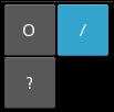
A ToggleButton instance can be associated with other ToggleButton instances, so just one of them is clicked on at a time. We can achieve this by assigning the same group property (line 250) to the ToggleButton instances that we want to react together. In this case, we want all the instances of ToolButton belonging to the same group, because we want to draw just one figure at a time; we make it part of the class definition (line 247).
On line 252, we implement ToolBox as a subclass of GridLayout and we add some character placeholders ('O', '/', and '?') to the ToolButton instances that we will substitute for something more appropriate in the following chapters.
The following is the code for generaloptions.kv:
260. # File name: generaloptions.kv
261. <GeneralOptions@BoxLayout>:
262.     orientation: 'horizontal'
263.     padding: 2
264.     Button:
265.         text: 'Clear'
266.     Button:
267.         text: 'Remove'
268.     ToggleButton:
269.         text: 'Group'
268.     Button:
270.         text: 'Color'
271.     ToggleButton:
272.         text: 'Gestures'
Here is an example of how inheritance can help us separate our components. We are using ToggleButton instances (lines 269 and 273), and they are not affected by the previous ToolButton implementation. Also, we didn't associate them to any group, so they are independent of each other and will just keep a mode or state. The code only defines the GeneralOptions class following our initial structure. The following is the resulting screenshot:

The statusbar.kv file is very similar in the way it uses BoxLayout:
274. # File name: statusbar.kv
275. <StatusBar@BoxLayout>:
276.     orientation: 'horizontal'
277.     Label:
278.         text: 'Total Figures: ?'
279.     Label:
280.         text: "Kivy started"
The difference is that it organizes labels and not buttons. The following is the screenshot:

Finally, the code for drawingspace.kv:
281. # File name: drawingspace.kv
282. <DrawingSpace@RelativeLayout>:
283.     Label:
284.         markup: True
285.         text: '[size=32px][color=#3e6643]The[/color] [sub]Comic[/sub] [i][b]Creator[/b][/i][/size]'
Apart from defining that DrawingSpace is a subclass of RelativeLayout, we introduce the Kivy markup, a nice feature for styling the text of the Label class. It works in a similar manner to XML-based languages. For example, in HTML, <b>I am bold</b> would specify bold text. First, you have to activate it (line 285) and then you just embed the text you want to style between [tag] and [/tag] (line 286). You can find the complete tag list and description in the Kivy API, in the documentation for Label (http://kivy.org/docs/api-kivy.uix.label.html). In the previous example, size and color are self-explanatory; sub refers to subindexed text; b to bold; and i to italics.
Here is the screenshot that shows the GUI of our project:
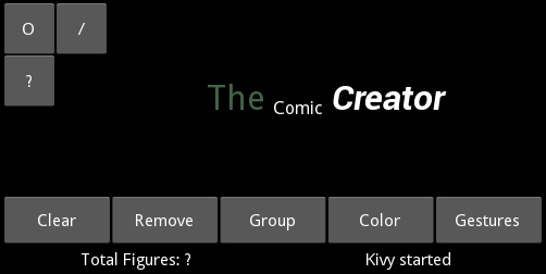
In the following chapters, we are going to add the respective functionality to this interface that, for now, consists of placeholder widgets. However, it is exciting what we got with just a few lines of code. Our GUI is ready to go and we will be working on its logic from now on.