Book Image

Unity UI Cookbook

By : Francesco Sapio
Book Image

Unity UI Cookbook

By: Francesco Sapio

Overview of this book

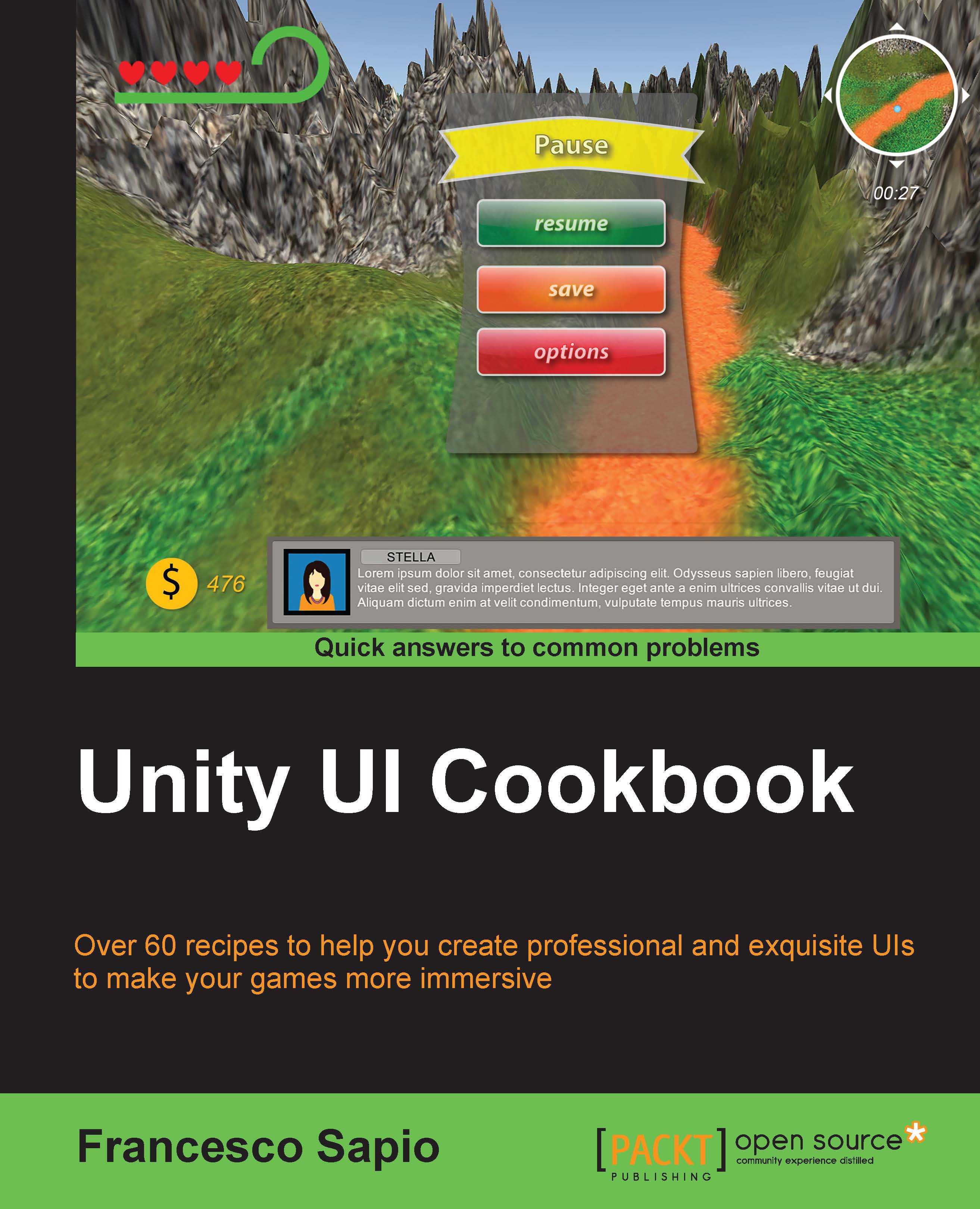
With the increasing interest in game development, it's essential to design and implement a UI that reflects the game settings and shows the right information to the player. The Unity system is used to create complex and aesthetically pleasing user interfaces in order to give a professional look and feel to a game. Although the new Unity UI system is powerful and quite easy to use, by integrating it with C# scripts, it's possible to realize the potential of this system and bring an impressive UI to games. This guide is an invaluable collection of recipes if you are planning to use Unity to develop a game. Starting with the basic concepts of the UI components, we’ll take you all the way through to creating complex interfaces by including animations and dynamics elements. Based on real-world problems, these recipes will start by showing you how to make common UI elements such as counters and healthbars. You will then get a walkthrough of how to manage time using timers, and will learn how to format them. You will move on to decorating and animating the UI elements to vivify them and give them a professional touch. Furthermore, you will be guided into the 3D UI world and into HUD scripting. Finally, you will discover how to implement complex minimaps in the interface.
Table of Contents (17 chapters)
Unity UI Cookbook
Credits
About the Author
About the Reviewers
www.PacktPub.com
Preface
Index

Making text scrollable with a vertical slider


Sometimes, we might have a large amount of text, such as a story in a book within our game, and we may want to show this to the player. One solution for improving the accessibility of reading text could be to add a slider so that the player can drag it in order to quickly scroll through text and immediately know which part of the text he is reading. Similar to what we did in the previous recipe, we need to make this text scrollable, and we also need to add the slider, which will be vertical in this example.

By the end of this recipe, we will be able to use the Scroll Rect (Script) and Scrollbar (Script) components to control scrollable text by using the slider.

How to do it...

  1. In the first step, we create a new panel within our UI. Right-click on the Hierarchy panel and then go to UI | Panel.

  2. Next, we should resize the panel until we have a scene view that is similar to this:

  3. It's always good practice to have all the files within our project ordered. Hence, we can rename the panel to Text Scroller.

  4. As we did in the last two recipes, let's add a Mask (Script) component. In order to view the scene without visual constraints, for the moment, we can disable it.

  5. Next, right-click on Text Scroller and then select Create Empty. By doing this, we create an empty child game object inside Text Scroller. Also, we should rename it to Text Content.

  6. On this last one, we need to add a Scroll Rect (Script) component. Then we need to create the text. This can be done by right-clicking on Text Content and going to UI | Text.

  7. Now we can write (or copy and paste long text) inside the Text variable of the component.

  8. Using the Rect Tool, we should resize the text area in order to obtain a rectangle. This rectangle must have a width narrower than Text Scroller and a larger height. We need to continue to increase its height until all of the text is contained inside of the rectangle. You can refer to the screenshot after step 10 to get a better idea of how it should appear at this stage.

  9. Now, right-click again on Text Scroller, and this time, go to UI | Scrollbar. Now our Hierarchy panel should look similar to this one:

  10. Next, we need to change the Direction variable of the Scrollbar (Script) component to Bottom To Up. Then, resize and place the scroll bar in the remaining space of the panel, as shown in this screenshot:

  11. We also need to link the scroll bar to the text. To do this, select Text Content and drag the scrollbar inside the Vertical Scrollbar variable. We also have to uncheck the Horizontal variable in order to force the text to scroll vertically.

  12. Finally, we can enable the mask on Text Scroller (the one that we have disabled in order to work better) and click on play to test what we have done. If you prefer, you can disable the elastic effect, as was done in the previous recipe. To do this, just change Movement Type to Clamped on the Scroll Rect (Script) component.

  13. We are now able to scroll the text within Text Scroller. As a result, we should see something like this:

How it works...

The entire process works in a way similar to the previous recipe. In fact, we created a mask for text, instead of images as we had previously done. Then we temporarily hid the mask, which made it easier to place the text. In order to make the text scrollable, we added a Scroll Rect (Script). Ultimately, we had to resize the text to display it correctly on the screen. We also added a scroll bar and linked it to Scroll Rect (Script). Since the Scroll Rect (Script) will do the needful for us, we don't need to update the scroll bar. As in this example, the text will scroll vertically, since we have disabled horizontal scrolling on Scrollbar (Script). Finally, we enabled the mask again in order to show only a portion of text at once.

There's more...

The following two sections will introduce us to new ways for scrolling the text so that it can better suit the design of our game.

Scrolling multiple columns at once

What happens if we want different kinds of text, such as a heading or a second column? We need to make a few changes.

First of all, we need to create a new empty game object and parent it with the Text Scroller. Next, we add a Scroll Rect (Script) component to this object and set the Text Content object that we created before in the Content variable by dragging it. Then we remove the Scroll Rect (Script) component from Text Content. Lastly, we can add an arbitrary number of UI text objects inside Text Content, and as a result, all of the text will be scrollable. If we add five of them, the Hierarchy panel should look like what is shown here:

Remember that in order to properly place the text on the screen, we can temporarily disable the mask attached to Text Scroller. By doing this, we are able to see all the objects inside the mask without its constraints.

At the end, we should have something that looks like this:

Tip

Resizing all the components could be needed in order to fit the text and the panel properly. As a result, the scroll effect will appear natural and as we have planned.

Scrolling horizontally

Even though using a horizontal slider is unusual, we can transform the slider that we already have and change its orientation. This is often used to implement inventory systems of point-and-click game genres.

To achieve this, we can begin by changing what we did in step 8. This time, we have to stretch the text, making its height a little smaller than the height of Text Scroller and the width as long as the text itself. Then, in step 10, instead to selecting Bottom To Up, change the Direction variable to Left To Right. Finally, in step 11, we need to link the Horizontal Scrollbar variable (instead of Vertical Scrollbar) with our scroll bar, so uncheck the Vertical variable.

Since horizontal scrolling becomes hard to read when the width of the Content is large, it could be helpful to split the text into more than one column. We can easily achieve this by creating different UI text elements inside the Content object and distributing them in order to form as many columns as we like. We can see an example of this in the following screenshot:

Tip

Again, resizing all the components could be needed in order to fit the text and the panel properly. As a result, the scroll effect will appear natural and as we have planned.