-
Book Overview & Buying
-
Table Of Contents

Sage Beginner's Guide
By :
Sage Beginner's Guide
By:
Overview of this book
This is a beginner's guide with clear step-by-step instructions, explanations, and advice. Each concept is illustrated with a complete example that you can use as a starting point for your own work. If you are an engineer, scientist, mathematician, or student, this book is for you. To get the most from Sage by using the Python programming language, we'll give you the basics of the language to get you started. For this, it will be helpful if you have some experience with basic programming concepts.
Table of Contents (17 chapters)
Sage Beginner's Guide

Credits
About the Author
About the Reviewers
www.PacktPub.com
Preface
 Free Chapter
What Can You Do with Sage?
Installing Sage
Getting Started with Sage
Introducing Python and Sage
Vectors, Matrices, and Linear Algebra
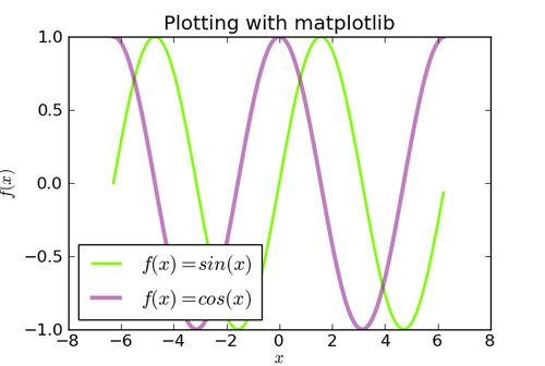
Plotting with Sage
Making Symbolic Mathematics Easy
Solving Problems Numerically
Learning Advanced Python Programming
Where to go from here
Index