Book Image

Getting Started with Zurb Foundation 4

By : Andrew D. Patterson
Book Image

Getting Started with Zurb Foundation 4

By: Andrew D. Patterson

Overview of this book

<p>Every web designer needs a toolkit. From text editors to graphics programs, from table structures to fluid style sheets, the web designer has many tools and techniques to choose from. Zurb's Foundation framework is an excellent kit for today's web designer. It's fluid, it's easy to work with, it has plenty of components, and most importantly, you can apply your creativity to make your very own designs.<br /><br />Zurb's Foundation 4 is a practical, easy-to-use toolkit for the layout and construction of web pages. Getting Started with Zurb Foundation 4 introduces Zurb Foundation’s powerful web design and development toolkit. Learn how to create professional layouts with ease, add powerful CSS and JavaScript components to your pages, and then customize and configure the design to your satisfaction. Understand how to efficiently manage your CSS and layout your pages with SASS, the style sheet language. This book will help you put Foundation 4 to work for you today!<br /><br />This book documents Foundation's grid system, all its components and plugins, and its generation of custom style sheets. The book serves as an all-encompassing introduction as well as a future reference guide. The foundation of Foundation is its grid system...and there is a whole lot more.<br /><br />Once you've covered the basics, you'll be ready to advance with SASS, the style sheet language, to customize your installation and layout your pages.<br /><br />With this book, you will discover all the CSS components and JavaScript plugins that are included in Foundation at the present time and learn how to integrate each of them into your web pages.</p>
Table of Contents (11 chapters)

Nesting rows in columns


The real strength of Foundation as a tool for website layout is its nesting capability. Besides a simple grid with rows and columns, you can nest rows within columns. Each newly defined row has its own cells to be grouped into columns.

Going back to our blog, let's say you have something in your content area that would best be displayed in three equal columns. That area was eight cells wide. 8 is not divisible by 3. But 12 is divisible by 3.

So let's create a new row within the content area. We'll refer to this as an inner row as it is treated a little differently than the outer rows we've seen up until now. This is what we want it to look like where the three columns shown in a lighter grey are columns in an inner row:

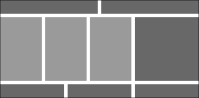
The HTML for the eight-column content area is as follows:

<div class="large-8 column">
  <div class="row">
    <div class="large-4 column"><!--content left--></div>
    <div class="large-4 column"><!--content center--></div>
    <div class="large-4 column"><!--content right--></div>
  </div>
</div>

Imagine the possibilities. Any space you have on your website can contain a grid with its own rows and columns.