
While designing a website, it is important to understand how images will be presented by default so you can adjust when necessary. In a Foundation-based site, where images are inside a row and column, this is especially true.
An image has an inherent width and height. Styles on the <img> tag will determine how an image will be presented in the browser. The following are Foundation's defaults:
img {
  max-width: 100%;
  height: auto;
  display: inline-block;
  vertical-align: middle;
}
When presented with these defaults, an image will use all the space that it can while being constrained by that space.
The following is an example code that demonstrates these styles:
<div class="row">
  <div class="small-3 column">
    <img src="http://placehold.it/220x220">
  </div>
  <div class="small-3 column">
    <img src="http://placehold.it/100x400">
  </div>
  <div class="small-3 column">
    <img src="http://placehold.it/400x400">
  </div>
  <div class="small-3 column">
    <img src="http://placehold.it/100x100">
    <img src="http://placehold.it/100x300">
  </div>
</div>
We started with a grid that was 1000 px wide and created four equal columns that were 250 px wide. With 15 px padding on each side, there is 220 px left for content.
The following is a screenshot of the result when shown in a browser that is wider than 1000 px and therefore shows the content at its maximum width:
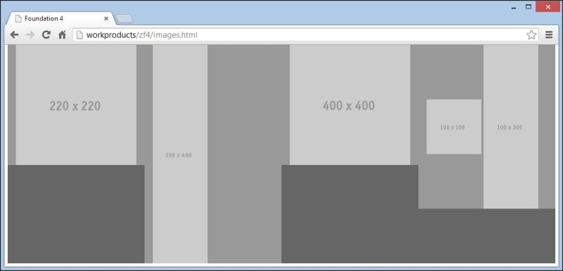
The image in the first column exactly fits the width of the column, which is 220 px. The column height (medium gray) is exactly the height of the image.
The second column contains an image having width 100 px and height 400 px. As the width of the image is less than the width of the column, the full width of the image is displayed, and therefore, the full height is also displayed. As this is the highest column, it determines the height of the row, which is also 400 px.
The third column contains an image having width 400 px and height 400 px respectively. This is wider than the available 220 px, so the image width is constrained to 220 px. As the height is adjusted proportionally to the width, it is also 220 px. This image is displayed having exactly the same size as the image in column one, even though the underlying image is larger.
The fourth column contains two images. The first one is 100 px by 100 px and the second one is 100 px by 300 px. As each one is only 100 px wide, there is sufficient width in the column to display them side by side. Because the full width of each image is displayed, the full height is also displayed. This makes the column 300 px high, and the height of the taller image and the smaller image sits in the middle vertically. Of all the images shown here, this smaller image is the only one that does not determine its column height.