
Progress bars are a metaphor used with traditional desktops as well as web development to provide visual feedback to a user on the progress of a task or action. Bootstrap provides a number of different styled progress bars.
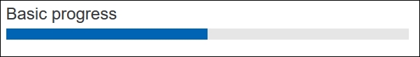
The basic Bootstrap progress bar displays a plain blue colored progress bar. Bootstrap 4 uses the HTML 5 <progress> element, with a class name of .progress, to display progress bars. The following markup generates a basic progress bar with a maximum value of 100 and current value of 50:
<progress class="progress" value="50" max="100"></progress>
The result of the markup is shown in the following screenshot:
You can use the same button and alert style classes to generate different colored progress bars. This is accomplished by setting the progress bar's class name to one of the following:
progress progress-successprogress progress-infoprogress progress-warningprogress progress-danger
The result...