Razor components are the basic building blocks of our Blazor WebAssembly application. Each Razor component is represented by a class with a name similar to the filename. In the component itself, we can use C#, HTML, and Razor markup. This class is generated automatically for us, but we can create it ourselves. The component is downloaded to the browser as a part of the DLL for the whole application.
Razor components can be anything, from simple standard HTML for a headline, to more complex elements, such as tables that contain data, forms, or anything that can be rendered on the website. Each component can use other components.
Note
A Razor component name must be in Pascal case. Naming a component as pageTitle is not a valid name for the Razor component, because the p part is not a capital letter. PageTitle will be a valid name. The file extension for Razor components is .razor.
To prevent errors, you should also name components differently from existing HTML tags.
A simple component representing the page title can be created with just a single line of HTML code in the Headline.razor file:
Headline.razor
<h1>Page title</h1>
The preceding code shows the simplest type of Razor component. In the background, public partial class Headline is created for us.
Using components in other components
The Headline component itself can show just a small amount of data. We need to use this Headline component in other components. We can do this with standard HTML markup. The class name of the component is also the name of the HTML element. The following code shows how to use our Headline component in different components:
PageHeader.razor
<div class="header">
<Headline />
</div>
The preceding code will create another Razor component using our Headline component as part of the rendered HTML.
The Razor component class is created in the namespace to reflect the current folder structure of the project. If the Headline component exists in a different folder than the PageHeader component, the usage of the component must reflect the namespace of the Headline component:
<Structures.Headline />
In the preceding example, the Headline component is in the Structures folder. The Structures folder is in the same folder as the PageHeader component.
To prevent specifying the component namespace in the markup, we can add the @using directive to the parent component, or create a file called _Imports.razor and add @using directives there. The following code shows how to make the Headline component available for all other components in the same project:
_Imports.razor
@using SampleApp.Components.Structures
This simple component can be used for static HTML markup, such as loaders and icons.
Note
@using directives in C# files (.cs) are not applied to Razor components (.razor) and vice versa. The _Imports.razor file’s @using directives are only applied to Razor components.
When we need to render some dynamic data, we need to load it inside the component itself or pass it to the component from the parent component.
Passing parameters to components
Razor components use parameters to create dynamic content and conditional rendering. Parameters are public properties of the component class. These parameters are decorated with either the Parameter attribute or the CascadingParameter attribute. Parameters can be any type of object in C#, such as simple types, complex types, functions, and so on.
There are two types with special meaning for Razor components:
- Event callback
RenderFragment
We will discuss these two types in the Creating Razor components section.
Let’s modify our Headline.razor component from a simple component with static text to a more dynamic component that can show data from parameters:
<h1>Page @Title</h1>
@code {
[Parameter]
public string Title { get; set; }
}
To use the preceding component in our PageTitle component, we will need to modify the line with component initialization using the following syntax:
<Headline Title="About us" />
The preceding code shows a parameter called Title that’s been added to our component. This parameter can be used to pass any string value from the parent component. The value is then used in the HTML markup. The Headline component will render Page About us text on the screen.
Note
At the time of writing this book, Razor syntax does not support the required attributes on the component parameters. In the latest version of Visual Studio, the EditorRequired attribute was introduced to help developers with this problem. The EditorRequired attribute tells the IDE that the marked parameter should be filled in when using the component. The RZ2012 warning is generated, but it will not prevent building the application. The following warning will be generated if we mark the Title parameter of our Headline component with the EditorRequired attribute and don’t fill in the parameter: Component ‘Headline’ expects a value for the parameter ‘Title’, but a value may not have been provided.
The component can have more parameters and can also read parameter values from its route (URL address) or query values. We will learn more about this in the Understanding page routing in Blazor section. The component should not update any of the Parameter or CascadingParameter properties by itself. To update the parameter, the event callback should be triggered.
In the next section, we will look at the RenderFragment parameter before covering event callbacks.
Creating components with child content
A common scenario when creating Razor components is the need to pass some additional content from the parent component. This content can be HTML inside the button tag, a figure element to wrap the image with its description, or a more complex HTML structure.
We can tell our component to render child content by providing a parameter whose type is RenderFragment and whose name is ChildContent. The following example renders complex HTML with content from the parent component:
Product.razor
<div class="product">
@ChildContent
</div>
@code {
[Parameter]
public RenderFragment ChildContent { get; set; }
}
The preceding code shows a Product component, which is a simple HTML div element with a class attribute and ChildContent parameter. This component can be used in other components to render a unified structure:
List.razor
…
<Product>
<div class="image">
<img src="demo_image.jpg" alt="Demo image" />
</div>
<div class="name">Product name</div>
<div class="info">Description & Price</div>
</Product>
…
The preceding code creates the List component using the Product component. The List component can contain much more code and render the Product component in the loop.
In this example, we can see that we do not need to specify the ChildContent attribute when using the Product component. Razor will take any content between the opening and closing tags of the component and pass it as a ChildContent parameter automatically.
In the List component, we need to write all the HTML that we want to render inside and repeat that for each product we want to render. This can lead to potential mistakes when reusing the component as it is easy to mistype any class name.
To help solve this, we can define as many RenderFragment parameters as we want. However, these parameters must be named by the caller component. In the following example, we are modifying the code of the Product component to allow us to use three sections – Image, Name, and Info:
Product.razor
<div class="product">
<div class="image">@Image</div>
<div class="name">@Name</div>
<div class="info">@Info</div>
</div>
@code {
[Parameter]
public RenderFragment Image { get; set; }
[Parameter]
public RenderFragment Name { get; set; }
[Parameter]
public RenderFragment Info { get; set; }
}
Now that we have defined three parameters with the RenderFragment type, we can use them from the parent component by using the parameter name as an HTML tag nested in our component:
List.razor
…
<Product>
<Image>
<img src="demo_image.jpg" alt="Demo image" />
</Image>
<Name>Product name</Name>
<Info>Description & Price</Info>
</Product>
…
The preceding example is using all of the parameters from the Product component. You can omit any of them and use only the ones you need. The Product component can have conditions to render only the RenderFragment parameters, which are not null.
Interesting fact
The component can have both named RenderFragment parameters and ChildContent parameters. If the parameter is not specified, ChildContent is used. Using at least one of the named RenderFragment parameters leads to the need to name the ChildContent parameter as well.
Now that we know how to pass parameters downstream to child components, let’s learn how to update data in the parent component. This is where event callbacks will serve their purpose.
Communicating with the parent component
There are a lot of situations where we need to notify the parent component about some change. These changes can include events such as a click on the element, a change in the element state, double-clicking the element, and dragging and dropping the element. For that purpose, there is an EventCallback or EventCallback<T> property, which can be defined on our component to allow the parent component to react to the events.
The event callback can be without arguments, or with an argument type defined by the T type parameter. The following is a list of predefined argument classes with supported DOM events:
|
Argument Class
|
DOM Event
|
|
ClipboardEventArgs
|
oncut, oncopy, onpaste
|
|
DragEventArgs
|
ondrag, ondragstart, ondragenter, ondragleave, ondragover, ondrop, ondragend
|
|
ErrorEventArgs
|
onerror
|
|
EventArgs
|
This argument class is supported by most of the events and holds basic event data.
General
onactivate, onbeforeactivate, onbeforedeactivate, ondeactivate, onfullscreenchange, onfullscreenerror, onloadeddata, onloadedmetadata, onpointerlockchange, onpointerlockerror, onreadystatechange, onscroll
Clipboard
onbeforecut, onbeforecopy, onbeforepaste
Input
oninvalid, onreset, onselect, onselectionchange, onselectstart, onsubmit
Media
oncanplay, oncanplaythrough, oncuechange, ondurationchange, onemptied, onended, onpause, onplay, onplaying, onratechange, onseeked, onseeking, onstalled, onstop, onsuspend, ontimeupdate, ontoggle, onvolumechange, onwaiting
|
|
FocusEventArgs
|
onfocus, onblur, onfocusin, onfocusout
|
|
ChangeEventArgs
|
onchange, oninput
|
|
KeyboardEventArgs
|
onkeydown, onkeypress, onkeyup
|
|
MouseEventArgs
|
onclick, oncontextmenu, ondblclick, onmousedown, onmouseup, onmouseover, onmousemove, onmouseout
|
|
PointerEventArgs
|
onpointerdown, onpointerup, onpointercancel, onpointermove, onpointerover, onpointerout, onpointerenter, onpointerleave, ongotpointercapture, onlostpointercapture
|
|
WheelEventArgs
|
onwheel, onmousewheel
|
|
ProgressEventArgs
|
onabort, onload, onloaded, onloadstart, onprogress, ontimeout
|
|
TouchEventArgs
|
ontouchstart, ontouchend, ontouchmove, ontouchenter, ontouchleave, ontouchcancel
|
Table 2.1 – Event callback predefined argument classes
Standard HTML elements in Blazor have defined these arguments for events. The button’s onclick attribute will provide the event callback with the MouseEventArgs argument.
You can also define custom event arguments that allow you to transfer any kind of data to the parent component.
The event callback parameter on the child component is attached to the method with the same arguments on the parent component. The following code shows two components that communicate with each other using event callbacks:
LikeButton.razor
<button @onclick="@OnClickHandler">
Click to change color to black
</button>
@code {
[Parameter]
public EvenCallback<string> OnClickEvent { get; set; }
private async Task OnClickHandler()
{
  await OnClickEvent.InvokeAsync("black")
}
}
The preceding code creates a simple HTML button element with the @onclick directive. Clicking on this button will trigger the OnClickHandler method, notify the parent component about the event, and pass the arguments to the parent component. The parent component can perform some action if this notification occurs:
Parent.razor
<Header Title="Color selector" />
<LikeButton OnClickEvent="@OnClickAction" />
<p>Selected color is @color</p>
@code {
private string color = "white";
private void OnClickAction(string args)
{
  color = args;
}
}
In the preceding code, the parent component has attached a custom method for the OnClickEvent parameter. The attached method must consume the same type of parameters as the OnClickEvent type argument.
If you use predefined arguments on supported events, you can call EventCallback<T> directly from the @on… event:
<button @onclick="@OnClickEvent">Click Me</button>
@code {
  [Parameter]
  public EvenCallback<MouseEventArgs> OnClickEvent
    { get; set; }
}
In the preceding example, OnClickEvent is called directly, without the need for a custom method. MouseEventArgs is passed to the parent component because it is supported by the prebuilt event.
There is another way to use events in the component itself. There can be a situation where you need to update the component’s data when an event occurs in the component. You can use Lambda expressions to achieve this update without the need for a custom method. In the following example, we are creating a counter that updates the information about button clicks in a single component:
Counter.razor
<p>Number of clicks: @count</p>
<button @onclick="@(e => count + 1)">
Click me to update counter
</button>
@code {
  int count = 0;
}
In the preceding code, the Counter component will update the count field with every click of the button. The e argument in the Lambda expression represents the event argument for the click event: MouseEventArgs.
The last type of event that’s used in a component is property two-way binding. Interactive elements on the website must be able to update themselves. The input element must update the text when the keyboard is pressed but also notify the parent component (for example, the form) that something has happened. Two-way binding is a way to automatically pair the Parameter property with the EventCallback property. In the following example, two-way binding has been enabled by using an input component with various properties:
CustomInput.razor
…
[Parameter]
public string BindingValue
{
get => _value;
set
{
  if (_value == value ) return;
  _value = value;
  BindingValueChanged.InvokeAsync(value);
}
}
[Parameter]
public EventCallback<string> BindingValueChanged
  { get; set; }
…
The BindingValue and BindingValueChanged properties in the preceding code enable the two-way binding of the BindingValue property since there is an EventCallback property with the same name as the property, followed by Changed. The following component will create an input with two-way binding:
CustomForm.razor
…
<CustomInput @bind-BindingValue="@message" />
…
private string message = "";
In the preceding component, when the BindingValue property changes in the CustomInput component, the parent CustomForm component updates the value of the message field automatically.
Now that you know how components can communicate, it’s time to look at the component life cycle.
Understanding the component life cycle
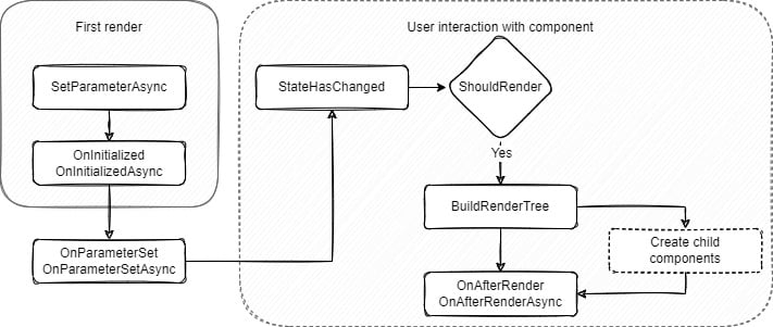
The life cycle methods for Blazor components are defined in the BaseComponent class. Thus, all the components have to inherit – at any level – from the BaseComponent class. The BaseComponent class has both synchronous and asynchronous life cycle methods. If you need to modify component initialization or rendering, these methods can be overridden. Some methods are only called the first time the component is rendered; others are called every time the component has changed.
The following diagram shows the component life cycle events in order:
Figure 2.1 – Blazor component life cycle events
In the preceding diagram, you can see the events that are called when the component is initialized from the parent component. The SetParameterAsync and OnInitialized/OnInitializedAsync methods are only called when the component is rendered for the first time. The re-rendering of the component does not trigger these methods.
After the OnInitialized method, the OnParameterSet/OnParameterSetAsync methods are called. These methods are called whenever the component parameters change. The change of the method can trigger the re-rendering of the component.
When the ShouldRender method returns true or is in the first render cycle, the render tree is created. The render tree is then sent to the DOM. In the first render cycle, the render tree needs to be created for the first time, so the ShouldRender method is not called in this cycle and the process continues the same way as when the method returns true.
After the DOM is updated, the OnAfterRender/OnAfterRenderAsync methods are called. These methods should not trigger the component UI update since this would lead to the component looping between the StateHasChanged and OnAfterRender methods.
Structuring component code
Component code in the Razor component can be divided into three sections – the directive section at the top of the file, the section that contains Razor markup, and the C# code with defined properties, fields, and methods at the bottom of the file.
It is common to not need all of the sections in every component file. Our PageHeader.razor component only has the middle Razor markup section because there was no need for directives or additional C# code.
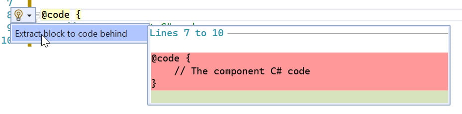
Having a lot of methods and functions in the component file can lower the readability of the component itself and can lead to potential mistakes. To prevent this, the @code block of the component can be moved to a separate C# file.
As we learned in the previous sections, the Razor component is translated into a C# partial class. To separate the component @code from the leading directives and Razor markup, we need to create the C# file with a partial class named the same as the component file. For example, in terms of our CustomInput.razor component file, the C# file will be named CustomInput.razor.cs.
We can create the file manually, or we can select the @code directive in our component. Open the Quick Action bar (Ctrl + . or Alt + Enter) and select Extract block to code behind. The Quick Action bar is shown in the following screenshot:
Figure 2.2 – The Quick Action bar
Clicking on Extract block to code behind, as shown in the preceding screenshot, will generate a new .cs file named ComponentName.razor.cs.
The created public partial class CustomInput has an inheritance from the ComponentBase class automatically, despite the inheritance not being specified in the .cs file.
Important note
To specify our custom base class for the component, our base class must inherit from the ComponentBase class in the Microsoft.AspNetCore.Components namespace. Also, we need to inherit from our base class in the .cs file and the .razor file using the @inherits directive.
The Razor component can be a small part of the website or a whole page with many different components on it. The only difference is in the directive used at the top of the file. Let’s look at how we can specify the component’s URL address.


 Free Chapter


