
In the second of our two real-world examples, we're going to look at making a responsive map using Google Maps. Responsive maps, I hear you ask? Surely this should come automatically, right? Well no, it doesn't, which makes its use a little awkward on mobile devices. Fortunately, we can easily fix this; the great thing about it is that it only requires a little additional CSS:
Let's make a start by browsing to http://maps.google.com, then entering the zip code of our chosen location. In this instance, I will use the UK office of Packt Publishing, which is B3 2PB.
Click on the cog, then select Share and embed map:

In the dialog box that appears, switch to the Embed map tab, then copy the contents of the text field starting with
<iframe src=….In a copy of the code download that accompanies this book, extract a copy of
googlemaps.htmlin your favorite text editor and add the<iframe>code in between thegoogle-maps divtags.Next, add this CSS styling to a new file and save it as
googlemaps.css:#container { margin: 0 auto; padding: 5px; max-width: 40rem; } .google-maps { position: relative; padding-bottom: 60%; height: 0; overflow: hidden; } .google-maps iframe { position: absolute; top: 0; left: 0; width: 100% !important; height: 100% !important; }
If all is well, we will see a Google Maps image of Birmingham with our office marked accordingly:
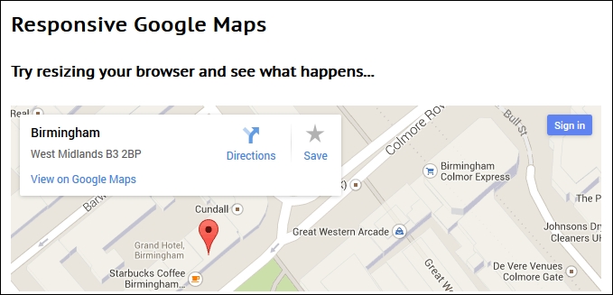
At this point, try resizing the browser window. You will see that the map resizes automatically; the CSS styling that we've added has overridden the standard styles used within Google Maps to make our map responsive and accessible from any device we care to use.