
The foundation (pun intended) of Zurb Foundation is its grid system—rows and columns, much like a spread sheet, a blank sheet of graph paper, or tables similar to what we used to use for HTML layout. Think of it as the canvas upon which you design your website.
The following is a way to picture a blank grid before you begin your design:

Each cell is a content area that can be merged with other cells beside or below it to make larger content areas. A default installation of Foundation will be based on 12 cells in a row. This is convenient because the number 12 is divisible by 1, 2, 3, 4, 6, and 12.
The following is the grid again with the cells in a row grouped into 12, 6, 4, 3, 2, and 1 columns respectively:
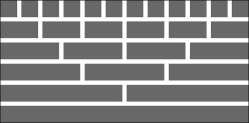
A column is comprised of one or more individual cells in a row. The total width of the columns in a row cannot exceed the number of underlying cells in the grid's row.
The following figure is an example of a typical blog layout:

How do we create these areas for our website? We simply define rows and columns using HTML. The following is the HTML code for the header row in the example blog:
<div class="row">
  <div class="large-6 column">
    <!-- Header left -->
  </div>
  <div class="large-6 column">
    <!-- Header right -->
  </div>
</div>
The outer <div> tells the browser to form a block representing a row. It gives that block all the styles associated with a row class. Each inner <div> tells the browser to form a block representing a column within the row where each column has a width of 6 cells. As our grid has 12 cells in a row, each column with six cells is 50 percent of the row width.
Foundation styles look after keeping the two columns in one row and making them equal in width. We'll cover the small-n and large-n classes in more detail further on. In this example, specifying each column as large-6 means that it will use six cells on a regular display.
From this, you can write the HTML for the content and footer rows in our sample blog. Each will be a row. The content area has two columns, of which one is eight cells wide and the other is four cells wide. The footer area has three columns, each being four cells wide.