
This section will cover the main principles behind designing responsive websites. Though these aren't set in stone and will change over time, they will provide a great foundation.
Responsive design principles
Responsive versus adaptive
Responsive designs constantly change website layouts depending on their size and orientation. A single pixel resize will tend to have an effect on the layout, usually not by a lot.
Adaptive schemes, on the other hand, have preset layouts, which are loaded depending on the size of the screen. This technique doesn't look as fluid and seamless as do responsive designs.
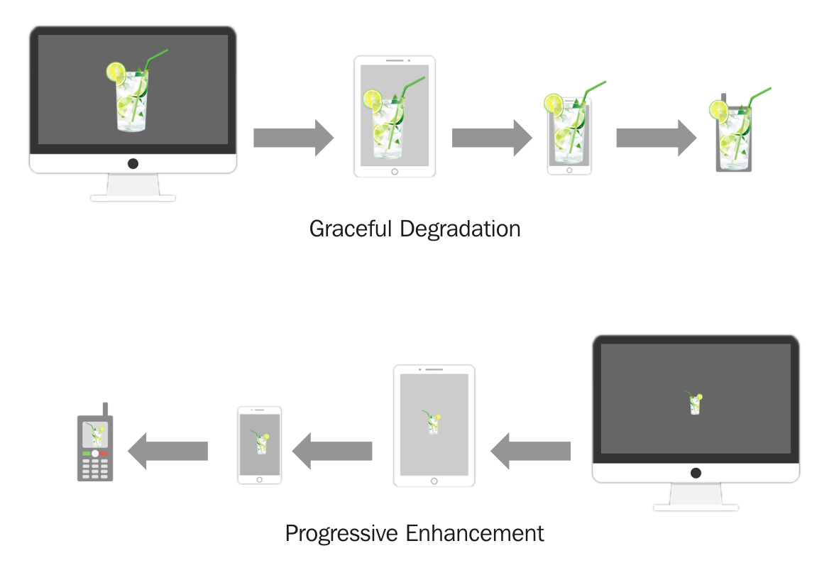
Modern-day Responsive Web Design usually incorporates both methods. Set layouts will be provided, as can be seen in the previous figure. But any changes made to a website's size will have an impact in real time through responsive scaling.
Breakpoints
Breakpoints are points at which a website's layout is no longer fit for the screen size, device, and/or orientation, and we are able to use different and unique layouts to accommodate the various changes that can occur to screens. When these points occur, the current layout is switched for a more suitable layout. For example, a mobile device in portrait mode will not effectively be able to use a layout that is designed for a widescreen desktop display; this just isn't possible. However, by using breakpoints a single website can serve many screen variations whilst making the website feel like it was designed with the user's current screen, device, and/or orientation in mind. This does not occur when reloading the web page, but content moves around dynamically and is scaled accordingly. Without breakpoints the website would appear with the same layout on all form factors and browser sizes, which using the example we just mentioned, would not be fit for purpose.
These breakpoints usually occur when the width of the browser changes and falls into the category of another more appropriate layout.
There are a few fundamentals that should be mentioned regarding the responsive philosophy of Responsive Web Design:
- Screen resolution: This is immensely influential in responsive design. The first thought for many designers is to design based on the resolution of the screen. But modern-day phones have resolutions of 1080p and beyond, which for the most part is still the de facto standard for desktops with some exceptions in 4K and ultrawide displays. This would prevent us from fully targeting all devices, as there is so much crossover in resolutions between devices. That is the reason why pixel density is very important when deciding which layout should be used as a 5-inch 1080p mobile display will be cramming the pixels in a lot closer than a 32-inch 1080p display. They both have the same resolution for the mobile device and they have a significantly higher pixel density, which helps distinguish between the device types. The viewport should also be taken into consideration, which is the user's visible area of a web page. This would allow us to rearrange content based on how much content should be displayed.
- Media queries: These are amazing facets within CSS that allow us to actually detect changes in a screen such as its size and an event device type. These are the things used to specify code for a specific layout, such as a mobile or desktop display. You can think of media queries as conditional statements, just as an "if" statement would only run a piece of code if the condition was true. A media query is the same, its far more limited, but as are many things in CSS.
I'm positive you will have used a website and noticed that it looks different on a computer compared to a mobile phone, or even a tablet. This is thanks to the use of breakpoints, which are very similar to conditional statements in other languages such as C++. When a certain condition is met, such as screen size range, or, change in form factor, different CSS is applied to provide a better-suited layout.
Relative units
Let's cover what relative and static units are. Relative units take into account the other content and more specifically the content's size, whereas static units do not and have an absolute value regardless of the amount of content.
If relative units are not used then static units would be used, which essentially lays the content using fixed units such as pixels. With this method, a box with a width of 400px on an 800px screen would take half the width. But, if the screen size changes to 300px, the box will now be partially off screen. Again, this would not provide the reader with that seamless experience, which we aim to provide.
The units simply display your content relative to everything else, or, more specifically, the screen size or viewport. This allows us, as creators, to display content consistently. Take the previous example, if we would like to display the box at half the screen width, on an 800px screen the box would be 400px wide, and on a 600px screen the box would be 300px wide. Using percentages we can set the width to 50%, which forces the box to always be half the width of its parent container, making its size relative to the rest of the page's content.
Maximum and minimum values
Scaling our content is greatly dependent on the screen size. But with screens such as ultrawide monitors, scaling the content may make it too big, or even too small, on mobile devices. Using maximum and minimum values, we are able to set upper and lower limits providing us with readable and clear results.
Nested objects
If we displayed every object individually, we would have to make them all adjust accordingly, but nesting allows us to wrap elements using containers. Nested objects are like a paragraph tag, as they contain text, and any changes made to the paragraph tag, such as its position or color, also affect its contents. Objects nested within each other are affected by any change made to their parent containers. An object can be anything from text and images, to HTML tags/elements. Take a look at the following example:
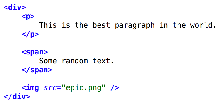
In this example, there are four elements—a div, paragraph, span, and image tag. The paragraph, span, and image tags are nested within the div tag. If the div tag's maximum width and background color were changed, this would affect all its child objects/tags. But if we were to make a change to the paragraph tag, such as changing its text color, this would not affect any other sibling tags or its parent tag. It would only have an affect on its contents/objects.
So, for example, if a container is moved or scaled, the content within the container is also updated. This is where pixels come in use. You may not always want a container to be displayed 10% from the right as, on mobile devices, 10% equates to a lot of real estate potentially being wasted; you could specify 50px instead for example.
Mobile or desktop first
You can design a website from a small screen such as a phone and scale it up or go the other way round and design it with a large screen in mind. There is actually no right or wrong answer. Depending on the intended target audience and the website's purpose, this will become clear to you. Usually, considering both angles at the same time is the best route to go down. Most responsive frameworks on the market have been designed with a mobile-first philosophy, but that doesn't mean you cannot use it for a desktop-first design; it is on you as the designer to decide how content should be displayed.
Bitmaps versus vectors
Bitmaps are great for images with a lot of detail, such as backgrounds and usually logos. Common bitmap formats include .png and .jpg. But these images can be large in file size and require more bandwidth and time to load. On desktop devices this isn't too much of a problem, but on mobile devices that are heavily reliant on cellular services that don't always provide unlimited data, this can be problematic. Also, when scaling bitmaps, there is a loss in quality, which results in jagged and blurry images.
Vectors, on the other hand, are small in size and don't lose quality when scaling. I know you'll be tempted to scream, "Hail vectors!" at this book, but they do have their drawbacks. They are only useful for simple content such as icons. Also some older browsers do not fully support vectors.
Again there is no "right choice"; depending on the content to be displayed, bitmaps or vectors should be used.