Cascading Style Sheets, most commonly known simply as CSS, is another contributing technology to the success of HTML and the World Wide Web. CSS is a style language that controls the way an HTML structure is rendered. Some of the benefits of using a style language alongside a markup language include separation of concerns, reusability of visual design, ease of maintenance, and scalability. As part of the HTML5 revolution, there were some significant updates to the CSS spec, which have also taken the language to a whole new level.
The first, and possibly most apparent benefit that CSS brings to the game is separation of concerns. By allowing HTML to describe the data that it represents, and not worry about how that data is presented, CSS is able to control the way that data is displayed. This way the CSS expert can work on styling a web application without the need to touch the HTML file. Best of all, the CSS expert needs absolutely no knowledge of any of the possibly many other technologies used in a given project. This way, no matter how complex the rest of the project is, the styling can be done independently and separately.
Reusability of visual design
There are many ways to include CSS rules into an HTML document. For example, you can write all the CSS code right into the same HTML file that uses it, you can write it inside each HTML element as you create them, or you can put the CSS style in a completely separate file, then import the stylesheet into the HTML file. Most commonly, what you'll want to do is write all your CSS code in one or more separate files (think separation of concerns), then import each file into the HTML files that you'd like to use for each set of styles. This way you can have a single stylesheet that describes a particular visual theme, then you can reuse that theme throughout an entire application (possibly composed of thousands of individual HTML files and pieces) simply by importing the stylesheet with a single line of code:
The previous code is an example of CSS rules written on a specific element. In this case, only this HTML paragraph tags will use the style defined by this simple rule (which tells the browser to render the text in red, and 23 pixels height).
The previous code is an example of CSS rules written in a separate document. In this case, any HTML paragraph tags in the file index.html will use the style defined by this simple rule (which tells the browser to render the text in red, and 23 pixels height). Other documents will not use the styling rules found in my-style sheet.css if the stylesheet is not imported into those files.
Another tremendous benefit that you get by separating the presentation of your HTML documents through external CSS files is that maintenance becomes very easy. Imagine the scenario where you write all your styles in the same document that uses them. If you only have one document, then that's not a big problem. However, most projects include multiple HTML files. So imagine that you simply copy and paste the CSS from one file into the next, since they both share the same CSS rules. How would you go about making a change to some of these rules if you now have tens or hundreds of files to update also, since the CSS to be updated in found in all of these HTML file?
Thus, if you only have a few CSS that only contain CSS code, and all the HTML files that use them simply import the stylesheet, whenever you need to change the style for your project, you only need to update one CSS file. Once that CSS file is updated, all other HTML files that import the CSS will automatically use the new style.
Lastly, the advantage of using CSS is that it makes the presentation layer of your project very scalable. Once the CSS code is in place, you can use it throughout hundreds of thousands of files (think of Wikipedia, for example), and the style will be consistent throughout all of them. If you then decide to upgrade your design, you only need to make changes to one file—the stylesheet.
Although the idea of having a separate style language to handle the presentation layer of HTML documents is unarguably brilliant, CSS has been somewhat of a nightmare to most designers. Since different browsers have always tried to be unique enough from other competing browsers in order to win the favor of users, different browsers have implemented certain features of CSS differently. For examples, a CSS rule that specifies an element with a width of 500 pixels would not behave consistently in all major browsers. By specifying an element's width attribute through CSS, most browsers would only set the content width of the element, while allowing any padding, border, and margin width to make the total width of the element even larger. However, there were browsers that included the width of an element's padding and border when setting the CSS width attribute.
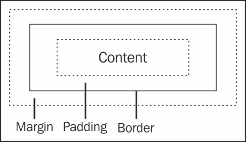
The previous figure shows an example of a CSS box model. Note that the margin space is always transparent, while any padding space inherits the background color or image of its corresponding element.
Inconsistencies like this made the success of CSS limited and slow. When a designer took on a project, one design would need to be coded with many browsers in mind, which also meant that it would need to be tested in many different browsers. Not only that, but the actual set of features that CSS offered were limited. For example, before Version 3, the only way to create an element with rounded corners through CSS was by adding a background image to the element, where this image was a box with rounded corners. This was not very practical, and often involved changing the HTML structure, which partly defeated the purpose of external stylesheets.
Thanks to the responsive nature of web standards, however, a new version of CSS was released alongside the new version of HTML. Officially named CSS Level 3, the new specification builds on CSS Level 2 modules, and includes additional modules. Given the wide acceptance and usage of CSS, major web browsers have been doing a much better job at implementing features more consistently, meaning that one code base is more likely to run consistently on different browsers.
Experimental features and vendor prefixes
As new features are added to the spec, and the spec itself progresses, browser vendors attempt to stay on top of things and provide the latest and greatest features to designers and end users. As of this book, however, not all features listed on the CSS3 specification are fully implemented by all browsers. The way you can tell if a feature is not yet fully supported by the browser (or that a feature may stop being supported by a particular browser) is that the CSS rule is prefixed by a dash, followed by the code name for the browser. For example, -webkit-(rule name).
Eventually, the specification will stabilize even more, and all browsers will implement the CSS specification the same, and no vendor prefix will need to appear in your stylesheet code. But until then, you'll need to repeat some CSS Level 3 rules so that each browser will recognize the feature.
It can sometimes be difficult to keep up with all the CSS features and their corresponding browser support. Some features have already gone out of the prefix (meaning that all major browsers support the rule without the vendor prefix keyword in front of the rule keyword). Still, many others haven't completely outgrown this experimental stage, and only some of the major browsers support them without any vendor prefix.
Some brave developers make the effort to stay on top of the latest browser updates, and update their code accordingly, by removing superfluous vendor prefixes from their stylesheet code. Others find this proactive effort to be counter productive, and instead include all possible versions of the rule to their code, in which case they would only need to update their stylesheet code one day in the far future, if at all.
Of course, repeating the same rule with each vendor prefix in front of it, followed by the non-prefixed rule, quickly makes your stylesheet files very large, and a nightmare to maintain. Find an approach that works best for you. There are also various tools available that help you maintain your CSS files, especially with regards to this evolving situation with the vendor prefix.
The two most popular such tools (also known as CSS preprocessors) are LESS (see http://lesscss.org/) and SASS (see http://sass-lang.com/). Although each preprocessor is slightly different, they all accomplish the same thing, namely, taking plain CSS stylesheets, then adding all the required vendor prefixes where needed.
The new CSS Level 3 modules can be divided into several modules, namely, style attributes
, selectors, colors, and media queries.
Style attributes tell the browser how an element is to be rendered (or styled). This could be anything from a string of text being styled with a font size of 23 px, to styling a list of images rotated 45 degrees about their y-axis and placed above its own reflection, to styling various HTML nodes to animate every half a second using keyframe animation.
Selectors are the way you tell the browser what elements are to be styled. That is, through the special expression language of CSS selectors, you can address one or more elements whose styling rules follow the selector declaration. The new CSS3 selectors basically extend this expression language, making it possible to target different elements in different, more flexible ways.
Colors, as the name implies, hints to the browser how an element is to be shaded. Colors can be applied to the actual text on a web page, to the border surrounding text or other elements, as well as the background of elements, following the box model scheme.
Finally, media queries allow the stylesheet to target the document (or parts of it) based on various conditions. What's more, media queries are triggered in real time by the browser. In other words, if, for example, you specify a media query that defines CSS rules that should only apply when the browser window is no wider than a certain width, the browser will update the web page automatically as needed as the window is resized. This way a web page can be responsive, meaning that it responds immediately to any changes in its environment that causes any media query to become valid.
A brief definition of these modules will follow, but a more in-depth discussion, along with usage examples, can be found in subsequent chapters as each model is added to our games.
Within the style attributes module
, we can subdivide the features into smaller modules that deal with custom fonts, text effects, other effects, and animation.
CSS selectors
, first introduced in CSS Level 1, have always been fairly powerful and comprehensive.
Source: Cascading Style Sheets (CSS) Snapshot 2010, W3C Working Group Note 12 May 2011
The two main additions to colors in CSS Level 3 are the adoption of HSL colors, and an additional alpha channel. Before, you could specify a color using RGB by specifying a value between 0 and 255 for each channel (red, green, and blue). Now the extra alpha channel can be appended to the end of the attribute, allowing you to control the level of transparency:
This CSS rule specifies a completely white background, with an opacity of 50 percent (half transparent) represented by the decimal fraction:
Alternatively, you can specify the same CSS rule using percentages for all values, which might be easier to read, and make the expression more consistent.
Specifying colors using Hue, Saturation, and Lightness (HSL) is similarly easy, and arguably much more intuitive. Instead of using the RGB or RGBA keyword, you simply specify a color as HSL by using the keyword HSL (or HSLA if you would like to add the extra and optional alpha channel). Another benefit to using HSL over RGB is that RGB is hardware-oriented, whereas HSL is not.
Here you specify a very bright red background color by setting the saturation to its limit, and lighting the color half way. Remember that setting the lightness channel to 100% will cause the color to be completely white (as a super bright light would do), while setting it to 0% will cause it to be completely black, as you would expect in a dark room; for example, see the following line of code:
Alternatively, you can specify the same CSS rule with a semi-transparent look by adding the alpha channel, and setting it to the 50% opacity.
The hue channel of HSL is a number between 0 and 359, which represents an angle in the color wheel, with red being 0 degrees, green being 120, and blue being 240. Note that this number wraps (since it's an angle value), so that 360 represents the same location in the wheel as 0. The saturation and lightness channels represent the percentage between being fully represented, and not at all.
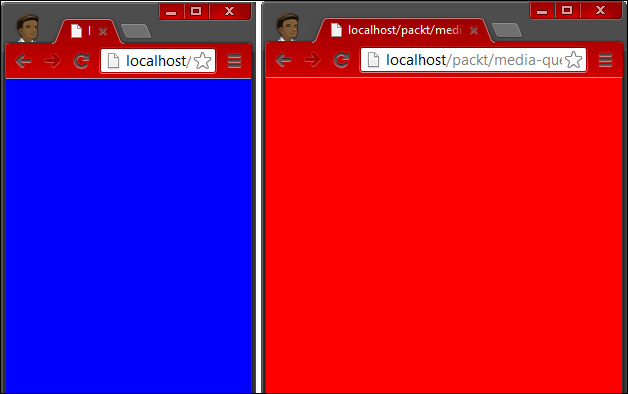
Media queries allow you check for specific features of the device rendering your HTML file. This is most commonly used in determining in real time the width and height of the window viewing your site. A common use case for this powerful feature is to determine whether the user is on a mobile device or not. A simple way to understand media queries is to think of them in terms of conditional statements, such as, "if the media is (…)". For example, as illustrated in the following screenshot, when a media is at least 500 pixels wide, one set of CSS rules gets applied. When the media is less than 500 pixels wide, an alternative set of CSS rules are used:
The same HTML structure is rendered differently based on the current state of the browser, thanks to media queries.
This simple example specifically targets any device in portrait mode, and defines the CSS rule that specifies a red background color to the body element.
Note
Behind the scenes, the way that browsers implement this particular media query (the portrait mode) is by calculating the width of the window viewing the page with respect to the window's height. If the window happens to be higher than it is wider, then for all practical purposes, the page is considered to be in the portrait mode. Similarly, if you manually resize the window, or if it just happens to be in a position where it is wider than higher, then the browser will consider the page to be in the landscape mode, and any media queries targeting the mode will be triggered.
In the previous example, we tell the browser to check if the window is less than or equal to 240 pixels wide. If it is, we define the CSS rule that tells the body tag to render itself with a white background.
As a last example for now, we tell the browser to check for a few different conditions in the previous code snippet. If at least one of the conditions evaluates to true, then the CSS rules inside that media query block will be made available to the page. This can be very helpful when reusing rules for different conditions, or when simply creating different rules to be applied in different situations. In this particular case, we set the background color of the body tag to a bright green whenever one of two (or both) conditions are true: the window is at least 5000 pixels tall, or the window's width is between 800 pixels and 1200 pixels (both values inclusive).


 Free Chapter


