
The Kendo Mobile ListView widget allows you to display a list of items on the page. The list can be flat or grouped. We have already seen an example of the ListView widget in the previous recipe. A ListView widget can be created by assigning the value listview to the data-role attribute of an ordered or unordered list. The list values can be specified in the markup or bound to a DataSource instance.
Let's add a ListView widget containing detail buttons to the page. A detail button allows you to specify an action button for each list item (each row) in the list.
To create a
ListViewwidget, create an unordered list and set thedata-roleattribute tolistview.Add detail buttons by adding anchor elements with the
data-roleattribute set todetailbutton. The following is the sample code:<div data-role="view"> <ul data-role="listview" data-style="inset" data-type="group"> <li>Default Buttons <ul> <li> <a>Add </a> <a data-role="detailbutton" data-style="contactadd"> </a> </li> <li> <a>Close </a> <a data-role="detailbutton" data-style="detaildisclose"> </a> </li> <li> <a>Insert </a> <a data-role="detailbutton" data-style="rowinsert"> </a> </li> <li> <a>Delete </a> <a data-role="detailbutton" data-style="rowdelete"> </a> </li> </ul> </li> </ul> </div>
The previous code snippet creates a ListView widget and specifies detail buttons for each item in the list.
When you run the previous page, you will see a list of items with detail buttons aligned to the right of the list item.
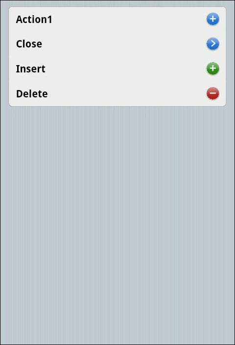
The data-styles attribute of a Detail button can contain one of these values: contactadd, detaildisclose, rowinsert, and rowdelete. Apart from specifying the data-style attribute for a detailbutton widget, you can specify custom icons through the data-icon attribute:
<li>
  <a>Favorites </a>
  <a data-role="detailbutton"
  data-icon="favorites">
  </a>
</li>
The list item mentioned previously does not include the data-style attribute; instead, a data-icon attribute is defined. Now, when you run the page, you will see the favorites icon shown for the list item as shown in the following screenshot:
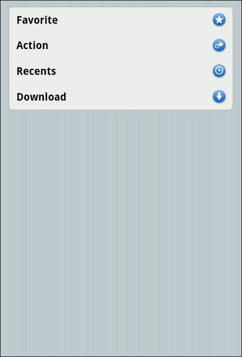
The data-icon attribute can contain one of these values: about, action, add, bookmarks, camera, cart, compose, contacts, details, downloads, fastforward, favorites, featured, toprated, globe, history, home, info, more, mostrecent, mostviewed, organize, pause, play, recents, refresh, reply, rewind, search, settings, share, stop, and trash.
The mentioned icons would suffice for most of the applications. However, you can include your own icon by defining a CSS class and specifying the data-icon value as custom. This will look for the class definition, km-class, in your CSS stylesheet.
In the previous recipe, we have created ListView using an unordered list and specified a list of items in the markup. It is also possible to create a ListView widget that is populated from a DataSource widget.
The mobile ListView widget can be bound to a JavaScript array and the mobile framework allows you to specify the DataSource for the ListView widgets:
<div data-role="view"
  data-init="flatlistviewinit">

  <ul id="flatlistview"></ul>

</div>
The previous markup does not contain any list items. It specifies the container's ul element, which will contain the list of items from the DataSource. Note that the view contains the data-init attribute. This attribute specifies the JavaScript callback function to invoke when the framework is initializing the widgets in the document.
The function flatlistviewinit is used to bind the DataSource to the unordered list in the markup.
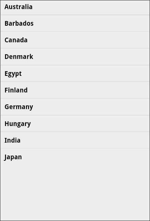
var flatData = ["Australia", "Barbados", "Canada", "Denmark", "Egypt", "Finland", "Germany", "Hungary", "India", "Japan"];

function flatlistviewinit(){

  $('#flatlistview').kendoMobileListView({
    dataSource: flatData
  });

}
The previous code snippet defines an array containing a list of country names. The function flatlistviewinit is invoked by the framework when it tries to initialize the view in the document. This function binds the array to the ul element defined in the markup. The function kendoMobileListView is called on the specified selector to initialize it as a ListView widget. The function also specifies the datasource value to be used for the ListView widget. In this case, the DataSource widget is the array containing the list of country names.
When you execute this page, you will see that a list view is created, which displays a list of countries that we specified in the array.
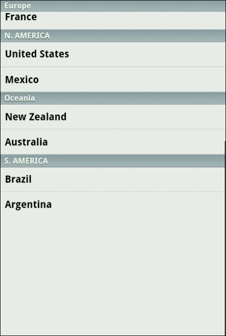
In the previous example, we listed countries; in this section, we will group these countries based on the continent in which they belong.
To group each of these countries, let's create an array of JavaScript objects. Each object in the array will contain the country name and the continent to which it belongs.
var groupedData = [
   {name: "Ghana", continent: "Africa"},
  {name: "India", continent: "Asia"},
  {name: "Australia", continent: "Oceania"},
  {name: "France", continent: "Europe"},
  {name: "Mexico", continent: "N. AMERICA"},
  {name: "Sri Lanka", continent: "Asia"},
  {name: "Argentina", continent: "S. AMERICA"},
  {name: "Kenya", continent: "Africa"},
  {name: "Italy", continent: "Europe"},
  {name: "United States", continent: "N. AMERICA"},
  {name: "New Zealand", continent: "Oceania"},
  {name: "Brazil", continent: "S. AMERICA"},
];
Now let's create a function that will initialize the ListView widget with the previous array.
function groupedlistviewinit() {
  $('#groupedlistview').kendoMobileListView({
    dataSource: kendo.data.DataSource.create({
      data: groupedData, group: "continent"
    }),
    template: '${name}',
    fixedHeaders: true
  });
}
Here we are initializing an unordered list with an array of objects. While initializing the widget, we are specifying the datasource value to be used and also the property by which the list items should be grouped. The template property specifies the template to use when adding list elements to the ListView widget. The value of the template property in this case is ${name}. When the application is run, it will replace ${name} with the name property specified in the object. The fixedHeaders property contains a Boolean true as its value; this makes the headers fix to the top when you scroll the list.
When you run this page, you will see a list of items shown on the page and these are grouped by the continent names.
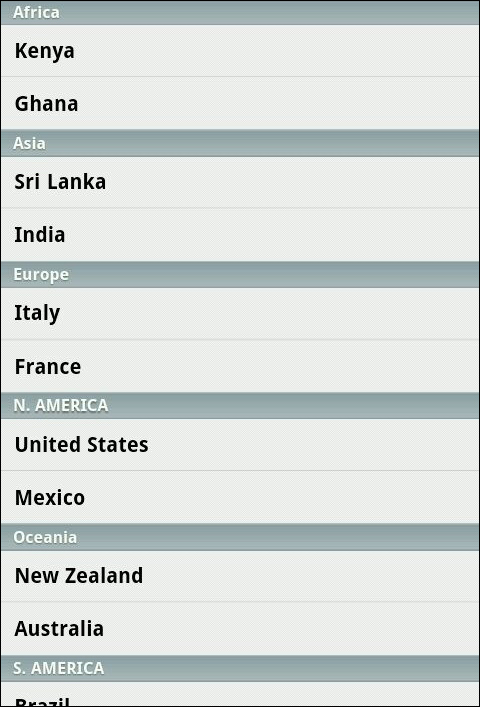
When you scroll, you will see that the headers containing the continent name fix to the top, as shown in the following screenshot:
The header will change only when a new group containing a list of country names is shown at the top of the list.