
A ModalView widget is similar to an ActionSheet widget, which is invoked by tapping on one of the widgets on the screen. A ModalView widget is used to present a window-like view as an overlay over an existing view in the page. In case of ActionSheet, the widget will slide up from the bottom of the screen, whereas a ModalView widget will be shown at the center of the screen.
Create an anchor element with its
data-relattribute set tomodalview.Create a
ModalViewwidget by setting thedata-roleattribute tomodalview.The anchor element's
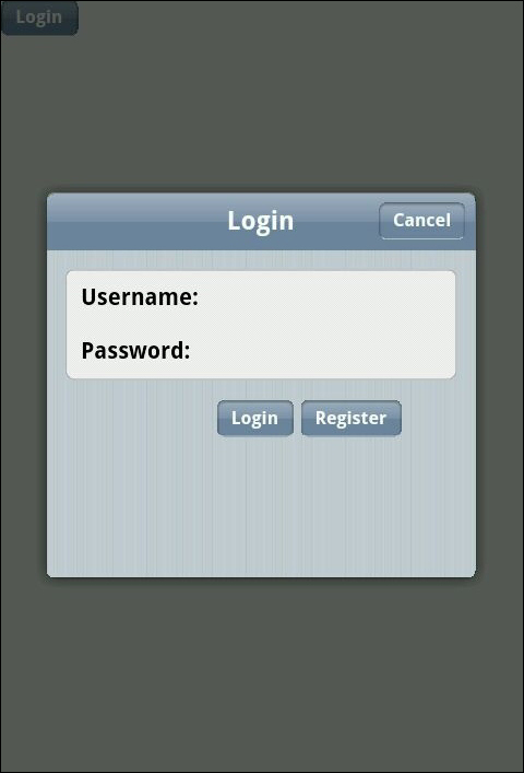
hrefattribute should be same as the modal view'sidattribute, as shown in the following code:<div data-role="view"> <a data-role="button" data-rel="modalview" href="#modalview-form"> Login </a> </div> <div data-role="modalview" id="modalview-form" style="width: 70%; height: 270px;"> <div data-role="header"> <div data-role="navbar"> <span>Login</span> <a data-click="closeBtnHandler" data-role="button" data-align="right"> Cancel </a> </div> </div> <ul data-role="listview" data-style="inset"> <li> <label for="username">Username:</label> <input type="text" id="username" /> </li> <li> <label for="password">Password:</label> <input type="password" id="password" /> </li> </ul> <a data-click="loginBtnHandler" type="button" data-role="button" style="margin-left: 40%;"> Login </a> <a data-click="registerBtnHandler" type="button" data-role="button"> Register </a> </div>
The previous code is very similar to the ActionSheet widget that we created in the last recipe. Here, the view specifies the value of the data-rel attribute as modalview and also specifies the id value of the ModalView widget (that is, modalview-form) as it's href attribute.
The ModalView widget has the id attribute set to modalview-form and the data-role attribute set to modalview to mark the target element as a ModalView widget. The widget can then contain any number of elements in it. The following widgets are added to the previous code snippet: a header containing the Navbar with the Cancel button, form elements that would capture the user's login credentials, and buttons to handle the login and register functionality.
When the page loads, you will see a Login button shown. On clicking on the Login button, a modal view containing the form elements is shown.
For a ModalView widget, you can specify the data-open attribute whose value will be the name of a JavaScript callback function. This function is invoked whenever the ModalView widget is opened.
<div
  data-role="modalview"
  id="modalview-form"
  data-open="openModalView">

  ....
</div>
This is particularly helpful when you are managing the state of the application. For example, you may want to execute a JavaScript function that changes the state of the application when the ModalView widget is opened.