

It is well known that R has very powerful data visualization capabilities. The primary reason behind the powerful graphical utility of R is the low-level graphical environment. The grid graphic system of R makes data visualization much more flexible and intuitive. With the help of the grid package, we can draw very basic shapes that can be arranged to produce interesting data visualizations. There are functions in the grid graphics system that draw very basic shapes of a high-level data visualization, including lines, rectangles, circles, and texts along with some other functions that specify where to put which part of the visualization. Through the use of the basic function, we can easily produce components of high-level graphs, such as a rectangle, rounded rectangle, circle, line, and arrow. We will now see how we can produce these basic shapes. In a single visualization, we will show you all the output from the following code snippet:
# Calling grid library
library(grid)

# Creating a rectangle
grid.rect(height=0.25,width=0.25)

# A rounded rectangle
grid.roundrect(height=0.2,width=0.2)

# A circle
grid.circle(r=0.1)

# Inserting text within the shape
grid.text("R Graphics")
# Drawing a polygon
grid.polygon()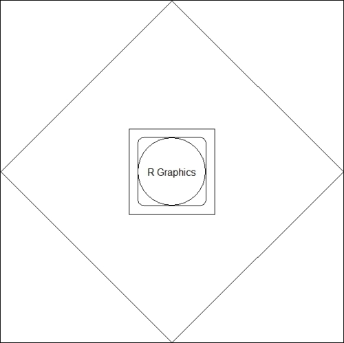
Basic shapes using the grid package
For any high-level visualization, we can use the basic shapes and arrange them as required. Now, we will list some of the functions for high-level data visualization where the basic shapes have been used:
plot: This is a generic function that is used to plot any kind of objects. Most commonly, we use this function for x-y plottingbarplot: This function is used to produce a horizontal or vertical bar plotimage,heatmap,contour, andpersp: These functions are used to generate image-like plotsqqnorm,qqline, andqqplot: These functions are used to produce plots in order to compare distributions
We will provide specific recipes for each of these functions in the subsequent chapters.