

Though grid graphics have much more flexibility than trellis graphs, it is a bit difficult to use them from the point of view of general users. The lattice package enhances the data visualization capability of R through relatively easy code in order to produce much more complex graphs. This allows the user to produce multivariate visualization. The lattice package could be considered as a high-level data visualization tool that is able to produce structured graphics with the flexibility to adjust the graphs as required.
The traditional R graphics system has much more flexibility to produce any kind of data visualization with control over each and every component. However, it is still a difficult task for an inexperienced R programmer to produce efficient graphs. In other words, we can say that the traditional graphic system of R is not so user friendly. It would be good if the user could have complete high-level graphics with the use of minimal written code. To address this shortcoming, Trellis graphics have been implemented in S. The inspired lattice add-on package is the add-on package that provides similar capabilities for R users. One of the important features of the lattice graphics system is the formula interface. During data visualization, we can intuitively use the formula interface to produce conditional plots, which is difficult in a traditional graphics system.
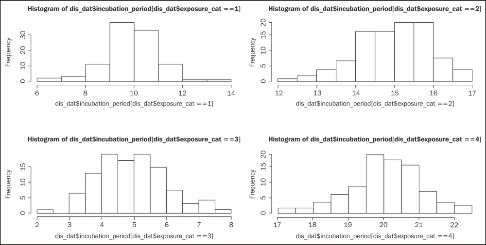
For example, say we have a dataset with two variables, an incubation period, and the exposure category of a certain disease. This dataset contains one numeric variable, the incubation period itself, and another discrete variable with four possible values: 1, 2, 3, or 4. We want to produce a histogram for each exposure category. The following code snippet shows you the traditional code:
# data generation

# Set the seed to make the example reproducible
set.seed(1234)
incubation_period <- c(rnorm(100,mean=10),rnorm(100,mean=15),rnorm(100,mean=5),rnorm(100,mean=20))
exposure_cat <- sort(rep(c(1:4),100))
dis_dat<-data.frame(incubation_period,exposure_cat)

# Producing histogram for each of the exposure category 1, 2, 3, and 4
# using traditional visualization code. The code below for
# panel histogram for different values of the variable
# exposure_cat. This code will produce a 2 x 2 matrix where
# we will have four different histograms.
op<-par(mfrow=c(2,2))
hist(dis_dat$incubation_period[dis_dat$exposure_cat==1])
hist(dis_dat$incubation_period[dis_dat$exposure_cat==2])
hist(dis_dat$incubation_period[dis_dat$exposure_cat==3])
hist(dis_dat$incubation_period[dis_dat$exposure_cat==4])
par(op)
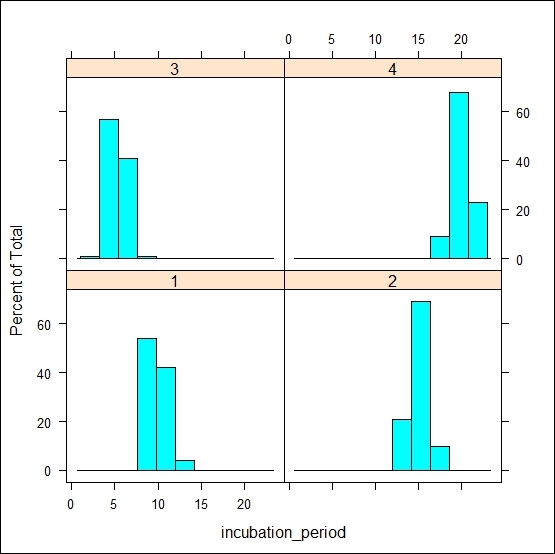
The following code snippet shows you the lattice implementation for the same histogram:
library(lattice)
histogram(~incubation_period | factor(exposure_cat), data=dis_dat)
In this lattice version of the code, it is much more intuitive to write the entire code to produce a histogram using the formula interface. The code that follows the ~ symbol contains the name of the variable that we are interested in to produce the histogram, and then we specify the grouping variable. The ~ symbol acts like the of preposition, for example, the histogram of the incubation period. The vertical bar is used to represent the panel variable over which we are going to repeat the histogram. Notice that we have used the factor command here to specify the grouping variable. If we do not specify the factor, then we will not be able to distinguish which plot corresponds to which category. The factor()command creates text labels. If the variable was left as a numeric value, it would show low to high values as though it were a continuous scale rather than discrete categories, as shown in the following figure:
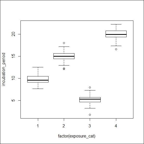
Now, if we change the code's formula part and use a plot generic function instead of the histogram, then the visualization will be changed as follows:
plot(incubation_period ~ factor(exposure_cat), data=dis_dat)
Tip
Downloading the example code
You can download the example code files for all Packt books you have purchased from your account at http://www.packtpub.com. If you purchased this book elsewhere, you can visit http://www.packtpub.com/support and register to have the files e-mailed directly to you.
If we change the code further and just omit the factor function, then the same visualization will be turned into a scatter plot as follows:
plot(incubation_period ~ exposure_cat, data=dis_dat)
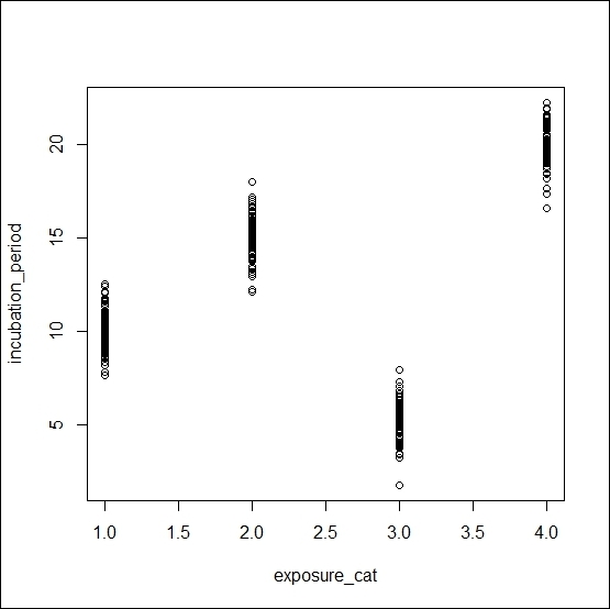
The plot()function is a generic function. If we put two numeric variables inside this function, it produces a scatter. On the other hand, if we use one numeric variable and another factor variable, then it produces a boxplot of the numeric variable for each unique value of the factor variable.