
A pie chart is circular chart divided into one or more slices. Each slice represents the proportion of a value to the total of all values. Pie charts can be used to show the share of a value in contrast to other values or the grand total. However, it may be hard to compare the size of slices within a pie chart when there are more than three slices, or across other pie charts. Therefore, if you need to compare data, we recommend using a bar chart instead.
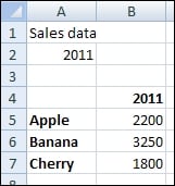
Open a new file in SAP BusinessObjects Dashboards and enter the data, as shown in the following screenshot, into the spreadsheet: