Book Image

SAP BusinessObjects Dashboards 4.1 Cookbook

Book Image

SAP BusinessObjects Dashboards 4.1 Cookbook

Overview of this book

Table of Contents (26 chapters)
SAP BusinessObjects Dashboards 4.1 Cookbook
Credits
Foreword
About the Author
Acknowledgments
About the Author
Acknowledgments
About the Reviewers
www.PacktPub.com
Preface
Index

Using a bubble plot chart


A bubble plot chart is essentially the same as a scatter plot chart, except that it has a third variable that determines the size of each point. The following screenshot represents a bubble plot chart:

Getting ready

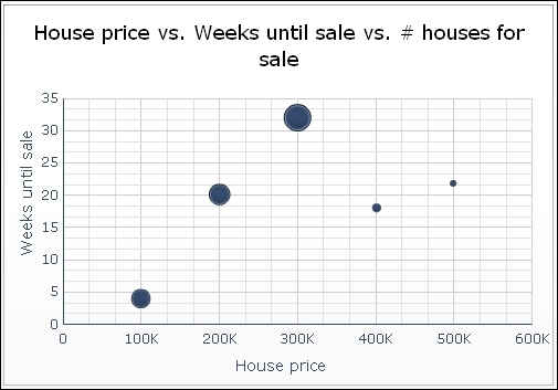
You can reuse the dashboard from the Using a scatter plot chart recipe and add the values in column D, as shown in the following screenshot:

How to do it...

  1. Drag a Bubble Plot Chart component into the canvas.

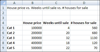
  2. Bind the data By Range to spreadsheet cells B5 through D9.

  3. Bind the Chart field to cell A1 and delete the subtitle.

  4. Bind the Value (X) Axis field to cell B4 and the Value (Y) Axis field to cell C4.

  5. Go to the Behavior tab and select the Scale sub-tab. Now select Fixed Label Size.

How it works...

In addition to the analysis we made in the Using a scatter plot chart recipe, we can now also see that the number of houses for sale in the mid-range market is very high, while the availability in the expensive market is very low.