

The tree map, also known as a heat map, visualizes values by dividing an area into a set of rectangles. The following screenshot shows an example of a tree map:
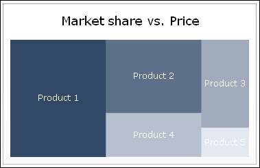
As you can see, two variables are used in this chart: one variable expressed by the relative size of each rectangle and another one illustrated by the color intensity. Instead of using the tree map, you can also choose the scatter plot chart to display two variables in one chart.
For this recipe, we can reuse the file we created in the Using a scatter plot chart recipe.
Drag a Tree Map component to the canvas.
Enter a name for the chart.
Bind the cell range A4 to C9 to the By Range field.
Select Data in Columns.
Select By Series and bind the Name field to cell A1:

Select a very dark color as High Color and a very light color as Low Color:

Preview the dashboard to check the result:
