

Using histograms, boxplots, and violin plots to examine the distribution of features
We have already generated many of the numbers that would make up the data points of a histogram or boxplot. But we often improve our understanding of the data when we see it represented graphically. We see observations bunched around the mean, we notice the size of the tails, and we see what seem to be extreme values.
Using histograms
Follow these steps to create a histogram:
- We will work with both the COVID data and the temperatures data in this section. In addition to the libraries we have worked with so far, we must import Seaborn to create some plots more easily than we could in Matplotlib:
import pandas as pd import numpy as np import matplotlib.pyplot as plt import seaborn as sns landtemps = pd.read_csv("data/landtemps2019avgs.csv") covidtotals = pd.read_csv("data/covidtotals.csv", parse_dates=["lastdate"]) covidtotals.set_index("iso_code", inplace=True) - Now, let's create a simple histogram. We can use Matplotlib's
histmethod to create a histogram of total cases per million. We will also draw lines for the mean and median:plt.hist(covidtotals['total_cases_mill'], bins=7) plt.axvline(covidtotals.total_cases_mill.mean(), color='red', linestyle='dashed', linewidth=1, label='mean') plt.axvline(covidtotals.total_cases_mill.median(), color='black', linestyle='dashed', linewidth=1, label='median') plt.title("Total COVID Cases") plt.xlabel('Cases per Million') plt.ylabel("Number of Countries") plt.legend() plt.show()
This produces the following plot:
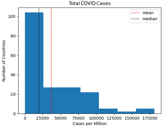
Figure 1.3 – Total COVID cases
One aspect of the total distribution that this histogram highlights is that most countries (more than 100 of the 192) are in the very first bin, between 0 cases per million and 25,000 cases per million. Here, we can see the positive skew, with the mean pulled to the right by extreme high values. This is consistent with what we discovered when we used Q-Q plots in the previous section.
- Let's create a histogram of average temperatures from the land temperatures dataset:
plt.hist(landtemps['avgtemp'])
plt.axvline(landtemps.avgtemp.mean(), color='red', linestyle='dashed', linewidth=1, label='mean')
plt.axvline(landtemps.avgtemp.median(), color='black', linestyle='dashed', linewidth=1, label='median')
plt.title("Average Land Temperatures")
plt.xlabel('Average Temperature')
plt.ylabel("Number of Weather Stations")
plt.legend()
plt.show()
This produces the following plot:
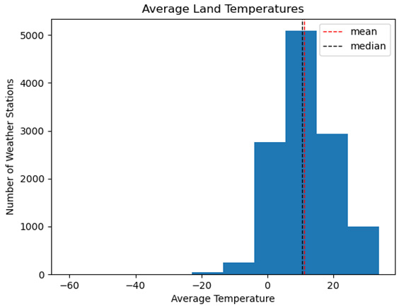
Figure 1.4 – Average land temperatures
The histogram for the average land temperatures from the land temperatures dataset looks quite different. Except for a few highly negative values, this distribution looks closer to normal. Here, we can see that the mean and the median are quite close and that the distribution looks fairly symmetrical.
- We should take a look at the observations at the extreme left of the distribution. They are all in Antarctica or the extreme north of Canada. Here, we have to wonder if it makes sense to include observations with such extreme values in the models we construct. However, it would be premature to make that determination based on these results alone. We will come back to this in the next chapter when we examine multivariate techniques for identifying outliers:
 landtemps.loc[landtemps.avgtemp<-25,['station','country','avgtemp']].\
...  sort_values(['avgtemp'], ascending=True)
      station               country          avgtemp
827   DOME_PLATEAU_DOME_A   Antarctica      -60.8
830   VOSTOK                Antarctica      -54.5
837   DOME_FUJI             Antarctica      -53.4
844   DOME_C_II             Antarctica      -50.5
853   AMUNDSEN_SCOTT        Antarctica      -48.4
842   NICO                  Antarctica      -48.4
804   HENRY                 Antarctica      -47.3
838   RELAY_STAT            Antarctica      -46.1
828   DOME_PLATEAU_EAGLE    Antarctica      -43.0
819   KOHNENEP9             Antarctica      -42.4
1299  FORT_ROSS             Canada          -30.3
1300  GATESHEAD_ISLAND      Canada          -28.7
811   BYRD_STATION          Antarctica      -25.8
816   GILL                  Antarctica      -25.5
An excellent way to visualize central tendency, spread, and outliers at the same time is with a boxplot.
Using boxplots
Boxplots show us the interquartile range, with whiskers representing 1.5 times the interquartile range, and data points beyond that range that can be considered extreme values. If this calculation seems familiar, it's because it's the same one we used earlier in this chapter to identify extreme values! Let's get started:
- We can use the Matplotlib
boxplotmethod to create a boxplot of total cases per million people in the population. We can draw arrows to show the interquartile range (the first quartile, median, and third quartile) and the extreme value threshold. The three circles above the threshold can be considered extreme values. The line from the interquartile range to the extreme value threshold is typically referred to as the whisker. There are usually whiskers above and below the interquartile range, but the threshold value below the first quartile value would be negative in this case:plt.boxplot(covidtotals.total_cases_mill.dropna(), labels=['Total Cases per Million']) plt.annotate('Extreme Value Threshold', xy=(1.05,157000), xytext=(1.15,157000), size=7, arrowprops=dict(facecolor='black', headwidth=2, width=0.5, shrink=0.02)) plt.annotate('3rd quartile', xy=(1.08,64800), xytext=(1.15,64800), size=7, arrowprops=dict(facecolor='black', headwidth=2, width=0.5, shrink=0.02)) plt.annotate('Median', xy=(1.08,19500), xytext=(1.15,19500), size=7, arrowprops=dict(facecolor='black', headwidth=2, width=0.5, shrink=0.02)) plt.annotate('1st quartile', xy=(1.08,2500), xytext=(1.15,2500), size=7, arrowprops=dict(facecolor='black', headwidth=2, width=0.5, shrink=0.02)) plt.title("Boxplot of Total Cases") plt.show()
This produces the following plot:
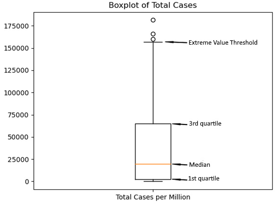
Figure 1.5 – Boxplot of total cases
It is helpful to take a closer look at the interquartile range, specifically where the median falls within the range. For this boxplot, the median is at the lower end of the range. This is what we see in distributions with positive skews.
- Now, let's create a boxplot for the average temperature. All of the extreme values are now at the low end of the distribution. Unsurprisingly, given what we have already seen with the average temperature feature, the median line is closer to the center of the interquartile range than with our previous boxplot (we will not annotate the plot this time – we only did this last time for explanatory purposes):
 plt.boxplot(landtemps.avgtemp.dropna(), labels=['Boxplot of Average Temperature'])
 plt.title("Average Temperature")
 plt.show()
This produces the following plot:
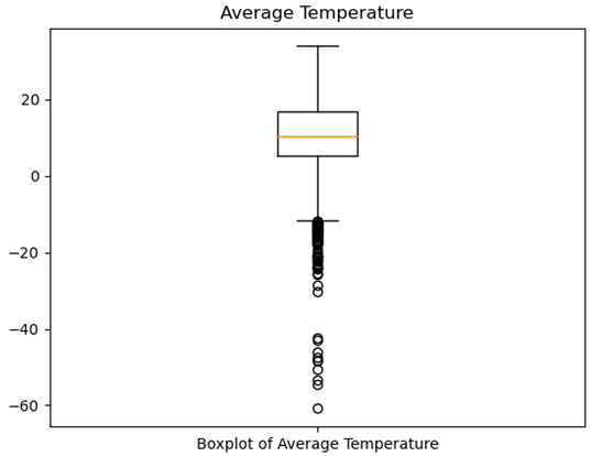
Figure 1.6 – Boxplot of average temperature
Histograms help us see the spread of a distribution, while boxplots make it easy to identify outliers. We can get a good sense of both the spread of the distribution and the outliers in one graphic with a violin plot.
Using violin plots
Violin plots combine histograms and boxplots into one plot. They show the IQR, median, and whiskers, as well as the frequency of the observations at all the value ranges.
Let's get started:
- We can use Seaborn to create violin plots of both the COVID cases per million and the average temperature features. I am using Seaborn here, rather than Matplotlib, because I prefer its default options for violin plots:
import seaborn as sns
fig = plt.figure()
fig.suptitle("Violin Plots of COVID Cases and Land Temperatures")
ax1 = plt.subplot(2,1,1)
ax1.set_xlabel("Cases per Million")
sns.violinplot(data=covidtotals.total_cases_mill, color="lightblue", orient="h")
ax1.set_yticklabels([])
ax2 = plt.subplot(2,1,2)
ax2.set_xlabel("Average Temperature")
sns.violinplot(data=landtemps.avgtemp, color="wheat",  orient="h")
ax2.set_yticklabels([])
plt.tight_layout()
plt.show()
This produces the following plot:
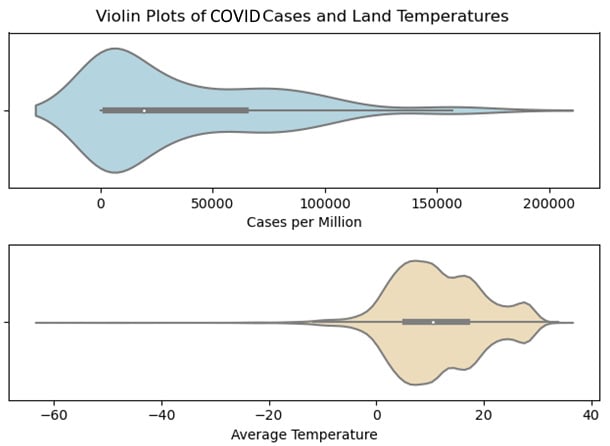
Figure 1.7 – Violin plots of COVID cases and land temperatures
The black bar with the white dot in the middle is the interquartile range, while the white dot represents the median. The height at each point (when the violin plot is horizontal) gives us the relative frequency. The thin black lines to the right of the interquartile range for cases per million, and to the right and left for the average temperature are the whiskers. The extreme values are shown in the part of the distribution beyond the whiskers.
If I am going to create just one plot for a numeric feature, I will create a violin plot. Violin plots allow me to see central tendency, shape, and spread all in one graphic. Space does not permit it here, but I usually like to create violin plots of all of my continuous features and save those to a PDF file for later reference.